In what has now become a viral commencement speech video, Admiral William H. McRaven addressed the graduating class of the University of Texas at Austin. He took “inspiration from the university’s slogan, “What starts here changes the world,” he shared the ten principles he learned during Navy Seal training that helped him overcome challenges not only in his training and long Naval career, but also throughout his life”. His speech was shared widely and enthusiastically because his advice could be applied so widely.


The popularity of his speech led to Penguin asking him to write a short guide based on those ten lessons. It’s called Make Your Bed. This is a review of that book.


It’s a short read, so this is going to a fittingly short review.
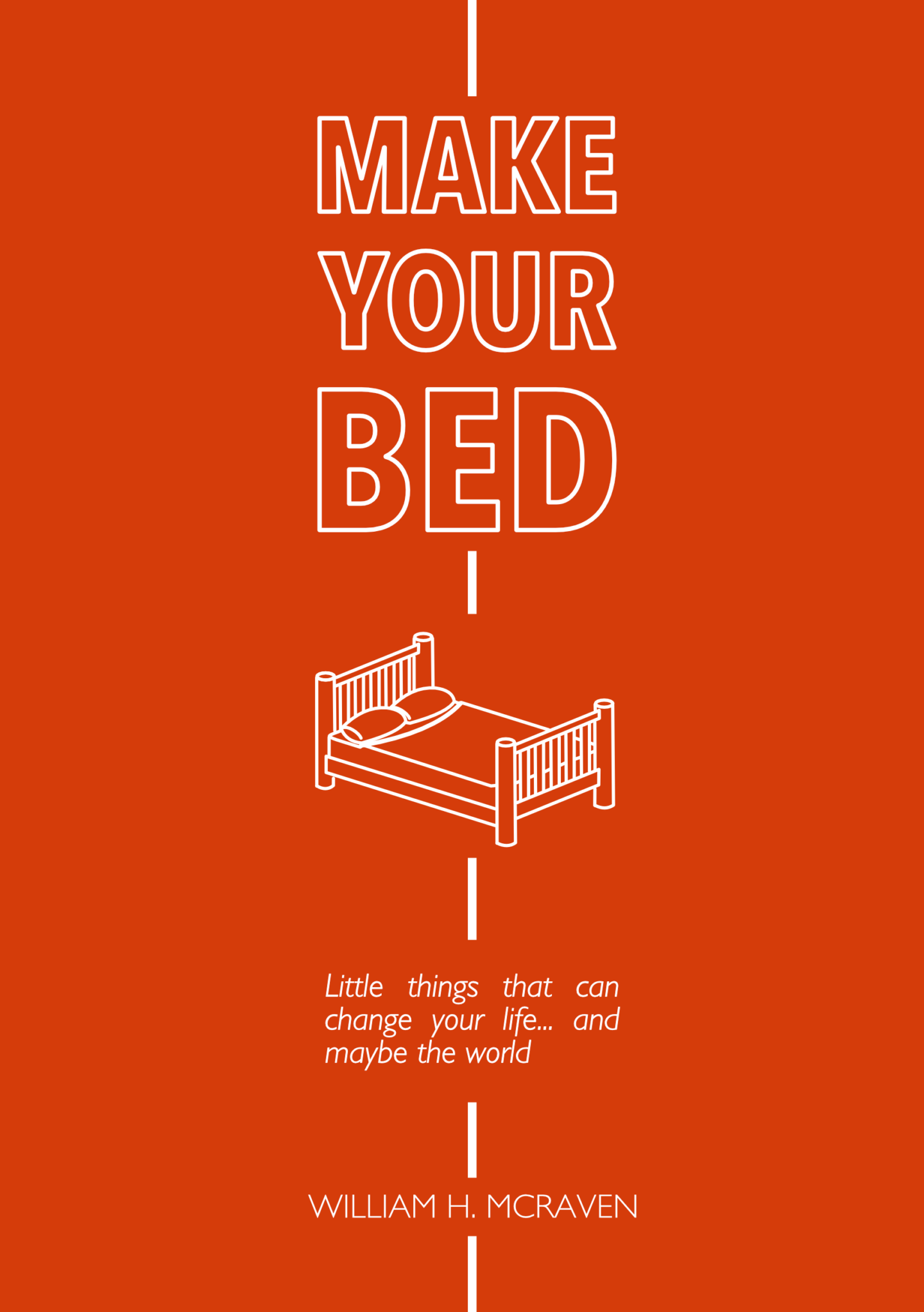
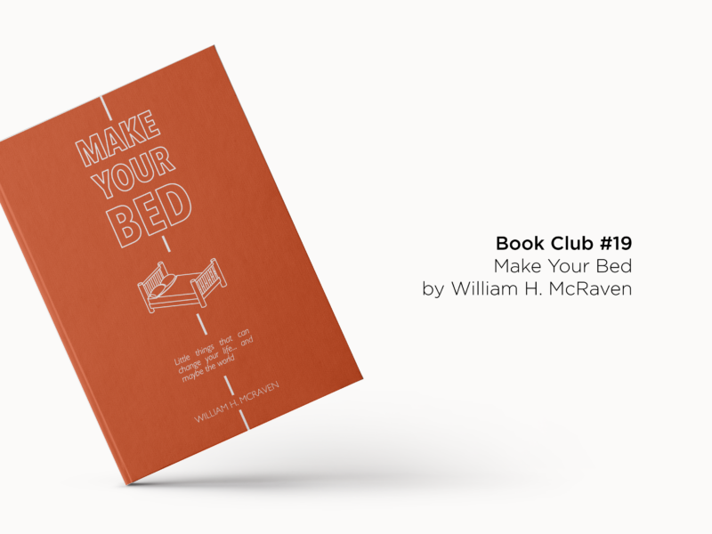
My alternative cover design for Make Your Bed. I really love how classy and minimal the original cover is with its black and gold accents, so I wanted to challenge myself to do something really different.

I’m a sucker for a commencement speech. My thesis adviser found this out much to his dismay. But I am. If you ever need a 10-20 minute boost to reset your day, week or month they’re usually wonderful sources of motivation. I think McRaven’s speech was recommended to me by someone on the internet (sorry I can’t remember who), and it really resonated with me. So, when I heard about his book a little while later via Ropes of Holland’s Reset Series, I knew I had to pick up a copy.


I read it in one sitting, in the bath, while on a solo holiday. It managed to reset my thinking in about 45 minutes, and I’ve dipped back into it a few times since.


The book itself is pretty simple, and I mean that in a good way. It features ten lessons McRaven has learned in his 37 years as a decorated Navy SEAL. That might put some of you off. I definitely wouldn’t naturally grab for a book by an Admiral. What would we have in common? McRaven’s job and training have put him through some of the toughest physical and mental challenges so he has a very tangible example for every lesson he shares. But you never feel like you’re reading a military guide book. I’m never going to go through BUDS training, but I could take something away from almost all of the advice he gives.


His lessons cover everything from the impact of making your bed, as the title suggests, to never going it alone and standing up to bullies. There’s something in there to help you solve whatever problem you’re trying to solve, big or small. Each chapter is discrete so you can easily dip in and out, or read it in one sitting as I did as the book in its entirety is just 129 (small) pages.


If you want a pick me up, a kick up the bum, or just a reminder that the little things can make a big difference you could do a lot worse than giving this one a read.


SOME QUESTIONS TO PONDER AS YOU READ

  • What impact does McRaven’s title and 37 years as a Navy SEAL have on how you perceive his advice?
  • Did you make your bed today? What effect did that have on your day?
  • Which lesson do you think will have the most impact on your life?
  • Do you feel there’s additional value in reading McRaven’s full advice over just reading/watching his speech which is included at the back of the book?


IF YOU WANT SOME FURTHER READING TRY…


IF YOU WANT MORE BOOKS LIKE THIS HAVE A LOOK AT…

  • David Foster Wallace’s This is Water
  • Marie Kondo’s The Life Changing Magic of Tidying Up
  • Sarah Knight’s The Life Changing Magic of Not Giving a Fuck
  • Jen Sincero’s You are a Badass
The moment has come, Affinity Designer for iPad Pro has arrived. So, it only seems right that I do a bit of a first impressions review, as my review of the desktop app was one of my first posts on this blog about two years ago.


Before we get into this, I have to confess that I bought my iPad with a future of using it with Affinity Designer, despite the app not existing at that point, quite firmly in my mind. While I was waiting, not so patiently, for the app to come into being I’d become quite attached to Procreate. It’s pixel only format was a lot of fun to play with, and was great at encouraging me to be looser with my less formal drawings. But it did leave me wanting as someone who mainly works in vectors and was used to having the full suite of tools available on Affinity Designer (who knew I would miss shapes and text so much?) it did leave me wanting, especially for commissioned work. In fact, I found myself reverting to my old Wacom Bamboo and Affinity on my laptop, after some bad experiences with duet, despite comparatively sad drawing experience.


So, as you might be able to guess, I was super excited when I heard the announcement, then I was filled with dread that my expectations might have been just that bit too high.


Thankfully, any anxieties I had were quickly way-laid. Affinity Designer does everything I want it to and a load more, much of it I probably still haven’t discovered yet. Before I start waxing lyrical let’s break this review up a little bit.

Pros?

The big pro of Affinity Designer is just the sheer amount it lets you do. It leaves Adobe Draw looking like a Fisher Price vector tool and it blows Procreate out of the water if you’re looking to do anything more than paint digitally. I’m not going to list everything you can do here, because we’d be here forever. There’s a full list on Serif’s website. But I can’t imagine there’s much you’d want to do or expect to be able to do in a similar desktop app, that you can’t make happen.


Affinity Designer moves absolutely seamlessly between raster and vector layers, which is the big thing I’ve been looking for. You can get those “natural” textures and the freedom of drawing with pixels. Then slip right back into the editability and scalability of vectors without skipping a beat.


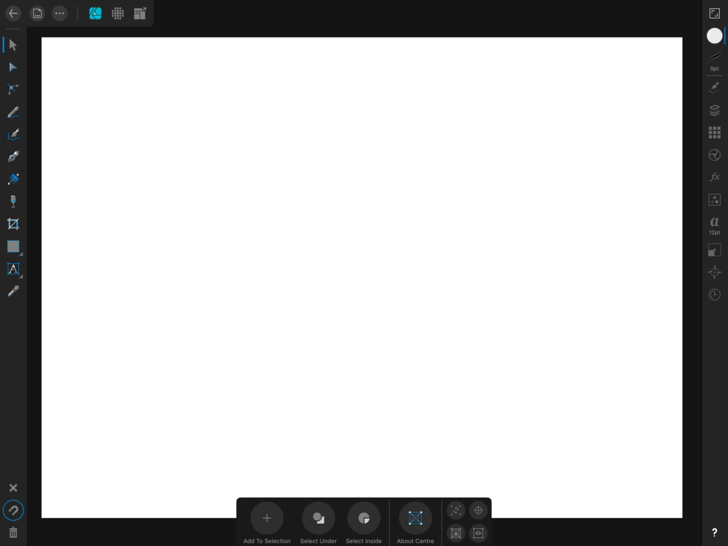
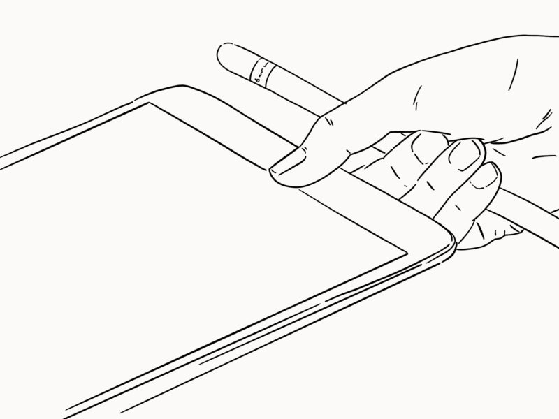
As I mentioned at the top of this, some time ago now, I’ve tried a few screen mirroring apps like Duet in my search to replicate the tools I was used to with little avail. Like Procreate, Affinity Designer was built with native use and the apple pencil in mind so all of the issues of lag and pressure sensitivity are a thing of the past. It also includes all of the multitouch gestures you’d expect from two-finger tap undo to canvas rotation (turn it on in the right-hand sidebar).


It also has all of the customisation options you’d expect from a desktop app from adding in your own fonts, which was surprisingly easy, to creating your own vector and pixel brushes. So there’s really very little you can’t do.


One area I haven’t really explored in the iPad version of the app, which is new, is its UI functionality. It’s something I’m looking to play with more, but I’m not a UI designer so I’ll leave a review of that to the pros.


Cons?

The only negative I’ve found so far is that the iPad version of the app takes a bit of learning. One of the things I loved about Affinity Designer on desktop was that it took all of the complexities out of Adobe Illustrator, and just offered you the functionality you wanted exactly where you would expect it. However, the UI on iPad is a little bit fiddly. I’m a few weeks into using it in earnest and I’m still opening and reopening bits of the sidebar trying to work it out. If you’re used to using Designer on desktop there are some similar features but don’t expect your workflow to be as smooth from the get-go. If you’re completely new to Designer, especially if you’ve not used Illustrator either or you’re a die-hard Procreate fan, be prepared to put some time into learning the ins and the outs. Thankfully the kind folks at Serif have put together a series of tutorials to get you started or help you out if you get stuck, but I’m still yet to find anything better than just using software like this and working out how to get it to do what you want it to do.

Who’s it for?

Affinity Designer is the app for anyone wanting to use their iPad as a serious graphics tool, whether that’s for illustration, lettering (it has loads of great typography tools), vector work, or anything in between. If you’re only looking to casually sketch, you might not need anything beyond Procreate. But for anything beyond that (shapes! Text! Vectors!) I’d highly recommend Affinity.


In short?

As far as I’m aware there really isn’t anything out there that can compete with Affinity Designer when it comes to using your iPad. Having tried using duet and other screen mirroring tools to use desktop apps and turn my iPad into a drawing tablet, having a native app that can do everything you need it to is pretty heavenly. For £19.99, without a subscription, you really can’t go far wrong. Plus, given that they’ve beaten Adobe to the punch I can see Affinity fast becoming the standard when it comes to iPad design apps.


PS – I am in no way sponsored by Serif or Affinity in any way (hi guys!), I just love their apps a lot.

This was initially going to be my second post on imposter syndrome, but I’m trying to set myself up into a more positive mindset, so here I am talking about faking it until you make it. Because let’s be honest we’re all making it up as we go along a little bit right?


In my “real job” I’ve just taken on a new role. If I’m honest with you all, I’ve been struggling with it. Even though it’s something I’ve wanted to do for a while, it’s out of my comfort zone and it’s hard to feel confident and own something new, especially when you view yourself as a junior. So, I’m currently trying to fake it until I make it my own, in exactly the same way I’m trying to tell myself (and the rest of the world) I’m an illustrator until it feels true.

When it comes to successfully faking it until you make it, there are two key elements as far as I know the physical elements and the mindset elements, they’re both about changing how you think but how you get there is slightly different.


First, let’s get physical. I feel like we’ve all heard of “power-posing” and done our best wonder woman stance in the mirror at this point. While it feels pretty silly to start with, there is something in trying to make your reflection mirror how you want to feel on the inside. There are whole books on this subject, but I’m going to keep it simple today with 3 ideas you (and I) can try out straight away:

  1. Think big – stand tall and take up as much space as you can. When we’re feeling small, we act small. But you deserve airspace as much as anyone else. Being big also means being seen and heard, because you need your ideas to be heard if they’re going to move forward
  2. Move slow – I don’t know about anyone else, but when I get nervous I talk a million miles an hour. Moving and speaking more slowly not only forces you to tackle the adrenaline in your system it also makes you appear in control and like you know what you’re doing. Plus, the more time you give yourself to think the more in control you actually will be. I promise no matter how slow you feel you’re going no one will think you’ve turned in to a slo-mo robot so really own it.
  3. Dress the part – I love clothes, I always feel weird saying that but I do. How you look is the least important part of how you are, but it can have a huge impact on how you feel about yourself. So dress for the role you want. That doesn’t have to mean rocking a power suit (unless you want it to) or buying a whole new wardrobe, but rather just asking yourself the question “if I was [insert the thing you want to be] what would I wear today?” when you reach into your wardrobe.


Now for the tough stuff, we need to get all up inside our own heads. While the physical stuff can help you trick yourself into believing the only way ‘faking it until you make it’ really works is if you believe.


Whenever you end up doing something new, the best thing to do is to find someone who’s really great at that thing and try to mimic the things they do, even if you feel like a fraud. You have to understand you’re a work in progress, and that faking it is part of the learning process like copying great masters when you learn to paint or even just using guidelines when you learned to write for the first time.


“By viewing ourselves as works in progress, we multiply our capacity to learn, avoid being pigeonholed, and ultimately become better leaders. We’re never too experienced to fake it till we learn it.” – Herminia Ibarra


There’s a whole load of science behind the idea that if you act “as if” something is true you can make it so, which has been boiled down wonderfully in this sketchnote video by Richard Wiseman. What would you be doing if you were confident in your new role or you were a successful author? What would you be doing if you loved networking? Okay now do it – trust me I know it’s scary and awful, but it is possible and you can make it happen.

I’m not quite ready to call myself a Londoner, but every passing month I do grow to enjoy and feel more comfortable in the city. So I wanted to take a moment to step back, be a bit of a tourist, and introduce you to some of my favourite London design icons.

Tube Map

I’ve already written about the design history of the Underground signs, as created by Edward Johnston. So instead today, I wanted to talk a little bit about the tube map.

Who designed it?

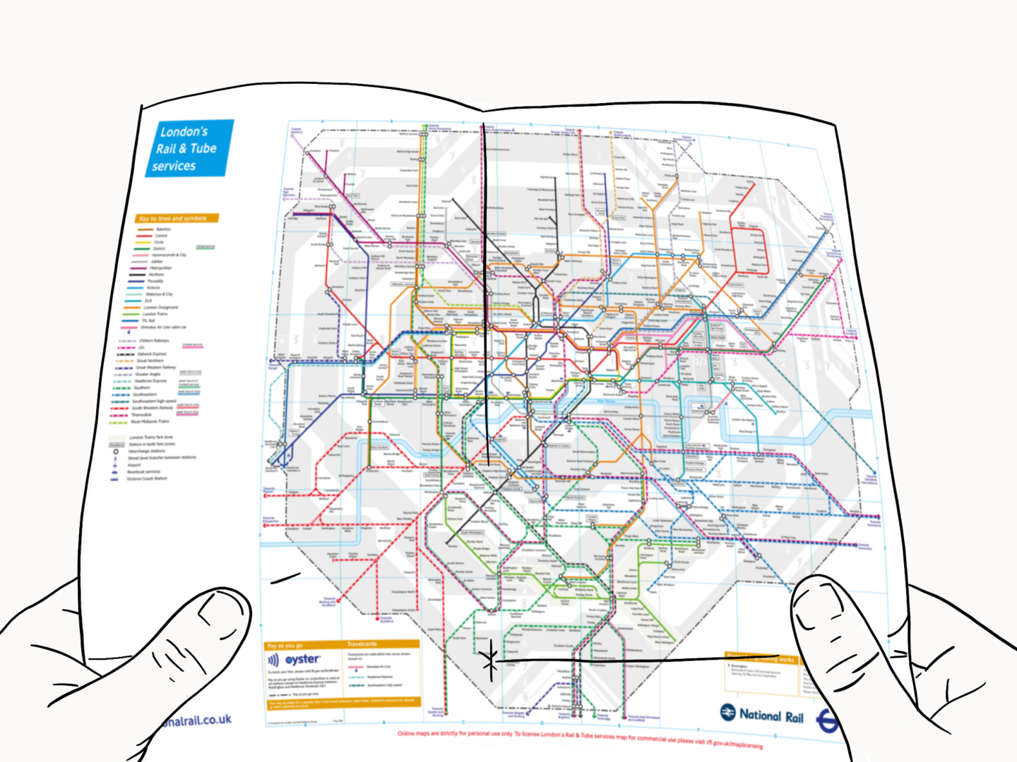
The tube map we all know, love and use to navigate the city was drawn up by the electrical draughtsman, Harry Beck in 1933.

Why is it a classic?

Beck took a different approach to transport map design. Rather than sticking with the classic method of basing the map on the geography of the network, which left the map looking busy, Beck decided to draw up his design using the style he was used to when drawing up circuit diagrams. It was a little too ‘out there’ for the board but as soon as it was put out into the world in test poster form, they realised it was what the people wanted.

Red Bus

Although the mayor stopped ordering the original red double deckers, in favour of something a little more modern, and a little cheaper, they’re still something tourists always seem to want to catch a snap of.

Who designed it?

In the early 50s, a team directed by AAM Durrant and Colin Curtis designed the original AEC Routemaster so it was lighter and easier to maintain. Then Douglas Scott styled up that efficient people carrier into the big red bus we all know and love.

Why is it a classic?

The big red bus was so well designed that it outlasted all of its competitors, and ran on the streets of London, with a few accessibility updates, until 2005. Even then, when Thomas Heatherwick came in to create the new Routemaster he knew he had to stick closely to that classic red design. In terms of longevity, I can’t imagine a London without some form of the red bus on its streets.

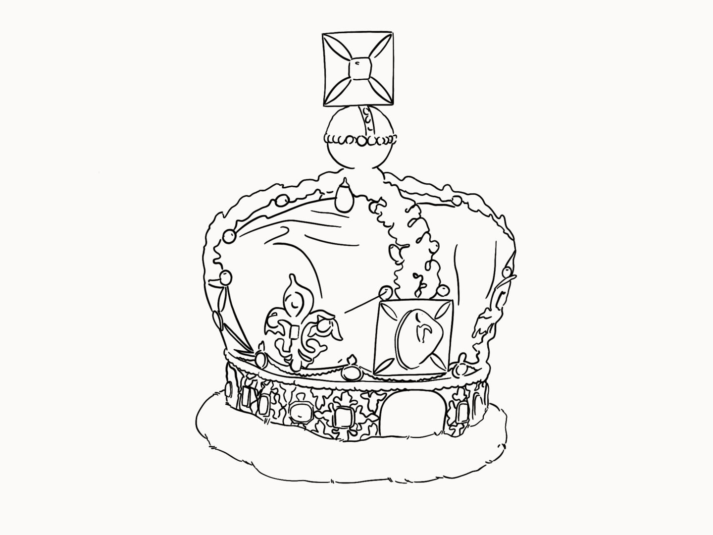
The Imperial State Crown (the one Queen Elizabeth wore in her Coronation)

I know that the provenance of many of the jewels is problematic. But there’s no denying that the Imperial State Crown is a British icon.

Who designed it?

Commissioned for the coronation of King George VI on 12 May 1937, the Imperial Crown was designed by Rundell Bridge & Rundell, with all of the jewelling done by Garrard & CO.

Why is it a classic?

Do I even need to explain this one?

Telephone box

So we may not use them as much as we used to, they may be being replaced by wifi hotspots, but the red telephone box is still on every other postcard for the city.

Who designed it?

The man behind the phone box is famed architect Sir Giles Gilbert Scott – also known for his work on Waterloo Bridge, Battersea Power Station and so much more.

Why is it a classic?

The phone box we all know and love is the K6 model, because, you guessed it, it was the 6th version to hit Britain’s streets. Its currant red was introduced to catch the eye. I love that the phone box was introduced by the Post Office to increase communication around the country, and they were not just used in the UK, but in Bermuda, Malta and Gibraltar as well!

Big Ben’s Clock 

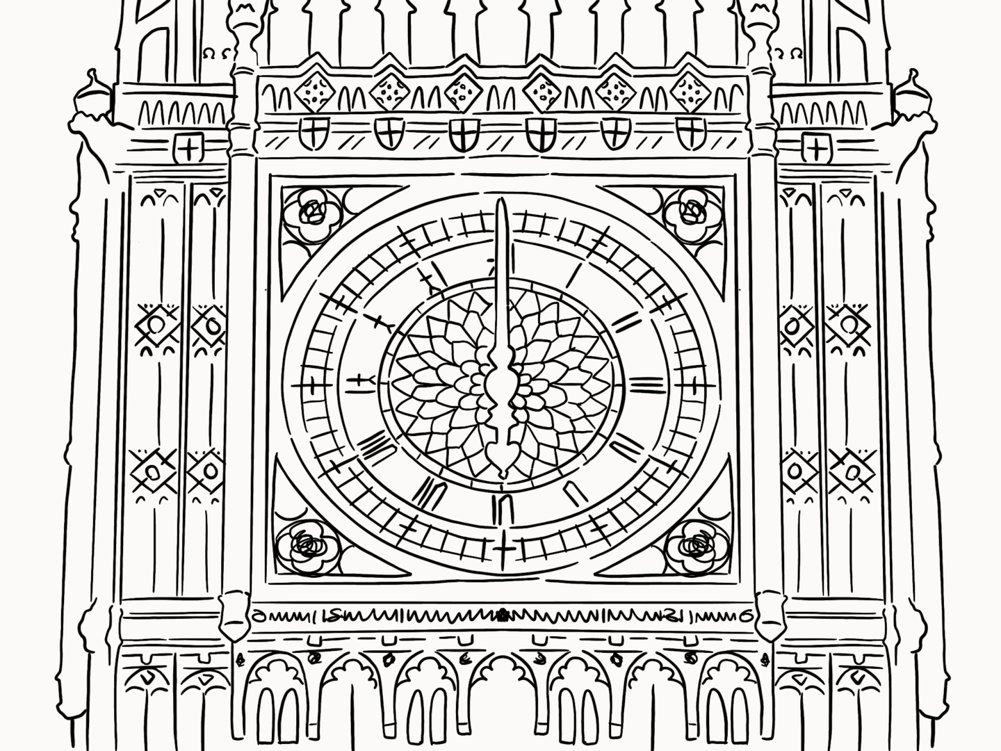
Even though Big Ben is currently hidden by scaffolding as construction work takes place to help preserve its grace for future generations, it’s still one of my favourite London sights. But there’s one element of Big Ben I love the most, that’s it’s signature tick-tocking clock.

Who designed it?

After the fire that destroyed the Palace of Westminster in 1834, Edmund Beckett Denison and Edward Dent (the two Eds) designed the clock which sits in the tower.

Why is it a classic?

So the thing I love the most about the clock is how it came about. George Airy (astronomer to the stars) wrote up the requirements for the clock, with the first and foremost being “The Great Clock should be so accurate that the first strike for each hour shall be accurate to within ONE second of time.” All the clockmakers in the land said it couldn’t be done. That was until Ed Denison stepped up. He wasn’t a professional clockmaker, he was a lawyer, but he loved clocks. So he wasn’t afraid of the challenge and just wanted to try. He got some help from fellow clockmaker Ed Dent, and the pair came up with a revolutionary double escapement design. Proof that even amateurs can redesign a national symbol.

Happy summer folks! It’s been a sunny, sticky month in the city. It’s not felt like London at all really, spirits have been high, we’ve been eating later and enjoying the long almost mediterranean days, we even did pretty well the football #southgateyouretheone.


This month’s roundup is another slightly shorter one because I went away at the start of the month. But it’s still filled with goodness, including some great longer reads well worth the investment.

stop watch illustration

SHORT READS, IF YOU’VE ONLY GOT A FEW MINUTES:


‘Breathtakingly beautiful’: Tate St Ives wins museum of the year award

So Tate St Ives is officially on my to visit list. Its extension is not only architecturally beautiful it also contains some of the country’s most cutting edge art. Plus it’s not got a bad view to go along with it.


5 more drawing exercises

Ralph Ammer has built on his “Quick beginner’s guide to drawing” with some more thought provoking exercises to align your hand and your eye. If you want to improve your sketching practice or just rethink how you see the world give it a read

Dentures illustration

LONG READS, IF YOU WANT SOMETHING TO GET YOUR TEETH STUCK INTO:

The story behind the rainbow flag

London Pride was one of the biggest parties of the month, I thought there was no more fitting time to share this wonderful article about the history of Gibert Baker’s rainbow flag. 99u spoke with some of the late creator’s closest friends to learn more about the maker who, through art and design, helped to spearhead a movement of enduring pride and acceptance.


Creating an illustration for The New Yorker

I love a good behind the scenes piece. Here, Daniel Savage walks us through the creation of an illustration for an article on paper jams for the New Yorker, showing how the illustration developed and was animated within a tight deadline.


This is how you create a feminist internet

This month I went to Nesta’s Future Fest conference, which got me thinking about technology, the future, and how we can shape them both. I thought this great op-ed piece from Aiga’s Eye on Design is the perfect way to carry on that conversation


Arts cuts are bad for our health – what are we going to do about it?

Jodie Caris, part of Forever Curious, a creative initiative set up to work with local east London primary schools, asks: what next for a generation let down by state funding for the arts?


Why Ceramic Artists Are So Good at Dealing with Failure

We talk about the need to fail fast and just create in design but it’s a lot easier to say than embrace. So what can we learn from ceramicists who choose to work with a material which is open to a “myriad mishaps that can occur during its processes, from wheel-throwing to glazing and firing”?


Flight of the Conchords: ‘We’re retired sex symbols’

I read this article over my boyfriend’s shoulder in the airport on the way home, and then again when I was reunited with my laptop. It’s not necessarily about art but everything Brett and Jermaine have to say about creating and having fun is so applicable.

“I mean, this was all just a side project to learn guitar,” Clement says.

“My entire career is a side project,” says McKenzie.

“Yeah, I’m still waiting for the main project,” agrees Clement and he gives another giggle of delight.

WHO TO FOLLOW, IF YOU WANT TO SPRUCE UP YOUR INSTAGRAM FEED:

@kitagar

Kit Agar’s terrazzo inspired portraits and illustrations are the perfect antidote to all of this heat. They’re cool, calm and perfectly collected.  


@anniedornansmith

I’m currently starting to work on some new stuff for my store, and Annie Dornan Smith is a huge inspiration for how I’m trying to approach my business. If you love gorgeous stationery or you’re a small biz owner I’d seriously recommend checking out her feed and her store – especially because her new peachy keen collection just launched!


@msjordankay

Not only is each and every one of Jordan Kay’s illustrations a masterclass in using colour, she also brings them together in the most gorgeous grid layouts. Her feed is a summery joy to scroll through and I can’t recommend it enough.