As part of something I’ve been working on for work (my actual job!) I’ve had to research universal design, and I’ve ended up coming across some wonderful pieces of design which I wanted to share with you all as inspiration and as a reminder that inclusivity should be in built to the extent that you don’t even think about it.

Before we jump in, what even is universal design? Universal design, sometimes known as inclusive design, “is the design and composition of an environment so that it can be accessed, understood and used to the greatest extent possible by all people regardless of their age, size, ability or disability” which to me just seems like common sense. Open what you make up to the world, and bring as many people in as you can from the start, because we work best when we work together and feel included.

So now we’re all on the same page, here are a few of my favourite examples of universal design.
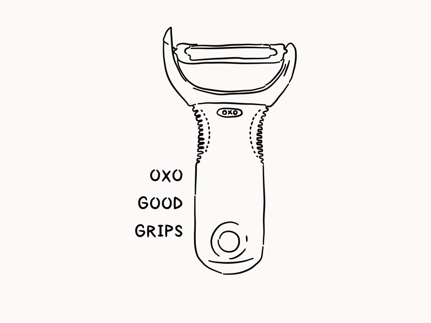
OXO Good Grips

OXO’s range of Good Grips kitchen utensils are frequently cited as great examples of universal design with good reason. Sam Farber and his wife loved to cook. However, when she developed arthritis it became increasingly difficult for them to share a lot of the tasks. Initially, the Farbers thought it was just part and parcel of her condition. But, after a while, he realised it wasn’t Betsy it was the fact that the tools she was using just weren’t fit for purpose. So he, and his son John, set up OXO working with industrial designers SmartDesign. The team they created brought in users from different age groups, with different hand sizes, manual strength and manual dexterity abilities to test their products. Thanks to that their ergonomic designs, featuring pressure-absorbing non-slip handles are so much easier to use for everyone than standard kitchen tools. They started with peelers but since then they’ve made salad spinners you can use with one hand, measuring jugs you don’t have to bend down to read and so much more. That range has won over 100 design awards and produced huge sales.

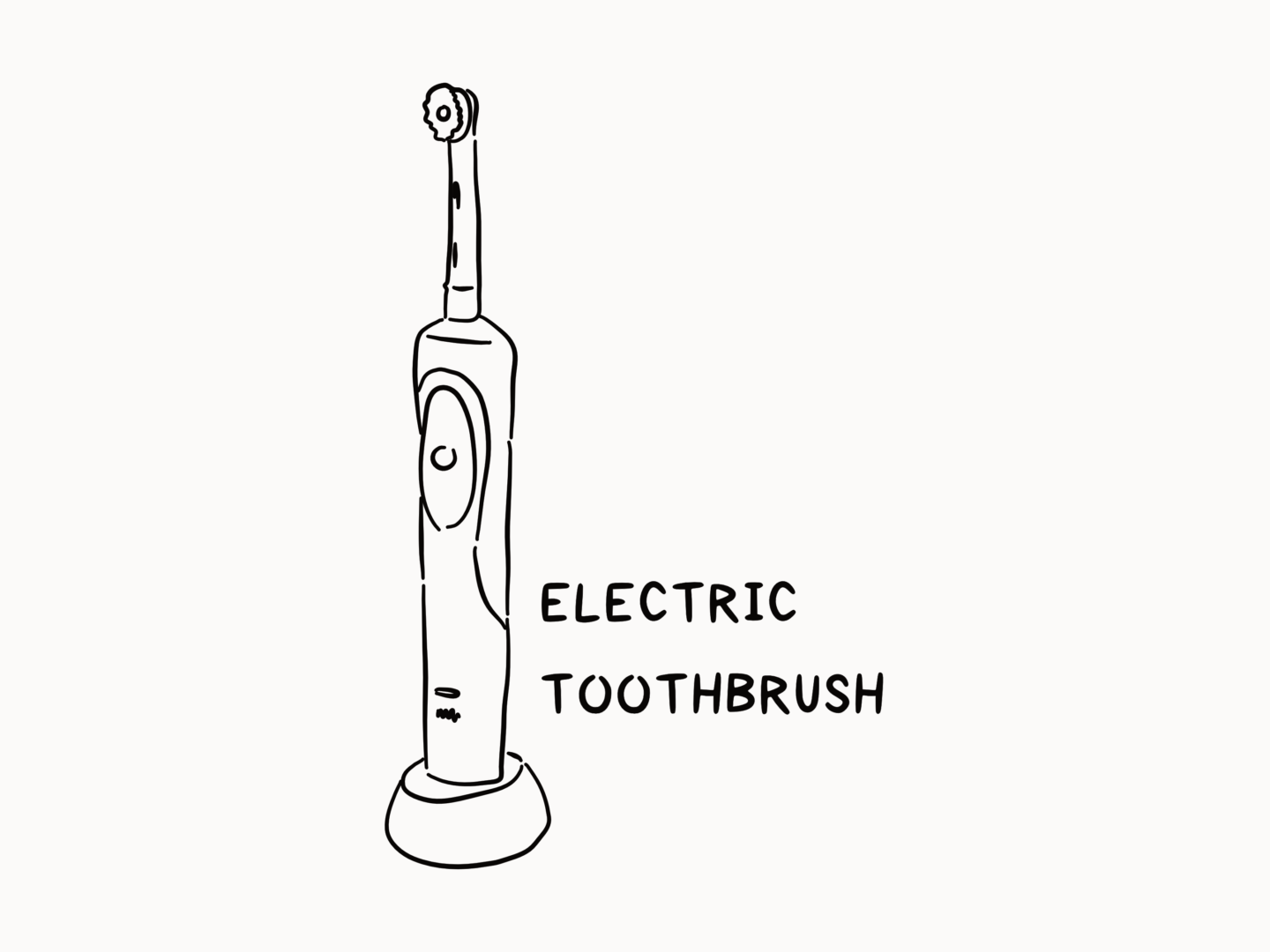
The Electric Toothbrush

What do you use to brush your teeth? If you have an electric toothbrush you might not know that they were originally created for patients in hospitals and those with reduced motor skills because they require you to move your hand far less than a manual brush. A manual brush requires lots of small tricky movements, that can become nearly impossible if your joints stiffen or your muscles weaken. So electric toothbrushes were developed to be easy to grip and to clean your teeth with a minimum of effort, which means they’re great for a wide range of users including those of us who are just super lazy.

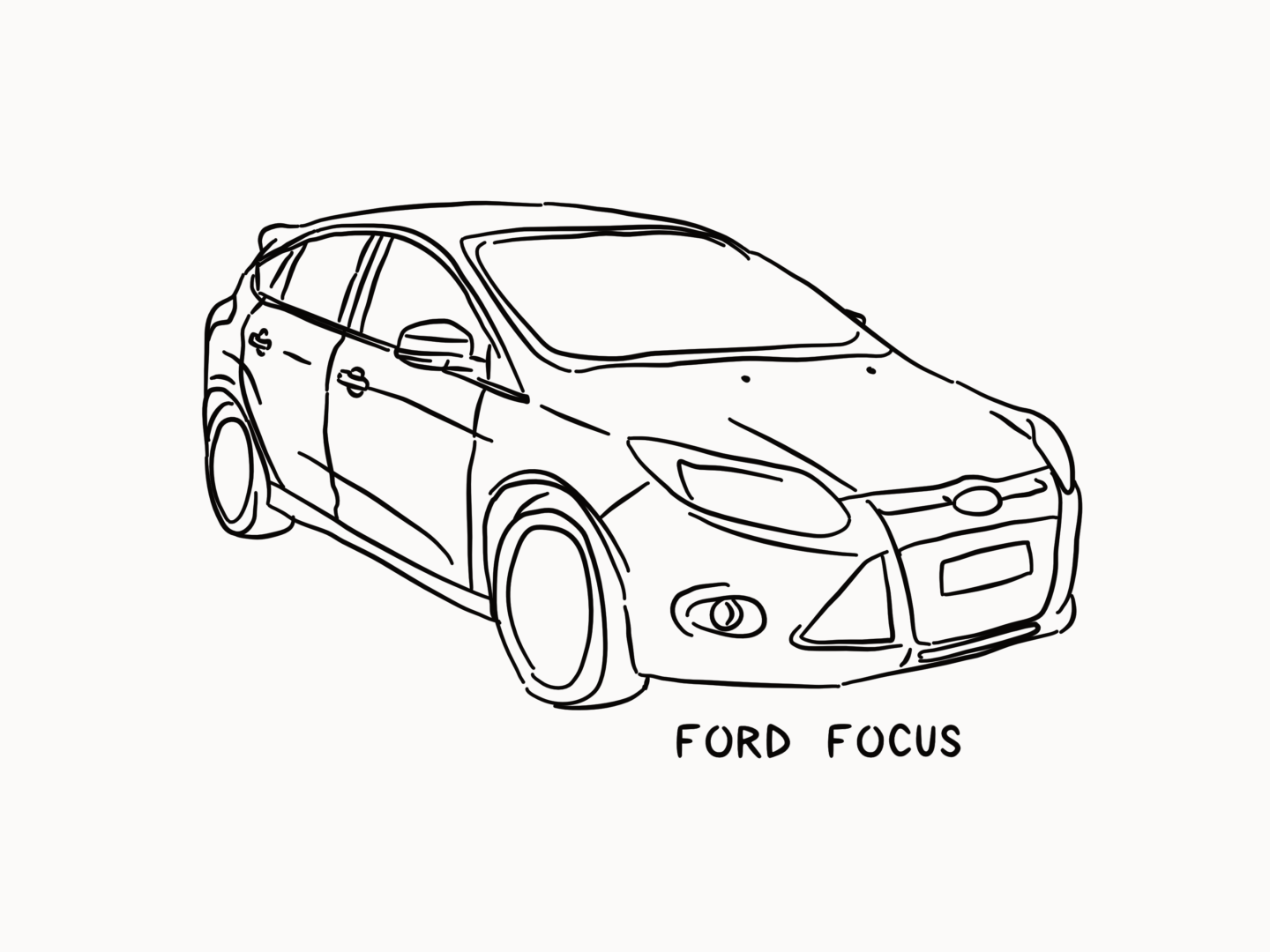
The Ford Focus

Car design has traditionally been focused on attracting young drivers. However, in 2001, the designers at Ford were encouraged to design for the needs of a much older market. In order to design for a different user group, the team at Ford were encouraged to build empathy with their target market. So, they built what was known as the ‘Third Age Suit’ which simulated the effects of old age such as decreased mobility. When wearing the suit the design team discovered just how hard it was to even get into and out of one of their previous designs. Taking their new findings back to the drawing board the Ford Focus was designed with seats that are higher and doors which are bigger than any other design before. They also made the dashboard controls easier to use by those who have lost fine motor control. By taking into account the needs of their user, they might not have designer the sexiest car, but they designed a supremely usable one which is why it’s one of the best selling models of all time.
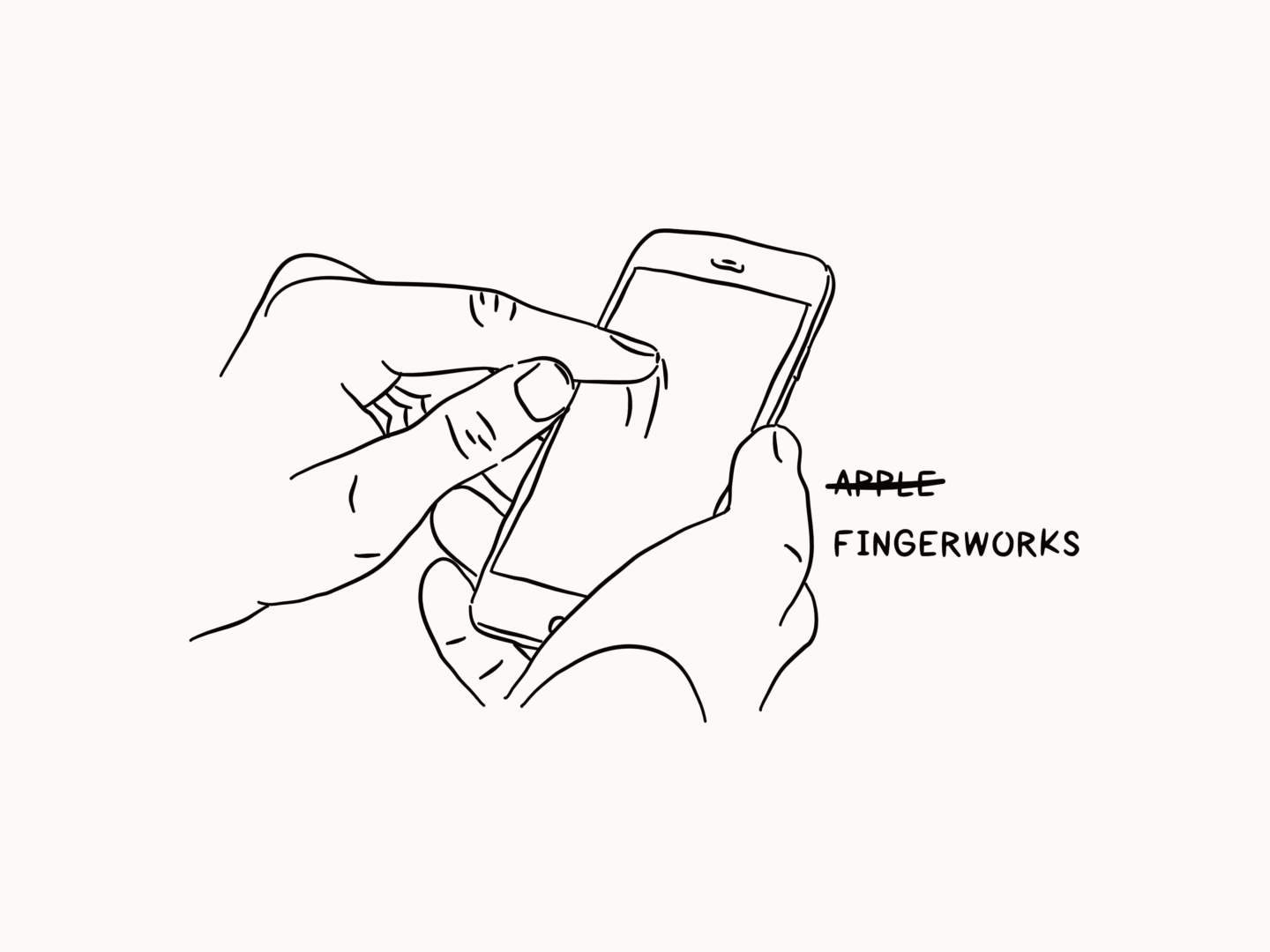
Apple Multi-touch

John Elias and Wayne Westerman set up a company called FingerWorks in 1998 and developed a number of multi-touch input devices including keyboards and touch-pads. Westerman was motivated to develop the multi-touch devices, inspired by playing the piano, after suffering from a stubborn bout of tendonitis which he developed through years of designing. Their products helped those who suffered from RSI and other illnesses that would make it difficult to use standard keyboards. They were a cult hit. Then in 2005 their tech was bought by Apple and made part of the first iPhone release. That multi-touch capability has been one of the key usability features of the iPhone and made it such a hit with so many different groups of users.

It’s that time of the year again, spring has sprung and cleaning is afoot, or in my case about to be afoot. Last year I wrote my ultimate guide to spring cleaning both your physical and digital space. If you’re looking for some top tips or a bit of a checklist, give it a read.


This year, I’m talking all things business spring clean instead. As someone who’s launched a store and started taking her freelancing work more seriously over the last 12 months, I’ve found there’s a fair bit of tidying up I’ve been neglecting. So, I’m making my business a part of my spring refresh, and these are the things I’m planning on doing.


Chase those invoices

Unfortunately, I think everyone who’s worked freelance has struggled with late payments at some point. If you have to keep chasing it can be easy to start to lose momentum or feel like you’re fighting a losing battle. But if you’ve done the work you deserve the compensation. Embrace that spring cleaning energy and go chase the payments you deserve.


File your receipts

I’m not going to lie, I definitely had a bit of a freak out around tax return time this year. That freak out inspired me to be really great with my finances for about a week, and then duly forget about them again. In an attempt not to have a breakdown next January, this spring clean I’m going to sort through and upload all of my invoices*, and hopefully start a habit or at least make sure the first quarter of the year is well documented.


*I’m currently using QuickBooks and I really like it so far. Potential review to come next year once I’ve actually filed a return with their help.


Update your portfolio

It always seems to be the case that it takes more effort to get a piece up and shared in your portfolio than it does to make it in the first place. But it’s so important to show off your best work and what you’re loving making because clients only know about what they can see. So if you’ve got a couple of projects you’ve been hiding under a bushel now is the time to let them shine brightly. Or, if you start uploading and realise your portfolio has become unwieldy or includes pieces you feel are out of date or your style get all Marie Kondo and cut them out.


Refresh your bio

This is something I know I am particularly bad at, because despite writing about my opinions and experiences every week I pretty much hate writing about myself. But your bio is such an important part of your site, it lets people know who you are and sets the scene for your working relationship. It should grow and evolve as you do. So, sit down, make peace with writing about yourself, and show the world who you are now and update that bio.


Spruce up your social media

There is so much social media hygiene to keep up on these days. I only really use three channels, Instagram, Twitter and Pinterest, but even still it’s too much to manage most days. Have a quick review of your channels and work out what things you can do to make your feeds look better or that will make your life easier in the coming months. That might mean putting in some Pinterest cover images, setting up Instagram highlights, investing in a new scheduling tool or even making a content plan. Pick the two or three most impactful things then make them happen.


Make a log of what you’ve got

As well as cleaning up and updating, a spring clean is also a great time to take stock of what you have to offer, whether that’s physical inventory, digital assets or new knowledge. If you don’t know what you have it’s very hard to offer it to someone else. So ask yourself what can you use in your business going forward? Where is it stored? How can you make it more appealing?


Once you’ve done all of that you should have a clean slate to help you review and make a plan for what it is you want to achieve for the rest of the year.


Are you doing a business spring clean, or any other spring cleaning, this year? What’s on your to polish list?

I think we’re all a little frustrated by Instagram’s algorithm, not least because it means that it’s harder to find new people to follow. I wrote a few weeks ago about supporting fellow artists, so I’m putting that into practice and sharing with you 10 smaller artists you should be following on Instagram.

When I say “smaller” I’ve chosen some of my favourite artists who have under 2,000 followers as an arbitrary figure. Some of them are well established elsewhere, some of them aren’t, but they are all worth a place in your feed and people you might not have stumbled across otherwise.

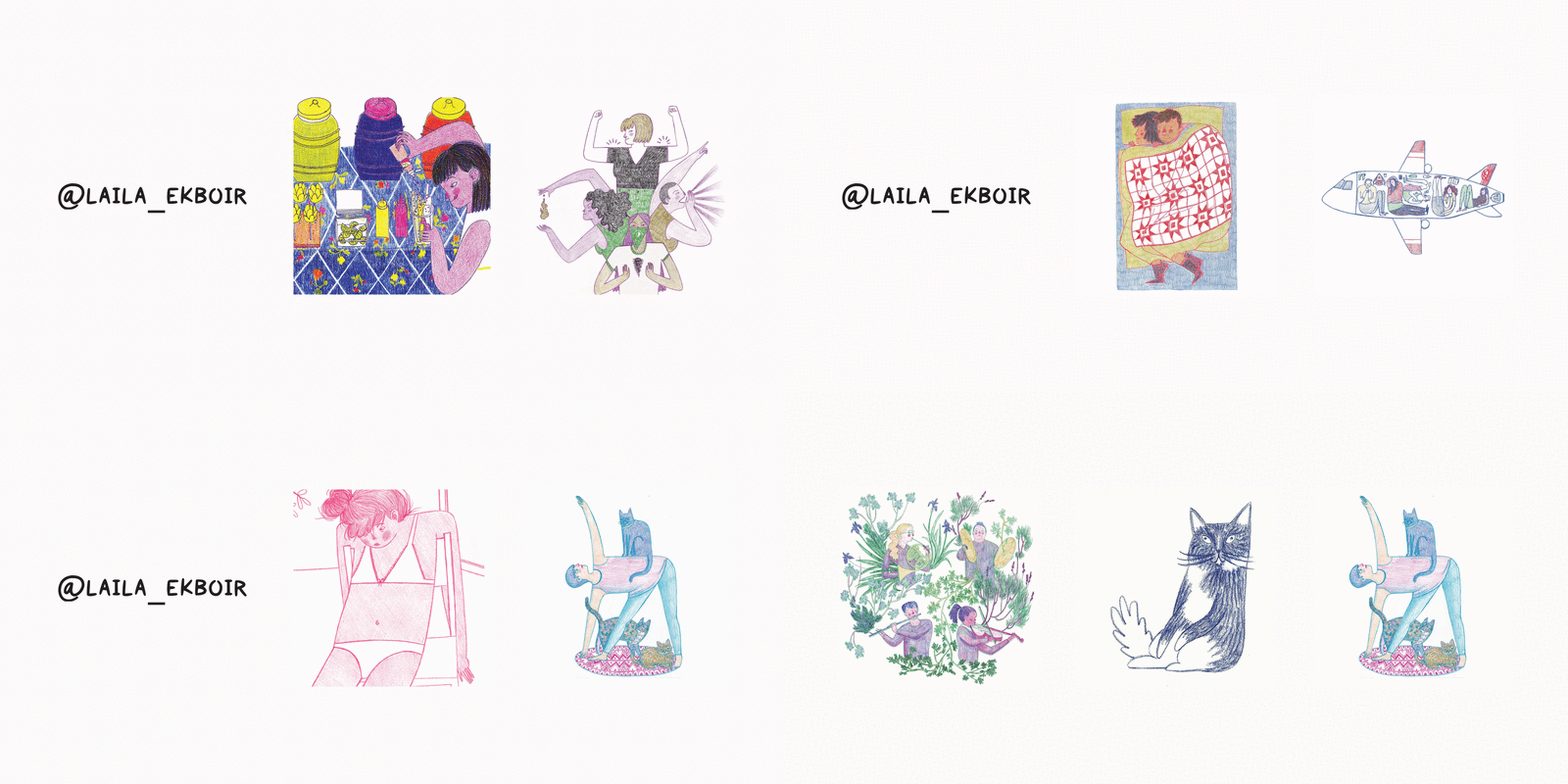
1.Laila E.

I love the texture and character in Laila’s pencil drawings. They’re joyous and playful.


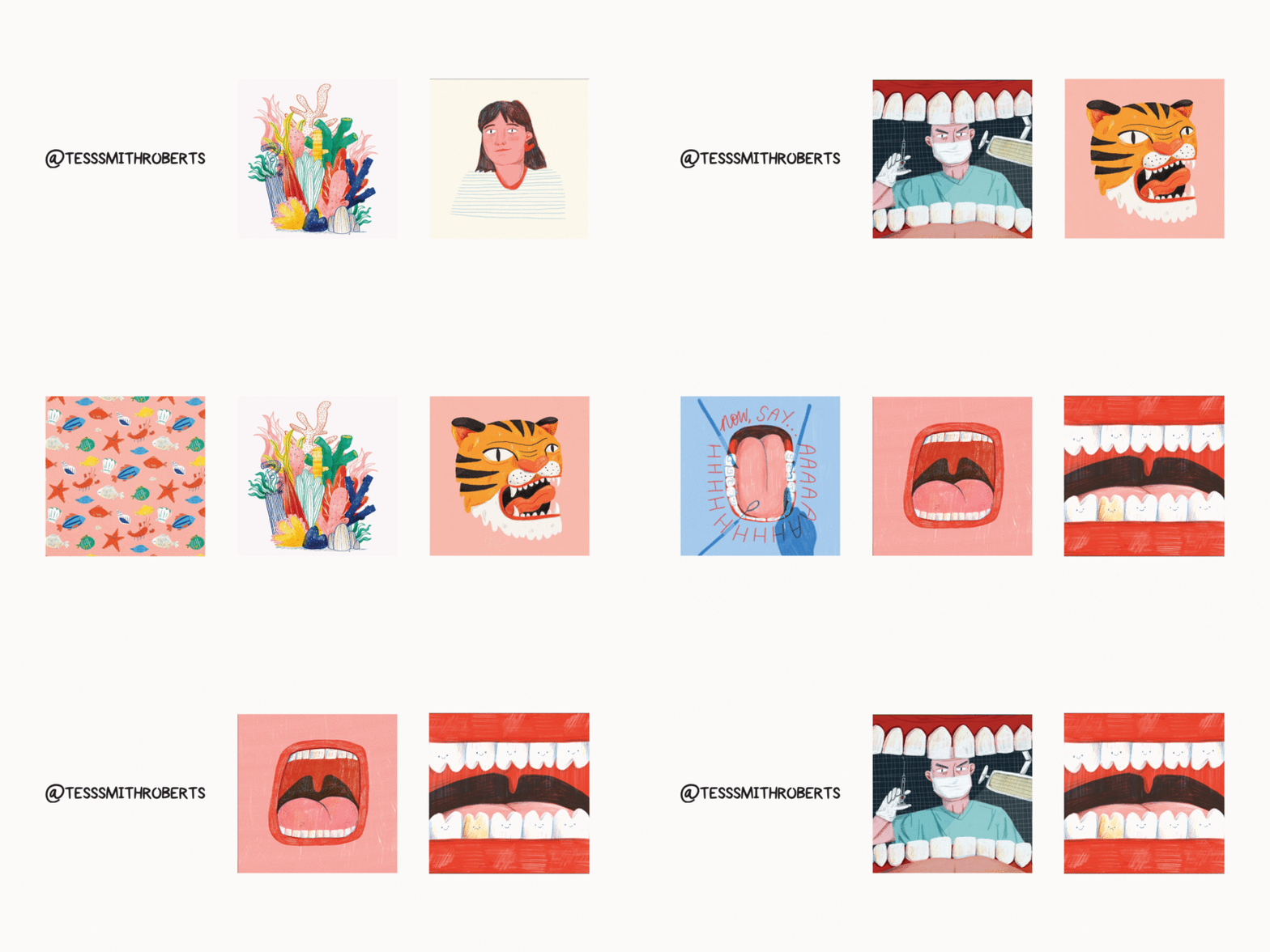
2. Tess Smith Roberts

I only started following Tess quite recently, but I would now count myself a solid member of her fan club. There’s just something wonderful about the hand coloured textures of her illustrations that takes me back to being 7 and desperately wanting to be able to draw better, in the best way.


3. Kate Peebles

Kate’s illustrations have a lovely energy and movement to them. Plus her use of pastels is right up my alley at the minute – pastels for spring how groundbreaking I know!


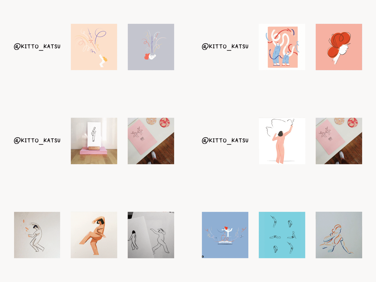
4. Janice Chang

I just love Janice’s style and how she weights different elements of the human body both in her illustrations and her sculptures. Having a style that can extend beyond media is impressive, and lovely to witness.


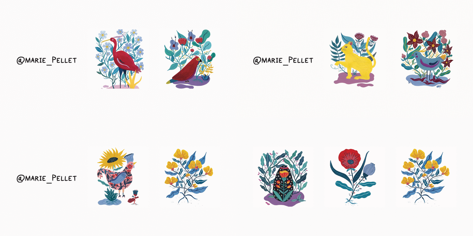
5. Marie Pellet

Marie’s folklore-ish paintings are wonderful, as is her use of Instagram’s grids. In particular I love her illustrations of plants and animals.


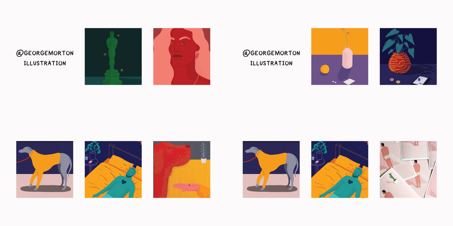
6. George Morton

George’s use of colour, especially in his portraits, is bold and beautiful and super inspiring as someone who generally avoids it.


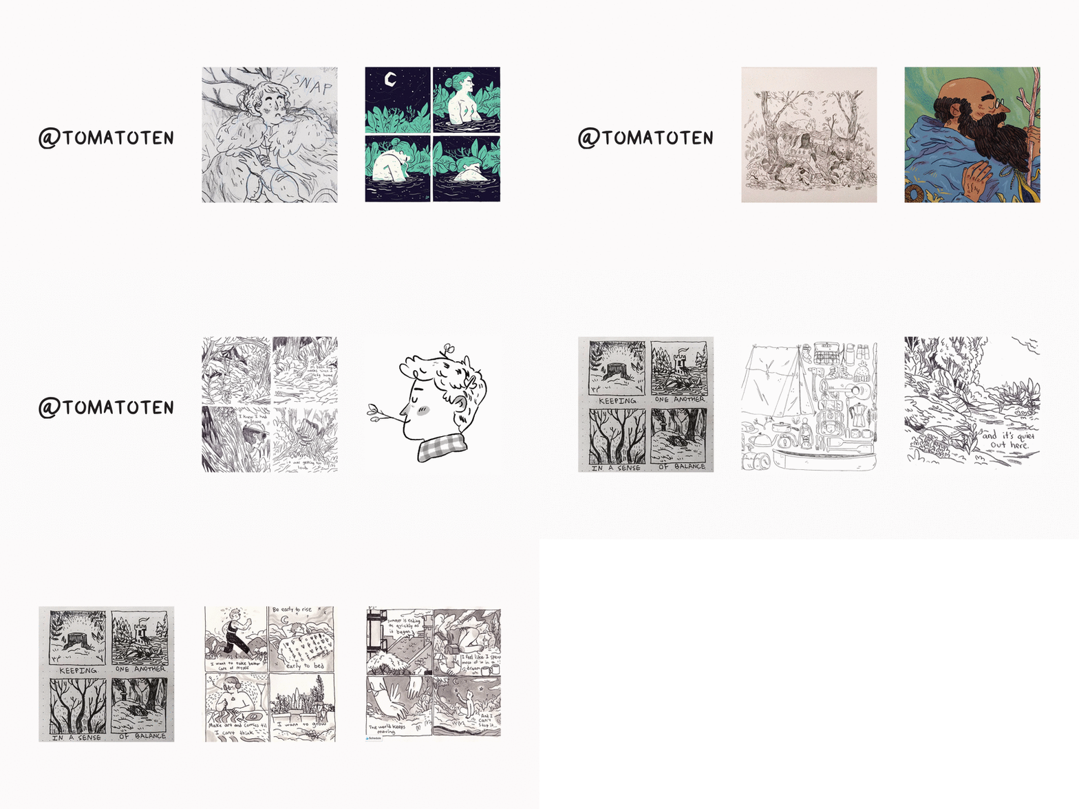
7. Anne Marie Rogers

If you’re into illustrations that tell a story and create endearing characters you need to follow Anne Marie Rogers to check out her mini comics and rough sketches.


8. Claire Leach

The detail in Claire’s pen drawings is absolutely stunning. I really need to pick up one of her landscape scenes. I’d highly recommend if you’re looking for something serene but endlessly fascinating.


9. R. Fresson

The texture of R. Fresson’s illustrations reminds me of Tintin and the old picture books I used to love as a child, brought into the present day with more diverse and stylised characters.


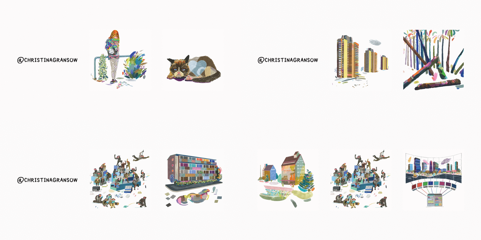
10. Christina Gransow

Christina’s layers coloured pencil illustrations are so well constructed whether they’re of landscapes, buildings, people or grumpy cat.


I’m always on the lookout for more great artists/illustrators/makers to make my life a little brighter, so who else should I be following?

In a first for the book club, this month we’re talking poetry. On a whim, I threw Fernando Pessoa’s I Have More Souls Than One into the cart of my last Waterstones order. It’s one of the Penguin Modern series of fifty new books celebrating the pioneering spirit of the iconic Penguin Modern Classics series, with each one offering a concentrated hit of its contemporary, international flavour.

I have been a huge fan of Pessoa’s writing since reading The Book of Disquiet whilst travelling, but I haven’t spent as much time focusing in on his poetry despite it being the writing for which he’s probably best known. 

Born in 1888, Fernando Pessoa was a Portuguese writer, poet and translator known best for his use of “heteronyms”, fictional characters with their own voices to whom Pessoa credited much of his writing. Each of these characters had a date of birth, often not too dissimilar to Pessoa’s own, and a personal history. These backstories were all intertwined, with Pessoa’s heteronyms having relationships of their own and with one another. Pessoa, whose name fittingly means person, frequently denied he existed as a single distinct individual but that he was a vessel for multiple characters, for “more souls than one”.

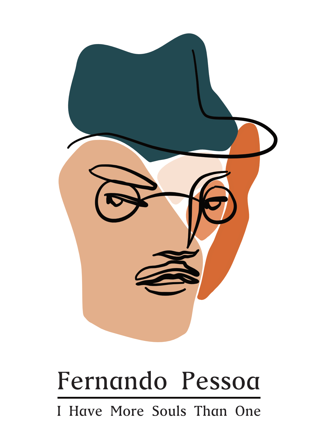
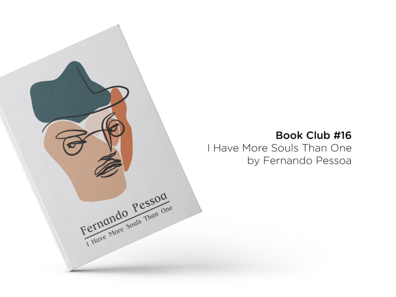
My alternative cover design for I Have More Souls Than One

His poetry, as written by Pessoa and his heteronyms, displays that desire to be more than just one man particularly clearly. Within his poetry as well as using his own identity, he wrote as Alberto Caeiro, “an untutored child of nature”; as Ricardo Reis, “a melancholic doctor dedicated to classical forms and themes”; and as Alvaro de Campos, “a naval engineer and world traveller who was a devotee of Walt Whitman”. Within I Have More Souls Than One, poems are grouped by heteronym which means you can easily see how each character has a distinct voice.

However, these characters aren’t the only appeal of Pessoa’s poetry. His writing is introspective, often, unsurprisingly on the nature of identity and universal whilst being highly localized to early twentieth century Portugal. It’s modernist in its eschewing of traditional structures, and it’s clever in its creation of new ones. It’s also just funny in places.

Reading I Have More Souls Than One is a fascinating insight into the work of one man, Fernando Pessoa, whilst offering the joy and diversity of getting to read the works of four highly inventive poets 

If you’re at all interested in learning more about Pessoa or his writing, I’d highly recommend picking up I Have More Souls Than One as a taster. I’m planning on trying out a few more of the Penguin Modern series, as they are perfect introductions to authors and styles you’re less familiar with, without the need to pick up a full novel or book of poetry and daunting feeling that can come with it.

SOME QUESTIONS TO PONDER AS YOU READ

  • What differences and similarities can you see in the different voices in the poems?
  • Do you have a favourite heteronym?
  • Do you have any alter egos or characters within you?
  • How does varying the form of Pessoa’s poetry effect how you read and feel it?

IF YOU WANT SOME FURTHER READING TRY…

IF YOU WANT MORE BOOKS LIKE THIS HAVE A LOOK AT…

 Have you read anything from Fernando Pessoa? What did you think?

Last year I wrote and illustrated a number of design story pieces which delved into the histories of everyday design classics including the Kanken backpack, crossing signs, the biro, Mondaine watches and more. I had so much fun researching and putting them together that I wanted to make a few more.

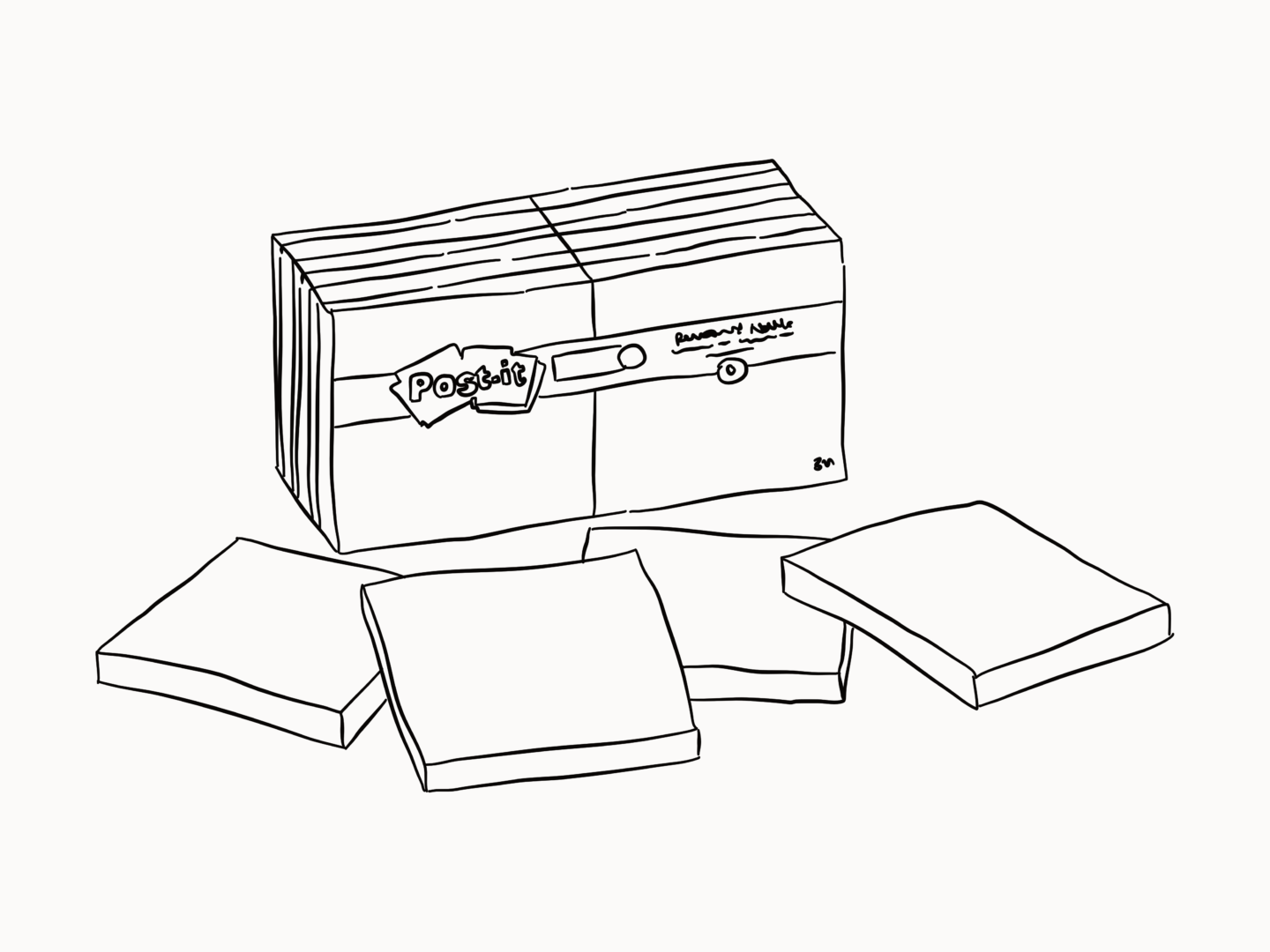
I’m starting off with post-it notes because they’re the resource we use most (other than our laptops) at work. It’s almost comical how many we go through. Honestly, if I had a pound for every time someone made a joke about service design just being covering walls in post-it notes I mightn’t need to work again.

Famously, post-it notes were created by mistake. 3M senior scientist Spencer Silver was trying to develop a new super-strong adhesive to expand his company’s range in 1968 when he accidentally created a weak adhesive that stuck to surfaces without bonding tightly to them, which at the time was completely useless.

That was until another 3M scientist Arthur, Art, Fry heard a Silver talk about this kind of sticky substance he’d created and the fact he’d spent years trying to find uses for it. Fry instantly thought of the problem he’d been having with his church music bookmark flying away.   

So Fry and Silver worked together and eventually realised Silver’s adhesive wasn’t useful on its own but when it was pre-applied the glue to the paper it had the potential to be something revolutionary. “I thought, what we have here isn’t just a bookmark. It’s a whole new way to communicate,” Fry once said.

They started using the yellow paper that the lab next door was using to build prototypes, a yellow which would later become an instantly recognisable part of their branding.

With the support of their boss, the pair were free to prototype further and bring in the help of Roger Merrill and Henry Courtney who were working on paper coatings. This fantastic four brought the first version of the post-it note, the “Press ‘n Peel”, to market with a test release in 1977. This release was limited in part to manage potential losses and in part because 3M couldn’t physically mass produce the sticky notes at that point. Despite this first test launch, bombing, the team were able to convince 3M to release free samples in Boise so users could see the product in practice for themselves.

There are a few things that have made post-it notes stick if you’ll pardon the pun. It’s simple. The post-it note does one thing and it does it well. But while it solves a specific problem but it’s open to users finding their own ways of fitting it into their lives. Art Fry initially saw the post-it notes as a great bookmark, but it’s also a tool for creating art and visualising and organising ideas. Plus, once you’ve used it you can reuse it again and again, which means it has a longer and more loyalty-inducing relationship with the user.

From idea to successful product, the humble post-it note, despite its simplicity, took twelve years of development. But it proves that with a little prototyping and a little problem solving, a failure can be turned into a design classic.