This is the second post in my mini home series. Now you know the lay of the land, I thought I’d share a few of my favourite design pieces that really make the space feel like it belongs to someone who’s slightly cooler than me!
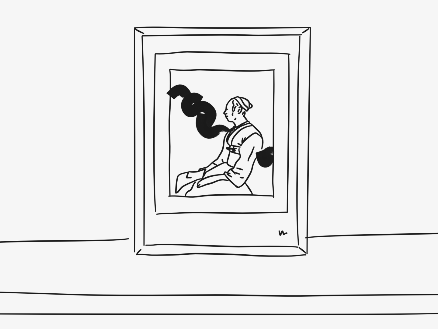
THIS PAINTING

The most obvious piece to talk about is the biggest piece of art work in my room. It’s a mixed media piece that I picked up at one of the Ruskin Art School sales when I was living in Oxford. When I first saw it, it instantly made me feel. It reminded me a bit of the work done by Chad Wys who I’ve been a huge fan of for a long while, but it has something slightly more delicate to it. It’s quite a muted piece so it works really well in my space and helps keep my room a calm sanctuary-like space.

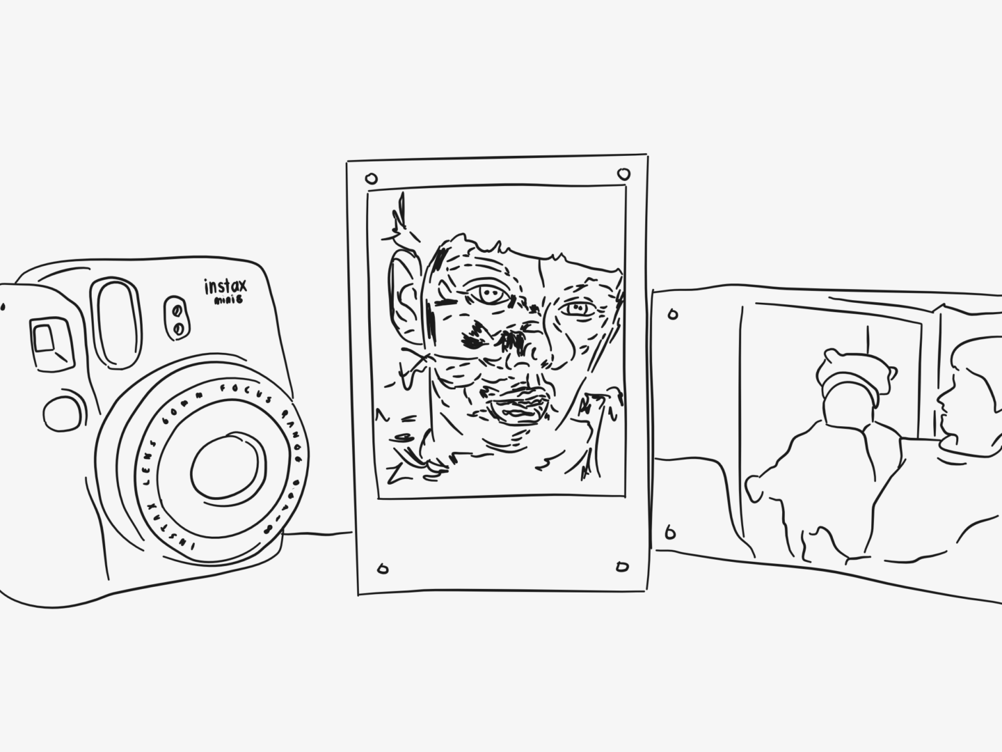
MY JENNY SAVILLE PRINT

Another favourite that I picked up in Oxford is a postcard sized Jenny Saville print. I had an A2 size poster print of this on my wall all 3 years when I was in Oxford, and made sure I picked up a smaller size so I could carry it with me in the future. I picked it up from Modern Art Oxford, which was somewhere I spent a lot of time – I used to have a standing Saturday lunch date with myself in their café. The gallery is right next to my old college and I volunteered there for about a year too. So, it’s a print that’s attached to a lot of memories as well as being of an absolutely stunning painting. I could happily live in a room covered in Saville paintings and never get bored of them.

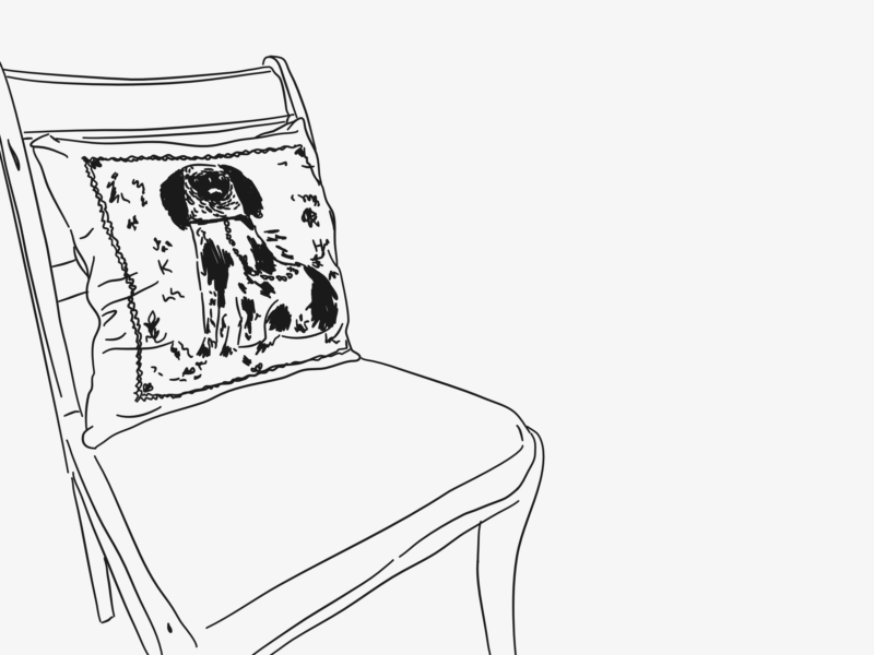
MY UGLY KEATON HENSON CUSHION

This kind of ugly King Charles Cavalier print cushion by Keaton Henson is quite a new addition to my room. It sits on my desk chair and keeps me company. For some reason the illustrated pooch and I feel like kindred spirits, I fear that if I had a patronus that he would be it. I love the way that the cover harks back to those porcelain dog figurines in a weird and distinctively Keaton way. Twists or hand crafted takes on classics make up a lot of my favourite designs.

MR BINGO’S HATE MAIL

I managed to pick up a copy of Mr Bingo’s Hate Mail for £3 at Urban Outfitters by chance after looking at it longingly for a number of months, and it’s a definite contender for bargain of the year. If you haven’t heard about/seen/already bought it, Hate Mail is a collection of illustrated hate mail that Mr Bingo sent on vintage postcards to willing weirdos. Not only is a great coffee table book to impress friends and visitors (perhaps not your mum though) it’s also a great pick me up. Whenever I need a little cheering up, or someone has really irked me, I reach for it and flick through to find a new postcard design.

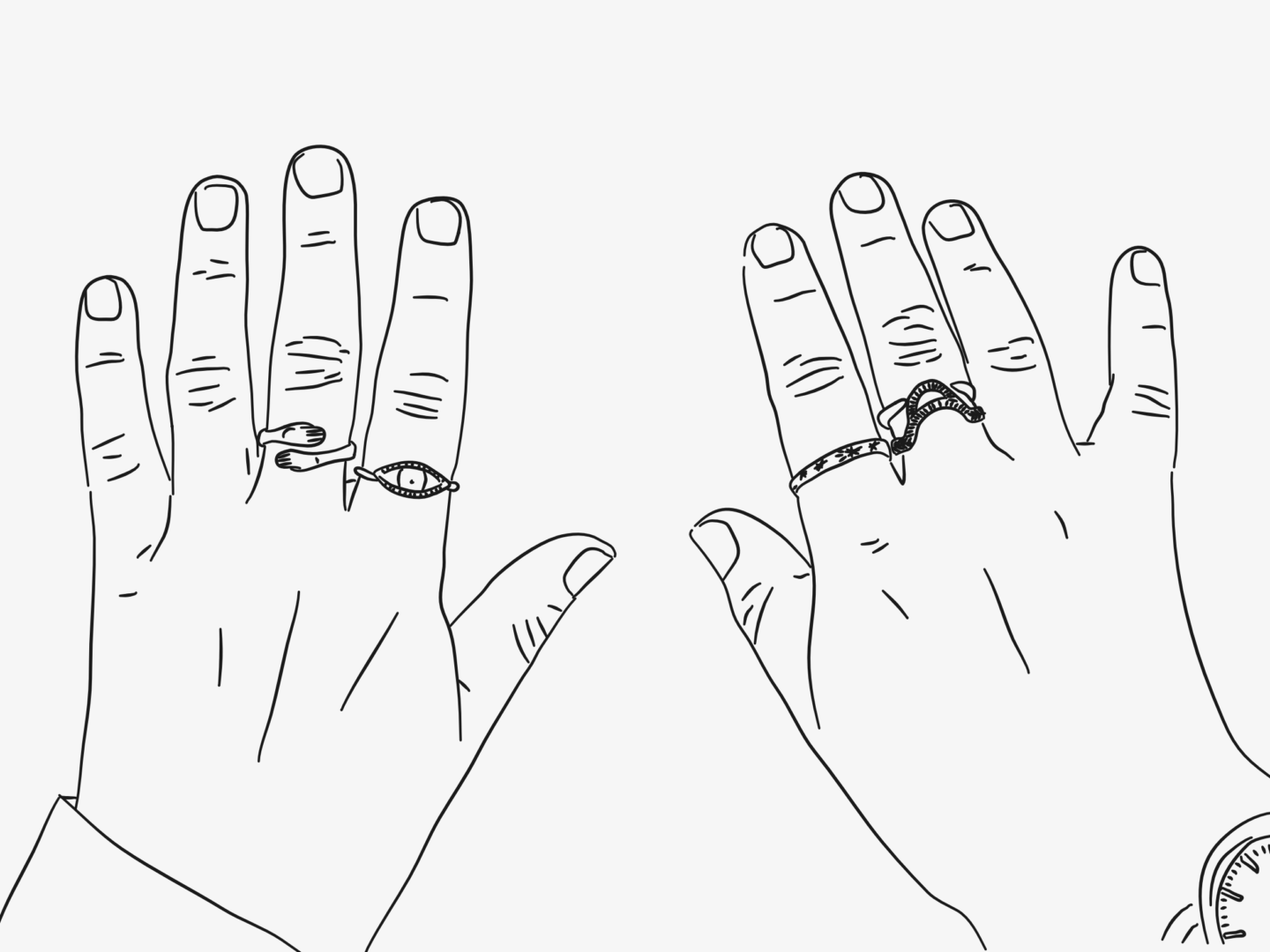
MY KAYE BLEGVAD RINGS

Okay so these aren’t really homewares, but they are design pieces that are often in my room (because I am) so I’ve decided they count, and I’m in charge here. I own four rings from Datter, which is the incredible Kaye Blegvad’s jewellery line, and there’s still so much more that I want. They are by far my favourite pieces of jewellery and I’ve received so many lovely comments on them. All of her pieces really feel crafted, they’re slightly irregular and the marks on them have a lovely distinctive line to them. They are oldest to newest as you go left to right, with the oldest being about 4 years old now. They’re the kind of design pieces where their character and the care that went into making them rubs off on you (literally and metaphorically) to the extent that I now don’t feel like myself without them.

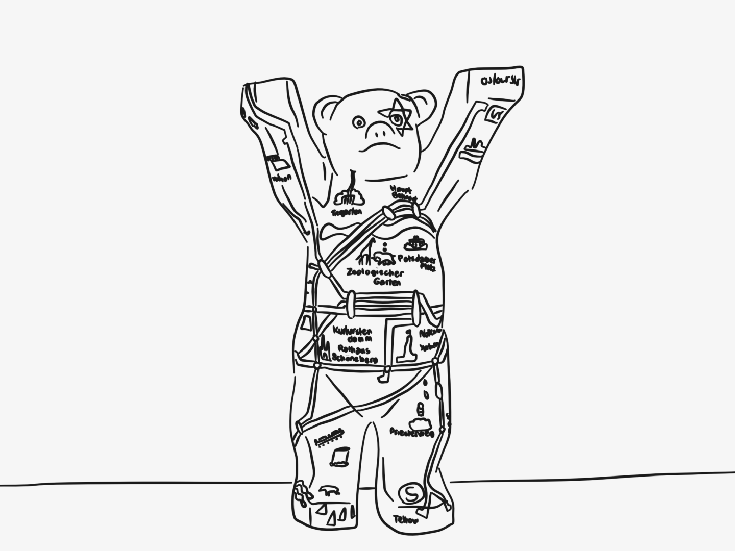
THIS LITTLE BERLIN BEAR

Last but not least I want to talk about the Berlin Bear I got for my 21st birthday that’s on my bookshelf. I was born in Berlin, and when I was younger (I think 13 or so) my family went back for trip so that my parents could show me all of their old haunts. While we were there, there was one of those city-wide art projects on where a load of artists are given the same blank statue to decorate and make their own. In this case, a selection of countries (perhaps cities – it was at least a decade ago) were given Berlin bears to decorate. I was obsessed with taking pictures of every single one I found and documenting it. That might have been the start of my interest in trying to find the design in every city. So, when I turned 21, my parents got me the Berlin version of the bear, which I still love now and reminds me of them and that trip. 

If you’ve been reading this blog for a while or even just glanced down my Instagram feed you will know that I don’t really use a lot of colour in my work. I feel like that line based monochrome style makes my work more easily identifiable and I just generally feel like it gets across the point I want in the simplest way possible, which is my favourite way to do anything.

But recently, the pieces that have been catching my eye the most use more colour. I love George Greaves and Manjit Thapp and Faye Moorhouse. They’re all so different but they all use colour so well. I love seeing rich hues and textures working together. I love seeing how colour can bring an image to life. And I used to use a lot more colour, throughout my school career the works I was known for were coloured pencil drawings like the one below.

So, I’ve decided to take a step out of my comfort zone and set myself a challenge. For the next 10 weeks, I am going to create at least one fully coloured piece every week. I’ll be posting everything I make over on my Instagram so if you’re not following me there, what are you waiting for?!

I’ll also be doing a recap at the end of the 10 weeks here, to share what I’ve learned and a few of my favourites.

To kick the challenge off I thought I’d share my first piece with you here before it goes up on Instagram.

I’m really excited to see where this challenge takes me and to see the new kinds of work it will allow me to produce, I’m thinking there might be more scenes, new styles of portraiture and even some more detailed work.

I’m thinking these kinds of challenges will become a bit more of a regular thing, to link in with my goal of trying out more new things and learning some new design skills. I’d love your feedback on if this kind of stuff interests you and if you’d want to see more of the behind the scenes, or if you’d prefer just to see the outcomes on Instagram.

This blog is about design of all kinds. It’s about illustration and graphics, as well as designing your life to be something that works for you. And an area of my life I’ve been working to design over the last little while is fragrance. Seems strange? Well, let me get scientific for a moment.

Dr. Rachel Herz at Brown University in 2004 found that a group of five women showed more brain activity when smelling a perfume with which they associated a positive memory than when smelling a control perfume they had never before smelled. The brain activity associated with the memorable perfume was also greater than that produced by the visual cue of seeing the bottle of perfume.”

– Sabrina Stierwalt, The Scientific American

Anecdotally, I whole heartedly agree. Certain perfumes take me back to very specific moments in my life, whether those scents were mine or someone around me. Estee Lauder Pleasures can’t help but make me feel like I’m 8 again following my mum around, and Elie Saab Le Parfum brings back terrifying memories of being 18 and on a gap year that I didn’t want.

As soon as I discovered that link between scent and memory, I’ve been trying to design scents around my life to make my memories more tangible. I’ve picked up new fragrances every time I’ve had a major change in my life, or at least when I’ve needed one.

So, I thought I’d share a few of the scents that I’ve used to define the past few years and some of the design that went into them, because so much of what makes a fragrance what it is the design that goes into turning it from a scent into a luxury.

Estee Lauder – Private Collection Tuberose Gardenia

This is my “signature fragrance” if I can be pretentious enough house a phrase like that. It’s the first fragrance that made me feel grown up. It was the scent that I wore on my first trip to America to visit some of the best friends I have ever, and will ever have. It was the fragrance that I wore when I started going out with my boyfriend. It’s what I wore when I graduated. It holds so many memories, it set the scene for me to define myself as a grown up. I changed an incredible amount through my time at university and my time wearing this perfume. It smells heavenly and the hammered gold cap on the bottle is supposedly inspired by jewellery given to Aerin Lauder by her grandmother, Estée Lauder, which makes it feel precious and that little bit grown up.

Jo Malone – Nectarine Blossom and Honey

This was my moving to London perfume. Peaches are my favourite summer fruit and this perfume gives me those summer feelings, it’s bright and fruity and sparkly. It’s a scent that smells like happiness and fresh starts and it helped lift my spirits in what was quite a tumultuous time.

Diptyque – O’Fresia

I bought this one when I needed to start over, at the beginning of this year. I wanted to feel like someone new when I stepped out of the door, so I moved from fruity to floral and it did the trick. This I think will be the scent that brings me back to my grad scheme. I, like pretty much every blogger in the world, love Diptyque’s packaging. Their typography and illustrated bottles feel really special, and really make you feel like you’re treating yourself when you wear it.

Diptyque – Do Son

This one is a more grown up (warmer, softer, a little more skin-like) version of the Estee Lauder. I got it in a roller ball to take on holiday and in my bag with me for special occasions. It makes me feel dressy because I mainly wear it for evenings out and like I’ve been out in the sun all day without all of the sun tiredness because of all of its holiday wear. It’s the perfect pocket pick me up.

Clean Reserve – Warm Cotton

My current daily fragrance is Clean Reserve’s Warm Cotton. It smells exactly like you would expect, like fresh sheets. I wanted something simpler for everyday and Warm Cotton the bill perfectly. It also puts me in a really productive and accomplished mindset, because I always feel on top of my life (rightly or wrongly) once I’ve done my laundry. When it comes to bottle design, I love Clean’s dedication to eco-friendly packaging, especially as I’m trying to be more conscious in my consumption and reduce the waste that I put into the world. So, it’s a fragrance that not only smells lovely but fits into the life I want to design for myself.

Is there a fragrance that takes you back to a specific time or place?

In the spirit of revisiting and updating posts from last year, I wanted to come back to my list of great apps for designers. As it’s been a whole year since I did my last list the apps I’m using have changed and updated, so I thought my list should be too.

FYI these are all phone apps (Android and Apple), mainly because I don’t have an iPad. They’re all also free, or were when I got them, because I’m cheap.

PANTONE STUDIO

This is the ultimate colour palette tool, as you would expect from the colour people. I like to use it to match hues from photos as well as to create palettes based on the world around me – it’s strangely soothing. Once you’ve created your palettes you can easily share them or sync them with whatever design software you use.

ASSEMBLY

Assembly is a kind of drag and drop vector tool. Just drag shapes (there are loads) together. It’s super simple to use. While I don’t use it for creating finished products it’s great for mocking things up, especially in meetings if you quickly want to visualise an idea.

PAPER

Designers have lots of notes, in lots of forms, and Paper is the best way I’ve found of holding them all together on the go. You can keep and edit notes, sketches and photos all in one place. The interface is really easy to use and swipe between notes to get an overview. It also has this really cool tick-able function for lists, I love having a checkbox, nothing makes me feel more accomplished than ticking a box. It was the iPad app of the year, and I’m so glad it’s now available for phones too.

GOOGLE PHOTOSCAN

This one is exactly what it sounds like. I’ve been using it to scan in old photos at home when I go back. I’ve been really enjoying them as reference images. Photoscan is great at piecing together fading colours in old, and in my case disposable camera, photos and making them look their very best. I also like it for scanning in images from magazines to add to Paper.

HEADSPACE

So, Headspace isn’t necessarily a design app but I think it’s a must use for all creative people. I’ve written before at length about my experience with meditation, and my ups and downs with Headspace. Right now, I’m loving it again. I’ve got back into the guided meditation it offers as a way to clear my mind and keep me balanced enough that I can be creative.

What apps are you using to help keep your design work on track while you’re on the move?

This is a post I’ve had in the back of my mind to write for quite a while, but for some reason, I’ve never got round to it until now because I’ve received a few questions about the materials I use, so I thought I’d just share the list publicly. Now, these aren’t all of the things I use. There’s still a load of random crap in my art bag and the odd digital project requires something extra. But these are the main things I use when creating my designs.

DIGITAL

TABLET – WACOM INTUOS PEN & TOUCH

The moment I bought my first tablet it changed my world. That might be too far, but it opened a lot of options up for me and made everything I did easier and quicker. You can’t really go wrong with Wacom. You don’t need of their more complex offerings if you’re just starting, I still use the Intuos Pen and Touch. I would recommend going for one that’s around A4 size (usually a Wacom Medium), anything smaller and you don’t get as much creative freedom, anything bigger can be hard to lug around and will obviously be pricier. I think my first tablet was only £20 second hand from eBay, and you can get similar ones today for well under £100. Now mine is about 3 years old (and already second-hand) it’s starting to act up a little and now always connect to my laptop, but I still couldn’t work without it.

PROGRAMMES – AFFINITY DESIGNER & PHOTO

I’ve spoken at length about Affinity Designer and done a full review, but basically, it’s a really powerful design tool that’s cheaper and so much easier to pick up than Adobe Illustrator. It’s all I use for my illustrations, and any graphic design work I do. I’ve now completely got rid of Creative Suite and turned completely to Affinity after trying Affinity Photo. There’s nothing that I feel like I’m lacking without it, apart from a hefty monthly bill.

TRADITIONAL

BULLET JOURNAL – RHODIA

I have been using a Rhodia Webnotebook as my bullet journal for the past four years or so. I previously used various incarnation of Moleskine, squared, diary, A5, pocket, but as soon as I used my first Rhodia Notebook I wasn’t going back. For me, it’s all about the paper.  It’s so smooth. There’s no bleed through, there’s no feathering. It is a pleasure to write on, and I don’t say that lightly. Also, dot grid paper is the only way to go. It allows you to line up your writing whilst giving you plenty of freedom and still leaving the page mainly free compared to squared pages. Plus I love that it’s orange! I can almost always spot it across the office, and everyone knows which one is mine. The soft touch hardcover wears really well and is always easy to spot in the office. It’s also worth noting the elastic fastener, ribbon and back pocket are all properly sturdy as well. They’re also just the perfect size for a year’s worth of journaling. It’s safe to say I’m a little bit in love with this notebook, even now that I’m on my 5th I think.

SKETCHBOOK

As much as I’ve just said I’m a Rhodia fanatic, my other two main notebooks are Moleskines. I use a Moleskine Sketchbook as, well, my sketchbook. I love the thickness of the paper and how well it holds inks. The pages lay flat meaning its easy to work on. Plus there’s just something about the warm slight off-white of the paper that makes it less daunting to fill. Before I was using this Moleskine I had a slightly battered Sea Whites sketchbook. While I prefer the paper of the Moleskine and the fact it isn’t as chunky, I’m not sure if I will repurchase another one purely on cost. The Moleskine I’m using right now was a gift, and I’m not sure if I can justify another £20 or so. I also still work on drafts on rough scraps of paper I have lying around as well, I wasn’t sure if they needed their own section.

DIARY – MOLESKINE NOTEBOOK

I also use a pocket dot grid Moleskine as my journal/diary. I would definitely have chosen a Rhodia in its place, but the pocket sizes in hardback were proving too tricky to find at the time I wanted mine. There’s a slight bleed through between pages that I’ve had to grow to love, but other than that it does the job very well. I write at least one good thing that happened every day in there. I started it at the beginning of this year, and so far I’ve kept up the habit. Despite the daily use, I’ve barely made a dent in it, so I think I’ll have this as my diary for the next 3-5 years, which is really nice. It’s decorated with my beloved feelings sticker from Adam JK – if anyone has any of his “It’s not all sunshine and roses” stickers treasure them/send them to me!

WATERCOLOUR PAPER – HOT PRESS PAPER

It’s smooth and lovely to draw and paint on. I got it because it was once on offer in CASS Art and I haven’t really ever wanted anything else for more “finished” traditional pieces.

PENCIL – ROTRING 300 MECHANICAL PENCIL

I never used to get mechanical pencils. The ones I’d used all broke instantly, scratched the paper and were generally horrible to draw with. But I’d heard so many nice things about them that I decided to give them one more chance, and after quizzing an assistant at London Graphics and trying out everything they had in stock, I settled on the Rotring 300 in 0.5mm. And you know what, I love it. It’s comfortable to hold and to draw with. The even with of line really suits my style now and works particularly well if I’m writing or doing thumbnail sketches which is actually a lot of what I do. I have two now one with HB lead and one with B. I’d really like a coloured lead as well, but I haven’t found anything I like. I’ve tried the Pentel coloured leads but they have hardly any payoff and snap like no one’s business – let me know if there are any you think I should try!

WRITING PEN – PILOT VBALL 0.5

There’s nothing too special about this pen. It just writes really nicely. I have it in black, blue, red, pink, purple, green and turquoise, but I mainly just use the black ones. It’s smooth and comes out with a good even deep black line. 0.5 is the perfect width for the size of my handwriting and the size of the dot grid – and is clearly the only size I like because it’s what I have my pencils in too.

FELT PENS – PENTEL SIGN PEN

These are my favourite felt pens. You can vary the width you’re using without the nib being too brushlike if that makes sense. I also really like Tombow brush pens (for the exact opposite reason) and for the washes of colour you can create with the lighter colours.

INKS – WINDSOR & NEWTON DRAWING INKS

These are the inks I use when I’m colouring/outlining a lot of my work. I mainly just use the black, but I also have the slightly temperamental gold as well. I’m not hugely wedded to these inks though – so if you have any good recommendations hit me up!

WATERCOLOURS

This little travel set has been the perfect thing to get me back into painting and playing with colour without having to over-commit. There’s a great range of colours to start out, and they’ve all painted well enough for what I’ve needed. I particularly like that they’re all so contained with means it’s easy to store as a palette but also to carry around if I want something to travel with.

CAMERA – IPHONE 7

I don’t actually have a camera anymore, so I rely on my phone. I already always have it with me so it’s great for reference photos, and the quality on phone cameras these days is so good that most of the time I don’t mind not having a real camera. That said, if I ever win the lottery/managed to have a bit more saved up buying a nice camera is definitely on my to get list.