The moment has come, Affinity Designer for iPad Pro has arrived. So, it only seems right that I do a bit of a first impressions review, as my review of the desktop app was one of my first posts on this blog about two years ago.


Before we get into this, I have to confess that I bought my iPad with a future of using it with Affinity Designer, despite the app not existing at that point, quite firmly in my mind. While I was waiting, not so patiently, for the app to come into being I’d become quite attached to Procreate. It’s pixel only format was a lot of fun to play with, and was great at encouraging me to be looser with my less formal drawings. But it did leave me wanting as someone who mainly works in vectors and was used to having the full suite of tools available on Affinity Designer (who knew I would miss shapes and text so much?) it did leave me wanting, especially for commissioned work. In fact, I found myself reverting to my old Wacom Bamboo and Affinity on my laptop, after some bad experiences with duet, despite comparatively sad drawing experience.


So, as you might be able to guess, I was super excited when I heard the announcement, then I was filled with dread that my expectations might have been just that bit too high.


Thankfully, any anxieties I had were quickly way-laid. Affinity Designer does everything I want it to and a load more, much of it I probably still haven’t discovered yet. Before I start waxing lyrical let’s break this review up a little bit.

Pros?

The big pro of Affinity Designer is just the sheer amount it lets you do. It leaves Adobe Draw looking like a Fisher Price vector tool and it blows Procreate out of the water if you’re looking to do anything more than paint digitally. I’m not going to list everything you can do here, because we’d be here forever. There’s a full list on Serif’s website. But I can’t imagine there’s much you’d want to do or expect to be able to do in a similar desktop app, that you can’t make happen.


Affinity Designer moves absolutely seamlessly between raster and vector layers, which is the big thing I’ve been looking for. You can get those “natural” textures and the freedom of drawing with pixels. Then slip right back into the editability and scalability of vectors without skipping a beat.


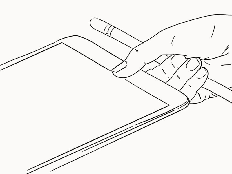
As I mentioned at the top of this, some time ago now, I’ve tried a few screen mirroring apps like Duet in my search to replicate the tools I was used to with little avail. Like Procreate, Affinity Designer was built with native use and the apple pencil in mind so all of the issues of lag and pressure sensitivity are a thing of the past. It also includes all of the multitouch gestures you’d expect from two-finger tap undo to canvas rotation (turn it on in the right-hand sidebar).


It also has all of the customisation options you’d expect from a desktop app from adding in your own fonts, which was surprisingly easy, to creating your own vector and pixel brushes. So there’s really very little you can’t do.


One area I haven’t really explored in the iPad version of the app, which is new, is its UI functionality. It’s something I’m looking to play with more, but I’m not a UI designer so I’ll leave a review of that to the pros.


Cons?

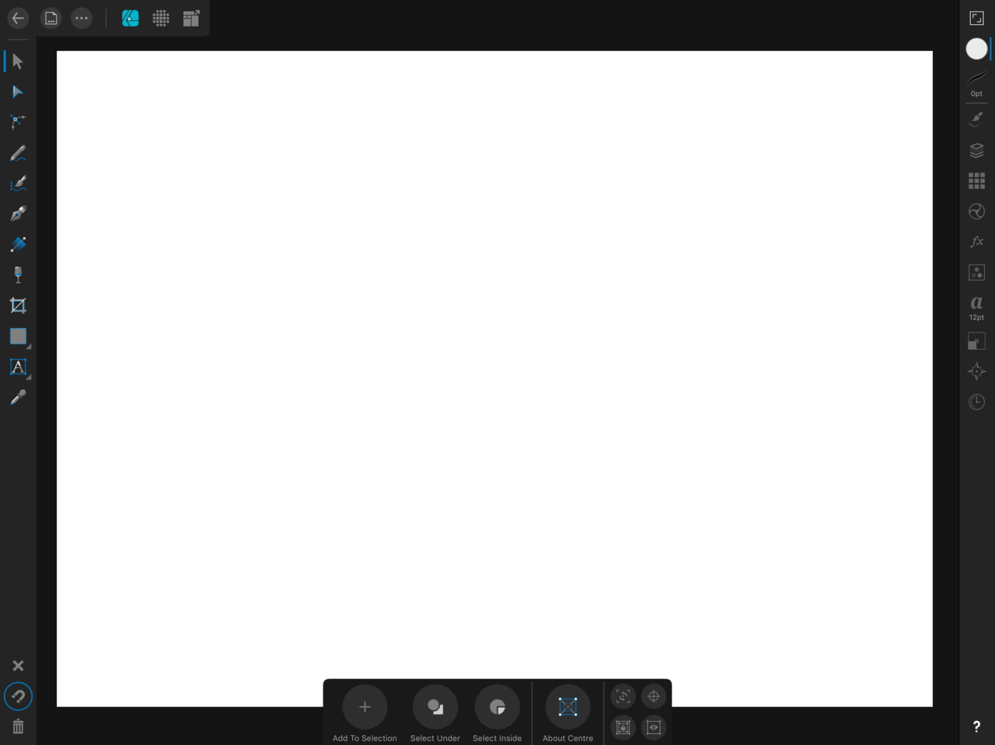
The only negative I’ve found so far is that the iPad version of the app takes a bit of learning. One of the things I loved about Affinity Designer on desktop was that it took all of the complexities out of Adobe Illustrator, and just offered you the functionality you wanted exactly where you would expect it. However, the UI on iPad is a little bit fiddly. I’m a few weeks into using it in earnest and I’m still opening and reopening bits of the sidebar trying to work it out. If you’re used to using Designer on desktop there are some similar features but don’t expect your workflow to be as smooth from the get-go. If you’re completely new to Designer, especially if you’ve not used Illustrator either or you’re a die-hard Procreate fan, be prepared to put some time into learning the ins and the outs. Thankfully the kind folks at Serif have put together a series of tutorials to get you started or help you out if you get stuck, but I’m still yet to find anything better than just using software like this and working out how to get it to do what you want it to do.

Who’s it for?

Affinity Designer is the app for anyone wanting to use their iPad as a serious graphics tool, whether that’s for illustration, lettering (it has loads of great typography tools), vector work, or anything in between. If you’re only looking to casually sketch, you might not need anything beyond Procreate. But for anything beyond that (shapes! Text! Vectors!) I’d highly recommend Affinity.


In short?

As far as I’m aware there really isn’t anything out there that can compete with Affinity Designer when it comes to using your iPad. Having tried using duet and other screen mirroring tools to use desktop apps and turn my iPad into a drawing tablet, having a native app that can do everything you need it to is pretty heavenly. For £19.99, without a subscription, you really can’t go far wrong. Plus, given that they’ve beaten Adobe to the punch I can see Affinity fast becoming the standard when it comes to iPad design apps.


PS – I am in no way sponsored by Serif or Affinity in any way (hi guys!), I just love their apps a lot.

I’m not quite ready to call myself a Londoner, but every passing month I do grow to enjoy and feel more comfortable in the city. So I wanted to take a moment to step back, be a bit of a tourist, and introduce you to some of my favourite London design icons.

Tube Map

I’ve already written about the design history of the Underground signs, as created by Edward Johnston. So instead today, I wanted to talk a little bit about the tube map.

Who designed it?

The tube map we all know, love and use to navigate the city was drawn up by the electrical draughtsman, Harry Beck in 1933.

Why is it a classic?

Beck took a different approach to transport map design. Rather than sticking with the classic method of basing the map on the geography of the network, which left the map looking busy, Beck decided to draw up his design using the style he was used to when drawing up circuit diagrams. It was a little too ‘out there’ for the board but as soon as it was put out into the world in test poster form, they realised it was what the people wanted.

Red Bus

Although the mayor stopped ordering the original red double deckers, in favour of something a little more modern, and a little cheaper, they’re still something tourists always seem to want to catch a snap of.

Who designed it?

In the early 50s, a team directed by AAM Durrant and Colin Curtis designed the original AEC Routemaster so it was lighter and easier to maintain. Then Douglas Scott styled up that efficient people carrier into the big red bus we all know and love.

Why is it a classic?

The big red bus was so well designed that it outlasted all of its competitors, and ran on the streets of London, with a few accessibility updates, until 2005. Even then, when Thomas Heatherwick came in to create the new Routemaster he knew he had to stick closely to that classic red design. In terms of longevity, I can’t imagine a London without some form of the red bus on its streets.

The Imperial State Crown (the one Queen Elizabeth wore in her Coronation)

I know that the provenance of many of the jewels is problematic. But there’s no denying that the Imperial State Crown is a British icon.

Who designed it?

Commissioned for the coronation of King George VI on 12 May 1937, the Imperial Crown was designed by Rundell Bridge & Rundell, with all of the jewelling done by Garrard & CO.

Why is it a classic?

Do I even need to explain this one?

Telephone box

So we may not use them as much as we used to, they may be being replaced by wifi hotspots, but the red telephone box is still on every other postcard for the city.

Who designed it?

The man behind the phone box is famed architect Sir Giles Gilbert Scott – also known for his work on Waterloo Bridge, Battersea Power Station and so much more.

Why is it a classic?

The phone box we all know and love is the K6 model, because, you guessed it, it was the 6th version to hit Britain’s streets. Its currant red was introduced to catch the eye. I love that the phone box was introduced by the Post Office to increase communication around the country, and they were not just used in the UK, but in Bermuda, Malta and Gibraltar as well!

Big Ben’s Clock 

Even though Big Ben is currently hidden by scaffolding as construction work takes place to help preserve its grace for future generations, it’s still one of my favourite London sights. But there’s one element of Big Ben I love the most, that’s it’s signature tick-tocking clock.

Who designed it?

After the fire that destroyed the Palace of Westminster in 1834, Edmund Beckett Denison and Edward Dent (the two Eds) designed the clock which sits in the tower.

Why is it a classic?

So the thing I love the most about the clock is how it came about. George Airy (astronomer to the stars) wrote up the requirements for the clock, with the first and foremost being “The Great Clock should be so accurate that the first strike for each hour shall be accurate to within ONE second of time.” All the clockmakers in the land said it couldn’t be done. That was until Ed Denison stepped up. He wasn’t a professional clockmaker, he was a lawyer, but he loved clocks. So he wasn’t afraid of the challenge and just wanted to try. He got some help from fellow clockmaker Ed Dent, and the pair came up with a revolutionary double escapement design. Proof that even amateurs can redesign a national symbol.

I was going to start that post off by saying I’m a big music fan but it felt a) far too obvious (who doesn’t like music?) and b) like someone was going to challenge me to recite the lyrics of an obscure album track. So instead, I want to say that I spend an awful lot of time listening to music and trying to seek out new bands. If I can be wearing my headphones I will be.


That also means I spend a lot of time looking at album artwork. Album artwork has to balance so many factors from embodying the music, to catching the eye of a passing browser in both a record store and on Spotify, as well as communicating something about the artist behind the music. It’s a complicated dance, and when it’s done right it’s truly something special. If you’d like to know more about how album artwork has evolved over the years I loved this piece by Herbert Lui.


Designing an album cover is also on my bucket list (if you’re a band looking for someone, hi!).

Until then, I thought I’d share a few of my favourite pieces of album artwork. The covers I’ve chosen to share are just the ones that caught my eye as I scrolled through my Spotify saved this morning, so it’s by no means a complete list of great artwork or music I love.


PS – this post has turned out way longer than I thought it would because I found researching all of the covers so interesting.


Brothers – The Black Keys

The cover for Brothers is an icon in its own right now, but it was a real risk for the band when they handed over the reigns to Michael Carney, Austin Kleon wrote a lovely little blog post about that leap of faith. The bold typographic artwork was a real departure from their previously illustrated artwork. But it was a risk that paid off.

Built on Glass – Chet Faker

Tin & Ed’s work on Chet Faker’s album cover is so stunning I had to pause the album just to look at it. It’s subtle and delicate and leaves you wanting to reach out and touch the pale porcelain hand which is almost suspended, even though you might break it. In their own words the series of still lifes they created for the album talk “about the impermanence of objects, memories and relationships. We’ve used objects that are millions of years old and others that are man-made and very new to create an expanded sense of time and history. The series also explores a number of themes from the album, one of which is strength and fragility and how these two things can co-exist.

Holy Fire – Foals

Leif Podhajsky is one of the best album cover designers out there. For the cover of Foals second album, he repurposed an old shot by National Geographic photographer Thomas Nebbia. It’s atmospheric and just abstract enough to draw you in. The colours and framing always remind me of a sepia print postcard I carry around of a painting of The Burning of Shelly’s Body by Louis E Fournier, but that’s just me.

Something To Tell You – HAIM

The sisters Haim are well known for their style. So it follows that their album covers all feel a little bit like Vogue shoots in the best way. The music is all about them, about their confidence to stand front and centre and just own their art.

Dirty Computer – Janelle Monae

Every pixel of the aesthetic of Janelle Monae’s latest set of releases has been perfectly calibrated, and the album cover of Dirty Computer is no different. Directed by Joe Perez, it’s heat and glamour with a dark edge. The composition seems to nod to Michael Jackson’s Extremely Dangerous in a way that’s dangerously feminine.

Birthdays – Keaton Henson

I love Keaton Henson’s artwork in general, I’ve mentioned before the King Charles print I have which I’m pretty sure is the inked version of my soul. The slightly horrified ceramic figure on the frosting pink background is just perfectly balanced by Keaton’s own handwriting scrawled across. Nothing quite matches, but everything works.

To Pimp a Butterfly – Kendrick Lamar

There have been essays written about this cover, it’s artistic quality and its political statement, so I won’t wax lyrical here. But I will say it’s captivating, and a testament to the fact that a great idea doesn’t always have to be laboured over as photographer Denis Rouvre put it together in a day.

Melodrama – Lorde

Lorde commissioned Brooklyn-based artist Sam McKinniss, 31, to paint an intimate, blue-lit portrait of [herself] for the album cover, which is all about “nighttime attitudes.” The finished product is something I’d happily stand in front of in the National Portrait Gallery for 15 minutes but works equally well to catch your eye when scaled down in a digital album gallery.

Bankrupt! – Phoenix

This album marked a really important time in my life so its cover has a whole load of meaning that’s personal to me. But I think I would appreciate it even if it hadn’t been the soundtrack to so much. It’s a pixel-perfect still life, a little bit bougie, a little bit modern, a lot of style. I love Thomas Mars’s comments on the choice of imagery “We were naive enough that we thought we were making a masterpiece, that was the ambition […] The peach comes from a totally random illustrator, a guy from California who does illustrations for food labels, marmalades and stuff like that.

Gracetown – San Cisco

Gracetown owes its title to a laid-back coastal town in South Western Australia so it seems only fitting that the cover of San Cisco’s second full album was designed by local artist Pete Matulich. I love how bright and fun it is, as well as the typography around the image which is set in such a way that it feels like it breathes like the album. Bonus points for the fact that they used the same format for their third album, I’m a sucker for consistent artwork.

Dead & Born & Grown – The Staves

I’d forgotten about how much I loved the lettering design this cover until it came to writing this post and I’m so glad I’ve rediscovered it. It reminds me of the illuminated pages of medieval manuscripts. The use of greens and botanical imagery fits perfectly with The Staves calm and folky tones. I couldn’t find out who designed this one if anyone knows who created it please let me know!

Vampire Weekend – Vampire Weekend

The album cover that launched a thousand uses of Futura. It’s a classic. I still love it. Fun fact: the Polaroid photo of a chandelier on the cover of the album was taken at one of the band’s earliest campus gigs at St. Anthony Hall house – a venue of some notoriety at Columbia University.

Fugue State – Vulfpeck

Vulfpeck’s video editing has become almost as big a part of their identity online as Joe Darts funky baselines. So I was so pleased to see them bring that style and identity into the album cover for Fugue State as well as their new offshoot The Fearless Flyers.

This post is a bit of a rip off of a piece I really loved from Austin Kleon, about how he puts his newsletter together. I’d highly recommend giving it a read. I mean I loved it so much I wanted to write my own version, to give you a behind the scenes look at how I put together some of my favourite weekly content – and how you can sign up right at the bottom of this page.


I’m a big fan of newsletters. They’ve probably overtaken blogs in my heart when it comes to reading content from creators (and even some brands) I love. Anne T. Donahue’s is a standout example amongst those, and is a big reason I started my own.


Pulling together my newsletter is also one of my favourite things I do associated with this blog. I think I enjoy it more than writing new posts, even though it’s probably read by fewer people. I love pulling out the best of the web, doing slightly looser illustrations and having the opportunity to be a little bit more personal.


I realise if you’re not subscribed to my newsletter, you’ve got no idea what I’m going on about right about now. So here’s a link to one of my past newsletters.


As you can see my weekly update is split into three key sections each with their own little image. Here’s how they all come together:


The Intro Section

This is where I like to share something of a more personal update. I like to reflect on the week and some of the things I’ve learned or give a bit of a nod to some of the things I’m working on this week. I generally sit down to write something on a Friday evening, no plan, no structure, then give it a bit of a tidy up when it comes to scheduling my email in MailChimp on the Saturday. I try to pick a fitting image from my vast stocks of instagram illustrations or things from past blog posts in part to save time and in part to tie my rambles to work people might know.


The Two Articles

Then I move onto sharing two of my favourite articles from the internet for the week. The internet is a big old place, and it’s full of gems but they can be hard to find so I like to share a couple of recommendations. They’re normally arts/creativity/design based but the main criteria is 1) did I enjoy reading it? 2) do I think other people will enjoy reading it? That’s it. To accompany those articles I like to put together some animated illustrations. These usually include the title of the article handwritten out plus either some images from the article or an illustration of one of the key ideas. I draw frame by frame which is why they’re usually quite simple, then animate using an online gifmaker.


The Social Share

The final section of my newsletter is all about sharing some of my favourite people on instagram. I like to see it as my way of fighting back against the algorithm and helping my readers find some incredible artists they might not have discovered otherwise. Because of that, I generally try to highlight smaller artists on the platform, but there’s no hard rule. I just add interesting accounts to my collection through the week and then pick out one I like on a Friday or Saturday. I also take reader suggestions, so if you have an idea of someone who should be included please do let me know! Along with a small intro to their work, I show a few examples of their recent, or my favourite, posts so you can get a flavour of their work.


If you like the sound of it, you can sign up to receive my newsletter below:

Subscribe to our mailing list

* indicates required


(In signing up to this newsletter you are consenting to receive a weekly email from me. All data is held and managed by MailChimp, you can read more about their privacy policies here)

There are few gadgets that have come back from the brink of extinction as powerfully as the instant camera. Over 7 million were sold last year alone. So, today I thought I’d delve a little deeper into the history of the original instant camera, the polaroid land camera.

The story goes that the idea for the polaroid camera came to Edwin Land in 1943 while on holiday with his family when his 3-year-old daughter “asked why she couldn’t see the vacation photos her father was taking “right now.”” Rather than chiding his daughter’s impatience, Land, who had just founded the Polaroid Corporation and created the first polarized camera filters (tech which you’ve probably taken advantage of when putting on your sunglasses as it reduces glare).

So, Land and his engineers at Polaroid started developing the technology to allow for instant photographic gratification. They began with creating peel-and-develop film, first in black and white, and then, eventually in colour. They debuted the “first one-step dry process for producing finished photographs within one minute after taking the picture, at a meeting of the Optical Society of America on February 21” 1947. This film was the game changer and was quickly put into practice as part of the Model 95 Land Camera.

That camera went on sale for $89.95 (that’s the equivalent of around $950 today) in the Jordan Marsh department store in Boston Massachusetts a year later. In under a decade Polaroid had sold over a million cameras in 45 countries.

The Model 95 was the blueprint for all Polaroid Land cameras over the next 15 years. In fact, it wasn’t until 1972 that the Polaroid camera we all know and love was born. That camera was the SX-70 Land camera, a fully automatic, motorized, folding, single lens reflex camera with film which automatically self-develops in daylight. This camera was what Land had in mind, 3 decades earlier, in 1943 when he first dreamed of instant photography. Owen Edwards at the Smithsonian Mag writes:

“Sam Liggero, a chemist who spent several decades as a product developer at Polaroid, told me recently that Land had long envisioned an SX-70-type camera, involving a self-contained, one-step process with no fuss and no mess. Liggero describes Land as someone who “could look into the future and eloquently describe the intersection of science, technology and aesthetics.””

That intersection of science, technology and aesthetics can be seen in Land’s keen eye for marketing as well as his cameras. He famously had red and yellow tulips flown in from the Netherlands for the launch of the SX-70 because they hadn’t quite perfected the colour film yet, and red and yellow were the colours which looked the brightest. So when the members of the shareholder’s board arrived, eager to try their new cameras out, they were sure to get the best shot.

Land’s camera hit peak popularity with the debut of the OneStep Land camera in 1977. The OneStep was cheap, easy to use with its fixed-focus, smooth to use, fun to carry and the best-selling camera in America. It was also Land’s 500th patent, leading to him being inducted into the National Inventors Hall of Fame, because he never stopped making things a new.

Unfortunately after Land’s death in 1991, due to a rise in competition and a quickly evolving digital landscape, Polaroid and their instant cameras’ fates changed.

In 2008, sensing Polaroid’s imminent closure of its film factories. A group of former employees bought a Polaroid film factory in the Netherlands. The company was called The Impossible Project. The Impossible Project kept the instant camera in Land’s original format alive, because as they say themselves “decades on, there’s still nothing like a Polaroid Original.” Their passion for the Polaroid camera, I believe, went some way to reinspire popular love for the instant format. As soon as the polaroid was hard to get, as soon as it became vintage rather than outdated, it was desirable.

Today, Polaroid don’t have the monopoly over the instant camera market they once had. In fact, they’re outsold by Fujifilm’s equivalent. Their equivalent is so similar that Polaroid are attempting to sue Fujifilm for millions of dollars as they claim the “square form” of Fujifilm’s Instax Square photos is “essentially identical” to the trademark and trade dress rights owned by Polaroid. But if you look past those legal issues, Polaroid’s name, if not its cameras, are still synonymous with instant photography. How many times have you heard one of those little square photos being called a Polaroid rather than anything else?

Polaroid’s phoenix like rise says a lot about the nostalgic power of great design, and of our desire as humans to hold our memories in our hands instantly as tokens of what we’ve experienced.