I’ve been working more and more with colour recently, especially in my weekly patterns, which has forced me to really think about how I put together colour palettes. It’s something I’ve definitely gotten better at over the years, through trial and error and from trying to replicate colour schemes I like.


Here are some thoughts on how (after many failed attempts) I create a coherent colour palettes for whatever I’m making, whether that’s an illustration, a branding project, or picking out an outfit.


Before we get into how I put colours together, here’s a quick intro to colour theory.


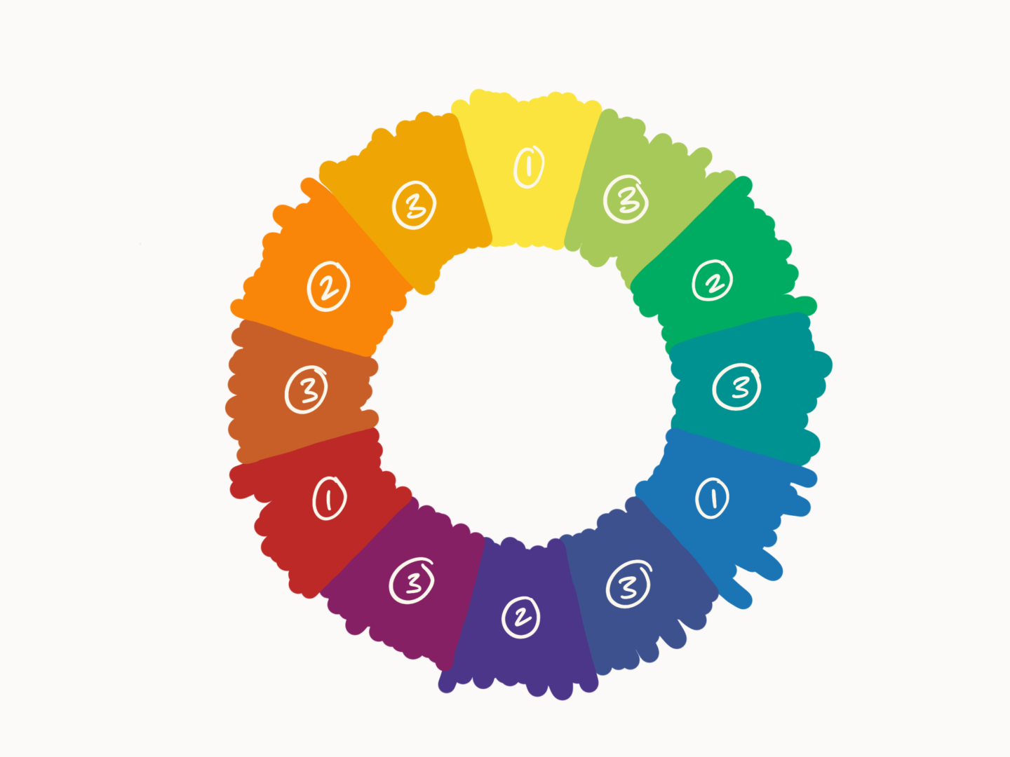
The colour wheel is the basis for pretty much everything in colour theory (example above). It’s made up of primary colours (red, yellow, blue), secondary colours between those (orange, green, purple), and tertiary colours between those (red-orange, orange-yellow, yellow-green, etc.). Colour theory offers some basic frameworks for picking colours that work together. I’ve outlined a few below, but I’d highly recommend you watch a great 6 minute Youtube video called Beginning Graphic Design: Color if this is all new to you.

Monochromatic – a colour palette which uses a single hue (colour) from the colour wheel and just plays with saturation (how vivid the colour is) and value (how light/dark the colour is)

Analogous – a colour palette based on a set of hues all close to each other on the colour wheel – a good example being the classic warm or cool palettes you see

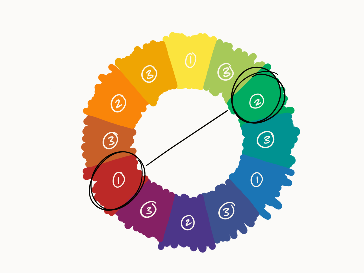
Complementary – a colour palette which uses two opposite hues on the colour wheel for a pop – the red and green of christmas is a good example of this one

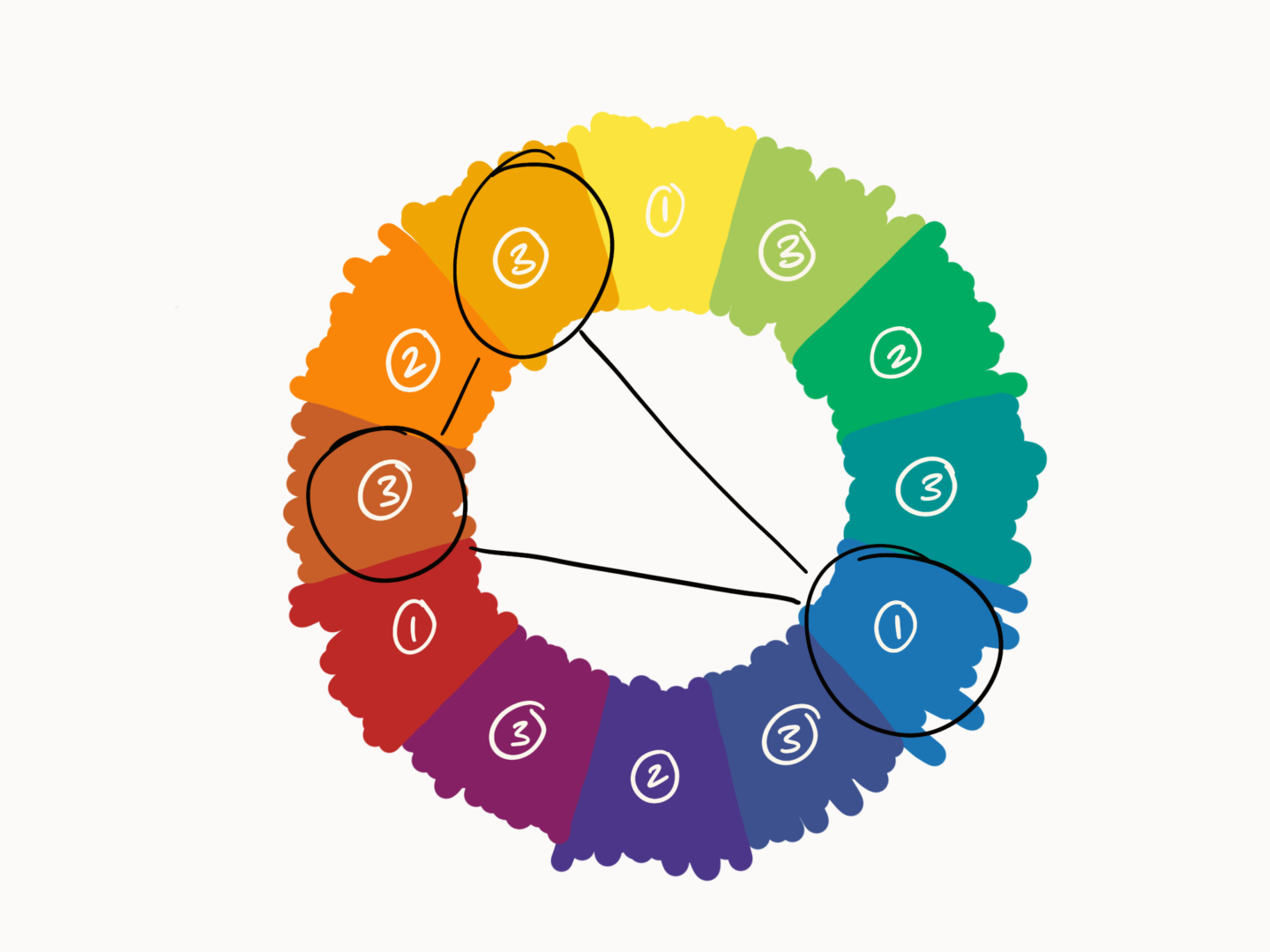
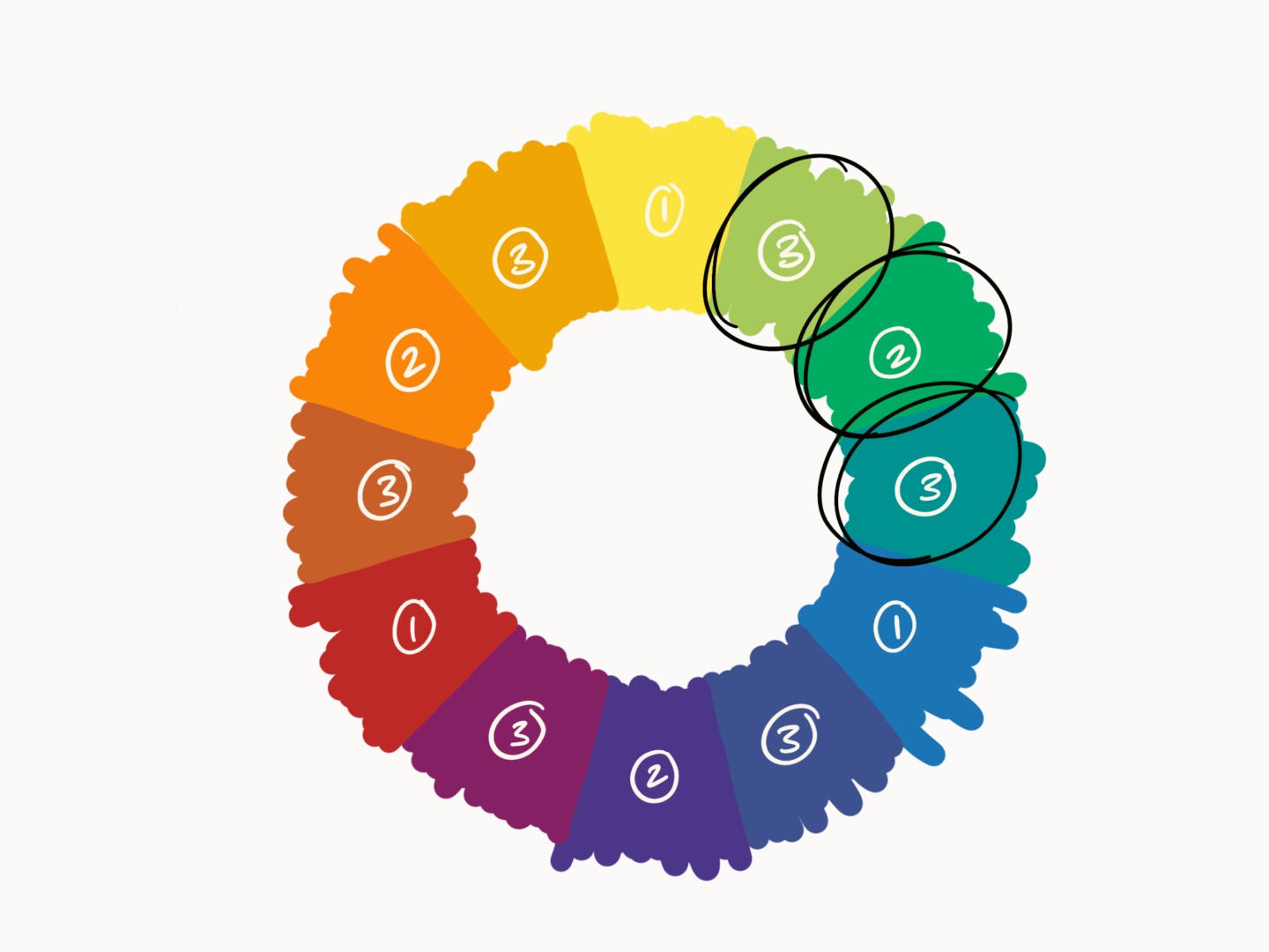
Split complementary – a colour palette which uses three hues one from one side of the colour wheel and the two adjacent to the first’s complementary colour (I made a diagram for this one because it’s hard to describe)


Using that knowledge and through some trial and error there are now really three key methods that I use to put together a colour palette:

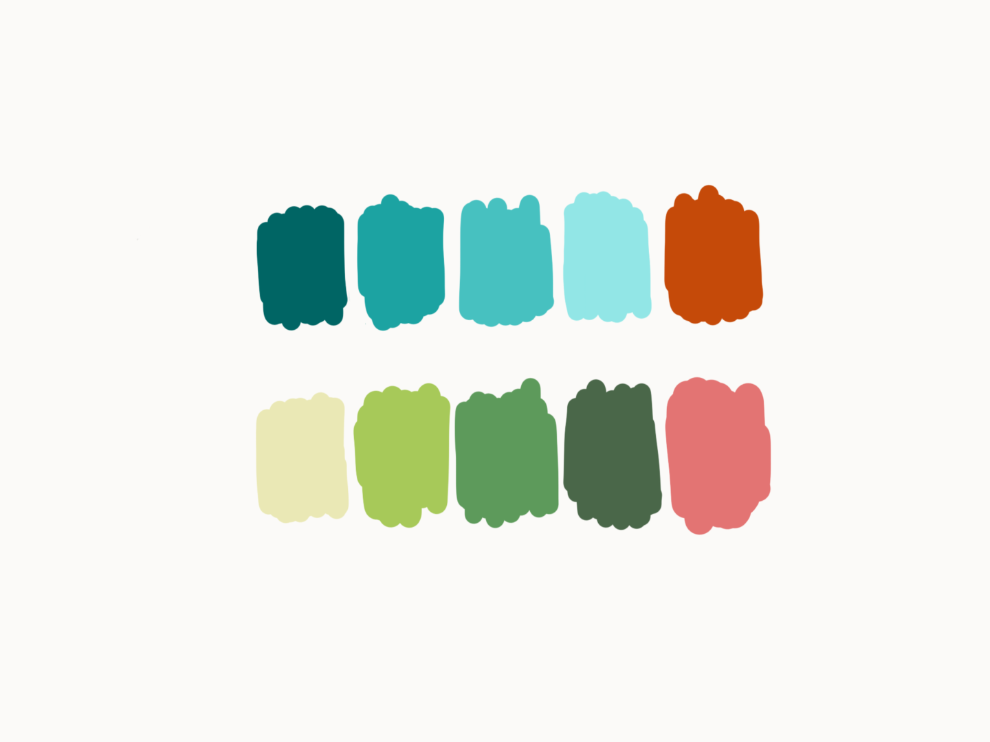
  1. Analogous or monochrome with a complementary pop – The most common structure I use is to pick a few analogous hues or even a monochromatic base for the majority of my colour palette then pick out a complementary colour to add a pop. This gives you something harmonious range of colours, without it feeling too boring.
  2. Analogous with an accent – Sometimes using a complementary colour as a pop can feel a bit to bold, so in those cases I stick with analogous hues. I pick out four analagous colours, playing around with saturation and value but generally keeping them a little more muted. Then I pick a colour just at the edge of that range and create a brighter accent colour to use as an accent.
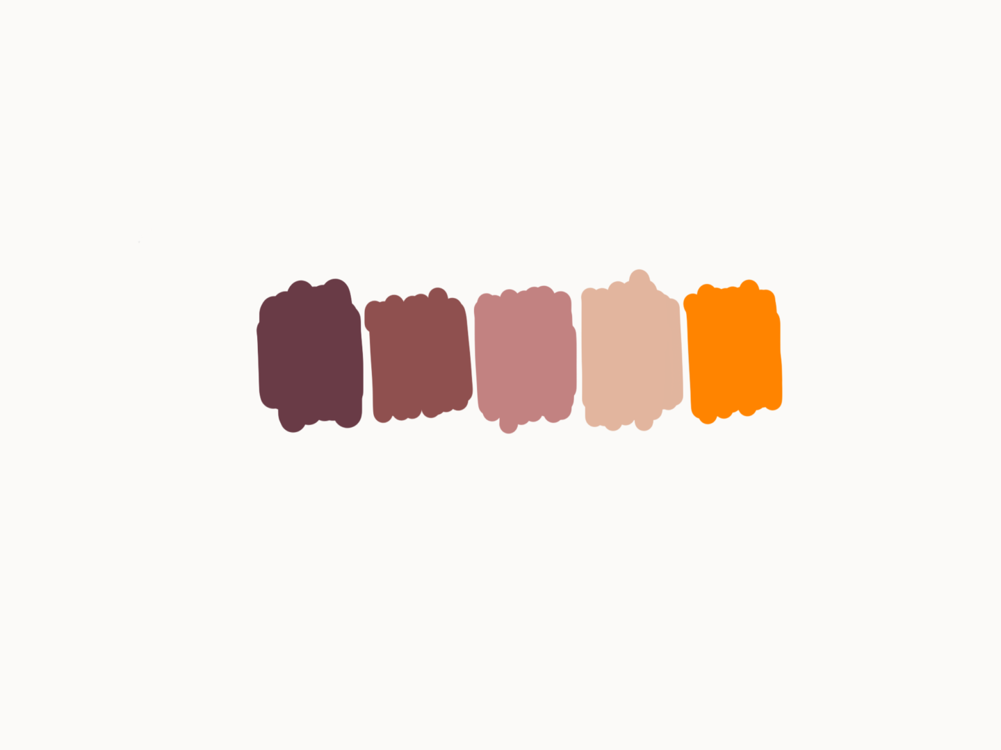
  3. From nature/photos – Then sometimes I come at it from a completely different angle. As a lot of my patterns draw from real life, I quite often use reference photos not just for the structure of my illustrations but also the colour. I have a hunt for a photo I like and then I pull out the colours I think work. This usually works particularly well with nature based images in my experience. I tend to try and pick out colours that already sit nicely together, or are natural shadows. Then I go for anything unusual that catches my eye. I usually use the Pantone studio app to help me with pulling those colours out and creating a palette I like, but there are loads and loads of tools out there you can try, or you can just do it within any digital design/illustration software you’re using with a colour pick tool.


As a rule of thumb the majority of my colour palettes are based on five colours. But you can certainly use more or less. In fact you can bend pretty much any of these methods, which is what I do all of the time, because all they’re really just guides to point you in the right direction.


If you have any top tips for putting together colour palettes or any favourite tools/sites for inspiration please do let me know! I’m always on the hunt to learn more.


Happy colouring!

Road signs might not seem like the most exciting topic for a blog post, especially from someone who doesn’t drive. They never seem remarkable. But that’s by design. When road signs work they should be an invisible guiding hand, that you don’t even have to think about using. They need to be a system that’s so easy to use that you can follow them even when you’re driving at 60mph and you’ve got 2 screaming kids in the back of the car. That’s why they’re more than worthy of a design story feature.


That’s also why Jock Kinneir called their creation “possibly the biggest graphic design job ever”. Jock Kinneir and, his former student, Margaret Calvert were tasked with redesigning the mismatched series of signs that governed the UK’s roads and creating one unified system, a “common language” for the future in 1958. It took 7 years to perfect their work through testing and iteration, but on January 1st 1965 their new signs took the road and changed the British design landscape.

After coming up with the basic designs including elements such as the visual language around the shapes of the signs (circles are used for signs that give orders, triangles are used for signs that warn you about something and rectangles are used for signs that give you information) the pair set about testing their designs. Neither Calvert nor Kinneir could drive, so they recruited a wide range of users to help them because usability was central to their process –  You thought of everything from the standpoint of: ‘What if I am at the wheel, doing speeds of over 70mph?’” (Calvert). The methods they devised were experimental, including having airmen in Oxfordshire sit on platforms with the signs driven towards them until they were readable, but they yielded significant insights. For example, they found that letters had to be spaced much wider than normal in order to be clear at speed from a distance. They settled on adding space set at the width of a letter i between each character because it allowed for the correct readability while remaining familiar to drivers.


The pair created two typefaces Transport and Motorway which were to be used across all of the signs. In an essay for The British Roadsign Project Margaret Calvert wrote of the Transport typeface:

Important details, such as the curve on the end of the lowercase l (borrowed from Johnston), and the obliquely cut curved strokes of the letters a, c, e, f, g, j, s, t and y, were specifically designed to help retain the word shape of place names when slightly letterspaced; a necessary compromise to offset the effect of ‘halation’, when viewed at the appropriate ‘decision-making’ distance, in full glare of headlights. (Much like a Rembrandt portrait – with brush strokes merging to focus the image). This specific letterform, after two attempts, and in two weights, was officially named ‘Transport’.

Calvert and Kinneir’s signs are best known for their clarity, understandably as it’s so essential to their functionality. But there is also a great sense of humanity and familiarity in the symbols used in their signs. They convey their message with a little personality. This tone was something Calvert spent a lot of time thinking about and redrafting to get right:

The first school sign was a torch, then a boy followed by a girl with a satchel – it looked very grammar school. I wanted it to look more inclusive so you couldn’t tell if it was secondary modern or grammar. And I wanted it to be more caring – so I made the little girl lead the little boy. But it needed to have something urgent about it.

That little girl was actually based on how Calvert herself had looked as a young girl. I think it’s those personal touches* which have helped the signs endure in the way they have.


The signs the duo designed 60 years ago are still in use today, almost completely unchanged. While there have been challenges, such as David Kindersely’s attempt to replace the typeface with his own, nothing has been able to beat Calvert and Kinneir’s designs for clarity or beauty, which is the true testament to their quality.


*The cow illustration was based on Calvert’s cousin’s cow, Patience, as well.

If you follow me on Instagram (which you totally should by the way) you’ll know that I share a style illustration every Saturday. Over the last few weeks, I’ve started to share a few of my favourite pieces by artists and makers. There are a few pieces I wear over and over again, so I thought it was worth sharing them with you all in one place here because they’re all wonderful and because supporting other makers is even better.

Belt by Kaye Blegvad

So I spoke about my love of my Kaye Blegvad/Datter rings in my favourite design pieces post at the end of last year, so I won’t prattle on about them again here – but they are glorious and I wear at least 3 of them every single day. Instead, I want to talk about this really special belt I picked up at the start of the year. When I say picked up I mean I fawned over for months and then got a friend in America to post over to the UK for me because I was so obsessed. It’s got a hand-carved brass face buckle which adds something interesting to even the most boring t-shirt and jeans outfits AKA what I wear most days. I do need to remember that I need to take it off before I go through any security checks though.

Wave hoops by Sacet

Hoops are my go-to earrings most of the time, because they’re so comfortable, even if I forget to take them off before bed which may or may not happen too frequently. These mid-sized hoops from Sacet have a lovely little wave to them which makes them a bit more interesting than your standard pair. Facet is a brand which supports craftspeople and designers, making sure everyone involved in making their jewellery is treated fairly and visible in the process, so while they’re not an individual maker they’re well worth inclusion on this list. Their stuff is even made from 100% recycled silver which is just the cherry on the top.*

*Sacet did very kindly send me these earrings for review, but this review is all my own.

Crescent necklace by Oh My Clumsy Heart

Sophie AKA Oh My Clumsy Heart makes the loveliest minimal jewellery. I have a pair of her arch earrings, but the newest piece to my collection is her crescent necklace in gold which is perfect for layering if I’m wearing something a little more low cut or wearing on top of a turtleneck (let’s face it, it’s pretty much always turtleneck weather in the UK) when it’s a little colder because the chain is just long enough. Bonus points for the fact that all of her pieces are super duper affordable if you’re looking for a simple special something to add to your collection or as a gift.

T-shirt by Tallulah Fontaine

As you can tell, most of my favourite pieces are accessories, but I have to make space on this list for what is my most comfortable and well-designed t-shirt. I’d been wanting to buy something featuring Tallulah Fontaine’s illustrations for a while now (remember that time I fan-girled over her super hard?), and a few weeks ago I finally made it happen with this dreamer t-shirt. I can already tell I’m going to be wearing it all summer. I got it via Black Winnebago Club whose packaging is some of the nicest I’ve seen and are just generally a lovely place to buy great pieces by great designers/illustrators.

Magritte earrings by Pieceofka

These are my special occasion earrings. They were the earrings I got my ears pierced for and I love them to this day. They’re laser cut, Magritte inspired wonders. Just big enough to catch the eye, just weird enough to start a conversation and break the ice at any awkward mingling event. Pieceofka, formerly Wild Thing Studio, custom made them for me 4 or 5 years ago now so they’re not available for purchase but her store is filled with some really beautiful pieces, especially if you’re into geometric designs.

This is a much overdue design story. The graphite pencil is the ultimate everyday design essential, the tool that launched 10,000 masterpieces. But it has been much neglected in this series, up until now.

As you might have guessed the story of the pencil starts way-way-way back. In fact, it goes back to the early 1500s when the first major deposit of graphite was found in Grey Knotts of Seathwaite in Cumbria, England. Where the pure material was carved up into sticks and used by local farmers to mark their sheep – denoting their ownership and making them easier to separate on the hillside.

From this first agricultural use, the graphite transitioned into use as a writing implement.  It also spread across the continent. By the end of the 16th Century graphite was preferred to charcoal and lead throughout Europe because of its “superior line-making qualities, its eraseability, and the ability to re-draw on top of it with ink”.

That “eraseability” wasn’t quite what we would think of now though. The original erasers were actually just stale ends of bread – we once had to use crust erasers in art class and I can confirm they work. The move away from bread, was made by accident in France, when a writer accidentally picked up caoutchouc—a stretchy sample of the newly-discovered Para tree – instead of his erasing baguette. It wasn’t until 1858, some 300 years after the first pencils, that the American Hymen Lipman came up with the idea of adding a rubber eraser to the end of a wooden pencil. His first patent included the eraser set inside the wood of the pencil like the graphite, just at the other end.

But before we got to that version of the pencil went through many incarnations. As the graphite started to gain popularity in the 1560s an Italian power couple, Simonio and Lyndiana Bernacotti, devised the first plan for a wooden pencil. Before then the graphite was wrapped in sheepskin to keep the user hands clean and the soft carbon substance intact. These first designs had the wooden case, at that time made of juniper, hollowed out and the graphite pushed through the flattened cylinder. Soon after the Bernacotti’s developed their wooden pencil, a far superior method of sandwiching the lead between two pieces of wood and then glueing the pieces together was developed. That’s pretty much how we still made them now.

As with all great designs, the wooden pencil spawned knock-offs. Con artists, known as stümplers, were inspired by the high price pencils were fetching to sharpen then colour in the ends of sticks and sell them as pencils, causing frustration across Europe.

With a well-defined process in place for making wooden pencils, they began to be mass produced in Nuremberg, Germany, in the 1660s. Instead of the solid sticks of graphite used in the first pencils, the ones being produced in Nuremberg were made from a powdered version of the substance, which was mixed with sulphur and antimony before being reconstructed within the wooden frame. This mixture reduced the waste and cost of making pencils.

That mix was perfected by Jaques Conté in 1795. During the Napoleonic war, British and German pencils were in short supply in France. But the French army still needed pencils. So Conté devised a way of mixing the powdered graphite they did have with clay and then firing it in a kiln to resolidify the mixture. This process was the same one being developed in parallel by Joseph Hardtmuth the creator of the famous Koh-i-nor.

Once the production of this graphite mixture had been settled, there were only a few stages left before the pencils being created became the ones we know, love and use today. William Munroe created America’s first pencil, which was made in the hexagonal shape that’s so common today when his partner Ebenezer wood automated production. Pencils then gained their yellow colour in the 1800s when Western pencil tycoons wanted their customers to know their pencils were filled with top-quality lead, so they painted their instruments in the colour associated with Chinese royalty: yellow.

Centuries later, we’re still manufacturing and sharpening down millions of them. Remember how much history you’re holding the next time you’re starting to sketch or draft.

This year I’ve had more commissions than I ever have before. I’ve had a few big commissions and lots of requests for portraits, which I absolutely love to draw. It’s been super exciting to see my illustration work start to grow, and I’m keen to do more and more as this year goes on.


As my client list started to grow I realised I’d never actually codified my onboarding process. I always just did what felt right at the time and let my client lead.


But that’s not the position I wanted to be in. A lot of the work I do e.g. portraits takes quite a similar format each time, so it makes sense to have a process not only to make creating those pieces as efficient as possible but also to give my clients the confidence that I know what I’m doing from the very start, because I do. Equally with larger pieces of work I wanted to have more control over what the scope of work was going to be and how my client relationships would work.


So, I put in some time a few weeks ago to really come up with a process for setting up new pieces with clients. I thought I’d share a bit of those onboarding processes with you guys in part in case anyone else is going through the same growing pains and in part so that you know what it’s like to work with me a little bit more.


New process – portraits

I’ve spoken before about my process for portraits, and as it was already pretty simple I haven’t made any dramatic changes, but I have worked to add some more clarity.


STEP 1 – In the description of my portrait commissions I’ve also added in further details of the extras that are available e.g. extra text and colour

STEP 1A – If what they’re looking for is outside my regular portraits e.g. a group bigger than four or they have special requests like extra text, we work out a plan over email and I send over a price and a contract.

STEP 2 – Once everything has been agreed/bought, I send out an email including a little hello, a visual guide to the kind of photos I’m looking for, details on sizes and file formats, and expected turnaround times. The inclusion of that photo guide has been one of the big changes I’ve made because quite often people are unsure of what to send, or we have to have a back and forth to find an image that works.

STEP 3 – The client sends me their photos

STEP 4 – The work begins


New process – big projects

I do far fewer big projects, in part because they’re a bit harder to come by and in part because I’m only one person with two jobs. But I’ve loved the longer more involved projects I’ve done so far this year and the ones I’ve got in the pipeline, and I’d definitely be down to do some more!

As I’ve only started taking on these bigger projects outside of contract work where I’m brought in as more of an employee, I’ve started using this as a guideline to give me the confidence I need when taking on something which feels a bit more high stakes.

STEP 1 – Every project starts off with a conversation either via email, chat, over the phone or in person so I can work out what the client wants, and so that we can both work out if we’re going to get on and the kind of working relationship we want out of process. I normally go into those conversations with a few set questions about what they’ve already done, what they like, what they’re looking for as an outcome, and the audience they’ve got in mind. Quite often I leave them with some “homework” to refine their brief or to help them have direction within the project.

STEP 2 – Off the back of that I come up with a proposal breaking down the task into chunks and explaining exactly what I would intend on producing for them, as well as how processes such as revisions, approvals and extra work would happen. I also put together a proposed cost, working with any budget details they’ve given me. We then discuss and refine that proposal where needed.

STEP 3 – Once everything is agreed, I send over a contract based on the proposal. I currently use Bonsai to help produce my contracts because it’s so easy.

STEP 4 –  Then I take a deposit (normally around 25%, but this can vary). This is a new step for me, but something that’s made the payment process a lot easier for me and gives me that bit of breathing room while working.

STEP 5 –  Then I come up with a plan of first steps, sharing the order I’m going to do the work in – this is almost always a more detailed version of the proposal and includes any tasks I need the client to complete before I start the next stage.

STEP 6 – The work begins