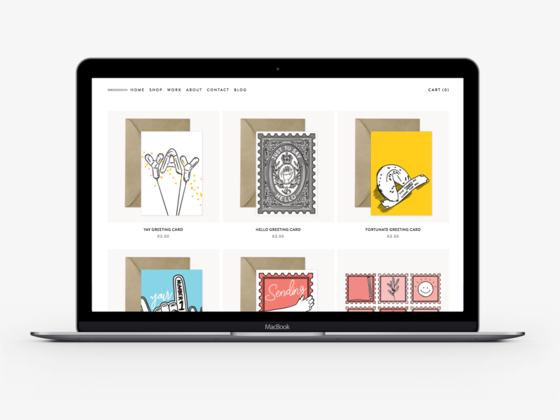
If you don’t know already I recently redesigned my portfolio and opened a store over at natalieharney.com. Because this blog is all about sharing everything I’m learning as an illustrator and designer (and human) I thought it would be worthwhile sharing the redesign process with you. Plus, it’s the kind of post I like to read, so I thought it might be the kind of post other people might enjoy too.
When I made my old portfolio, I was an English student, the work I was creating was very different, the skills I had were very limited and I didn’t need a portfolio all that much – or at least I didn’t share the link all that often. So, I thought it was about time I had a portfolio and personal site that really showed off the work that I’m doing and that I was proud to share when emailing people about commissions or even when my colleagues ask what I do outside of work. Plus, I really wanted to start selling some pieces on my own terms. Both of those meant that the time was right for me to build a new portfolio.
Once I’d come to the decision I needed a redesign, it took me a good month or so to actually find the time to do anything about it. Or rather I procrastinated because I had a blank slate, and there’s nothing scarier than a blank piece of paper.
So, my first stage was to try and build some boundaries into that blank sheet of paper. I created a list of the basic things I would need from my portfolio:
- a short but engaging landing page
- a grid portfolio page
- flexible individual project pages
- a store page
- product pages
- an about/contact section
- all of the extra information sections that come with running a store
Then I gathered some inspiration by going through the sites of people who are doing similar work to see what they had included and how they’d laid out their content. Thankfully I feel like I’m digitally surrounded by so many incredible artists and makers with wonderful portfolios like Kitkat Pecson and Katie Suskin, which meant I was spoiled for choice. I also did a run through of the classic design inspiration Pinterest, Behance, and one page. Through that research as well as picking up a few new cards, I started to have an idea of how I wanted my new site to work and look.
After some more research, I decided that I wanted to use Squarespace to build my new site. I use WordPress for this blog, and it’s great, but I’ve used WordPress for previous portfolios and found it cumbersome and inflexible as someone who can’t code.* I’d heard good reviews of Squarespace and it seemed to tick all of the boxes I needed.
With Squarespace (as you probably already know) you have a selection of themes to choose from to base your site template on. I chose Brine as it fulfilled all of the basic criteria I established at the start, and seemed to offer me more than enough flexibility so I could make it my own.
Rather than just jumping into designing on Squarespace, I chose to start with pencil and paper. I wrote a list of all of the design capabilities and options I had with Brine and then I tried to imagine what I would do with all of those options instead of tweaking the options on site and getting a cookie cutter portfolio. I think I did okay.
The next step was obviously to build the thing, which thanks to Squarespace was really easy and didn’t take much time at all.
This might have been the wrong way to have done things, but I didn’t start making content until I had that framework in place. It worked for me because I know my own body of work pretty well, so from the start, I was already imagining how best to display it. I do think I underestimated the amount of time it would take me to turn a few years of work into a set of concise project case studies. Plus, it took me a good warm-up period to get over the discomfort of writing another about section. But once I’d powered through the curating, writing, editing, and uploading process I was left with a selection I’m pretty happy with and I think shows off a good range of the things I can do. It has also given me a lot of food for thought on the kind of work I want to do more.
Before sending it live, and sharing it with you, I tested it on a couple of friends and colleagues to get their feedback and to have an extra few pairs of eyes to spot typos. I’m still gathering feedback and improving and I think I will be for a long time, but that’s all part of the process to isn’t it?
All in all, it took me about a month to sort out my new portfolio (whilst still doing my 9-5, working on the products for my store and posting on the blog).
I think it’s hugely important in this day and age to have a portfolio you are proud of, and somewhere you can direct people to that explains what you do. If I can do it, I think anyone can, especially with the number of tools out there to help.
Please do head on over to my new portfolio and leave me any feedback you have on the site, or if you like what you see pick up some new stationery!
*I have also used Wix for other projects, but it just didn’t offer the level of control I wanted.


i feel you about blank canvas being scary! when i first created my portfolio, it was for portfolio class and i chose the color scheme black and white because i thought those are my color. fast forward to late 2016 and early 2017, i decided to undergo change. revamp everything. because black and white are so not me. i chose a muted blue color and a creamy-khaki color and my friend said that my current portfolio and color scheme feels more like who i am. designing our own personal portfolio is definitely one of the most fun thing to do since we’re free to do whatever and however we like, in terms of its look and feel.
i want to use squarespace for my portfolio too but i can’t with the pricing, at least not yet. i still need to prioritize other bills to pay so i’m not in the position to luxuriously own a squarespace yet. luckily, since i subscribed to adobe cc, i get free access to use myportfolio.com, which is a website to build portfolio (doh!) from adobe. it doesn’t have the fanciest theme like squarespace does but for the mean time, i think it’s decent. next thing in my plan is to actually purchase another domain for my portfolio so it’s not stuck with this subdomain. for some reason, a part of me is postponing this plan because i don’t think my portfolio is THAT great yet – as in, the works i display since most of them are college projects and ugh, i hate my old design. i feel like they’re garbage :))
anyway, i really love your portfolio. i took a quick look and i love it! 😀