Getting to draw as part of my research work always feels like a treat. Using visuals to tell a story, gather insights and share information is my happy place.

But it’s easy to forget to bring illustration into my research practice when the common standard is to focus facilitation and documentation around written work. So, I’ve put together a non-exhaustive list of ways that research can be visual. 

This list is here for me as a reminder and for anyone who works with me to inspire what you can ask for and expect from my design-led research practice.

Gif with the title how did it feel, it shows an illustration of a woman outlined with pencil scribbles to show different feelings like love and frustration
Illustrated cards to sort with short titles like "things you've written" and "photo evidence" they move between being laid out and grouped

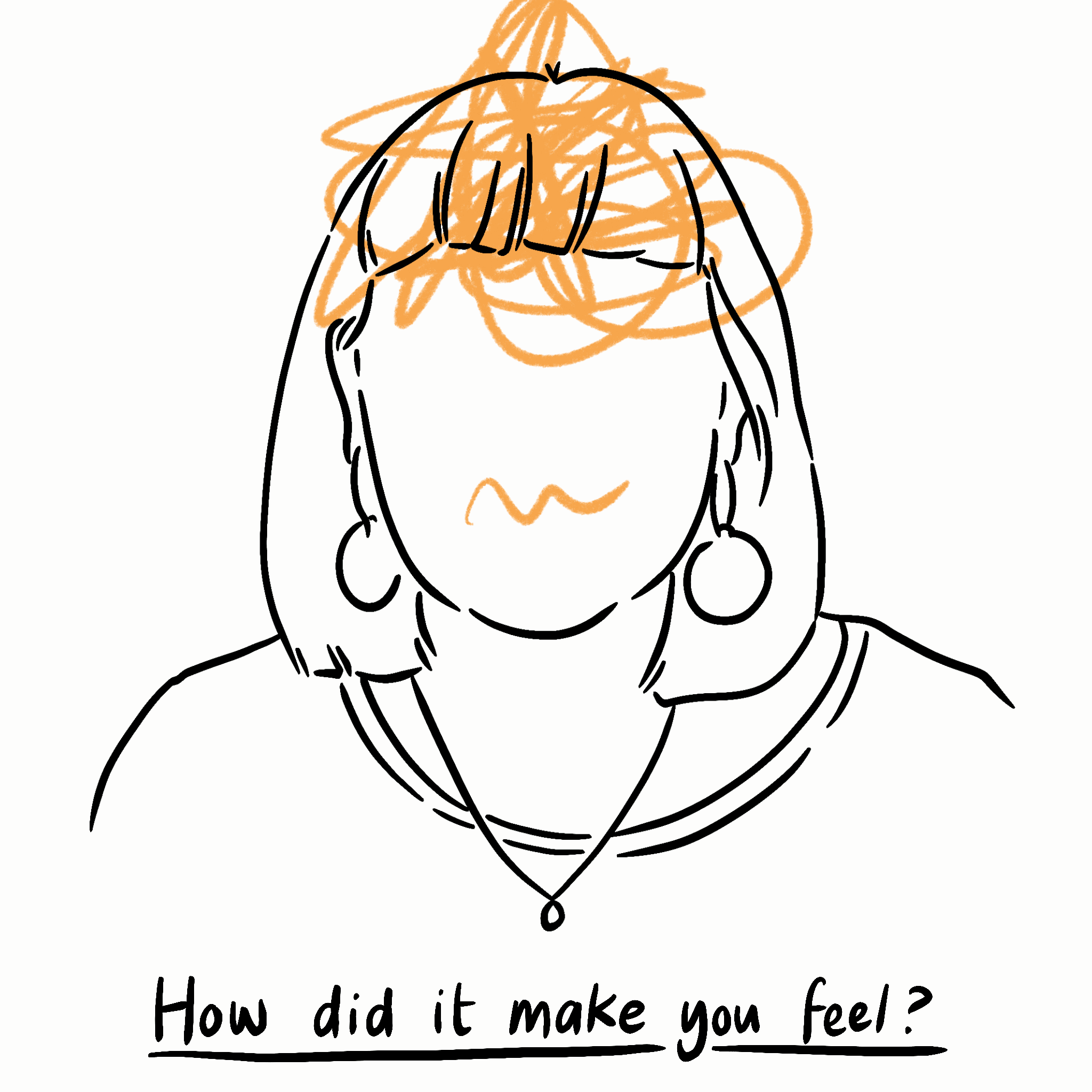
Visual prompts in interviews

Illustrated facilitation tools are a great way to get participants engaged in interviews and workshops. These might take the form of anything from adding illustrations into card sorts, to getting participants to draw emotions as they tell you a story, to much more involved visual layouts to structure the discussion with whoever you’re speaking to.

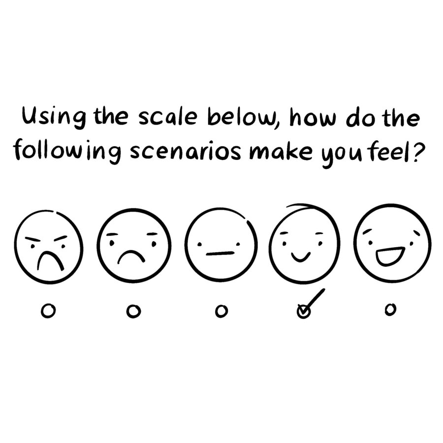
Visual elements in surveys

Surveys can be pretty dull. Including illustrations can not only make surveys more interesting to fill out, they can also inspire different kinds of responses. Visuals can bring hard to verbalise feelings and ideas to life and visual responses to questions can challenge responder’s thinking.

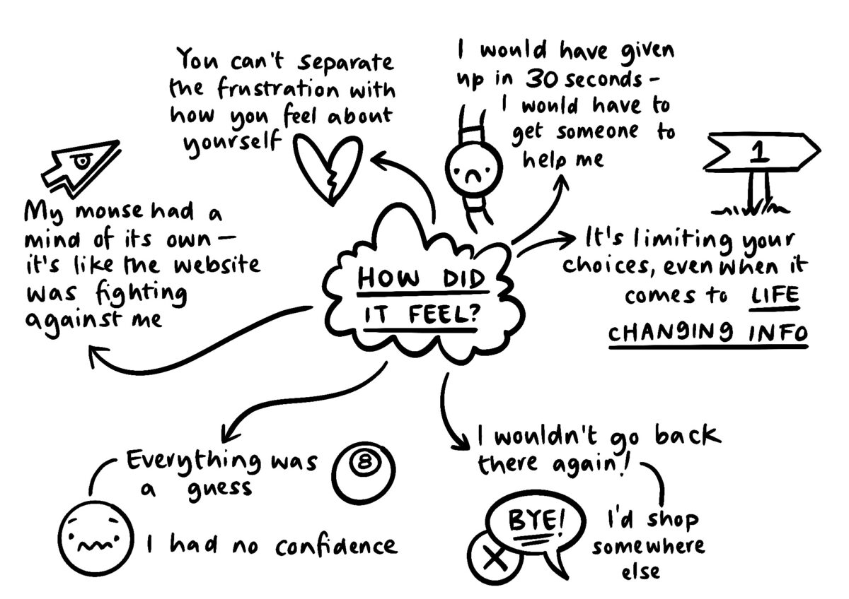
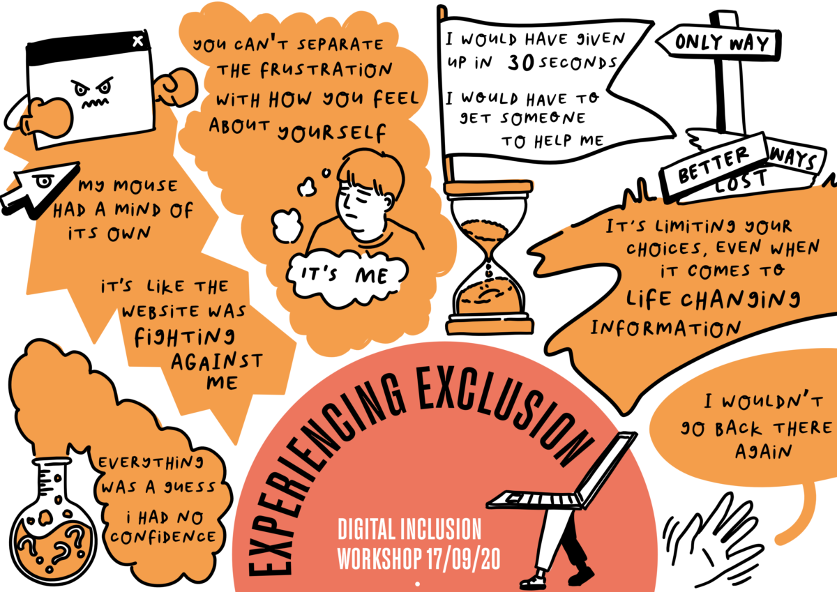
Graphic recording and facilitation

My own personal notes are filled with visual and verbal recordings, because that’s how I think best. But shared graphic recording and facilitation takes that to another level. Visuals can anchor discussions and there’s an energy that comes along with people seeing their ideas be brought together on a page not just in word form. Illustration can also be democratising in group discussions relying less on quick reading and eloquence to get a point across and see it part of the whole.

Scene sketches and multimedia reportage

Inspired by the work of brilliant artists and reporters like Olivier Kugler, illustrated scenes from research can bring back what you’ve learned through interviews and ethnography in more immersive form. These might take the form of mixed media collages, featuring photos and notes or sketches of whole scenes to bring the worlds and contexts of the people you’ve spoken to to life for everyone else involved in the project.

A long winding yellow line is used like a time line to anchor the timeline of the development of the inclusive design workshops I've been running. Each entry has a small drawing.
This is the story of the inclusive design workshops we’ve been running at ENGINE Transformation

Illustrated journey mapping

Journey maps have been some of my favourite things to illustrate. Visual layouts effective hold narratives together while illustrated people, quotes and key take aways make journeys made by people through services feel human. 

Illustrated process diagram of how I onboard new illustration clients
This is how I onboard new illustration clients

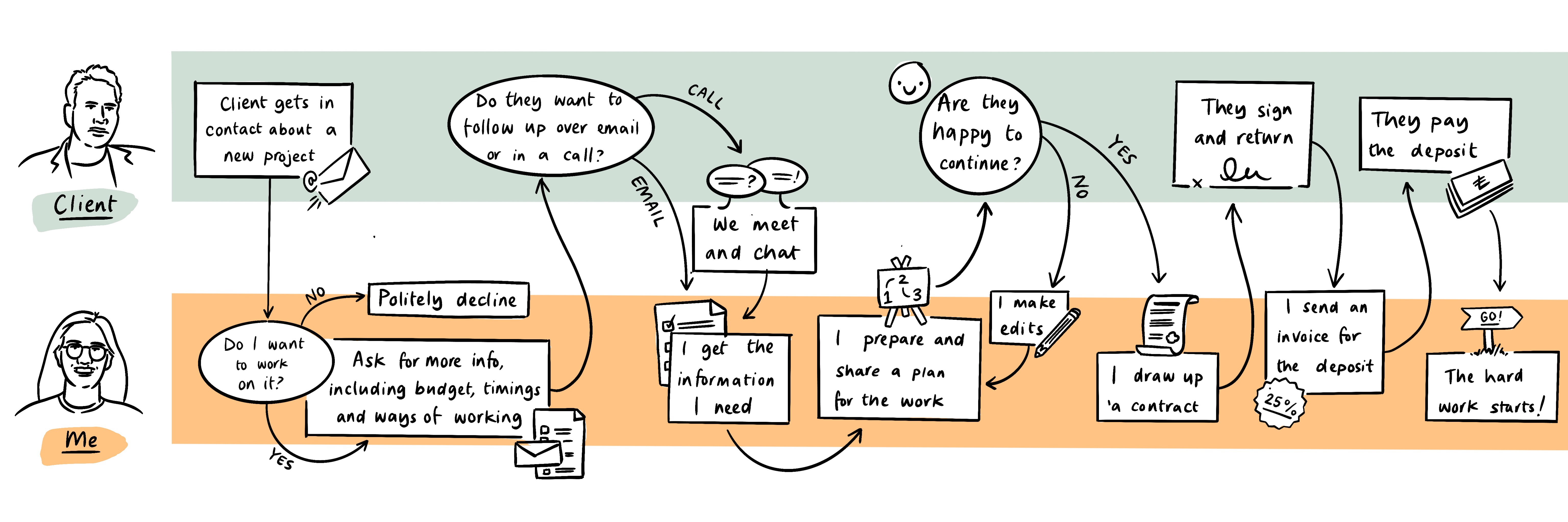
Illustrated blueprints and process diagrams

Process diagrams and blueprints are necessarily visual but they can often feel cold, bringing in illustration, even if it’s just to put faces to swimlanes can make them easier to approach and more human. 

Illustrated portrait of a woman with the line "I want someone else to help me fo this. I'm so overwhelmed I don't know where to start and I don't trust myself to make the right decisions when there are so many rules"
Example of the kind of work I’ve been doing at HM Courts and Tribunals Service

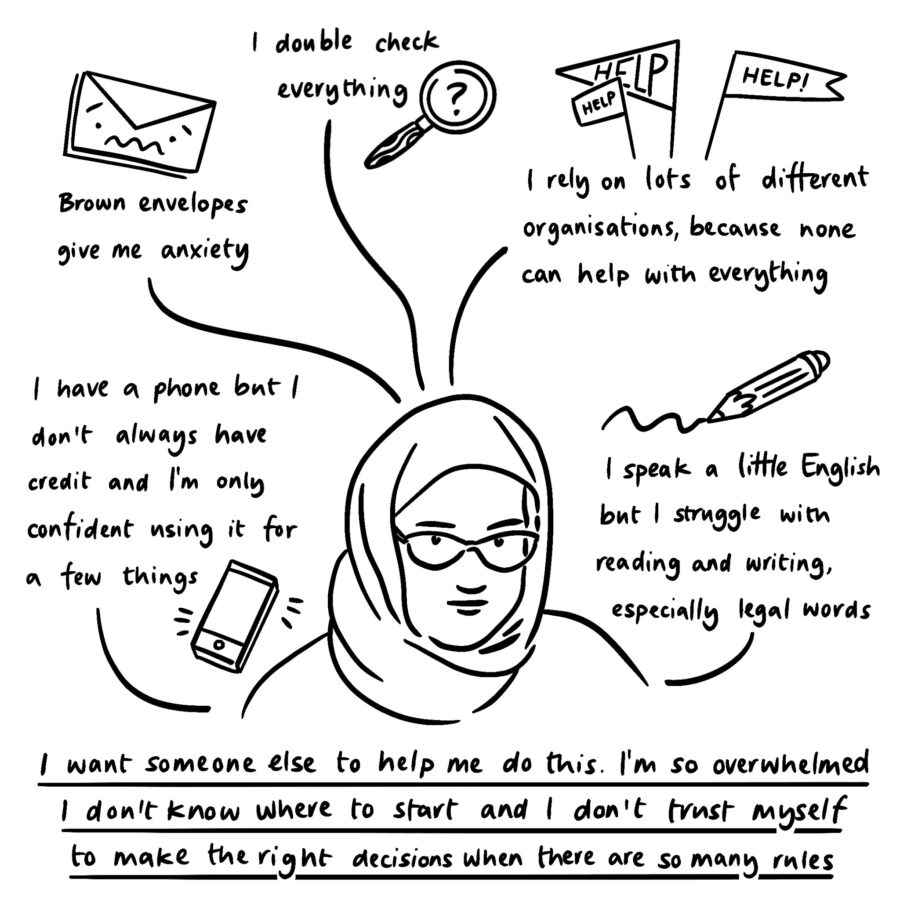
Illustrated personas

I’m a big believer that smaller more emotive personas are the most useful. Illustration is a great way to bring your key insights to life and make them easy to share and remember. Where those bigger more comprehensive character study personas are required, hand drawn elements can break them up and stop them feeling as scientific (because they very rarely are) and more human.
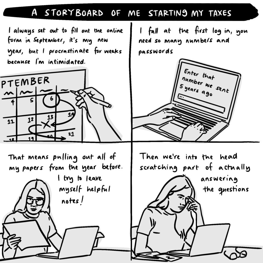
Illustrated storyboard of me doing my taxes, or rather me failing because I can never ever find the right passwords!

Storyboards

Storyboards are a way of visually describing a sequence of events. Their graphic format works best to tell a story of a person’s journey through a service and offer a more emotive companion to service maps and process flows.

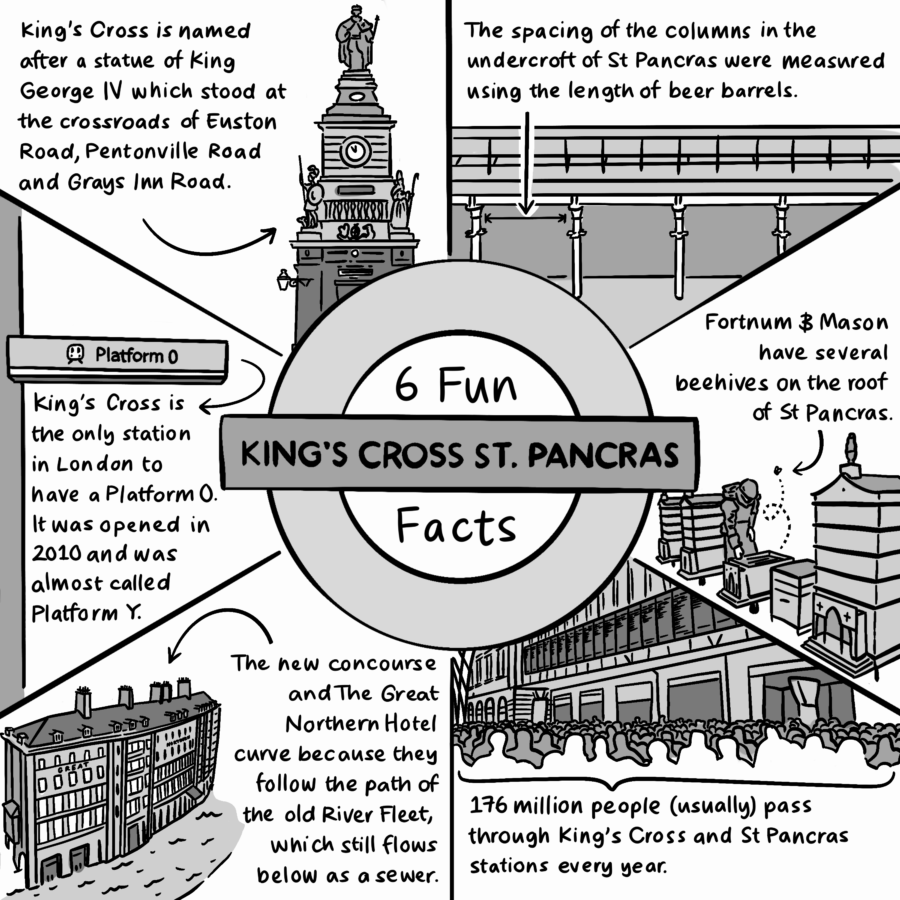
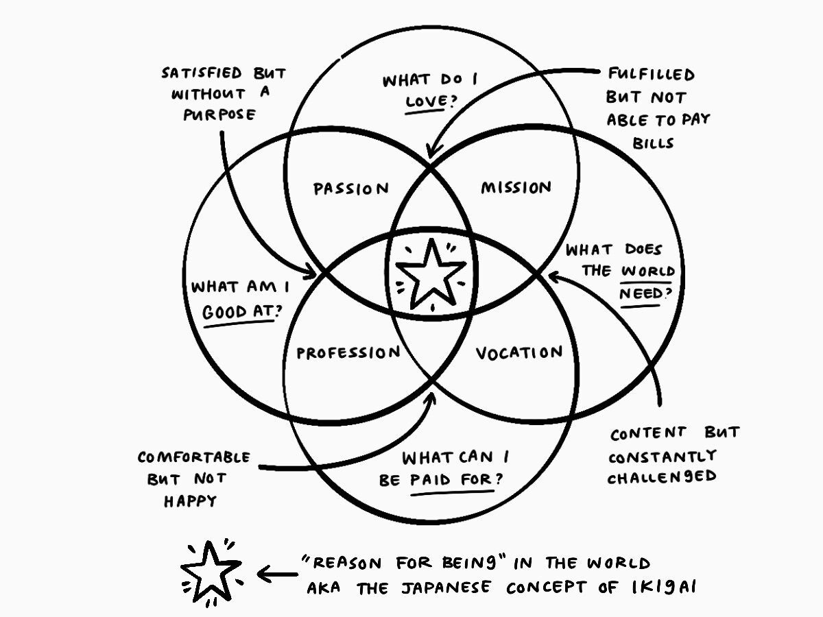
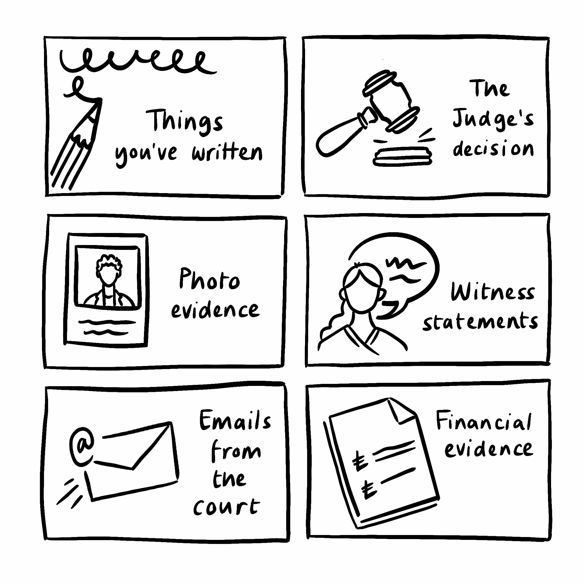
Visual cues and infographics

Sometimes research covers information that sits outside of a character or narrative format, that’s where infographics come in. At HM Courts and Tribunals Service, I did a lot of research into the different kinds of appeals, that information could be brought to life with imagery and made more accessible for stakeholders with a range of background knowledge through visual storytelling. This can work for huge bodies of knowledge, where big infographics and maps might be useful and tidbits you want to have reminders of like key quotes from people you’ve spoken to – a pepper mill drawing sat above my desk to act as a cue to remember words from one of our judges that started “consider the pepper pot…”

So those are some of the ways that my research work can be made visual and made better for being visual. Now to actually get to work and do more of this stuff!

COVID-19 has pushed more people online than ever before. Three times more 70-year-olds have registered for online banking than the year before. For those of us who the web is largely built for this has been an inconvenience but for those who have been excluded from the web due to age, disability, poverty, literacy, neurodiversity, confidence or whole host of other reasons it’s been incredibly difficult.

Doing research for and designing services that are inclusive is a big part of my work, so it’s something I think about a whole lot. But I know it’s not at the top of everyone’s mind. That’s why, along with some of my brilliant colleagues, I run inclusive design workshops for anyone involved in services that have some or all of their interactions online. We’ve run these workshops with designers, researchers, coders, and people working in communications internally and externally with participants across government and financial sectors so far.

Through those workshops we’ve busted a lot of myths about inclusive design and I wanted to share some of those with you here. 

Graphic with quotes about people's experiences during a workshop, they show frustration and empathy with those who aren't always included in the design of digital services.
An example of some of the feedback from one of our workshops

This is an extended version of a piece that I put together for ENGINE’s blog, if you’re short on time feel free to head on over and read the highlights.

Inclusion is only about making things accessible to people with disabilities, right?

Making things accessible to people who live disabilities is hugely important. We need to consider how people who have a range of abilities different to our own are able to engage with and feel included in the work we do.

In order to do that we need to go beyond just thinking about perhaps the obvious things you imagine as disabilities, and instead consider a whole range of barriers that might typically make it harder for someone to use services online. That means thinking about how people across the spectrum of age, gender, race, neurodiversity, literacy, access and confidence amongst lots of other factors can be included in your service. It also means thinking about how you might, unintentionally, be excluding people.

When we make services that are inclusive and flexible to as wide a range of people as possible, we’re making them better for lots of people, not just those who you might have thought about facing barriers to access.

But surely that’s still only small number of people?

There are far more people than you might expect. Let me hit you with some statistics…

In the UK alone there are around 14.1 people who live with a disability, that’s around 1 in 5 working age adults and just under half of people old enough to receive a pension.

Around 15% of people are neurodivergent, including those who are autistic or dyslexic, which means that their brains function, learn and process information in ways different to what society expects.

Then 22% of people in the UK lack the digital skills they need for everyday life, the skills and confidence you might take for granted if you’re reading this blog post.  

When we’re thinking about who might use our services online, we also need to think about people with disabilities that might be temporary (like breaking your arm for example!) and situational (like having to carry a crying baby in one arm).

So, a huge number of people are often, unfairly, excluded from services.

Isn’t most of the internet inclusive as standard?

Not at all, actually, only 2% of the world’s most popular websites actually meet the legal requirements for accessibility. So, 98% do not. That’s before you think about how inclusive their content and design is once you can access it.

Well, people can just get someone to help them can’t they?

Particularly in light of COVID-19, where many of us where isolated from our usual support networks, it’s wrong to assume that everyone has access to support. There are many things we all want to, and should, have the ability to do on our own. So, we should be striving to create inclusive services which empower people to access what they want and need on their own terms.

Is there a checklist I can follow?

There are some basic accessibility guides that you should definitely follow. GDS (Government Digital Services) break these down in a really easy to understand way and WCAG (Web Content Accessibility Guidelines) offer a brilliant guide for testing online services for those who want to get deeper. 

But inclusion goes beyond that. It’s about really understanding who’s using your services (and who might want to or need to) and how the want to engage with what you’re putting out into the world. 

Often making things simpler and easier for people who typically face barriers to accessing digital services makes those services easier for everyone. But the idea that one solution will be universal isn’t quite true. That’s a myth I bought into at the start of my career. Universal design sounds great and really easy to scale. However, we all have different needs and sometimes flexibility and specificity are the best way to support those needs. I learned a lot about that from Sarah Hendren’s brilliant book ‘What can a body do?’. The example that we usually turn to discussions at work is the idea that phone support is a great way to offer human assistance for those who aren’t digitally confident, but it’s also awful for those who are anxious or living with Alzheimer’s where it can be stressful to talk on the phone and hold conversations in your memory.

So, if the designer on the project knows about this stuff it’s all sorted?

Everyone involved in services needs to be aware of and asking questions about inclusion. So often the people who make design decisions aren’t just designers but stakeholders with purchasing power, developers who actually build and test services, researchers and strategists who give direction to projects. That’s why the workshops we’ve been running are aimed at broad understanding and getting conversations started across businesses. 

Okay, but surely this is going to cost money, is it commercially viable to improve services?

­­Let’s be honest, working inclusively does require an investment. Making sure you’re doing high quality research and design with users with a range of abilities takes time, money and effort.

But it’s an investment that will repay you many times over. Services that are easy to use require less support to fix errors and answer queries. They’re also more likely to get a share of the £11,750,000,000 (that’s over £11 billion with a b) estimated spending power of assisted digital users. I know from experience testing services and running inclusive design workshops the power of a hard to use service to turn people away, but also the loyalty (and genuine joy) that comes with using something that makes you feel included.

It’s been a while since I’ve introduced myself and checked in here. Hello! I’m Natalie and I make the stuff you see here and lots of other stuff too.

I’ve really been struggling with making recently. It’s been a hard year. It’s been a hard year for all of us, for the world. But I think this particular block had been building long before I’d ever heard of COVID-19.

The lyrics from a teenhood favourite song have been on a loop in my head.

a yellow ostrich with the lyrics I am a marathon runner and my legs are sore and I'm anxious to see what I'm running for

This is almost certainly my brain’s way of telling me I’m burnt out and I’m listening. I’m setting boundaries, saying no and taking time to rest. But I also think it’s a sign that I’m struggling with not having a clear direction for my work. 

For the past five years, I’ve been a really lame version of Clark Kent. I don my best reporter worthy outfit to work as a design researcher, largely on brilliant and serious government service design projects. Then when the internet calls I don my spandex (read pyjamas) and become someone who illustrates and tells visual stories online. Each of those identities have been running separately and they’ve been running in different directions, tearing me apart in the process.

Now it’s time to just be one person. 

I’ve tried in the past to define a set of values of a direction I thought would unify my work. But my 2019 mission statement now feels like a relic of who I thought I should be and what I thought I should be making. I don’t think anything I had on that list was bad or wrong. They’re all qualities that I strive to embody in my work. But I could only ever strive for them. They were too big, too nebulous, too generic. My work can never be everything. The only thing I can guarantee is that it will be mine. So right now I’m more interested in having something I can hold that encourages me to be who I am and to make the work I can make best while enjoying myself.

Right now that looks something like this.

I am a design researcher and illustrator (all of the time).

I am a person who uses visual storytelling to bring human centered research, inclusive services and interesting conversations to life. 

I make work that is inquisitive, structured, honest, inclusive and connected. 

I’m excited by those values. They are a north star I can use. I can measure myself and my choices against them. I can use them to say no to the work that doesn’t serve me and to make the work I do the best it can be to serve others.

Despite being only a few words it’s taken me a long while to get here. There was a lot of reflection behind each choice.

Inquisitive – I want to make work that reflects how much I love to ask questions, that’s not settled and makes people want to know more.

Structured – I want to make work that is rooted in method and rigour, and that uses structure to hold stories together.

Honest – I want to make work that tells the truth, even when it’s hard.

Inclusive – I want to make work that actively welcomes people in and that supports belonging for more people. 

Connected – I want to make work that is connected to its context and real life, but that also makes its own connections bringing new things together.

The process I went through leant heavily on brilliant work done by other people. I can’t prescribe steps because I think that working these things out is hugely personal. But I benefited hugely from Meg Lewis’s talks and workbook, talking to the wonderful Hollie Arnett, and this blog post by Emily Bazalgette. They all take quite different approaches and I think I needed all of those different ways to make enough cracks in the problem that I could get to the heart of it.

It was a messy process. But all process is, and it’s the best part.

So I want to reintroduce myself at the start of the next phase of this process. I’m ready to embrace the next phase of mess and then look back on it in a few years and see how that version of me in the world compares with this version. 

After a year of intermittent lockdowns, I’m missing doing research in person. While we’ve taken our work online and working remotely has allowed me to do research and design more easily with groups of people I mightn’t have otherwise got to collaborate with at scale, there’s something about seeing people in their natural environment that can’t be replicated.

You can learn so much by taking the time to really observe new surroundings and it adds so much context when you’re doing design research. I’ve gathered as much insight from watching how people move about their offices, the papers they keep to hand and things they choose to display as I have watching how they navigate the service I’m researching. 

Observation is a muscle. Just like every other muscle you have to train it and learn how to use it. I was worried that, just like every other muscle in my body, that it was going to get a little flabby over the months. So I’ve put myself into a training regime on my evening walks and park visits. 

I’m taking the things I used to do when I was just starting out and shadowing to train my eye and now trying to apply them not to user research but to making sure I get the most out of the tiny adventures I can still have. Oh and so that I come home confident I’ve seen every dog I can possibly see. 

It’s not only helped me reconnect with a part of my work I enjoy it’s also helped me find new inspiration and feel more connected to my environment.

These are a few of the exercises that are in my observational work out.

Before you start, put your phone down. That should be obvious. Make sure it’s on silent. We’re going for the full observational cinematic experience here.

  1. Slow down – I wrote about the power of slowing down in museums a while ago and I loved to spend a whole lunch break with a single painting at the national gallery back when I was in an office nearby. When I’m researching I try to apply the same focus to busy areas, like book cases, and body language. Try to really look at one thing for a whole minute, then two, then four. See how long you can really spend with something and you’ll find so much more than you would have at first glance.
  2. Use your nose – wake up and smell the coffee, or the roses, or the fish and chip shop down the road. Take a big breath and really focus on what you can smell. Smells often give you much more subtle observations but they’re ones that really stay with you because your olfactory memory is particularly strong. 
  3. Follow your ears – we mainly rely on our eyes for observation. Why wouldn’t we? They’re a great primary source of information. But if you can follow your ears you might find something your eyes would miss. I find this one particularly good outside or in busier places, because there’s more to hear, but it’s a great challenge in quieter locales too. Take a moment to hear all you can hear and then try to follow a sound to its source. Take a little audio adventure. 
  4. Pick one thing – this is based on one of my favourite childhood games, “how many red cars can you see?” If you dedicate yourself to spotting one thing be that red cars, digital aids, or dogs you’ll start to see them everywhere. This isn’t how you should go about all of your observation, but it’s a great way to start to change your perception of what’s around you.
  5. Look up – we went on a walking tour of my home town as part of a school history project when I was 9 or 10 and the guide told us to look up. That one instruction did more to shape how I view the world than the whole rest of that project (which I can’t remember at all). When we’re walking we’re usually looking down, at our shoes or our phones. So we often miss the things that are above eye line, whether we’re inside or outside. Spend some time looking up and you won’t regret it, as long as you’re standing still because, speaking from experience, you might regret tripping over your own feet.
  6. Check for patterns – this is another one I learned in art class and then applied to my research, because looking for patterns is universal. When I’m looking at an artwork or a piece of literature, I’m always looking for composition. What’s been repeated? How are things structured in twos or threes? Where is there symmetry? Where is there not? While you’re unlikely to get perfect fibonacci sequences of mug placement, you can always spot patterns in nature and in movement.
  7. Take notes – if you’ve read anything on my blog before you know I’m a big fan of note taking (see here, here and here for just a few reasons why) but one of the best ways to tone your observational muscles is to use them to record your surroundings whether that’s in words or images. It forces you to slow down, to look for patterns and points of focus. It also challenges you to filter what you see. It’s a HIIT workout of observation if you will.

So those are just a few of the things that you can do to really work on your observational skills, whether you want to use them for a specific cause or you’re just looking for something new to spark your interest or ignite your passion for the place you’re in.

For the last year and a little bit I’ve been a member of ENGINE UK’s shadow board. ENGINE is a full stack agency which covers creative, communications, media and transformation, essentially it’s like a creative marketing and comms powerhouse that works hand in hand with data and consultancy know how. The shadow board was an opportunity for 9 of us from across the business to come together and shape the future of where we work, support our executive team and ultimately see what it means to be a leader in a different context.

As my time on the shadow board is drawing to an end, I wanted to put together some personal reflections alongside the group work we’re doing to support next year’s cohort and share the good stuff we’ve learned. 

This was the first time ENGINE had ever had a shadow board. Well, in fact, a junior board which we swiftly renamed a shadow board. So we didn’t really know what to expect. 

We went through a long recruitment process, sharing written submissions, doing hot seat interviews and group tasks all to find a group that could represent the diversity of disciplines and voices in the business, and who would hopefully work well together too. Our purpose became championing the voices of our colleagues and sharing what it was like “on the ground”, offering fresh energy and expertise to central projects, and spending time learning about the business. Alongside still doing our day jobs!

It’s been a full on experience, with highs and frustrations. 

We launched a new intranet. We rejuvenated our onboarding processes. We put plans in motion to make ENGINE culture much more active and physically present, before COVID put a little spanner in the works. We researched and designed new career progression guides. We tried to make sense of what the pandemic will mean for us as people and a business. We learned from Jim our CEO. We learned from each other. We learned more about ourselves.

Professionally, I learned a great deal about what makes a big people-centred company like ours tick. I don’t think I had ever really stopped to think about the decisions our exec made day to day, there was a lot more tactical management of the stuff that’s the “boring” fabric of the business than high flung strategic work. But the more I saw, the more that made sense. You need that fabric to be woven tightly if you’re going to use it as a sail to take flight. There’s a constant tug and pull as you go, trying to balance priorities and budgets. But ultimately it comes back down to working with people.

I learned more about how the other parts of our business work than I thought I would. Having been on a graduate scheme where I spent a year rotating around different sections of the company, I thought I had a good handle on what we did. But the time I spent with my other board members, reviewing training plans or trying to come up with cultural events, made me realise how different our approaches to problems can be. There are a lot of similar foundations in what we do (research, insight, strategise, produce something that resonates) how a group of PR people can hive mind a brief when they’re together, how a group of strategists will research and analyse it, and how a group of designers will immerse themselves and workshop it can look and feel very different. They’re each incredibly valuable and I’ve been made much wiser by watching other brilliant people work.

But I really wanted to reflect here on a personal level. If there’s one thing that will stick with me long after this experience, it’s that things are what you make of them.

It’s the most obvious lesson and also the hardest (for me) to put into practice. As I mentioned, when we started our time on the shadow board we weren’t really sure what it was. We were the first people to ever form a shadow board in the context we had. We struggled really hard with defining the role for ourselves. We struggled with getting projects going. We failed to get some things we wanted done and (in part because of that) we failed to win some people over. More often than not it was because we wanted to discuss and not do. We’d been trained as great diplomats who could come up with ideas and plans, who can research the pants off anything you need us to, but without the burning fire of a client we weren’t always the best do-ers. I wasn’t always the best I could have been. If I could go back and start this all again I’d want to be braver and bolder. In order to lead you have to go out on a limb to take a first step, knowing it might be wrong but also how much worse it can be if you don’t.

My favourite projects to work on, our careers project, the intranet, our exec shadowing discussions, were my favourites because we had a clear scope and we had a real drive to get something done. We applied what we knew of our expertise and drew on other people as experts in their own experiences.

If I’m ever a leader that’s what I would hope to provide. I would want to model clear communication and confidence in action (and responsibility with failure). I would want to acknowledge the strengths and diversity of those around me and amplify those talents, knowing I still have so much to learn. I would want to remember that things are what you make of them. 

Now that I’m leaving the shadow board behind, I’m not sure what’s next other than focusing on trying my best at my day job. It’s changed my perspective and I think it’s made me better. But I don’t know that it’s made me want to have loftier ambitions.