Last year I wrote a post about starting to find my style and the lovely Asti left a comment asking if I’d ever shared my style inspirations, and it got me thinking. I have shared artists I love in the past, but I’ve never done a post about the ones who’ve had a real impact on how I work on a more personal level.
So here are a few of the names that spring to mind when I think of my artist inspirations.
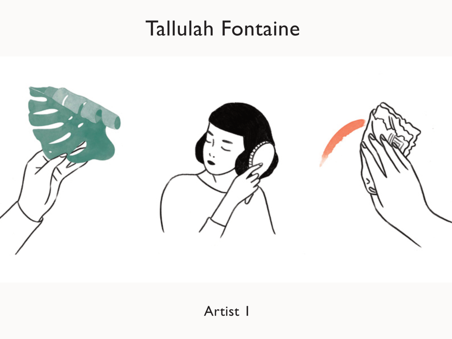
I’ve spoken about my love for Tallulah’s work before, so I won’t spend too much time gushing here. There’s a certain tender quality to her watercolours, which although I’m not a painter I want to incorporate into my own work. Her characters are always very simply drawn but hold themselves in a such a way that they really do appear to have genuine emotions of their own.
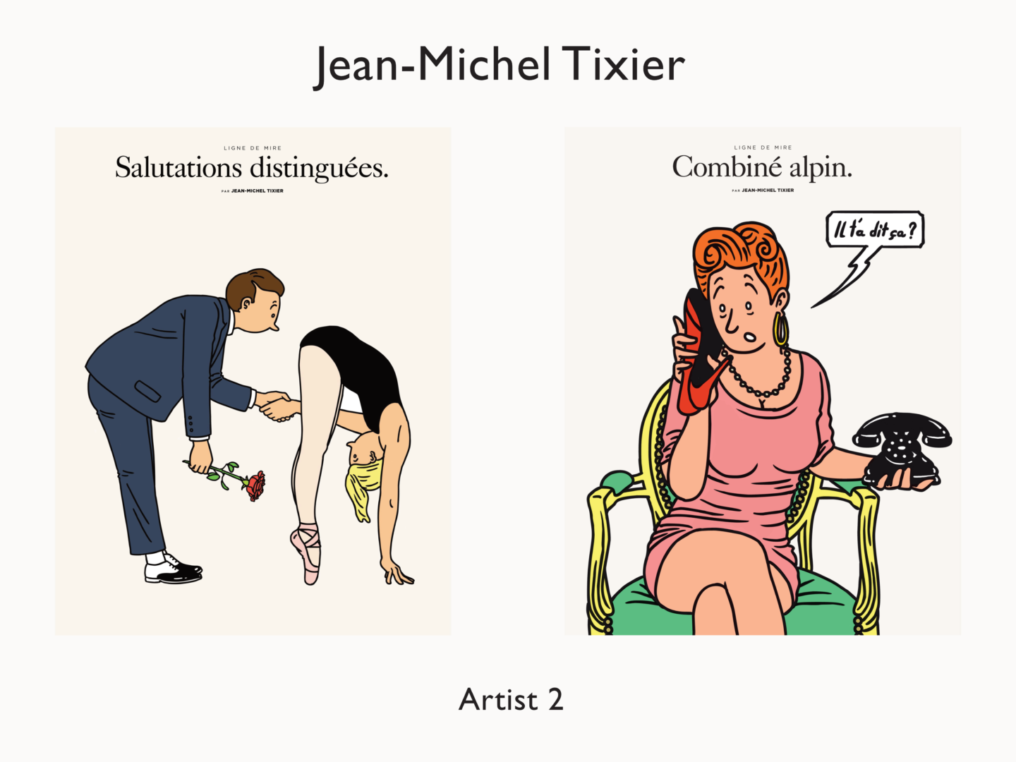
I think Jean-Michel is a more obvious influence on my work. His character illustrations always remind me of a modern Hergé. I love the way he creates playful interactions on a page using line in a way that feels quite bold without ever being static. When I first started adding colour to my own work, his illustrations were the first place I looked for inspiration because his work felt so familiar but just with something more that I’m trying to put my finger on, so it made the jump into colour that bit easier.
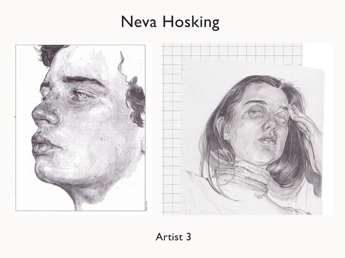
While you can certainly see Matt Blease’s influence in the work I share here, it might be slightly less clear as to why I’ve chosen Neva Hosking as a big inspiration for my work. Her detail rich pen drawings and etchings are very different to my digital work but I love how she uses line to create texture and depth within her work. It’s been something I’ve been working on more in my sketches and that I’m starting to try and incorporate in my digital. Her work is just quite simply stunning though. Her sleeping series is magical, dreamy even if you’ll allow me the pun.
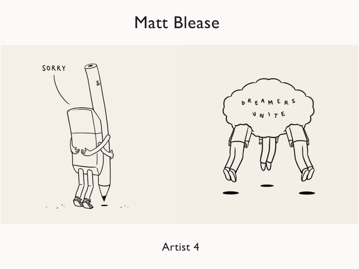
Matt’s distinctive line drawings were a huge influence on my work when I first started to illustrate digitally. I think you can definitely see it more in my earlier work. He’s also the reason I use a slightly off-white background in my images to give them a little warmth and to make them feel slightly less digital. His work is clear and confident, in part because of their very minimal style which requires a certain decisiveness in their creation but also because of their matter of fact statements. Everything Matt seems to draw says something, whether that’s a statement, observation or just a great visual pun.
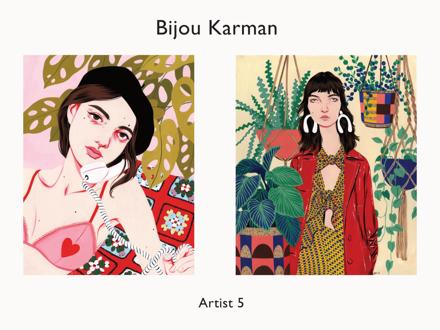
Over the past year I’ve slowly become more and more interested in fashion illustration and colour, as well as moving back out of digital as a medium, Bijou Karman is a huge force behind those changes. She’s even inspired me to start having a play with gouache because she makes it look so fun. As you might have been able to tell, what often draws me to an artist is their use of line. Bijou adds detail, particularly around the eyes of her characters, using line in a way that really enhances their character but also makes her images look very distinctive. She also uses coloured line in a way I find really refreshing. In fact, the way she uses colour in general is refreshing, especially as someone who mainly works in monotone. Her paintings are bright and have so much depth, so many layers of interest, without ever feeling overwhelming or hard to look at – the portrait focal point she creates is so strong.
Other honourable mentions: