In my taste finding expedition, I’ve found myself being drawn to more complex and narrative pieces which juggle multiple elements.
I’ve always loved looking for structure in whatever I’m looking for whether that’s pattern when I’m researching, rhetorical devices or clever conclusion when I’m reading or hidden triangles when I’m walking around a gallery. But since leaving school, where the importance of composition was drilled into us in with almost a gull term of arranging triangles, squares and circles when we were 14, I’ve gotten lazy.
So I thought I should go back to basics and do some research. When I’m doing research, I’m a big notetaker, because that’s the only way I remember anything. This is a spruced up version of those notes in case you’re looking to put some more visual structure into your own work, or to just feel like you’re in the club when you’re looking at art. This is definitely not a comprehensive guide, but it’s what stuck with me.
The Tate defines composition as “the arrangement of elements within a work of art”
What makes good composition?
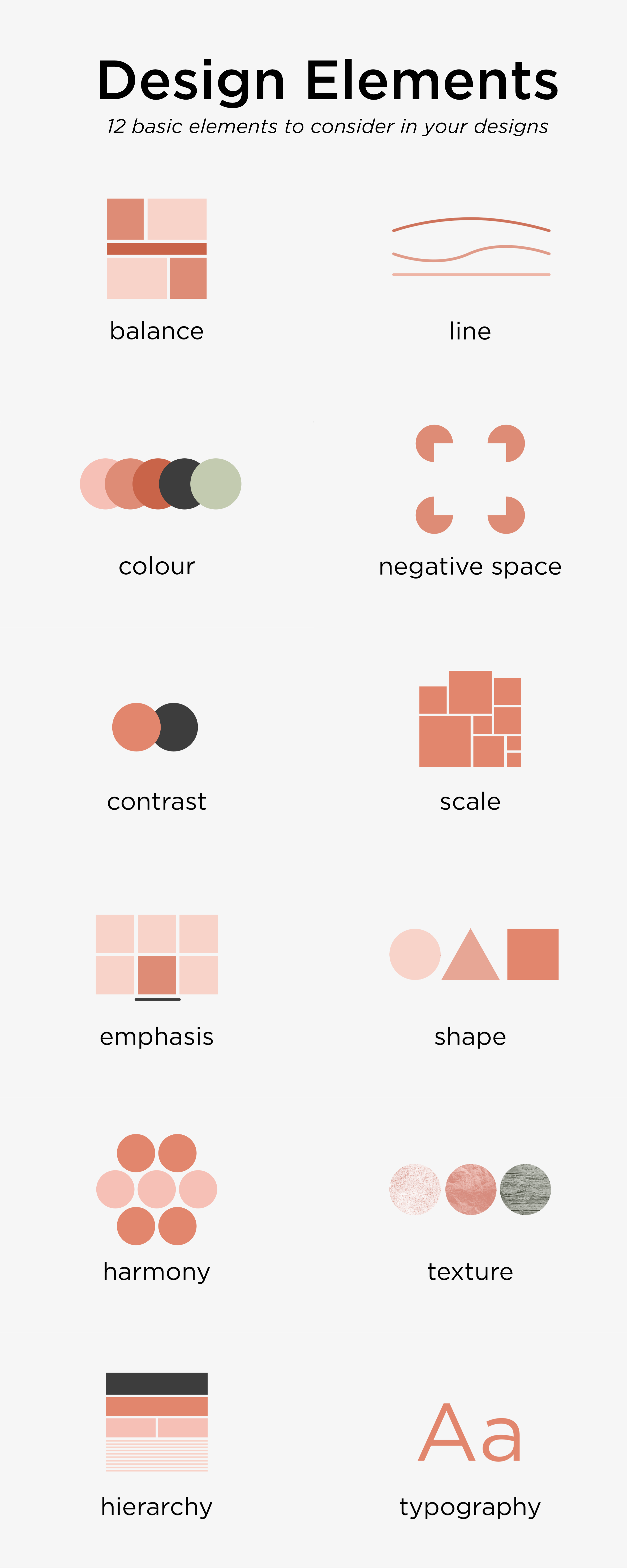
The qualities that make good composition seem to almost mirror the qualities that make good visual work more generally, which I pulled together a little while ago in poster form (below). The qualities most relevant to composition (with a little explanation) are the following:
- Proportion – how do “things fit together and relate to each other in terms of size and scale; whether big or small, nearby or distant”? This is the most obvious quality of composition.
- Emphasis/focus – where is the viewer’s eye drawn? Creating contrast and playing with balance, rhythm or movement can make certain elements of a piece stand out and appear more important.
- Balance & unity – do all of the elements work together? Symmetrical compositions instil a sense of order and calm (think Wes Anderson) whereas asymmetrical ones create more dynamic and active pieces.
- Rhythm & movement – what is happening in the image and how does it draw your eye? Leading lines and underlying shapes/tones can direct the viewer to focus on certain elements of give a sense that a piece is going somewhere at a certain pace.
- Pattern – do elements of the composition repeat? Using repetition can give clear structure or draw certain parts of an image together.
- Contrast – how do elements of the piece appear different? Contrast may come in many forms including hue, tone or scale and can create dynamics within a piece.
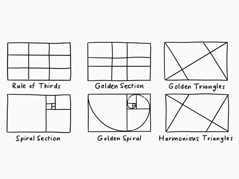
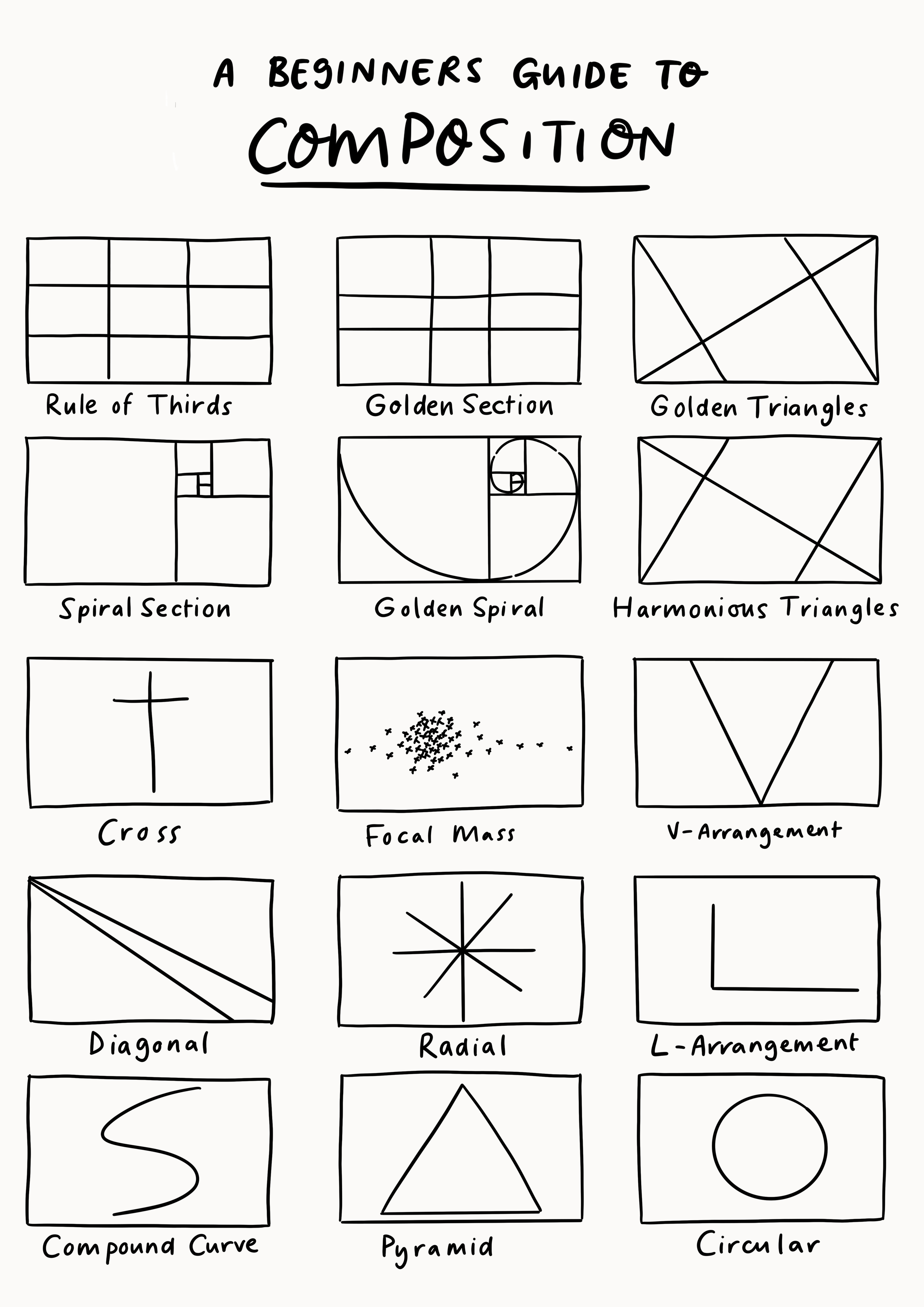
Tried and tested structures.
There are a number of “rules” in classical composition like using the golden mean or the rule of thirds. These seem to be less rules in the strict sense, but tried and true templates we can use to inform our own compositions. I’ve put together a visual guide to these templates/bits of composition inspiration.
Top tips
- The rule of thirds works best in rectangles (not squares)
- Aim for variety in the sizes and spaces between elements for a more dynamic composition – but there is a time and a space for super regular work.
- As well as the scale/spacing of elements, also use colour and tone to draw the eye.
- Use objects and light to point at the thing you want people to focus on.
So those are the bits of advice I’ve collected so far, but if any of you have any other top tips or have more formal art backgrounds and can help a girl out I’m all ears!
But for now I’m just going to try out what I’ve got in my illustration and by burgeoning photography practice.