
A couple of weeks ago a new version of my portfolio made its internet debut without a bang.
I’m so proud of the work that went into that stage left entrance and the little static show it’s putting on. So I wanted to share something of its backstory, because it’s a backstory of reinvention, technical triumph and procrastination.
This change came about because more and more people from my “real life” were finding my website and I was embarrassed by it. I wasn’t embarrassed because it was objectively bad, but because it felt like I was pretending to be someone I wasn’t. I’d made an online presentation of myself that didn’t feel connected to the me that people met in real life.
So, in this new site you won’t find any cards (or anything else) for sale right now. I’d made the decision to make cards 3 years ago when I thought that was what you had to do if you wanted to be an illustrator online. But I was never 100% happy with the cards I’d made and the way I’d tacked them on didn’t feel good. So , in Marie Kondo style, I’ve gotten rid of them because they didn’t spark joy.
In fact, I’ve dropped almost all references to just being an illustrator. I’m trying to make the work I do during the day (the more research based stuff) and the work I do on an evening (the more visual stuff) a more cohesive whole. That’s why there are fewer examples of my work up right now. I’m in the process of producing more of the type of thing I’d like to be making not just what I’ve been asked to do in the past.
Because the reason for my change was all about content, that’s where I start my design work. I spent time sketching out what I ultimately want to make more of and how I want to support myself making those things. I stuck with pen and paper drafting out how I wanted to talk about what I do. I think taking the time to really think about the story I wanted to tell, away from the web side of things, gave me much more focus and purpose than I’ve ever had when designing past portfolios, where I’ve just dived in.
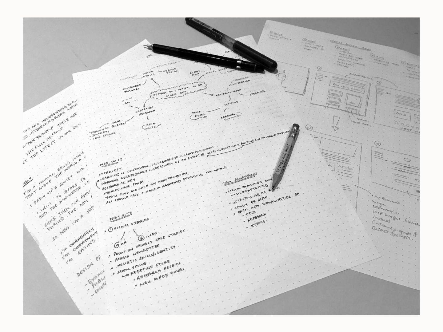
I stayed on paper to sketch out how I wanted to organise that information across the site and on the pages themselves. I’m no UI designer, but I went though sites I loved and tried to find elements that I thought would structure and highlight my work in the way I wanted. Through that process of searching for inspiration and like a magpie picking up what was shiny for my own nest, I ended up with a clear sense in my mind of how I wanted the site to look, feel and behave.
For the last three years, my portfolio has been hosted on Squarespace. Squarespace is an absolutely brilliant tool for quickly making lovely websites, particularly if you have your own store. But I was worried it wouldn’t be flexible enough for me to build something that really felt like it was my own. That sense of ownership was so important to this process for me. I wanted an identity I had crafted rather than fit into. So, I decided to look into other options and ended up going with Semplice. Semplice is a designer’s portfolio builder and came highly recommended by UXers at work. Not one to just rely on a recommendation, I weighed up the pros and cons before I purchased.
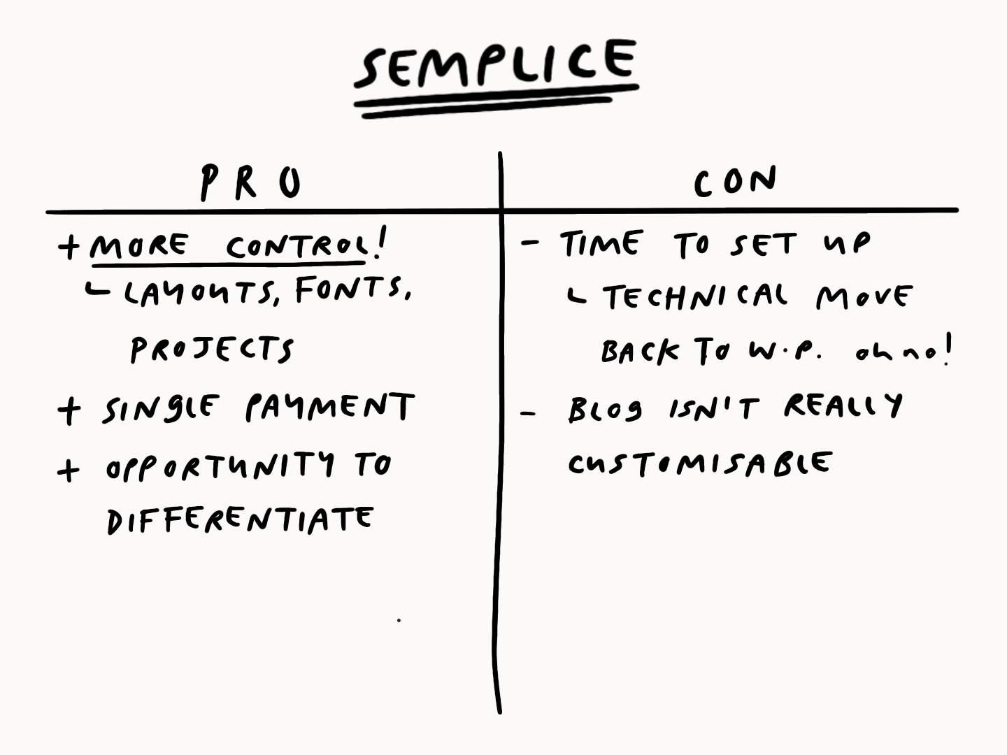
I’m really glad I went with Semplice in the end. I feel like I’m in complete control and that what I’ve made is flexible enough to carry me into the future. For anyone else considering Semplice, I will say that it does take longer to build a site than with the out of the box solutions. That was a price worth paying for me. The only regret I have is that the blog element isn’t as customisable as I would have liked, but I’m looking into what I can do with the little coding knowledge I have and raiding github.
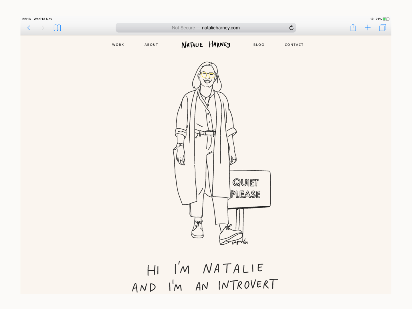
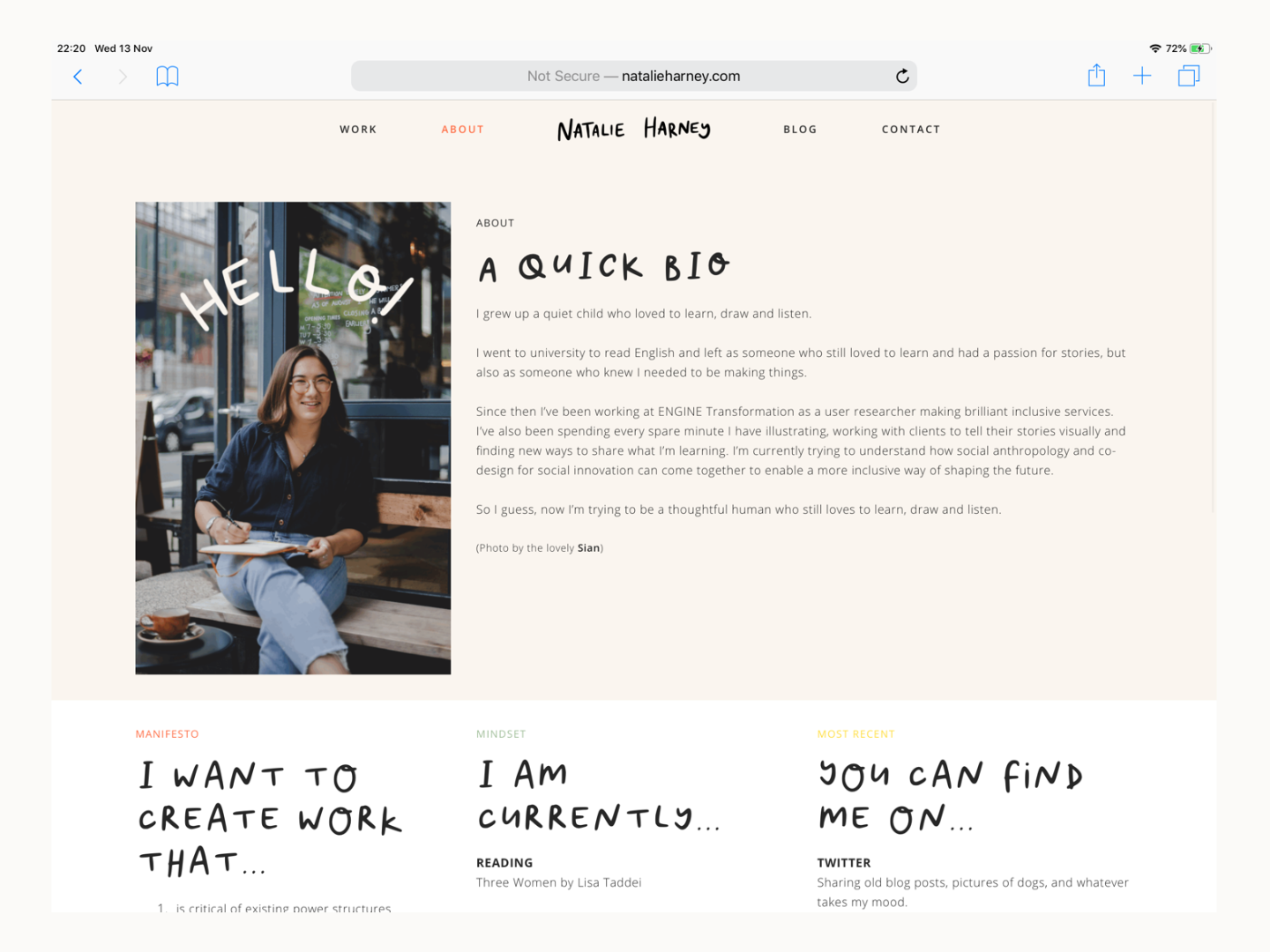
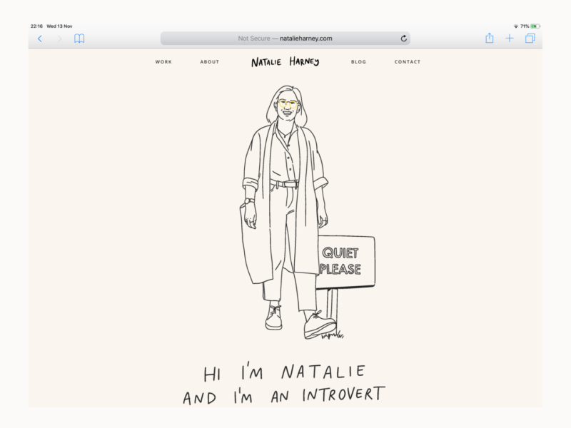
That said there are bits of the site I absolutely adore. I like the warmer colour palette that feels at once neutral and bright. I’m so glad I took the time to create a font based on my handwriting to use as the titles. I think it speaks to the hand drawn nature of so much of my work in a way that no google font ever could. I love the animations and the way they’re both examples of my illustration and my personality. I even like the photo of me (as taken by the wonderful Sian) on the about. I typically hate having my picture taken, but I think having my real self as part of the internet presentation of myself is such a good way to bridge the divide that had been pulling me apart before this project.
It’s not all been plain sailing though.
All in all, I think it took me 6 months or so to get something out of the door and onto the internet.
I had a lovely to do list on my wall all summer. I knew what I wanted to make and I knew how to do it, but I just couldn’t bring myself to just sit down and do it.
I’m not normally a procrastinator, in no small part because I don’t give myself the time. So what was different about this? That’s what I kept asking myself.
I think it came down to two things. First, it was a project for myself, meaning it felt like it was the least important thing on my to do list at any given time. Second, I’d put all of this pressure on it being not just a representation of a tiny bit of myself that I could use when I needed it, but it actually being me.
I’m not sure if that makes sense. There’s a lot of discussion about how to be visible is to exist online, and in a way it is. But not to be visible, or not to be shown in my best light, doesn’t mean I, the physical I, cease to exist. In fact, the visible internet I isn’t even all that well seen.
A portfolio is just a way to showcase my work to real people. It’s not me. It’s also not a big deal for anyone else and I have to own that. It’s not a negative. It’s not a comment on my personhood. It’s actually quite empowering to try to view it as a sticky tape and cardboard project in my bedroom rather than a grand presentation.
On Instagram I described it as a piece of string project, it could be as long and winding as I made it. But I needed to make the cut. So I did.
The version of www.natalieharney.com you see online today isn’t “done” but it’s never going to be “done”. There are more projects I want to share, page elements I want to refine, load issues I want to smooth out. But it’s a start and a start that I’m proud to share.

Your website has turned out stunningly, Natalie! It really is wonderful and think reflects you and your goals perfectly. I’m also so glad that you have a photo of yourself that you like and are happy to showcase on your site too! 🙂
Thank you so much for making having my photo taken waaay less scary and giving me some of the confidence I needed to finish this project off.