
A lot of the client illustration work I’ve done this year has been for Lenny’s newsletter, which is “a weekly advice column about product, growth, working with humans, and anything else that stresses you out at the office” with over 65,000 subscribers by Lenny Rachitsky. It’s been a lot of fun to work on.
I worked on a new illustrated brand for the newsletter, which you can read about in a little case study I wrote for my portfolio. But I wanted to share a little bit more about my favourite thing we’ve been working on together, illustrated infographics.
These images really hit the sweet spot of work I want to be making right now they use visual structure to making information more engaging and accessible. I think they also bring something fresh to Lenny’s already brilliant newsletter.
So how do we make them?
I say we, because while I do the illustration and visual elements, they’re a real collaborative effort.
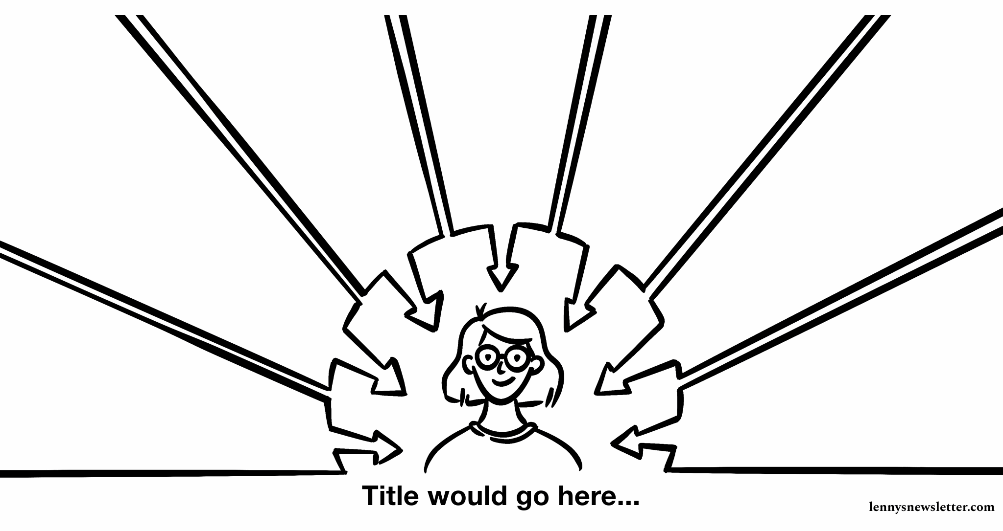
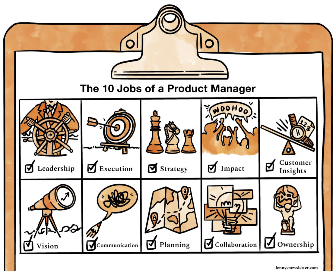
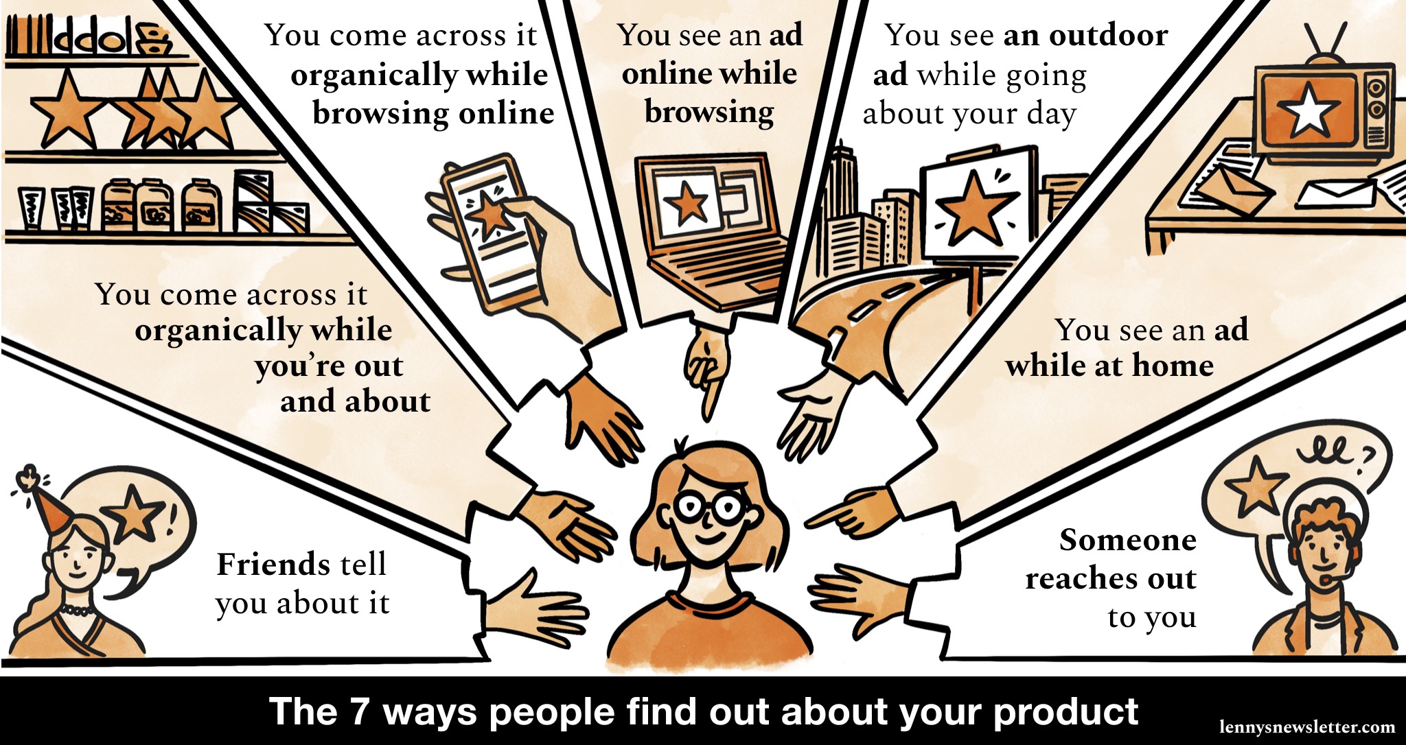
Each one starts with its own brief that usually covers an outline of the content that the visual should cover. The infographic I made to go with the habits of successful product managers had an idea of a title, that there were going to be ten habits and a rough list of what those ten would be.
With that brief in hand, the first thing I do is develop the structure for the image. These layouts have definitely become a bigger part of the image and better as we’ve made more. The first one I made was just a grid, but more recent infographics have really used their structure to convey elements of the content, like the clipboard for the jobs of a product manager image which really added to the feeling of someone going through their own work checklist.
Then I go back to the brief and start to brainstorm ideas of how I can bring the content to life. I’m always aiming for something that’s easy to understand but a little bit figurative rather than purely literal. This stage is usually in a notebook and just words or descriptions of ideas rather than thumbnails. Even though I usually think visually, I find my brain is usually moving a lot faster than my hands at this point!
Depending on how much time we have, I’ll try to share these ideas to make sure they’re on the right track and if they’re not get some feedback so I can pivot quicky.
Next up it’s line work. The brand style we developed is based around loose inky lines and watercolour textures. So I’m always referring back to that as I sketch.
While I draw in procreate, everything really comes together in Figma. I have to admit this is really the first time I’ve used Figma, so I’m sure I’m only using a tenth of its capacity. But it’s been a brilliant tool for collaboratively combining text and images. I was really taken aback by how easy it is to use!
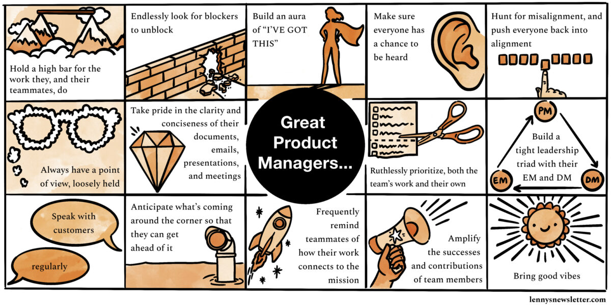
When the text and images are starting to work together, I’ll make any necessary tweaks to the illustrations then add colour. Often when we put the text in I find images have to shift a little bit to make the text as readable and easy to layout as possible. I’m not typically a hue colour person (as you may have guessed from seeing pretty much all of my work on this blog) but working with the palette we defined at the branding stage and getting to play with tone within that structure has made it really fun. I love how you can use light and dark to draw the eye across the infographic.
With all of the final elements together, it’s ready to go out as part of Lenny’s newsletter and be shared across social media.
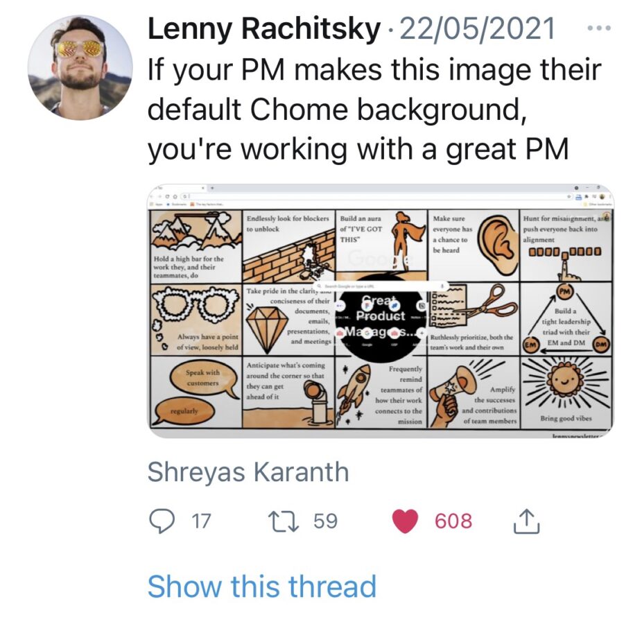
It’s been wonderful to see the illustrations and infographics embraced by the same community that inspired the initial campfire branding. The infographics have been shared far and wide and even made it into that coveted digital real estate spot of the desktop background.

This is so rad, Natalie! I love how you can see your style of illustration mixed with the water colour textures. A match made in heaven, I think! I always find behind the scenes processes so interesting. There is always so much going on that I wouldn’t have even thought to consider. I’m so glad to hear your work has been embraced – it very much deserves to be!
I feel like this orange is totally your colour too – I associate you with all the good warm, earthy tones. It’s weird how working with someone else can really push you to try something a little bit different and find you love it, like these tonal watercolours. Hope you’re doing well!