Happy summer folks! It’s been a sunny, sticky month in the city. It’s not felt like London at all really, spirits have been high, we’ve been eating later and enjoying the long almost mediterranean days, we even did pretty well the football #southgateyouretheone.


This month’s roundup is another slightly shorter one because I went away at the start of the month. But it’s still filled with goodness, including some great longer reads well worth the investment.

stop watch illustration

SHORT READS, IF YOU’VE ONLY GOT A FEW MINUTES:


‘Breathtakingly beautiful’: Tate St Ives wins museum of the year award

So Tate St Ives is officially on my to visit list. Its extension is not only architecturally beautiful it also contains some of the country’s most cutting edge art. Plus it’s not got a bad view to go along with it.


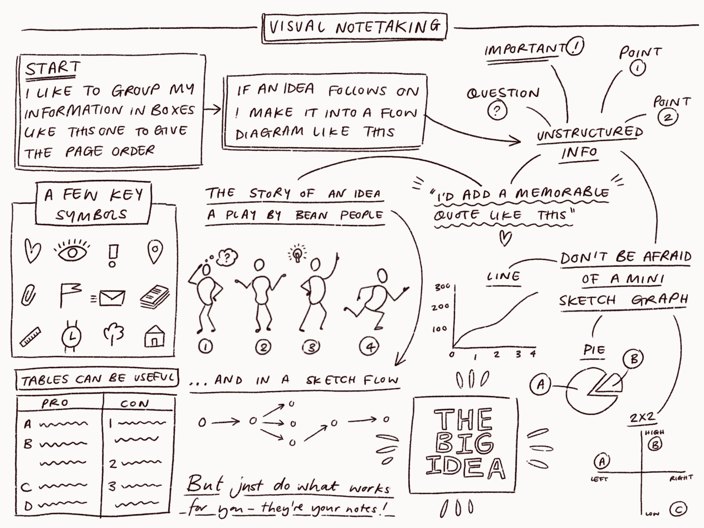
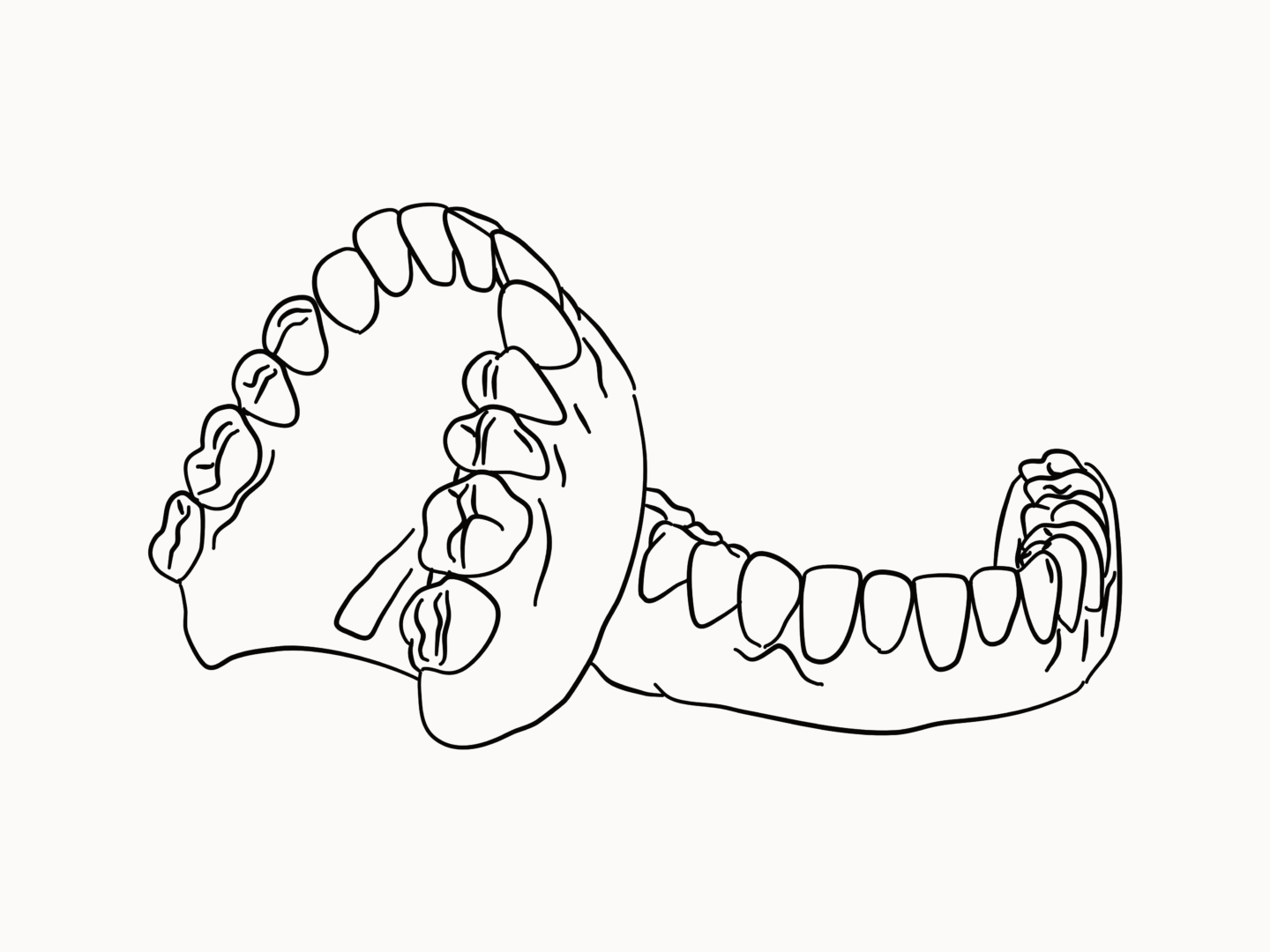
5 more drawing exercises

Ralph Ammer has built on his “Quick beginner’s guide to drawing” with some more thought provoking exercises to align your hand and your eye. If you want to improve your sketching practice or just rethink how you see the world give it a read

Dentures illustration

LONG READS, IF YOU WANT SOMETHING TO GET YOUR TEETH STUCK INTO:

The story behind the rainbow flag

London Pride was one of the biggest parties of the month, I thought there was no more fitting time to share this wonderful article about the history of Gibert Baker’s rainbow flag. 99u spoke with some of the late creator’s closest friends to learn more about the maker who, through art and design, helped to spearhead a movement of enduring pride and acceptance.


Creating an illustration for The New Yorker

I love a good behind the scenes piece. Here, Daniel Savage walks us through the creation of an illustration for an article on paper jams for the New Yorker, showing how the illustration developed and was animated within a tight deadline.


This is how you create a feminist internet

This month I went to Nesta’s Future Fest conference, which got me thinking about technology, the future, and how we can shape them both. I thought this great op-ed piece from Aiga’s Eye on Design is the perfect way to carry on that conversation


Arts cuts are bad for our health – what are we going to do about it?

Jodie Caris, part of Forever Curious, a creative initiative set up to work with local east London primary schools, asks: what next for a generation let down by state funding for the arts?


Why Ceramic Artists Are So Good at Dealing with Failure

We talk about the need to fail fast and just create in design but it’s a lot easier to say than embrace. So what can we learn from ceramicists who choose to work with a material which is open to a “myriad mishaps that can occur during its processes, from wheel-throwing to glazing and firing”?


Flight of the Conchords: ‘We’re retired sex symbols’

I read this article over my boyfriend’s shoulder in the airport on the way home, and then again when I was reunited with my laptop. It’s not necessarily about art but everything Brett and Jermaine have to say about creating and having fun is so applicable.

“I mean, this was all just a side project to learn guitar,” Clement says.

“My entire career is a side project,” says McKenzie.

“Yeah, I’m still waiting for the main project,” agrees Clement and he gives another giggle of delight.

WHO TO FOLLOW, IF YOU WANT TO SPRUCE UP YOUR INSTAGRAM FEED:

@kitagar

Kit Agar’s terrazzo inspired portraits and illustrations are the perfect antidote to all of this heat. They’re cool, calm and perfectly collected.  


@anniedornansmith

I’m currently starting to work on some new stuff for my store, and Annie Dornan Smith is a huge inspiration for how I’m trying to approach my business. If you love gorgeous stationery or you’re a small biz owner I’d seriously recommend checking out her feed and her store – especially because her new peachy keen collection just launched!
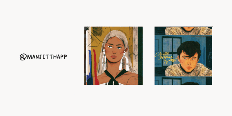
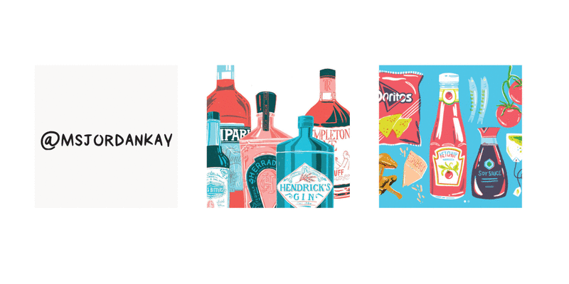
 

@msjordankay

Not only is each and every one of Jordan Kay’s illustrations a masterclass in using colour, she also brings them together in the most gorgeous grid layouts. Her feed is a summery joy to scroll through and I can’t recommend it enough.

This month’s roundup comes to you a little early (gasp) and so is a little shorter than normal (double gasp) because I’m going on holiday next week. But don’t worry there are still plenty of great reads in there from some of the usual places (the minds of Austin Kleon and Jocelyn K Glei to name a couple) and some sparkly new sources, so hopefully there’s something in there to catch your eye and get you reading and thinking afresh.

stop watch illustration

SHORT READS, IF YOU’VE ONLY GOT A FEW MINUTES:

Artists Need Pockets

Austin Kleon’s blog is one of my favourites and this short piece on why artists need pockets is a great demonstration of why. Austin manages to pack in some great artist anecdotes, a brief history of the politics of the pocket and some super interesting links out all in a 2 mind read.

The Women who Designed the Pattern for Modern Britain

This (mini) Guardian feature on Enid Marx, Minnie McLeish and Lucienne Day, who were a generation of revolutionary print creators, is pretty darn great. If you’ve never heard of them, if you live in the UK you’ve most certainly sat on their work.


Beginning Graphic Design: Color (video)

This video was linked on a great thread by Lauren Baldo about how she chooses her colour palettes for her illustrations and it was so helpful (in just 6 minutes) I had to share it all with you here.

Dentures illustration

LONG READS, IF YOU WANT SOMETHING TO GET YOUR TEETH STUCK INTO:

5 Brainstorming exercises for introverts

Inspired by Susan Cain’s research on the power of introverts and how solitude, like collaboration, is a crucial ingredient to creativity, Allison Press from IDEO asked her colleagues what strategies they use to incorporate solitude into the most extroverted of activities, brainstorming. As a fellow introvert I can personally attest to the power of the first two.


On Needing to Find Something to Worry About

Something a little more philosophical/psychological for this week’s first pick. I occasionally dip into The Book of Life’s blog posts when I’m in the mood for something self-help-y but not self-help-y if that makes sense. This piece about needing something to worry about really spoke to be a serial worrier and all round anxious bear. If you’re having an anxious day/week/year give it a read because it’s super calming, even if you enjoy nothing else but the steady cadence of the writing.


10 Book Cover Designers Discuss the Covers They Rejected and Why

You know I love book cover design, and harbour a not so well hidden desire to design book covers as a job. So when I saw this piece from Electric Literature where 10 incredible cover designers shared their design process and their rejected covers, I knew it was a must read. I was not disappointed.


Confessions of a Burnt Out Over-Achiever

Jocelyn’s intro to this article is way better than anything I could write so I’m just going to quote it and then leave you to read this mini saviour in your own time. “If I asked if you could continue working at the pace you currently work for the next 10 or even 20 years, what would you say? I think for most people, the standard response would be: “Hell no!” But what we do today, and what we do tomorrow, rapidly becomes the status quo. Until working in a way that is completely unsustainable starts to seem quite normal.”


Sketchnotes 101: The Basics of Visual Note-taking

If you enjoyed my piece last week on how and why I make my notes visual, this piece from Core77 taught me a lot of what I use and is a great follow on read. Plus the little sketches are really lovely.

WHO TO FOLLOW, IF YOU WANT TO SPRUCE UP YOUR INSTAGRAM FEED:

@moritzwienert

Moritz Wienert is another new smaller follow for me, but I love his modern minimal style. His combinations are bizarre and hilarious, so if you’re looking for something fresh go and check out his feed


@manjitthapp

I tend to try and feature smaller artists you might not already know about in this section, but this week I just want to talk about Manjit Thapp even though you probably all follow her already because she’s great. I’ve followed her for quite a while (4 years I think) and her work has truly come into its own. Her use of layers and texture in her illustrations now is just so good, but she’s never lost her signature style or colour palette, simply refined them. Honestly, I’m more than a little bit in love.


@ohkiistudio

I’m ending on another bigger fish in the form of Ohkiistudio aka Angela Mackay. All of Angela’s illustrations are wonderful but I particularly wanted to highlight her sketchbook scenes in place because they’ve really got me in the holiday mood recently because they really embody that idea of just getting out there and enjoying the colours of your surroundings.

I take a lot of notes, at work, for blog posts, when I’m working on creative projects. I’m the kind of person who thinks best when they’re writing their ideas down, with pen (or more often pencil) and paper. I quite often get asked questions about my notebook, and how I put my notes together because I use a mixture of traditional notes and sketch notes.


Visual notes help you remember more of what you write down. Don’t just take my word for it, it’s science. It has been found that “visual stimulation is more effective than audio stimuli at achieving higher memory retention and recall,” and “specifically, it seems that the use of visual stimuli with the act of writing seems to elicit the best recall.” That means that notes with a visual element are the best kind of notes, not just because they’re the nicest to look at, but because they’re a great learning aid.


Now I know when someone says “visual notes” that can be kind of intimidating. It sounds like you have to be a great artist, or be able to do one of those live illustrated TED talks, which by the way are so cool. But it doesn’t.


For me, visual notes are about organising and enhancing the written elements of your notes in a way that helps create a picture in your mind that sticks.


There are a few key things I like to keep in mind when making visual notes, which I think will help anyone who wants to start giving them a try. I’d also recommend having a look at Core77’s sketch notes channel if this is something you’d like to know more about.


  1. It’s all about flow – I like to put chunks of text in containers to keep single ideas defined, then link those ideas together in some kind of flow that makes them easy to view and remember later. I tend to either go with your classic arrows and make a process out of the information if that suits or just group ideas together a bit like a mind map.
  2. Tell a story – as part of that flow, it’s always great to tell a story if you can because we’re much better at remembering stories than facts. You can either do that through linking up your information into a step by step style flow or quite often I just add in a little scene sketch using my favourite quick doodle friends bean people!
  3. Icons help you identify – I said before that you don’t need to be able to draw to make visual notes, the only real drawings I do (you can obviously go all out, but I stick with a strict effort-reward ratio) are icons that help me identify ideas. Those can be super basic diagrams or symbols, whatever works for you.
  4. Highlight the phrases that you want to stick – this is something that I think is super important in all note taking, and something you can add your own style too. You could play with lettering styles, colour, size, boxes, anything really. I tend to just underline and add some sparkle lines to my favourite quotes.
  5. Frame information and data – where the information you’re capturing fits into a framework nicely use it. That can mean showing numbers in super basic graphs, dividing pro/con lists into two sections, or detailing a process as a flow chart. Use your common sense, what’s the easiest way to view what you’re trying to say?


These kinds of notes can work in pretty much any situation where you would normally take notes, whether that’s when you’re reading, watching something, or in a meeting (they’re particularly good in client meetings because they do look a little more impressive than bullet points).

So a little while ago I spoke about walking and creativity, about how the act of pacing the streets where I live really influences the work I create. Today, I want to talk about another influence on my creativity, cooking.

I love cooking, and not just because I love food.

As with walking there’s an obvious physical benefit to cooking, or rather eating. Feeding yourself with foods that power you (mentally AKA chocolate and physically) to create is an act of self-care if ever I saw one. There’s a quote in a piece Ruby Tandoh wrote for the Guardian that I often think of when I’m cooking “The thing that tastes the sweetest, when you’re feeling blue, is knowing that somebody cares enough to want to nourish you, to keep you going, and to help your body grow strong.” You can do that for yourself too, make the effort to nourish and look after yourself to show that you care and that you’re worth that effort.

There’s a lot food philosophies like that, which I carry around with me. That’s part of the reason I created my zine about my relationship with tea.

And when it comes to food philosophers, my Socrates is Nigel Slater. I can so vividly remember seeing him on TV, demonstrating a recipe, pulling out a cold tray of leftover veggies from his fridge saying just put in whatever veg you like and meaning it. Telling you to make the food your own. That was a real break through for me, cooking isn’t all or nothing. It doesn’t have to be a science in following minute step by step in a recipe, it’s taking the skeleton of a meal, whether that’s something your mum taught you or is a Ottolenghi special, and building it into something you love.

Now that I know the basics, cooking is a space for me to play and create without the fear that comes with failure in my art. It’s something separate, where it doesn’t matter if it looks great, or if it’s not quite right. As long as I’ve put things I love in, it’s hard to go wrong.

Then there’s the joy of making something with your hands, to take some veggies and through the power of your own magic turn them into something bigger than their individual parts. Cooking takes me away from my screen and forces me to focus on my hands, to focus on not chopping those hands off. You have to be in the moment and engage all of your senses to stay on top of a few pans. It’s a good reminder that you’re really here. For me it’s often a much needed reminder.

And that’s why I love cooking. That’s also why I think we all need something outside of our day to day that we really love, that can take us somewhere different. That doesn’t have to be cooking – although I highly recommend it. It could be sewing, or carving, or tennis, or reflexology, or whatever else gets you back in the moment, just find it.

It’s that time of the month again when I come to you with some of the best things I’ve read and seen on the internet in the last four weeks. My reading has been a bit more arts and designed focused this month it seems, so we’re actually staying on brand for May.

stop watch illustration

SHORT READS, IF YOU’VE ONLY GOT A FEW MINUTES:

Important lessons Keith Haring taught us about life and art

Even if you don’t know his name (you probably do though), you know Keith Haring’s art. Dazed breaks down some of the life and art lessons we can learn from Haring’s work, 60 years after he was born.

The Art of the Movie Poster in the Age of Netflix 

From its offices in a Hollywood movie lot, Percival + Associates designs the key art for some of the most recognizable movies and TV shows. But how do they do it now that they’re all being displayed smaller than a postage stamp on our laptops and phones.

“Subtlety is key”: Rachel Levit on the art of illustrating sensitive themes 

For World Mental Health Day, It’s Nice That interviewed one of my favourite illustrators Rachel Levit and really delved into how she manages to cover sensitive, often mental health based, topics with such care and grace. “When I illustrate a piece that deals with delicate, sensitive or controversial issues: subtlety is key,” she tells It’s Nice That. “One cannot be too direct or literal.”

How The BBC Made Its Animated World Cup Film

If I’m honest I couldn’t really care less about the world cup, but I have watched the BBC’s animated, embroidered ad for it at least 7 times. This short video interview with its makers lets you seesaw it’s done, and who doesn’t love a good behind the scenes video?

Dentures illustration

LONG READS, IF YOU WANT SOMETHING TO GET YOUR TEETH STUCK INTO:

Designing Ethically Pt. 1 

Companies can no longer afford to ignore the ethical ramifications of their products. Kat Zhou explains how designers can pave the way for ethical decision-making in tech.

10 Book Designers Discuss the Book Covers They Rejected, And Why 

You know I love book cover design and harbour a not so well hidden desire to design book covers as a job. So when I saw this piece from Electric Literature where 10 incredible cover designers shared their design process and their rejected covers, I knew it was a must-read. I was not disappointed.

What Do We Mean When We Call Art ‘Necessary’? 

This is a really well thought through piece of criticism from The New York Times on what we mean when we call a piece of art, be it theatre, painting, or TV, “necessary”. If you’re looking to stimulate your brain cells a little bit more this evening this is the one.

How to Feel Progress 

I think we can all agree that as humans, we can’t help but be goal-oriented. We love to move forward. We love to feel a sense of momentum. And, more than anything, we love to tick things off a list. Jocelyn K. Glei offers some great advice on making progress and how to make the work we do feel meaningful.

PS – I wish my blog posts were half as well written as hers so it’s worth a read for style and structure alone.

WHO TO FOLLOW, IF YOU WANT TO SPRUCE UP YOUR INSTAGRAM FEED:

@cynthiakittler

Cynthia Kittler’s brushwork adds so much character to her illustrations plus look at the sassy fun of all of those bell bottom trousers! Her editorial work all fits the brief and the piece it accompanies whilst slotting perfectly into her body of work.

@satoshikurosaki

I found Satoshi Kurosaki’s work through his collaborations with Stay Home Club, and had always loved them, but I’d never seen him on Instagram or any other social sites, until this week. When I saw one of his drawings tagged somewhere else. His social presence is quite understated, misaligned shots of A5 sketched on floorboards and leant up against shelves but that just seems to add something more human to his quirky and confident line drawings.

@indi_kippeum

Want something bright and fun and just a little bit spooky in your life for the summer? Well Indi Kippeum has you covered with her wonderfully childlike illustrations of ghosts, oranges, and everything in between.

@tatjanaprenezel

As soon as I stumbled across Tatjana Prenzel’s Instagram I wanted to share it with everyone I know. Her characters are simple but full of tenderness, texture and movement. She doesn’t have a lot of work up right now but all of it is wonderful. Plus she has 250 followers so if you join the party now you get to join the “I knew her before she was super popular” gang.

GET THE WEEKLY DIGEST BY SIGNING UP FOR MY NEWSLETTER, NEWS OVER EMAIL.