Originally, this post was going to be a history of the roundel. But as I started researching them, I became fascinated by the typeface on them and its history. That typeface is a huge part of the London, not just the Underground’s identity, and yet I had walked past it so many times without giving any thought as to the designer behind it.
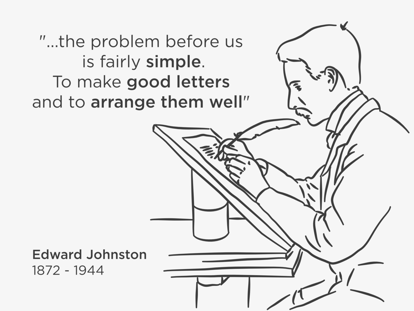
That designer was Edward Johnston. Johnston was commissioned by Frank Pick, one of the Underground’s driving forces, to create a typeface that unified all of London Underground’s lines, which at that point in 1912 were run by different companies with different branding. Pick had already rejected the W.H. Smith typeface, a serif typeface which was inspired by the fashionable calligraphy at the time because it would be too hard for travellers to read on the go. So, Pick asked Johnston for “a strong and unmistakable symbol” with “the bold simplicity of the authentic lettering of the finest periods”.
In 1915, Johnston answered with what would be known as Johnston Sans, a block letter typeface. A sans serif typeface might not seem all that revolutionary today, but in the early 1900s, the fashion was for more elaborate styles inspired by Victorian calligraphy. Johnston’s interest in earned him a lot of criticism from his teachers. Despite its being unfashionable, Johnston took his inspiration from the block lettering on tradesmen’s waggons and created a sans serif typeface. The result was a typeface that was easy to read at speed, and appealed to the people who were actually using the underground. The diamond shaped tittles (dots above the i) which Johnston Sans is perhaps most easily identified by, was, in fact, a nod to the popular styles of the time mimicking the angular mark made by a calligrapher’s pen.

Those touches were retained when Eiichi Kono was tasked with revitalising the typeface in 1979 in order to make it fit to be used as London Underground’s house typeface. Johnston’s original design was made for signs. At first, he didn’t even make any lower-case letters. So, when it came to updating Johnston Sans for wider print usage Kono had to edit some of Johnston’s original design, and add in some missing characters, to make it fit for purpose and to stop it being replaced by fonts like Helvetica.
Johnston New, Kono’s version of the typeface, then had to be updated again for the typeface’s 100th birthday. Kono, and certainly Johnston, could not have predicted the importance of the hashtag or the @ symbol when they were designing the font. In fact, @ was used in email addresses precisely because it was one of the least used symbols on a keyboard. Nonetheless, in today’s digital world, if Johnston was to be useful it needed to be able to accommodate both characters as well as several weights for digital use. That’s where Monotype stepped in. Not only did Monotype add in the missing pieces of Johnston’s font, they also took it back to its original width, at once making it more and less like Johnston’s first design. In the process of its updates over the past century, being taken from wooden blocks to metal, then to a digital form it had become narrower and narrower. So the Johnston100 you see on TfL documents and signage today is as close to the original as it can be in the modern day.
Johnston’s typeface hasn’t just been updated and adapted to suit a changing rail network, it was also the basis of another typeface which has shaped reading far more widely. One of Johnston’s former pupils, Eric Gill, further developed Johnston Sans. Gill, who is famous for both his design work and awful abuse of his daughters and dog, simplified Johnston’s typeface to create Gill Sans. The original design Gill Sans, a hand drawn sign above a bookshop, caught the eye of Monotype (yes, the same design house that recently created Johnston100), who commissioned Gill to create a full typeface. Since then, Gill Sans has become one of the most famous typefaces in the world as the choice for the covers of the classic Penguin book covers.
Just as Johnston’s typeface has been adapted and used far more widely than he may have ever anticipated, so has the roundel it is famously featured on. In 1908, the first roundel was simply a platform name board at the station we know today as St. James’s Park. Around 3 years later, the roundel became the official logo for the underground network. But it is not until 1917 when the new typeface is put on the roundel that it becomes a registered trademark. In the following years it undergoes a number of tweaks, but remains much the same and a symbol of London itself rather than just the underground.
This synonymy with London, is why, in 2000, when TfL was founded and became responsible for all of the transport networks for London rather than commissioning a new logo they stuck with the roundel, and just commissioned more variations. Today, the roundel has been edited to accommodate airports (Heathrow’s roundel features a little aeroplane symbol), clocks such as the ones at Bethnal Green and Redbridge, and coffee art as seen in the Transport Museum’s café.
As someone who is, often quite vocally, not a huge fan of the tube, learning more about its design history has definitely changed the way I approach my commute. Finding out more about the design thinking in the details in the environment around you can really shift the way you look at the world.


You re right..knowing the story behind something change completely your point of view on it. And for the persons the same thing. How many times it happens to me with men.
http://www.vivaguides.com/