The brain processes visual content 60,000 times faster than text so it’s no surprise that infographics have been proven to be a highly effective way of engaging people with information. Infographics are in fact 30 times more likely to be clicked on than a blog post. Brands, companies, and bloggers have all caught onto that effectiveness, and infographics have been booming.
This popularity has meant that more people want to give making them a go. So, building on my last workplace design tips post, I thought it might be useful to share some of my top tips and some helpful layout ideas for anyone wanting to give it a go either for work or just for fun.
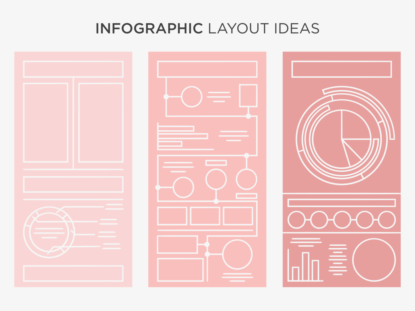
So how should you go about creating an infographic? The first thing you always need to do is to choose your content. There’s no point deciding you want to create an infographic if you don’t have anything to say with it. Once you have a compelling story to tell, work out what kind of infographic is going to convey that story best. The seven most common types of infographic are: visual articles (make a story more visual), data viz (best for stats based stories), maps (for geographical content), versus (for illustrating 2 opposing ideas), timelines (for historical content), lists (used to support a claim through a series of information), and processes (used to show logic, or give readers personalised choices). Then you need to plan. I’ve put 3 really basic layouts you can follow below to help you get to grips with organising your information.
As you start to populate your infographic, there are a few things you should bear in mind. First, make sure you tell a story with your infographic. I like to gather up all of my information on separate cards and just move it around to see what works best, layout and hierarchy are so important when you’re making such a big graphic. Once I’ve got the flow sorted I either add in the graphs or ideas of how I can visualise the information. I do this stage digitally because it’s easier to produce graphs and to manipulate sizing without having to redraw elements. I play around with scale, to make the graphic interesting and also to keep the reader’s attention where I want it to be. Normally, I do all of this in black and white because I’m just creating the structure, so the next stage is to add the colour. All that’s left to do then is a final review of the flow and also the shareability of the graphic I’ve created because you need to get the most out of what you’re making.
Keep the story you’re telling, and the rest of your infographic, really simple. People like infographics because they’re easy top digest so don’t overcomplicate it. To create that simplicity, make sure you stick to a basic colour palette, a short title, maintain some white space, and don’t overwhelm it with text. Also, please, don’t make it 20ft long!
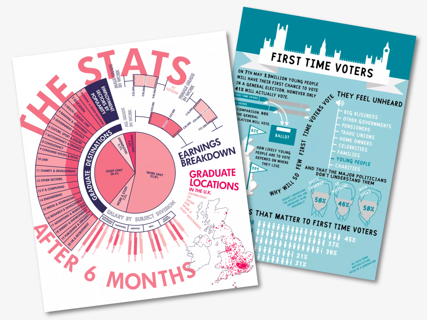
If you need some inspiration these are just a few of my favourites:
- The Blogging Food Groups: A Well-Balanced Diet of Content from LinkedIn
- Are We in the Midst of a Sixth Mass Extinction? by Bill Marsh, Sunday Review Graphics Editor, New York Times
- Jing Zhang’s Infographic Recipes (please please please check out the rest of this series, they’re so good)
- I’d also highly recommend checking out the infographics on Good.