After my post on my commission process to help explain some of the things on offer in my shop, I want to spend a little bit more time here talking about my work, and how it actually gets done. So, today, I’m going to talk you through a recent illustration project I took on at work for my old grad scheme website.
As a quick bit of background if this is the first post of mine you’ve read, last year I was a part of the Engine Graduate Scheme. The Grad Scheme is a year-long look into the world of marketing and communications, which comprises of four three-month long rotations in various best in class agencies covering everything from consultancy, to sport sponsorship, to events, PR, data and, of course, above the line advertising.
Every year the most recent group of grads take over the website, so this year it was our turn and we wanted to give the site a bit of a spruce up. The first step in this process was moving to the Engine Group site, from our .wordpress site. Then we moved onto content and visuals, which is what we’re talking about today.
So how did we go from a need for a new style to the site that’s up now?
CREATING THE BRIEF
First off, we came up with a bit of a brief, which was relatively informal and more of an agreement between ourselves as to what we wanted. We knew that we needed something fun and colourful and that suggested we were a more creative scheme than the visuals we had before.
As well as deciding what we wanted we also had to work out what our limitations were. We knew we weren’t going to be able to get any new photography done, so we decided to go with something illustrated. We were also limited by the structure of the web pages on the Engine site, which meant we were mainly just working with set header images.
But we also knew we’d need designs that could work for our social media in terms of branding and generating content later.
COMING UP WITH IDEAS
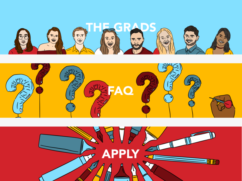
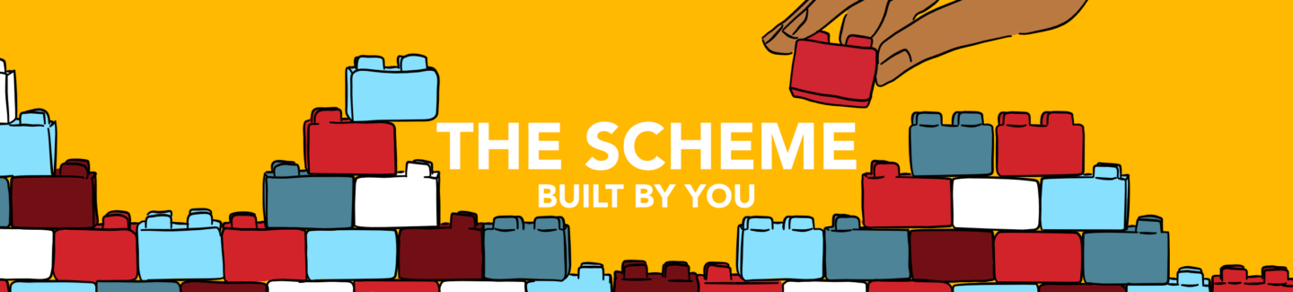
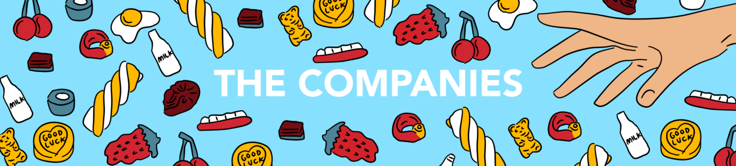
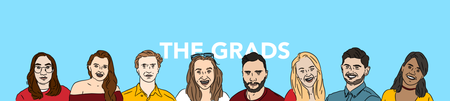
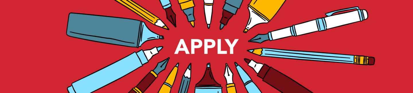
The ideas for the images bounced off the copy, for example, the sweets in the companies page came from someone describing the choice of placements as a bit of a pick and mix. The one image I really struggled with was the scheme page, so we came together as a group (over WhatsApp because I had a meltdown at 10 pm) and tried to come up with the simplest image for building we could, which turned out to be children’s building blocks.
THE ILLUSTRATION PROCESS
Then we got to my favourite part, the illustrating! I started by gathering reference images for the portraits, then drew from those. I also found references for the hands and the sweets in the companies header. Once I’d drawn the outlines of all of the images I came up with a colour palette. I started with the red of the Engine logo and worked from there, adding a darker version of the red, two shades of the blue, and the yellow for highlights. I stuck to this palette for everything other than the skin tones, and I think it really ties all of the images together.
SIGNOFF AND UPLOAD
As anyone who has ever made a commission like this knows, the work isn’t actually done until it’s signed off and on the site. In order to get sign off, I put the designs into very basic web page scamps in powerpoint, to give an idea of how the pages would come together. Once we’d made all of the amends to the copy and visuals we needed to, I worked with the guys who run the Engine site to get everything live which included editing sizes and doing a few tests on a staging platform. I also made versions of our imagery for the scheme Facebook and Twitter.
If there’s something you’d like to work on together, or you just want to say hi, feel free to drop me a line!