I’m not quite ready to call myself a Londoner, but every passing month I do grow to enjoy and feel more comfortable in the city. So I wanted to take a moment to step back, be a bit of a tourist, and introduce you to some of my favourite London design icons.

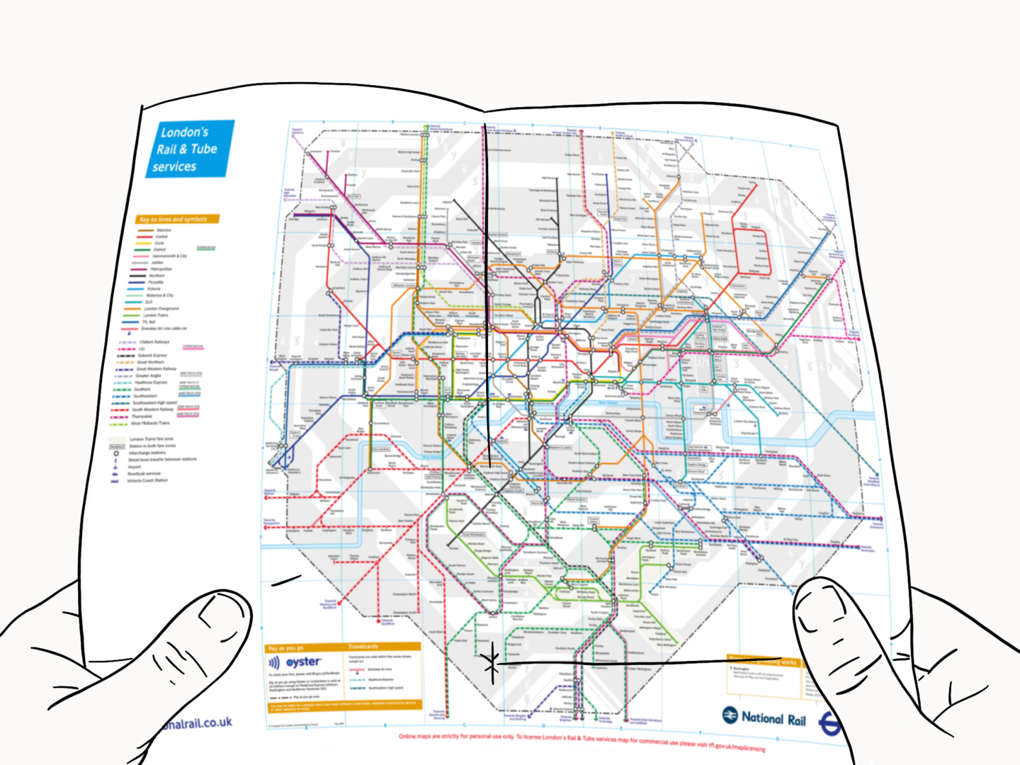
Tube Map
I’ve already written about the design history of the Underground signs, as created by Edward Johnston. So instead today, I wanted to talk a little bit about the tube map.
Who designed it?
The tube map we all know, love and use to navigate the city was drawn up by the electrical draughtsman, Harry Beck in 1933.
Why is it a classic?
Beck took a different approach to transport map design. Rather than sticking with the classic method of basing the map on the geography of the network, which left the map looking busy, Beck decided to draw up his design using the style he was used to when drawing up circuit diagrams. It was a little too ‘out there’ for the board but as soon as it was put out into the world in test poster form, they realised it was what the people wanted.

Red Bus
Although the mayor stopped ordering the original red double deckers, in favour of something a little more modern, and a little cheaper, they’re still something tourists always seem to want to catch a snap of.
Who designed it?
In the early 50s, a team directed by AAM Durrant and Colin Curtis designed the original AEC Routemaster so it was lighter and easier to maintain. Then Douglas Scott styled up that efficient people carrier into the big red bus we all know and love.
Why is it a classic?
The big red bus was so well designed that it outlasted all of its competitors, and ran on the streets of London, with a few accessibility updates, until 2005. Even then, when Thomas Heatherwick came in to create the new Routemaster he knew he had to stick closely to that classic red design. In terms of longevity, I can’t imagine a London without some form of the red bus on its streets.

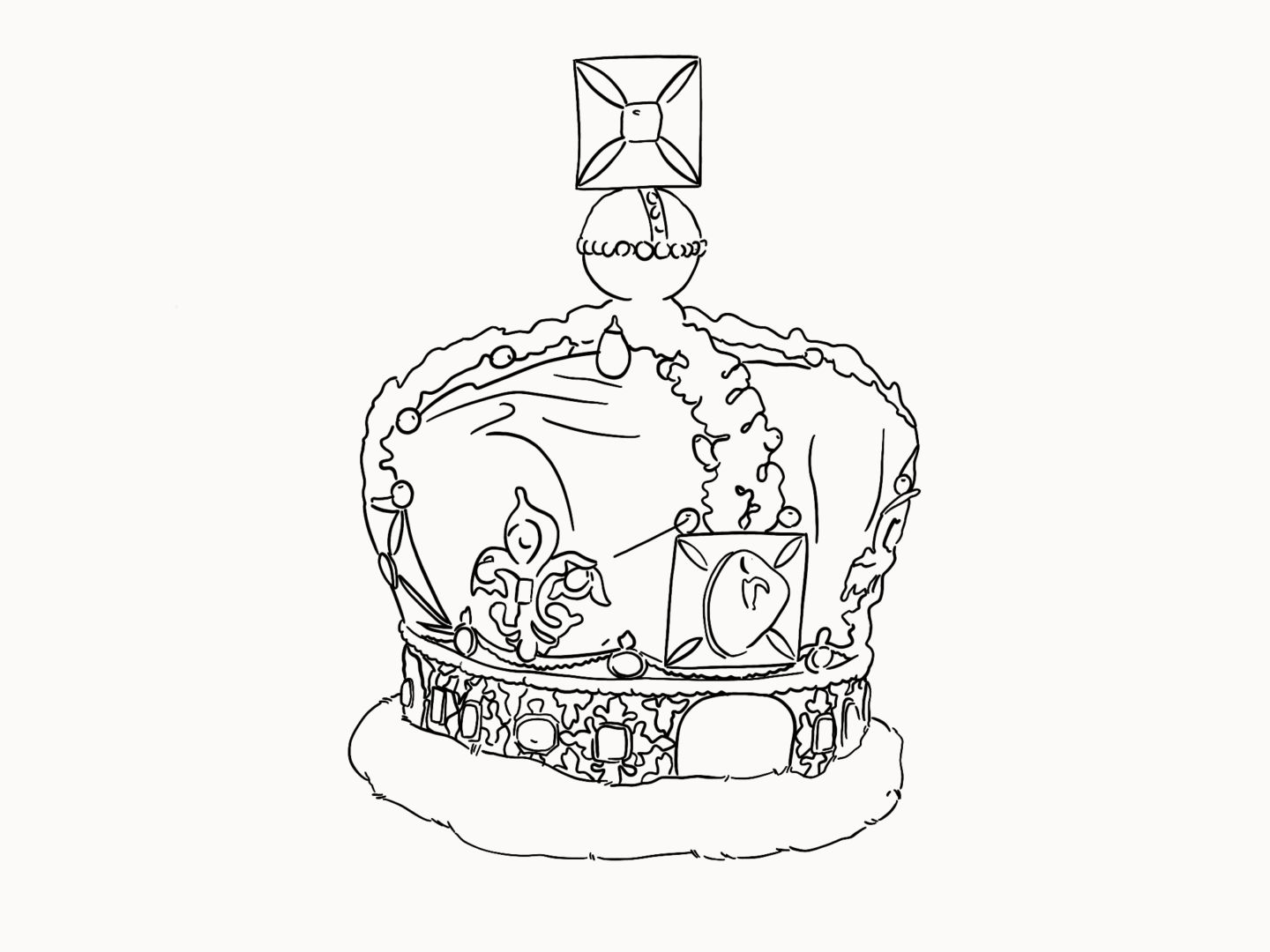
The Imperial State Crown (the one Queen Elizabeth wore in her Coronation)
I know that the provenance of many of the jewels is problematic. But there’s no denying that the Imperial State Crown is a British icon.
Who designed it?
Commissioned for the coronation of King George VI on 12 May 1937, the Imperial Crown was designed by Rundell Bridge & Rundell, with all of the jewelling done by Garrard & CO.
Why is it a classic?
Do I even need to explain this one?

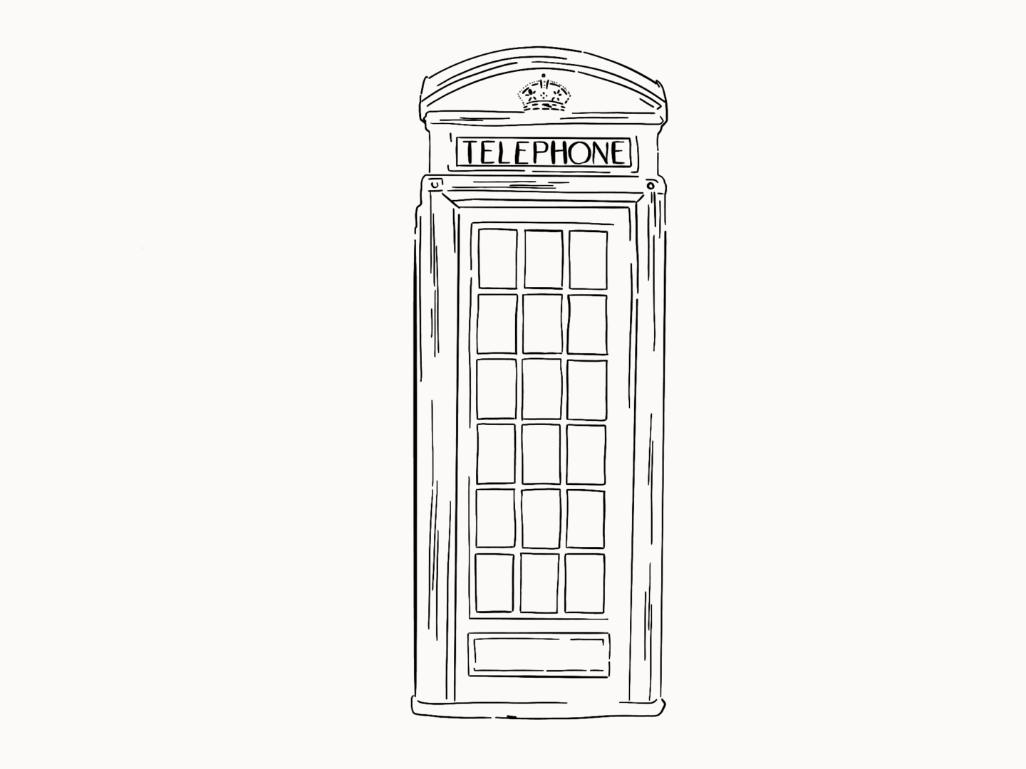
Telephone box
So we may not use them as much as we used to, they may be being replaced by wifi hotspots, but the red telephone box is still on every other postcard for the city.
Who designed it?
The man behind the phone box is famed architect Sir Giles Gilbert Scott – also known for his work on Waterloo Bridge, Battersea Power Station and so much more.
Why is it a classic?
The phone box we all know and love is the K6 model, because, you guessed it, it was the 6th version to hit Britain’s streets. Its currant red was introduced to catch the eye. I love that the phone box was introduced by the Post Office to increase communication around the country, and they were not just used in the UK, but in Bermuda, Malta and Gibraltar as well!

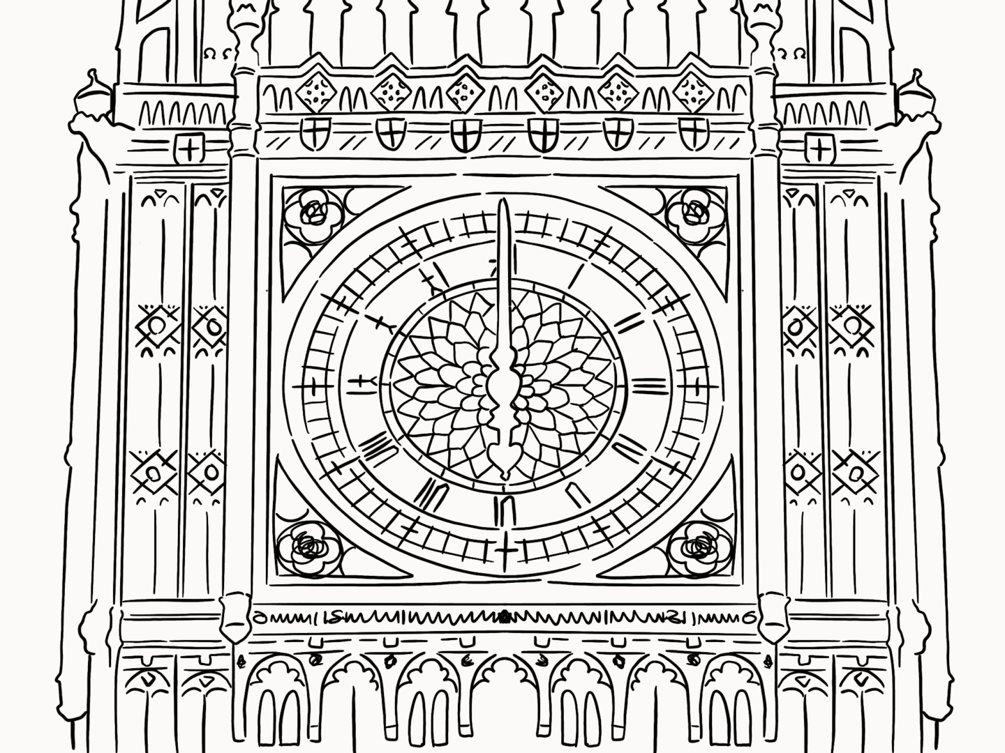
Big Ben’s Clock
Even though Big Ben is currently hidden by scaffolding as construction work takes place to help preserve its grace for future generations, it’s still one of my favourite London sights. But there’s one element of Big Ben I love the most, that’s it’s signature tick-tocking clock.
Who designed it?
After the fire that destroyed the Palace of Westminster in 1834, Edmund Beckett Denison and Edward Dent (the two Eds) designed the clock which sits in the tower.
Why is it a classic?
So the thing I love the most about the clock is how it came about. George Airy (astronomer to the stars) wrote up the requirements for the clock, with the first and foremost being “The Great Clock should be so accurate that the first strike for each hour shall be accurate to within ONE second of time.” All the clockmakers in the land said it couldn’t be done. That was until Ed Denison stepped up. He wasn’t a professional clockmaker, he was a lawyer, but he loved clocks. So he wasn’t afraid of the challenge and just wanted to try. He got some help from fellow clockmaker Ed Dent, and the pair came up with a revolutionary double escapement design. Proof that even amateurs can redesign a national symbol.


