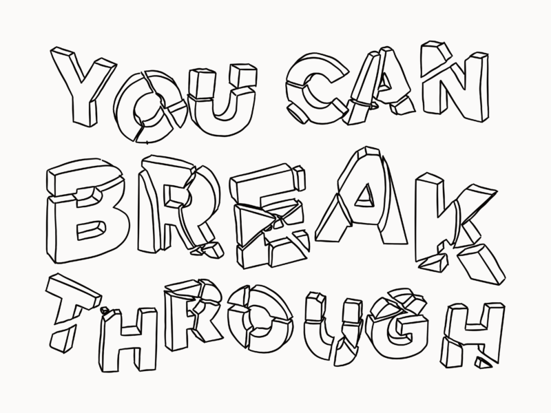
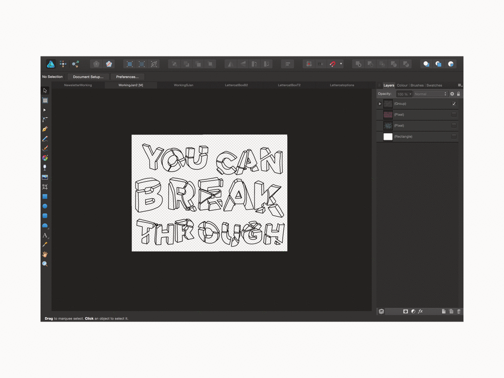
This year I want to share a bit more of the process around my work as well as few more tutorials and tips, so today I’m killing two birds with one stone and showing you how to do the exploded lettering I did for Oxford University Drama Society’s festival ‘Breaking the Fifth Wall’.

I’ve only recently started playing with lettering within my work but I’ve really enjoying it. So, when OUDS got in touch with me and asked for a graphic to go with their festival of drama centered around women breaking through the glass ceiling, I knew I wanted try something lettering based. I’m really pleased with how the final piece turned out. I think it definitely illustrates the spirit of the festival in a simple but fun way. 

Here’s how I did it.


FYI I’m using Affinity Designer and a Wacom Bamboo tablet to draw with, but you could also easily use illustrator or even photoshop (with a few tweaks) to do this.


Step 1

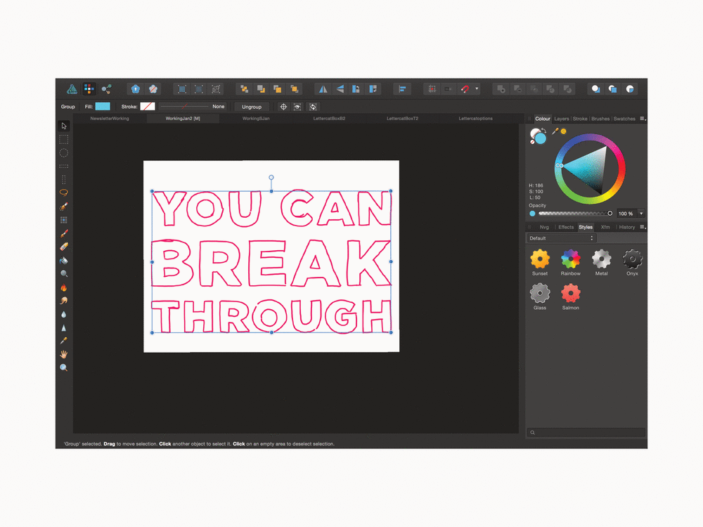
First, I just drew out the text. I used big block capitals because I knew I was going to break them up so they had to be clear and have a bit of weight to them so the text was still readable after it had been smashed. 

Side note: I always do all of my rough sketches in bright colours because I find them easier to work with.

Step 2

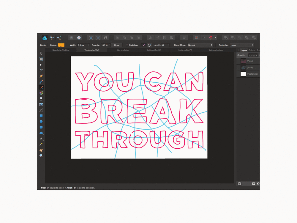
Then, I added in the smash lines. I had a look at some images of broken glass and found tried to replicate their patterns to make the smash a bit more believable.
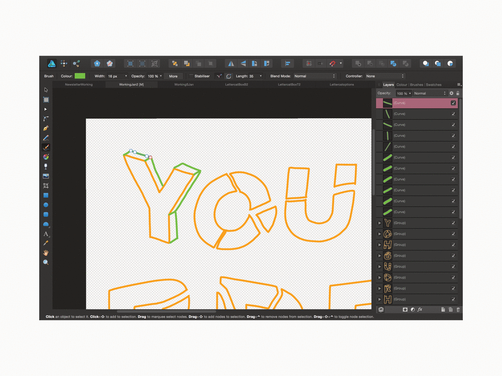
Step 3

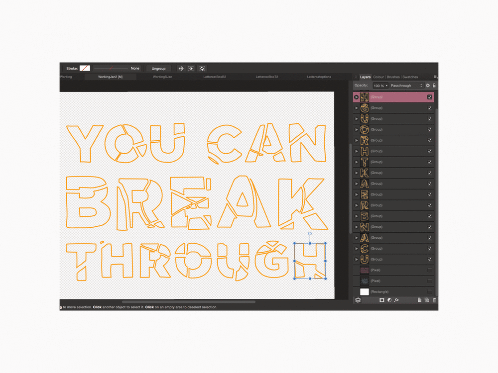
With all of those rough outlines in place, I traced over the individual broken sections of the letters to create vector line illustrations of the smashed letters.

Step 4

Once I had the vector illustration of the letters, I got rid of the pixel guides. I separated them out a bit more on the page to give them the feeling of really having been smashed. I made sure to try and strike a balance between exploding the individual pieces and maintaining the integrity of the letters so that you can still read the copy.
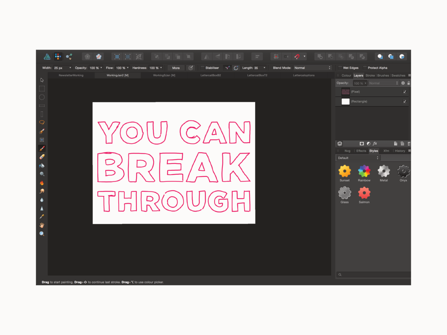
 

Step 5

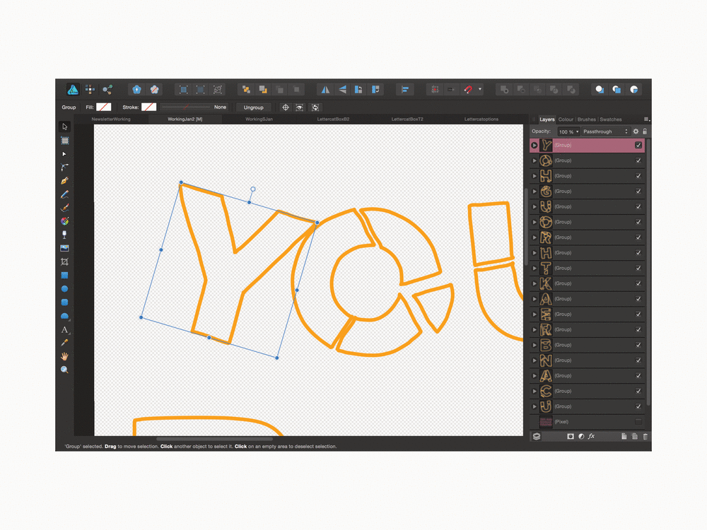
When I was happy with the composition, I took each individual letter (by grouping sections) or individual broken piece and sheared it. To do that I rotated the vector a little and then used the shear function so that the vertical lines were still vertical – I’m hoping the imagery above explains that a bit better.

Step 6

Next, with the letters all tilted, I added in the lines that give the letters some depth and the appearance of being three-dimensional.


Step 7

Then, all that was left were any final adjustments.

 And that’s how it’s done.


Let me know if you try out this method or style, and if there’s anything else you’d like to see how tos/tips on!

A little while ago I was catching up on Austin Kleon’s wonderful blog and read his piece on the importance of revisiting and revising old notebooks and it got me thinking about revisiting old sketchbooks. I don’t revisit old rough books that often, but I’m making a concerted effort to dip into them every once in a while, now.

EXCELLENT!

Here’s why:

1. It reminds you of the importance of keeping a sketchbook

I’ve written before about the struggles I’ve had in keeping a sketchbook. It’s only something I really got into properly last year, and since then I’ve certainly had blips. But taking the time just to skim through an old sketchbook is a great reminder of what you can get out of the process. Personally, it also gives me a sense of pride when I get to go through a full sketchbook – a feeling I always want to recreate.

 2. It shows you how much you’ve grown

Seeing your old work is a great way to evaluate how far you’ve come, in whatever it is you’re making. In a world where’s increasingly easy to compare yourself (unfavourably) to others, it’s really refreshing to compare your present-self with your past-self. I can guarantee you will have grown. But you might also find something in you did ages ago that you want to go back to if you feel you’ve lost your way.

3. It’s a great source of ideas and inspiration

On that note, going through past work allows you to revive old ideas. Quite often you end up abandoning work you do in a sketchbook or at least parts of it. Revisiting those ideas can help you come up with something new. Just because something didn’t work then doesn’t mean it won’t work now. You will have new perspectives, you will have grown (see point 2) and you will have new bits and pieces of ideas you can stick together. So, if you’re feeling like you’re in a creative rut, or like you’ve got creative block, why not try reaching back inside of yourself to provide that inspiration?

4. It gives you the opportunity to revisit and revise work to make it better

This is only something I’ve only started doing recently, with super old Instagrams, but reworking old pieces can be really rewarding. I feel like we’ve all had the “ugghhhhh” feeling when looking at something we made a few years ago. Revising those pieces with any new-found skills or in a different format can be a great way to get some practice. It’s often more of a technical challenge where you are out to beat yourself. This is one for if you have some downtime and want to work on your skills – I know some people who revisit the same piece every year to see what they can bring to it afresh every time.

Do you revisit your old sketchbooks or rough work?

There’s been a lot written about how we’re being bombarded with more and more digital distractions. There have been studies into how it’s effecting our memory and attention spans*, and think pieces on how it’s bad for our productivity. But is digital distraction bad for our creativity?

On one hand, there are some people who would emphatically say yes. When it comes to making focused work being sucked into the black hold of related videos on YouTube isn’t exactly ideal. Sometimes you need to just focus on making something with your hands away from a screen.

Plus, if our tendency to just keep scrolling has shortened our attention spans, creating detailed or labour intensive work is going to be harder. We’re also less likely to have the patience to draft and redraft in order to make the best work that we can, and to shy away from the tough tasks that will require delayed gratification.

On the other hand, isn’t distraction where a lot of our best ideas come from? And isn’t the digital world just as big a part of our lives as the physical world? According to one scientific study the more creative you are the more likely you are to be distracted by what’s happening around you.

When it comes to brainstorming, the best creative minds draw from a number of sources including things they’ve picked up distractedly browsing Instagram as if by osmosis. The web is an infinite source of content and distraction, or potential idea fodder, and who’s to say that content is any less meaningful if it’s online. 

Digital distraction, in moderation, I believe, is good for creativity, at the idea generation stage at least.

But it can’t be our only crutch, and it is something you should be aware of, because it can quickly spiral into something negative. In short don’t forget to go outside, speak to people in person and touch real objects too. Finding out what makes your audience tick face to face is an invaluable resource, and fresh air and quiet is so good for you. That might mean limiting your scrolling time or actively scheduling in time to go for a wander without your phone depending on how your day works. But as with everything, balance is key.

How does digital distraction impact your work? Do you actively limit your screen time?

*Digital distraction might not have actually made any difference to our attention spans

As I mentioned in my look at the year ahead, I’m starting a monthly roundup filled with great links and new favourites who are worth a look. This is that roundup.

For this week’s roundup, I’ve tried to avoid the January trap of yearly summaries and resolution reflections. Instead, I’ve focused in on some inspiring design stories as well as a few pieces that really made me think, in the hopes they’ll motivate you for different reasons.


Short Reads, if you’ve only got a few minutes:

1. The best ‘design‘ books that aren’t explicitly about design.

Daniel Burka asked a whole bunch of designers what books, which weren’t specifically about digital or graphic design, inspired them, and he got some great responses

2. The Hospital Gown Gets a Modest Redesign

In partnership with students from Parsons School of Design, Care and Wear has created a hospital gown in a kimono-inspired style, so, at long last, it actually works.

3. Watch: How To Watercolor x Palms | Botanical Illustration

Watch Jess Engle, of Studio Jess, create a simple a palm leaf painting. It’s so soothing and if you’re looking for an easy, but lovely, creative project this would be perfect.


Long Reads, if you want something to get your teeth stuck into:

1. How Don Bluth changed the face of feature animation

From his studio in Dublin, the American animator rivalled Disney during the 1980s and early ’90s.

2. Tiny Wins

Joel Califa talks about the power of small changes when improving how users interact with your designs.

3. Here’s My Problem With the Google Arts & Culture Face-Matching App
Kim Sajet, the director of the National Portrait Gallery, offers ideas to make the Google’s now wildly popular face-matching app better.

4. Björk on creativity as an ongoing experiment

Björk talks to The Creative Independent about what makes a good collaboration, why she doesn’t get creative blocks, the value of being grateful in your work, and why she likes projects that aren’t overcooked.

Who to follow, if you want to spruce up your Instagram feed:

  1. Matt Dorfman – Matt’s collages and editorial work are always top notch
  2. Anastasia Tasou – Anastasia’s feed is full of positivity and words of encouragement, and who doesn’t need a little bit more of that in their lives?
  3. Skinkeape – some of my favourite sketches on Insta
  4. Claire Leach – some of the most stunning and detailed black and white drawings of nature

If you want to get more links like these in your inbox every Sunday, along with insights into my work and a few freebies then you might want to sign up to my newsletter.

Sign up for more updates

* indicates required


If asses are made by making assumptions, the design world is all out of room for them in 2018.

Up until now the world has been designed based on the assumptions of those who were in charge that everyone else was just like them. So, as white men have been in power for so long, that means that the world is designed to work brilliantly for a white man and not really for anyone else. Danielle Kayembe has a fascinating list of some of these assumption-based designs in her excellent piece The Silent Rise of the Female Driven Economy.

But, I’ll share a few examples here too. 

There’s a reason there’s always a much longer queue for the female toilets. Many women struggle to open push/pull doors because they were designed with the tensile strength of the average man in mind – presumably because they were the people doing the designing. Petite female crash test dummies weren’t mandated to be used in vehicle tests until the 2010s meaning there was a risk they hit the airbag chin first, snapping their heads back, leading to serious neck and spinal injuries. Passports, in the UK at least, are available with a braille sticker. However, this sticker just says the word “passport” rather than any of the useful information a blind person might be looking for in their passport. And to round things off, if you didn’t read about this automatic soap dispenser that doesn’t recognize darker skin tones, prepare to get mad. 

Now, catering for those who have needs outside of those of the 95-percentile man isn’t something new. But it is something that has previously been seen as something of a party piece. Brands and design studios would design specialist inclusive products to enter awards or as a PR exercise. These are often great pieces (or at least great-looking) pieces of design, but less often made into a reality. Catering for anyone who, if we’re speaking in broad terms, wasn’t white, middle-class, male, and able-bodied, was an exercise outside of their everyday. It was separate to how they saw their business identities.

But there’s change afoot.

Government services, through GDS, are leading the charge on digital design that works for everyone, by focusing on those who might need the most support don’t face any barriers to accessing their services. This means people who are hard of hearing or have visual, cognitive or motor impairments. But beyond that, it means all users – not just those with permanent disabilities.

Brands like Fenty and Nubian are making everyday products that work for a wider range of people, because sometime one size, or one shade of “nude” doesn’t fit all. They’ve put this inclusivity at the heart of their brands and it has paid off in spades 

Then you have a brand like Heist tights, who have taken a product we all have in our homes, tights, and asked the question “why does wearing tights have to be the worst?” They put in their user research, found the pain points, and actually designed a product that works for the people who use it. Unsurprisingly, they’ve had somewhat of a hit on their hands.

As is proved by the success of the companies mentioned above, getting to know your user putting building something that actually works for them at the center of your business pays. Plus, as more and more companies who genuinely put the user first and focus on diversifying their design teams in order to do so spring up it will soon be damaging not to.

So, in short, there’s no more room for asses in design in 2018.