I’m quite picky about what comes into my inbox these days. I used to give my email address to anything and everything, but now, after having a massive clear out of store subscriptions, I do my very best to only sign up for emails that bring me some joy. These 10 newsletters are some of the best, brightest and most inspirational from my inbox that I would love to pass onto yours.

AUSTIN KLEON

Austin Kleon has been an inspiration of mine for quite a while so it’s always a thrill to get a rundown of the articles and artists who are inspiring him delivered straight to my inbox. Each of his emails includes a list of 10 (or so) links to things he’s seen over the week as well as the occasional doodle and killer book recommendation.

CREATIVE ONLINE STRATEGY

I professed my love for Meighan O’Toole in my run down of inspirational blogs a while ago, so it will come as no surprise that I adore her newsletter as well. Her email correspondence is jampacked full of tips for getting the most out of your online presence as well as her thoughts and musings. I normally get to the end of her emails and feel that bit more prepared to tackle life online. Also, is it weird that because her emails always start Hi Natalie that I like to pretend she’s written just to me?

ANNE T DONAHUE

This is one of the select few newsletters I actively get excited for when it arrives and have to try work pretty hard to save it for the tube ride home. I look forward to it with the same passion and desperate anticipation as I do my mum’s Sunday roast when I’m home. Unlike many of the newsletters on this list, Anne’s is a long personal note rather than a list of other bits of inspiration. She either writes about her own experiences of trying to grow up and find her place or reader’s questions on similar topics. If you’re ever anxious about your place in the world, trying to navigate being a “grown up”, work, life, the usual, this one is so for you. Everything she writes is just so relatable and real, but so damn well written. So well written, in fact it has inspired me to try and improve my own writing. It honestly reads like a letter from a friend every single week. It genuinely makes me feel a bit better, and lighter every week. It’s also damn funny. I just really love it okay?! If that’s not enough for you, she ends each one with a gif of Leo DiCaprio – what more could you want?

BRAIN PICKINGS

The Brain Pickings newsletters isn’t necessarily a creative newsletter but it does inspire me. It is one of the longest on this list and includes a series of articles and thought pieces on everything from design to philosophy to psychology and science which aim to make you think. Every Sunday it encourages me to examine the world in a slightly different way.

MY MORNING ROUTINE

My Morning Routine is pretty much exactly what it says on the tin, it’s interviews with the brightest and most creative folks out there all about their morning routines. That might sound like it would get repetitive but honestly, they’re all so different and each one feels like a private insight into the interviewee’s life. Plus, they really make you reflect on how you use the first hours of the day yourself.

POCKET

I love pocket as a tool. It has got my intense tab habit under control by making it super easy to save and file away articles to read later. I also love using its explore function to find new articles to read that I wouldn’t have found otherwise. The Pocket newsletter makes that second function even easier, it’s a daily digest of the most clicked on articles from around the web, and there always seems to be something that catches my eye in there.

GOOD FUCKING DESIGN ADVICE

GFDA’s newsletter is one of the shortest on this list but it packs a mighty little punch. Every week you get sent one piece of their great, and slightly sweary advice, to give you the kick up the behind that you undoubtedly need.

TINA ROTH EISENBERG

Tina Roth Eisenberg AKA Swiss Miss is one of the most badass creative lady bosses out there. She founded CreativeMornings, co-created a to-do app called TeuxDeux, founded Tattly, a designy temporary tattoo shop as well as a co-working space called FRIENDS. Her newsletter is, much like her blog, an array of the coolest design projects from all of the corners of the web curated by Tina’s keen eye.

TOBIAS VAN SCHNEIDER

I had to include Tobias Van Schneider’s newsletter on this list. I think Randy Hunt, Etsy’s design VP, sums it up perfectly “Tobias’s emails are little peeks inside a big imagination”. They’re not just run downs of Tobias’s inspirations they’re little insights into his brain and personality which is what’s best about them.

TIFFANY HAN

I know I’ve mentioned Tiffany’s work before in my round up if my favourite podcasts but I had to include her here as well because her newsletter always puts a pep in my step. Much in the same vein as her podcast, and her work in general, Tiffany’s newsletter is filled with words of wisdom and encouragement for living a creative life. Her newsletter comes across as just so Tiffany, that you can almost hear her reading it to you and it makes her “just go do it” message even more powerful, because it feels like it’s coming from a friend.


What do you look forward to arriving in your inbox? What else should be on my list?

While you shouldn’t judge a book by its cover, sometimes those covers are so lovely that they need just as much attention as the book inside. When I was little I really wanted to be a book cover designer (amongst a few other things) and I still kind of do, and I’ve been working on that urge as a part of my book club, where I review and redesign a book every month.

I love great book cover designs, and there have been so many that have stuck with me and inspired me through the years. So, I thought I would share some of my favourite book cover designs (I’m sticking mainly to novels here), and a little bit about why I like them. These are listed in no particular order, and there are so many I haven’t mentioned, but these are 25 covers I love.


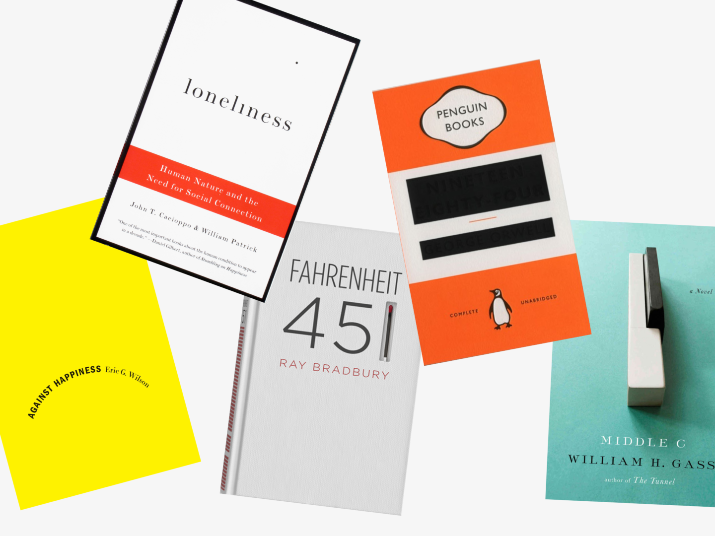
Against Happiness, Eric G. Wilson

Designer: Jennifer Carrow

This cover is essentially just text on a blank background. But the choice to turn the text into a downwards curve, an upside-down smile, conveys the book’s subject matter more effectively than any other image could. That frown in contrast to the supposedly happy bright yellow cover not only catches the eye but draws it in to find out more.


Loneliness, John T. Cacioppo

Designer: Peter Medelsund

This is another simple typographic cover (I just love them okay). The dot of the i in Loneliness has drifted off. This subtle detail poses a puzzle for the viewer and beautifully illustrates the idea of loneliness.


Fahrenheit 451, Ray Bradbury

Designer: Elizabeth Perez

Whenever I think of clever cover designs, my first thought is always this experimental cover for Farenheit 451 by Elizabeth Perez, which beautifully capture’s the novels central image of the burning of books in a really impactful way.


1984, George Orwell

Designer: David Pearson

My second thought is always this updated version of 1984 by David Pearson. The idea of censoring the key information on a novel which focuses so much on the control of information is just genius. You can tell that the designer worked really hard to leave just enough of the author and title on the cover, through the use of embossing, whilst seeming to remove them from the page.


Middle C: A Novel, William H. Gass

Designer: Gabriele Wilson

This cover is as perfect a visual interpretation of the book’s title as you could imagine. A singular middle C, that apparently was quite tricky to get hold of, photographed on the most beautiful and slightly melancholic light teal background.


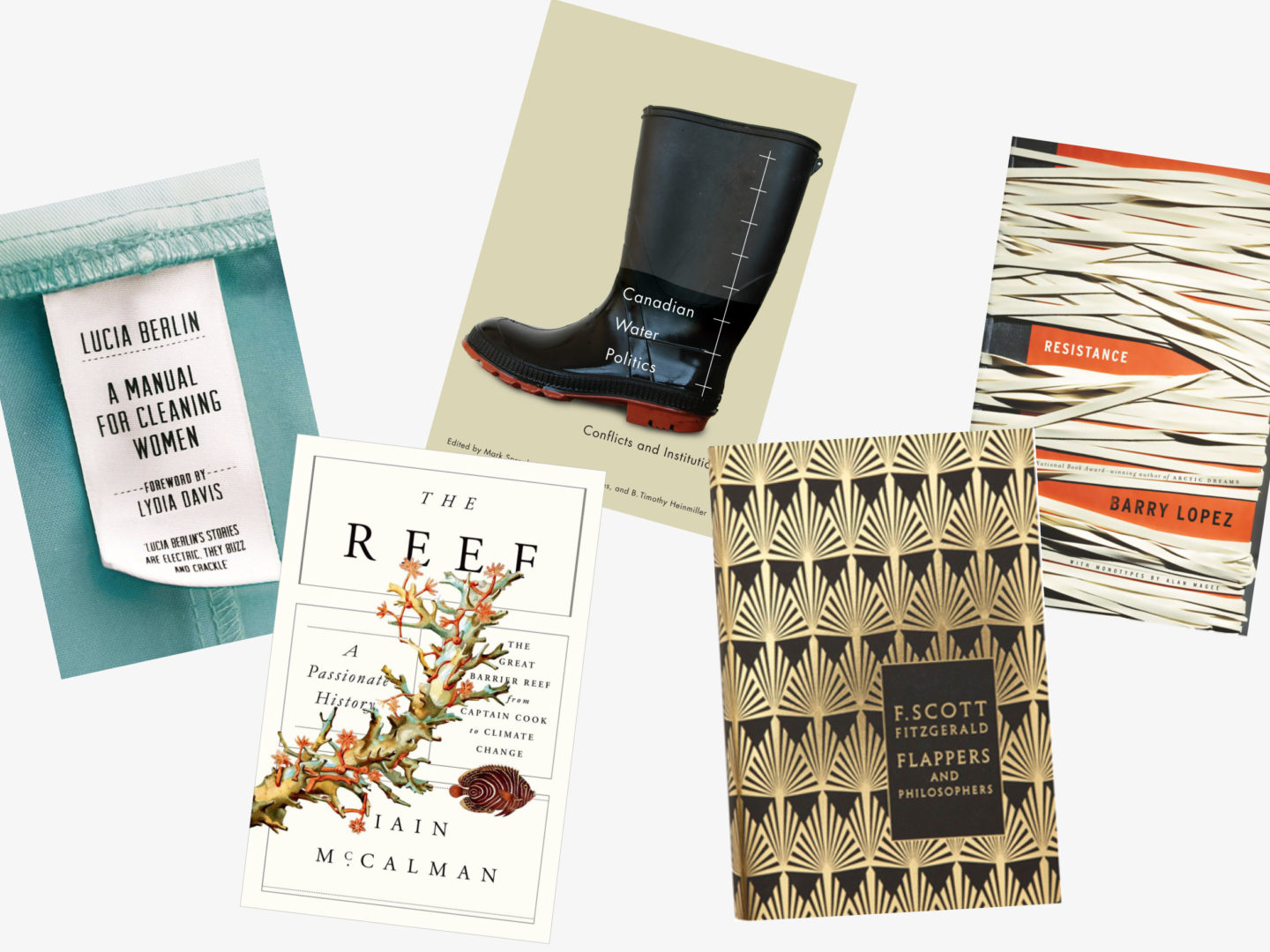
Resistance, Barry Lopez

Designer: Gabriele Wilson

Gabriele Wilson’s photographic cover for Resistance evokes a real feeling in the viewer. It’s not hard to imagine the taught resistance of all of those layered rubber bands. The earthy, almost sepia tones, always remind me of much older books and give what is quite a modern cover a grown up feel.


A Manual for Cleaning Women, Lucia Berlin

Designer: Justine Anweiler

This one is clever, beautiful and so so well made. I love that they actually made the clothes label, the commitment to the concept is what sells this cover in my opinion. It also doesn’t hurt that the idea of seeing inside the striking blue uniform is a lovely play on the novel’s look inside the lives of the women who wear those uniforms.


The Reef, Iain McCalman

Designer: Oliver Munday

I’m not entirely sure why I like this one. I think it’s just how well it is balanced and the way that it updates vintage botanical illustrations in a really aesthetically pleasing way.


Canadian Water Politics, Mark Sproule-Jone, Carolyn Johns & B. Timothy Heinmiller

Designer: David Drummond

I’m a sucker for simple well placed sans serif text on image covers, as you will know if you read my book club on The Shepherd’s Life which has the most stunning cover. Everything about this cover is so well placed and considered despite each element being very unassuming on its own. The composition of this cover really elevates an academic text on what might not immediately seem like the most interesting topic to something special.


Flappers and Philosophers, F. Scott Fitzgerald

Designer: Coralie Bickford-Smith

I love the entirety of Coralie Bickford-Smith’s F.Scott Fitzgerald series, the gold foiled art-deco patterns not only capture the spirit of the age in which Fitzgerald was writing, they’re also elegant enough that you can picture them sitting on his shelves. I picked Flappers and Philosophers simply because I love the pattern and I thought it might break up the high number of white/light covers I’ve picked for this list.


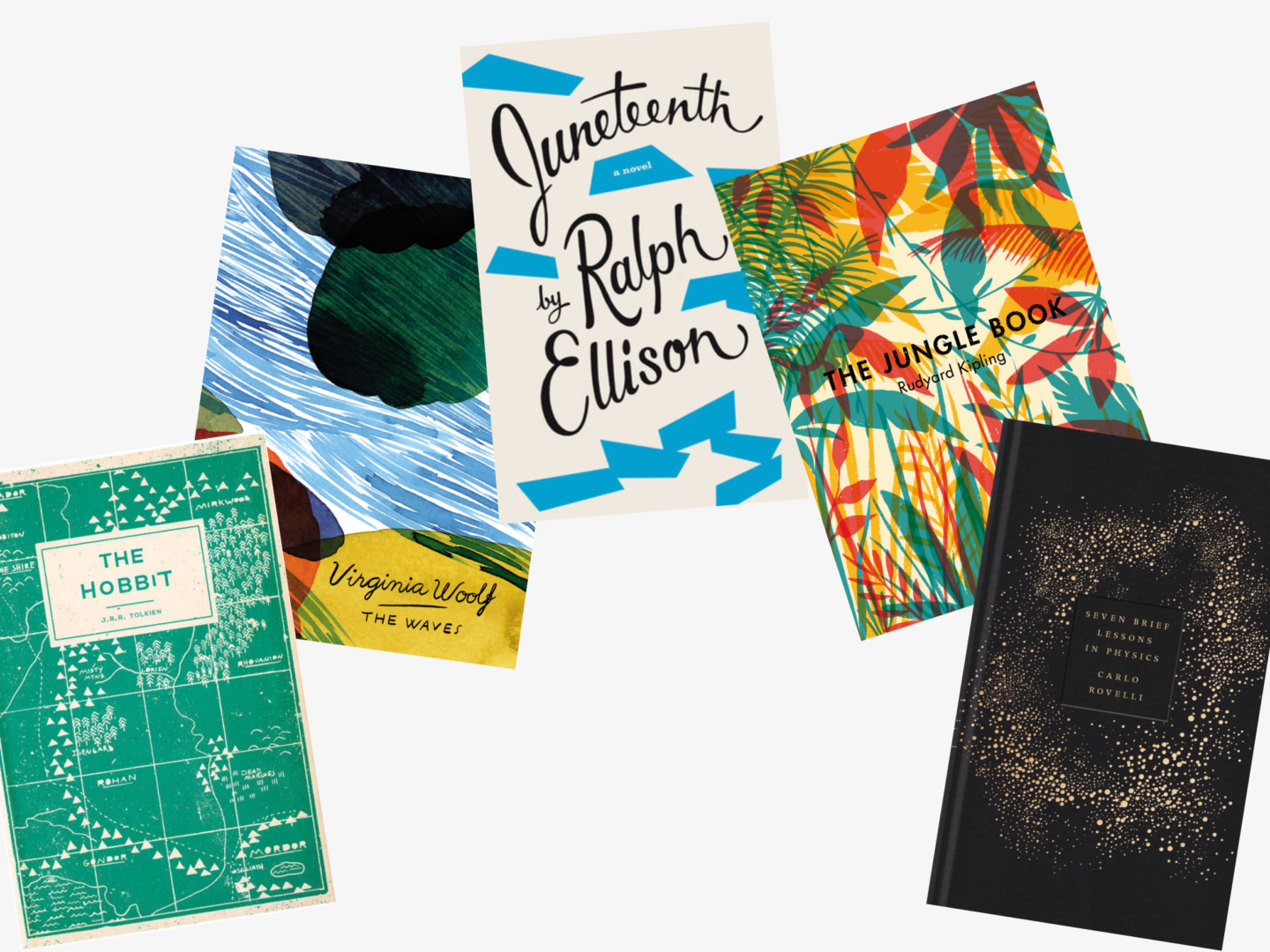
The Hobbit, J.R. Tolkien

Designer:  Adam Busby

Adam Busby’s cover for The Hobbit sadly isn’t real. Despite it’s being a mock cover, I absolutely love its design. The flat map design is at once a nod to The Hobbit’s past and a move to bring it up to date with the present. It wouldn’t be hard to imagine a character in a Wes Anderson movie pulling this version of The Hobbit out of their neatly packed suitcase.


The Waves, Virginia Woolf

Designer: Aino-Maija Metsola

Aino-Maija Metsola designed a series of these abstract covers of Virginia Woolf’s novels. The choice to go abstract really fits with Woolf’s modernist style which often relies on fragments and feelings to convey its messages in the same way these covers do. All of them are equally lovely so I chose The Waves, because it’s my favourite Woolf.


Juneteenth, Ralph Ellison

Designer: Barbara De Wilde

This jazz inspired cover is part of a whole series of Ellison’s works reimagined by Barbara De Wilde. What really struck me about these covers is how fun they are and how they really capture something of Ellison’s energy. I also love that when they’re stood together the colour blocks on the spines of the books come together to create a similar irregular, jazzy pattern.


The Jungle Book, Rudyard Kipling

Designer: Tatiana Boyko

Tatiana Boyko’s use of primary colours and simple leaf shapes reflects what an important, foundational work of children’s literature The Jungle Book is. But it also makes the cover feel modern due to its minimal style and centrally placed block sans serif title.


Seven Brief Lessons in Physics, Carlo Rovelli

Designer: Coralie-Bickford Smith

This one is just stunning, I mean look at it!


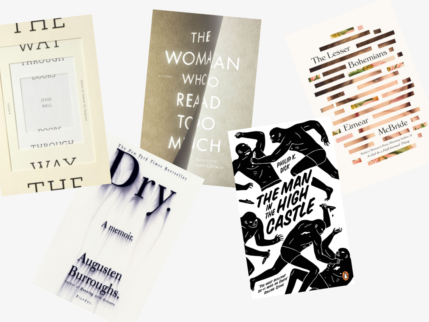
The Way Through Doors, Jesse Ball

Designer: Jason Booher and Helen Yentus

The cover for The Way Through Doors is potentially one of my favourite papercut covers ever, even though its paper element is so simple. The way that the title is divided on either side of the cut to literally allow you to see the way through it is so clever and really well done, this could easily have been a cover that was much too hard to read to be effective. For me what really makes this cover though is the fact you can see it’s real paper in its colour and texture. The little touch of the sideways extra text is so lovely as well.


Dry, Augusten Burroughs

Designer: Chip Kidd

There’s a reason Chip Kidd is thought of as one the masters of book cover design. The visual irony of this cover reflects perfectly the idea of an alcoholic in denial which features prominently in Dry. It’s seemingly simple cover but so effective.


The Woman Who Read Too Much, Bahiyyih Nakhjavani

Designer: Anne Jordan

There is something fleeting about Anne Jordan’s use of light to create this cover. I love how the text spreads between the two pages whose division feels almost sculptural.


The Man in the High Castle, Philip K. Dick

Designer: Cleon Peterson

Cleon Peterson’s illustrations for Philip Dick’s The Man in the High Castle are so visceral and convey a sense of pace and drama about the novel. The figures on the cover almost don’t look human as they attack each other with knives. The entire composition appears to be set on a diagonal driving the action forward and setting the scene for some precarious tension in the novel.


The Lesser Bohemians, Eimear McBride

Designer: Oliver Munday

Oliver Munday features in this list 3 times with good reason, he makes stunning work and this cover for Eimear McBride’s The Lesser Bohemians. His fragmentation of the portrait leaves just enough of the woman’s face there to be identifiable whilst interspersing it with text and fragments of a floral painting, which come together to produce a cover I would not be opposed to have hanging on my wall as a work of art.


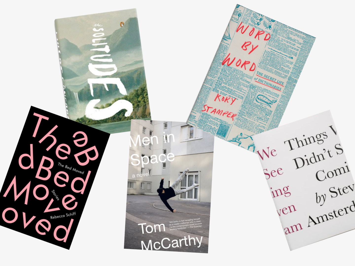
The Bed Moved, Rebecca Schiff

Designer: Janet Hansen

Yes, it’s another typographic cover. I love how fun this one from Janet Hansen is though, with its scattered letters reflecting the book’s title. The way the non-scrambled text is still placed on angles and slotted between the big pink text means that it doesn’t detract from the design or spoil the fun. I’m also always a sucker for a bit of pink.


The Solitudes, Luis De Gongora

Designer: Eric White

The way the hand type comes vertically through the centre of this cover is just magical. The muted blue grey tones of the background scenery give it a sense of atmosphere, and make the white text seem even bolder. Also, can we talk about how perfect the placement of the Penguin logo is on this cover please?


Men in Space, Tom McCarthy

Designer: John Gall

The way that the figure in this photographic cover is hovering in the air is marked out perfectly against the pale urban setting in his black hat and jumper, the focus is always on this man caught in the space. The choice to have the text edge just slightly off the page expands the space beyond the physical bounds of the page without ever distracting from the singular focus of the figure. I think it’s also worth noting that John Gall designed a series of these covers, each a little different, so it would work digitally as well, which I think is going to be more and more important in the coming years.


Word by Word, Kory Stamper

Designer: Oliver Munday

There are a few covers knocking around like this, a title peeking out from columns of text. But what marks this one out is Oliver Munday’s use of colour and handwritten text, the mix of unexpected textures and tones in a familiar setting makes Word by Word’s cover that little bit special.


Things We Didn’t See Coming, Steven Amsterdam

Designer: Peter Medelsund

The concept, the use of colour, the justification of the text, everything about this cover is absolutely genius. But I would expect nothing less from Peter Medelsund.


If you want to keep up with all of the covers I’m loving I’ve created a pinterest board just for that! It’s currently got over 100 pins and is growing.

What are your favourite book cover designs? Which books have you judged (rightly or wrongly) by their covers?

Handwritten letters are something really special. I’ve written at least one letter a week for the last 3 years and it’s not a habit I can see myself giving up anytime soon. Not only is it a lovely thing to do and share with someone you love, I genuinely believe that taking the time out to create a handwritten letter is good for you.

Here are 12 reasons I think we should all we writing more letters.

THEY’RE A LOVELY SURPRISE

Who doesn’t love receiving mail? Knowing that someone you loved has thought of you in the form of a little envelope (or a big envelope) on your doorstep is just the best feeling.

YOU CAN SAY THE THINGS THAT MATTER

Quite often when we send an email or a text we’re responding to something or asking for something. When you write a letter, you can just write the things that matter more proactively (I guess you could do that in an email, but you’re more likely to in a letter). The idea that you’re writing for the sake of writing, for sharing something special is what makes letters that little bit magical.

THEY MEAN MORE

There’s no getting away from the fact that sometimes letters just mean more. There’s something wonderful about holding a piece of paper that you know someone else was holding and thinking of you. Handwriting can convey so much more than a typed letter, you can see emotion and speed in letters. Handwritten letters are just so personal, that’s why they’re so loved.

THEY LAST

Physical letters feel more permanent than their electronic counterparts. There’s just something them. Because they’re more likely to be cherished (I’ve kept every letter, and meaningful post it, I’ve ever received) they’re also more likely to stick around. Just think how great it’s going to be for you, or your friends, or your great great grandkids, or even your future biographer to get to go through them in however many years.

BE A PART OF TRADITION

Letters of Note is one of my favourite books I own. It is a testament to the enduring tradition of letters, a tradition which I am so happy to kind of be a part of.

THEY MAKE YOU HAPPIER

Writing letters to people you love is good for your mental health, and that’s not just me talking it’s science. At the University of Kent, Steve Toepfer tested the benefits of writing genuine letters of gratitude and found that the “more letter writing people did, the more they improved significantly on happiness and life satisfaction.”

IMPROVE YOUR MEMORY

Writing out what happened in your week, or how you were feeling about someone or something at a particular time helps it become a lasting memory. According to Dr Helen Macpherson of Deakin University “hand writing forces you to organise your thoughts that leads to deeper processing” which means that you remember what you’re writing down. So, write letters to your friends about the good times and the things you love and they’ll stay with you much longer.

IMPROVE YOUR WRITING

While you can just go stream of consciousness, if you want your recipient to get the most out of your letter you have to think about what you’re writing. Practising structuring your thoughts and getting it right the first time (it’s much harder to cut and paste on paper) really does help you become a better writer. I think if you put my letters from 3 years ago, next to the one from 3 days ago, you would definitely see a difference, even if my punctuation still sucks. Plus, you worked all those years through school to perfect your cursive, don’t let it get rusty and go to waste!

GET CREATIVE

Writing a letter doesn’t have to be all about the words, it can be a great excuse to get creative. That can mean anything from including some paper ephemera from the stories you’re writing about, to including a physical photo, to illustrating your letters and envelopes. In terms of creative letter inspiration, you could do a lot worse than scrolling through Lucy Halcomb’s Instagram.

TAKE TIME TO UNPLUG

When you hand write a letter, you have to give it your focus for however long it takes you to write out what you want to say. That’s time spent not looking at a screen, but making something and thinking. In an age where we’re increasingly looking to unplug and try out digital detoxes, writing a letter is the perfect excuse to step away from the blue light.

IT’S AN EXCUSE TO BUY/USE YOUR NICE STATIONERY

Now I never really need an excuse to buy more stationery, but I never say no to having one. Some good places to start your hunt include: Paperchase, Papier, and Rifle Paper. I love my super simple but pink (!) paper and envelopes from Crown Mill too. If you want to resist the urge to expand your collection of paper and envelopes (I have so much respect for you) letter writing is the perfect time to use up the random bits you have lying around. Got a couple of sheets of coloured paper just hanging around, use it! Got some off cuts of wrapping sheet that aren’t big enough for a gift, make them into a fun envelope! Got a wealth of stickers you’ve only ever used 2 of, decorate the poop out of that letter!

EASIER THAN YOU THINK

All you really need is a pen, some paper, an envelope and a stamp. It doesn’t have to be any more complicated than that. You don’t have to write the next Great American novel. It doesn’t even have to take that long. You just need to write something honest, something thoughtful or even something funny, seal it up and send it.

Are you a snail mail lover? Why do you love letters?

I love greeting cards. I love sending them. I love receiving them. I love hoarding them. I may or may not have a whole box full of them.

I love it when a card just speaks to you, and you know you have to send it to that one specific person, and I like to think the people on the other end enjoy them too. Nothing says I saw this and thought of you in the way that a great greetings card can. There are loads of incredible designers creating greetings cards, so I thought I would share a list of some, by no means all, of my favourites to help you fulfil all your stationery desires.

Rifle Paper Co.

THE BIG GUNS

Rifle Paper

Founded and owned by husband and wife team, Anna and Nathan Bond, Rifle Paper might just make some of the most stunning cards you can buy. They have a mix of beautifully illustrated and quite simple designs. Personally, I usually end up gravitating towards their more illustrated styles, especially when there’s a bit of gold foil involved. Even though they’re based in Florida, their postage to the UK isn’t too steep but does give you an excuse to add an extra couple of cards to your basket.

Gemma Correll

I think I have, at some point, bought every card Gemma Correll has made, in some cases I’ve bought them more than once. All of her cards feature her easily recognisable illustration style, and they’re the perfect mix of funny, true and a little bit uplifting.

Kikki.K

Kikki.K are known for their simple Swedish designs and their mindful journals, but they also make some beautiful greeting cards, for all occasions. Their cards embrace many of the same minimal design principles as their other stationery, so if you’re a fan of anything else they’ve made I’d highly recommend their cards. They have a store in Covent Garden, but their greeting card selection is way better online.

Ohh Deer

Ohh Deer stock a lot of the designers I’m mentioning in this list, as well as so so so many more. If you’re looking for a card that’s a bit quirky, and also to accidentally pick up more stationery than you will every use, Ohh Deer is the one for you.

Emily McDowell


THE WORDY ONES

Emily McDowell

Emily McDowell makes cards for the relationships people really have and for the times when there isn’t really anything you can say. If you scroll through her website I guarantee you’ll find a card that speaks to you in the that’s so us, or even that’s so me, kind of way. She’s even written a book about the times when there’s no good card for what you’re looking to say.

Dorkfeatures

In a similar vein, Lauren Goodland, AKA Dorkfeatures, makes cards that are relatable and funny and so so lovely. They’re so great for friends, which I think is kind of hard to come by. Plus, her relationship cards are just great, if someone could sign up to protect me from giant spiders (mainly just the ones with big bodies) I’d be very appreciative. I will also say that if you like her cards, I would highly recommend following her on social media to watch them come together and just have some chuckles.

Adam JK

I’m a huge fan of Adam JK in all situations, but he recently released a set of postcards that are just brilliant. They’re perfect for when the high street just doesn’t have a card that says just what you want it to, or for when you want something a little shorter and less formal than a card (and by that I mean a postcard).

Katie Leamon


THE SIMPLE ONES

Katie Leamon

Katie Leamon makes some lovely handwritten cards, as well as some very special foiled numbers (I have a thing for foil on cards okay?!). I particularly love the unique cut edges of her cards that are inspired by vintage postage stamps, such a wonderful idea and a really special touch to a simple, does the job beautifully card.

My Dear Fellow

I’ve included My Dear Fellow in the “simple” category even though their cards are bright, colourful, and illustrated because their style is quite graphic. These are the perfect cards for when you want something beautiful but not to specific, ie. the ideal store-cupboard cards.

Jordan Carter


THE FUNNY ONES

Katie Abey

Katie Abey’s cards are happy, bright and just a wee bit sarcastic. I love all of her animal based designs, but her happy birthday llama has got to be one of my favourites – if any of your friends loved ‘Llamas with hats’ as much as I did you really need to check this furry fella out.

Jordan Carter

‘You’re a huge sack of dicks but I like you’* sums up Jordan Carter’s style. They’re a little bit rude and a little bit mean, and perfect for that friend/loved one you’re so close to that you just rag on each other lovingly. *I’m not being unkind it’s one of my favourite cards of his.

Amy Heitman


THE DAMN THAT’S PRETTY ONES

Present & Correct

When they’re not curating the most perfect Instagram feed, Present & Correct’s day job is making gorgeous stationery.

Wrap

You would expect nothing less than beautifully designed from Wrap Magazine’s card selection, and they do not disappoint. They sell cards from a range of designers but their selection is so well curated that there isn’t a card on their site that I don’t like.

Amy Heitman

Amy Heitman’s cards are hand illustrated objects of love, they are stunning. If you like Rifle Paper’s style I would highly recommend having a look at her stuff and drooling a little bit.

Jon Klassen

I love everything Jon Klassen does. His picture books are absolutely tremendous if you haven’t read We Found a Hat you really truly need to. His cards are just as lovely and heart-warming as his books are, they’re beautifully illustrated and really small pieces of art that you can put your own feelings in and share.

 Annie Dornan Smith

Annie’s cards are bee-autiful (check out her website to get that pun), she has quite a small range but I love all of her cards and stationery. Plus, her packaging is gorgeous so if you order online it’s like you get a gift as well as the person you’re sending the card to later.

How long should we look at art? It’s a question I come back to every now and again.  I recently read a great article on artsy about it and it got me thinking again. When was the last time I made an effort to look at art for longer, not to hurry through a museum passing an extra cursory glance to the artists I recognise or I find appealing before shuffling through to the gift shop.

There have been several studies which have tried to analyse how long we spend looking at works in galleries, all of which have come up with slightly different answers. One study concluded that we look at paintings and photographs for an average of 17 seconds, another decided on 10 seconds, which broke down to 2 seconds looking at the piece, 8 reading the wall text, and then a final cursory glance. Those figures aren’t low because of the quality of the art, apparently, people spend just 15 seconds looking at the Mona Lisa. The most optimistic survey comes from the Metropolitan Museum of Art, where the visitors look at each work for 32.5 seconds.

Surely part of the reason for the speed of our viewings is that we’ve been trained not to spend too long looking at anything. When it comes to moving images, TV cameras cut on average every seven seconds, to hold out attention and tell us where to look. We don’t even have the patience for video clips anymore. We’ve become pros at scrolling through news feeds, flicking through channels and Snapchatting. All of which have combined to create an ability, that is both a blessing and a curse, as whilst we can take in visual stimuli at record speeds, we also often struggle to slow down.

But just because it’s hard doesn’t mean we shouldn’t try. We need to retrain ourselves to spend time looking, and I mean really looking.

That’s what I’ve been trying to do recently. I’m lucky to work near some of London’s best art galleries, so when I can I take a trip out on a lunch time and just sit with one painting for as long as I can. There are 2 main things I’ve learnt from that experience. The first is that just sitting and looking and feeling is magical, it’s somewhere between meditating and being engrossed in a book. The second is that it’s really hard to sit and look at an image if you have no idea of things to look for. It’s boring just to stare blankly at a picture, and you don’t get much out of it.

So, I thought I would share some of the things I’ve been doing when I’m looking at paintings in the hopes that it might help you see things a little differently:

  • Work out what’s going on before reading the information
  • If it’s a portrait, or includes people, I try and work out what they’re thinking
  • Then I like to follow their eyes and see what they’re looking at
  • I squint my eyes a little and try and see the shapes that make up the composition – I like to see the lines that hold a piece together
  • I divide the image up into thirds, or quarters, and look at each section on its own
  • I work out their relationships and their relationships to the surroundings
  • I try and work out why any objects have been placed with them and what they mean
  • I try and find the smallest detail
  • I look at the quality of the brush strokes
  • I find everywhere the same colour appears
  • Then I try and work out the colour spectrum
  • I look from the edges of the picture into the middle or vice versa
  • I like to read the information card after I’ve looked at it for a while and see what that adds to my understanding of the piece
  • I trace where the light is coming from in the image
  • I like to imagine how the image came together by looking for any bits that have been erased or looking for layers and textures
  • I look for dogs (that should be at the top of the list, but I wanted to seem serious)


If you’re interested in learning more about experiencing art a little more slowly, or you’d like a bit of company on your next trip around a museum, it’s Slow Art Day on the 8th April. Slow Art Day is a global event where people all over the world visit local museums and galleries to look at art slowly. Participants look at five works of art for 10 minutes each and then meet together over lunch to talk about their experience. That’s it. Simple by design, the goal is to focus on the art and the art of seeing.