
It’s no secret that portraits are some of my favourite things to draw. This blog really saw the start of what I would consider my current portrait style. In the past, I’ve enjoyed and learned a lot from breaking down how I make things, whether that’s a deep dive into composition or patterns. But I’ve never really shown the process I take when making a portrait, until today.
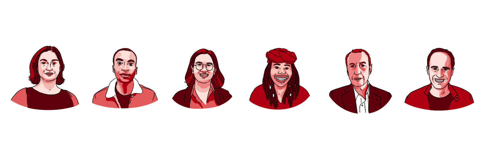
Recently I worked with The Browser, a writing and podcast recommendation service, to do a set of portraits of the brilliant people who work there (and me as their casual resident illustrator) for their site. We took inspiration from a portrait I made for social media of Michelle Obama that’s still one of my favourites.
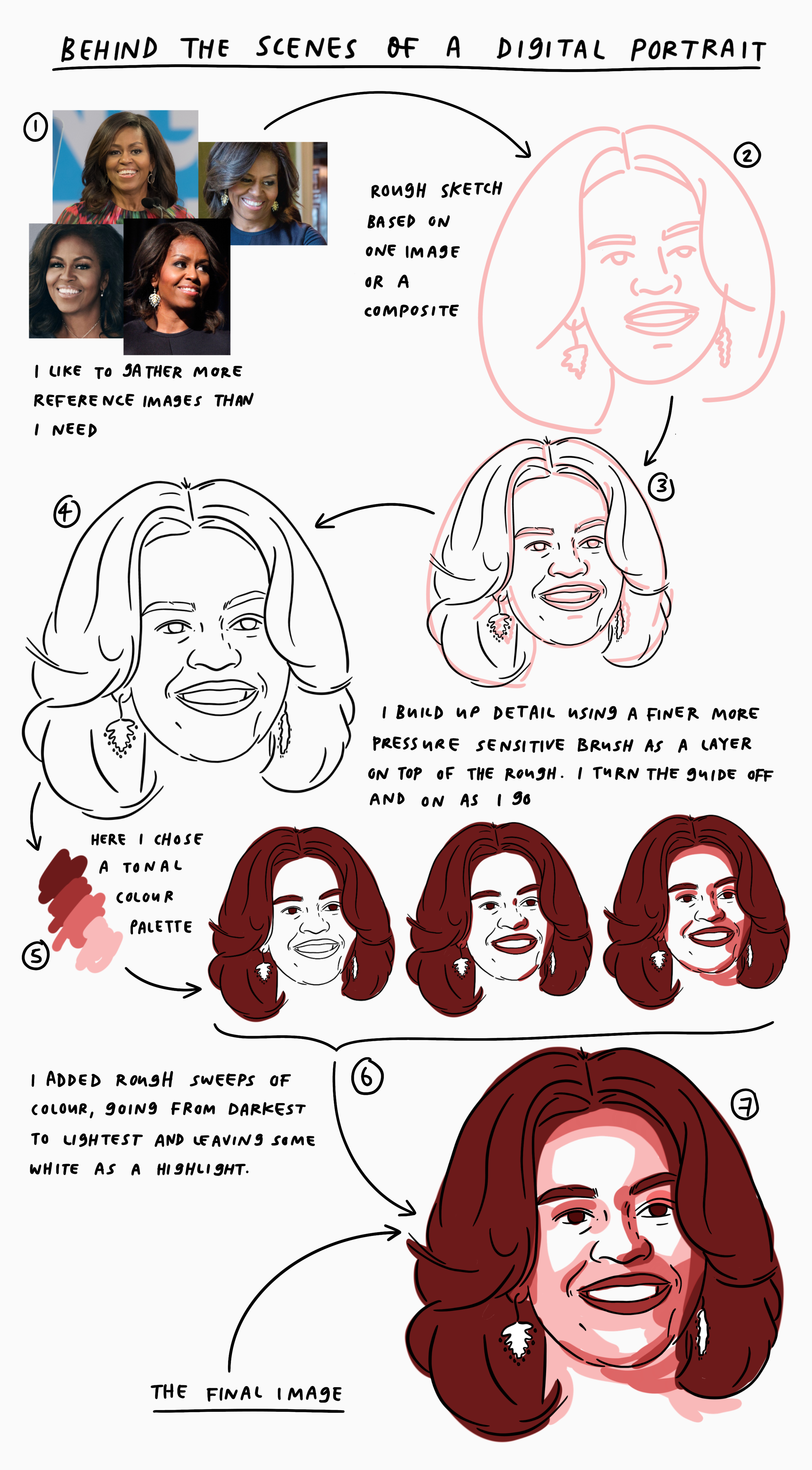
In a rare stroke of luck I realised I had kept all of layers of that illustration so I could break down how the final piece came about. So let’s jump right into the stages I go through to make a tonal or full colour portrait.
- I always start by gathering images. If I’m working with a client I’ll get them to send me a few over. Otherwise I’ll search google for a range that I like. I try to get more than I need so that I can take elements from a few images and bring them together. I have to be honest and say the image I used for the main reference for this image wasn’t in my original file and I couldn’t find it, but these are the side references I used.
- Then I like to do a rough sketch, often in a light colour or shade of grey, to give me a structure and an outline. In cases where I have to be really accurate to a specific image I might trace this first rough to help structure the outline.
- Once I’ve got a rough outline. I’ll then use that as a base layer and start to add detail on top. I typically choose a finer more pressure sensitive brush to add these details in. I will almost always start with the eyes and eye brows, then move onto the shape of the face, leaving the nose and mouth to last (I usually find these the hardest).
- I’ll flick the base layer off and on as I go, and typically do some final refinements when the rough lines are removed because having a base can distort how you see an image,
- When I’m adding colour to a portrait I decide the palette upfront. In this case I wanted something tonal. I really liked the light pink I had used for the rough draft, so I took that as a base to build up a range of shades.
- To colour the portrait I decided to use broader strokes than I normally would to make it feel loose and more gestural. I stated with the darkest tones then worked lighter leaving some sections of white as a highlight. For The Browser portraits I used a similar process but a slightly neater style.
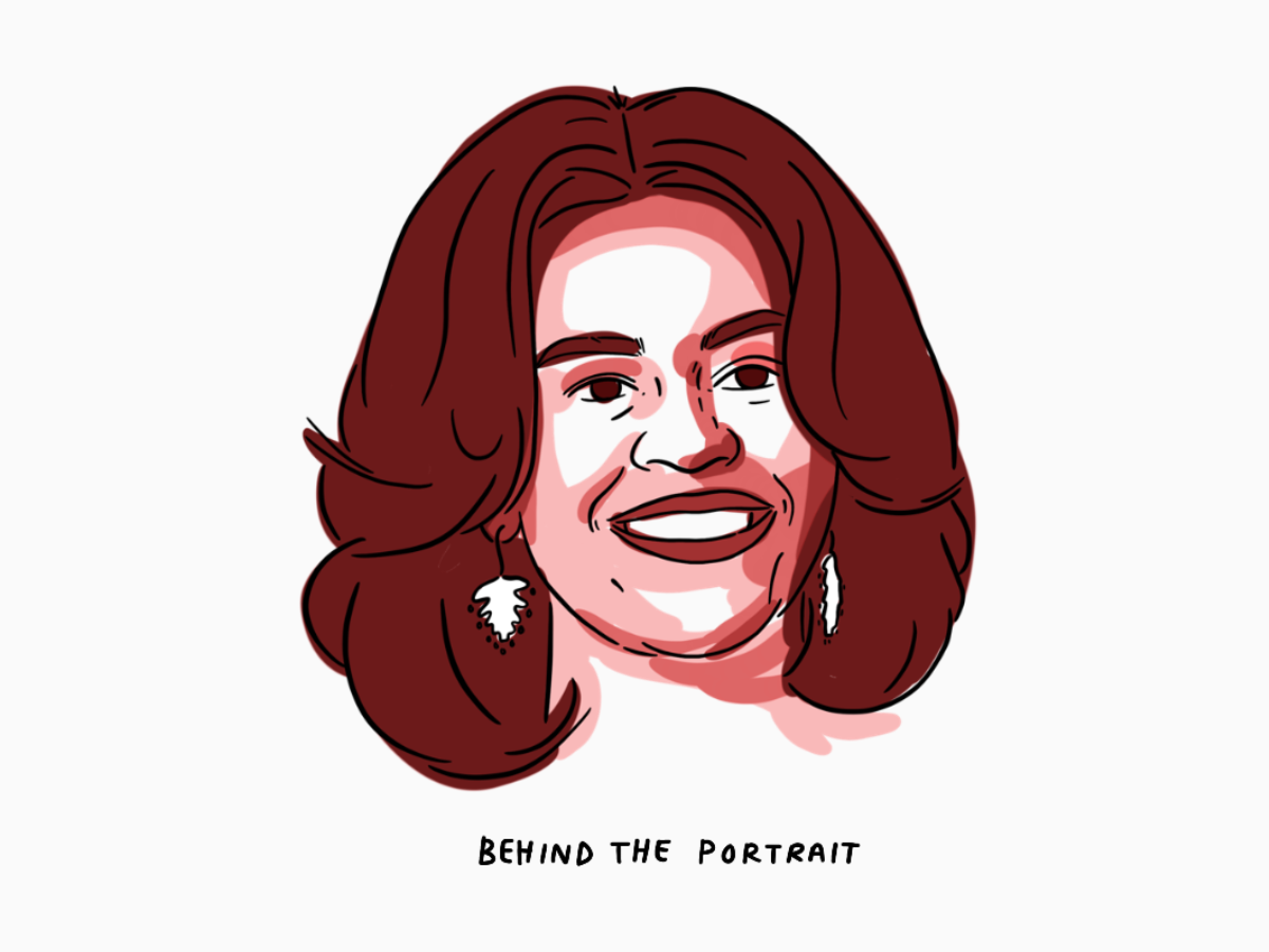
- All that was left to do was clean up the image and refine the colouring. That’s how I got to the final image.

Gosh, this is so interesting – I love behind the scenes snippets so much! The portraits you have created are just so beautiful too.