Road signs might not seem like the most exciting topic for a blog post, especially from someone who doesn’t drive. They never seem remarkable. But that’s by design. When road signs work they should be an invisible guiding hand, that you don’t even have to think about using. They need to be a system that’s so easy to use that you can follow them even when you’re driving at 60mph and you’ve got 2 screaming kids in the back of the car. That’s why they’re more than worthy of a design story feature.


That’s also why Jock Kinneir called their creation “possibly the biggest graphic design job ever”. Jock Kinneir and, his former student, Margaret Calvert were tasked with redesigning the mismatched series of signs that governed the UK’s roads and creating one unified system, a “common language” for the future in 1958. It took 7 years to perfect their work through testing and iteration, but on January 1st 1965 their new signs took the road and changed the British design landscape.

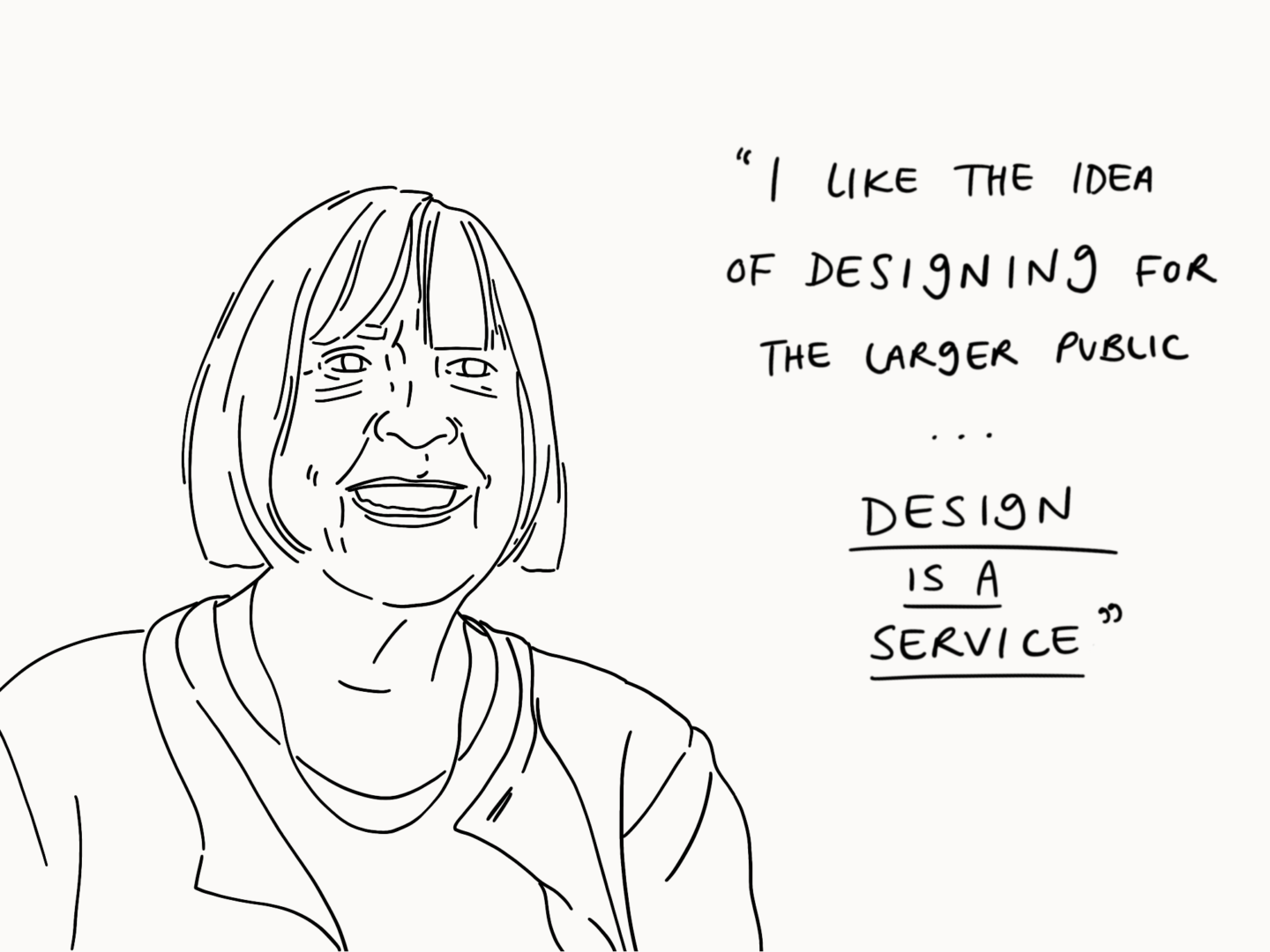
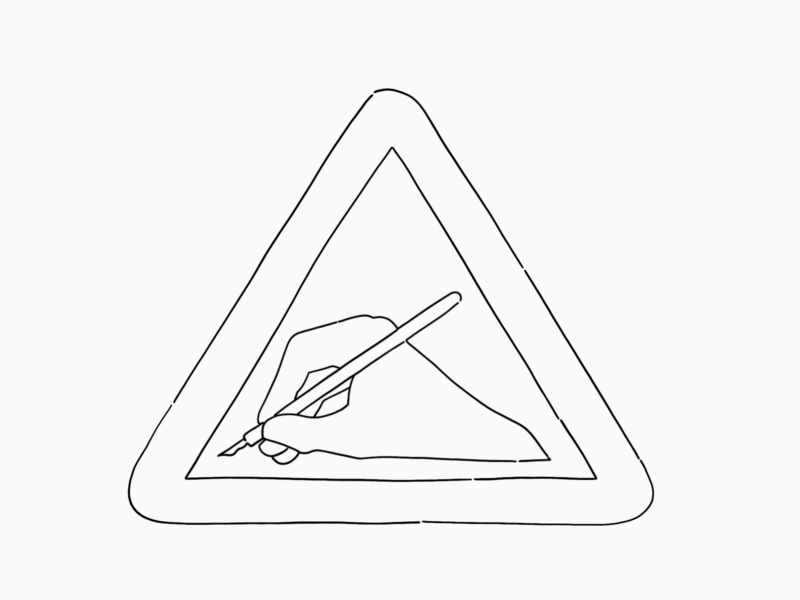
After coming up with the basic designs including elements such as the visual language around the shapes of the signs (circles are used for signs that give orders, triangles are used for signs that warn you about something and rectangles are used for signs that give you information) the pair set about testing their designs. Neither Calvert nor Kinneir could drive, so they recruited a wide range of users to help them because usability was central to their process –  You thought of everything from the standpoint of: ‘What if I am at the wheel, doing speeds of over 70mph?’” (Calvert). The methods they devised were experimental, including having airmen in Oxfordshire sit on platforms with the signs driven towards them until they were readable, but they yielded significant insights. For example, they found that letters had to be spaced much wider than normal in order to be clear at speed from a distance. They settled on adding space set at the width of a letter i between each character because it allowed for the correct readability while remaining familiar to drivers.


The pair created two typefaces Transport and Motorway which were to be used across all of the signs. In an essay for The British Roadsign Project Margaret Calvert wrote of the Transport typeface:

Important details, such as the curve on the end of the lowercase l (borrowed from Johnston), and the obliquely cut curved strokes of the letters a, c, e, f, g, j, s, t and y, were specifically designed to help retain the word shape of place names when slightly letterspaced; a necessary compromise to offset the effect of ‘halation’, when viewed at the appropriate ‘decision-making’ distance, in full glare of headlights. (Much like a Rembrandt portrait – with brush strokes merging to focus the image). This specific letterform, after two attempts, and in two weights, was officially named ‘Transport’.

Calvert and Kinneir’s signs are best known for their clarity, understandably as it’s so essential to their functionality. But there is also a great sense of humanity and familiarity in the symbols used in their signs. They convey their message with a little personality. This tone was something Calvert spent a lot of time thinking about and redrafting to get right:

The first school sign was a torch, then a boy followed by a girl with a satchel – it looked very grammar school. I wanted it to look more inclusive so you couldn’t tell if it was secondary modern or grammar. And I wanted it to be more caring – so I made the little girl lead the little boy. But it needed to have something urgent about it.

That little girl was actually based on how Calvert herself had looked as a young girl. I think it’s those personal touches* which have helped the signs endure in the way they have.


The signs the duo designed 60 years ago are still in use today, almost completely unchanged. While there have been challenges, such as David Kindersely’s attempt to replace the typeface with his own, nothing has been able to beat Calvert and Kinneir’s designs for clarity or beauty, which is the true testament to their quality.


*The cow illustration was based on Calvert’s cousin’s cow, Patience, as well.

So a little while ago I spoke about walking and creativity, about how the act of pacing the streets where I live really influences the work I create. Today, I want to talk about another influence on my creativity, cooking.

I love cooking, and not just because I love food.

As with walking there’s an obvious physical benefit to cooking, or rather eating. Feeding yourself with foods that power you (mentally AKA chocolate and physically) to create is an act of self-care if ever I saw one. There’s a quote in a piece Ruby Tandoh wrote for the Guardian that I often think of when I’m cooking “The thing that tastes the sweetest, when you’re feeling blue, is knowing that somebody cares enough to want to nourish you, to keep you going, and to help your body grow strong.” You can do that for yourself too, make the effort to nourish and look after yourself to show that you care and that you’re worth that effort.

There’s a lot food philosophies like that, which I carry around with me. That’s part of the reason I created my zine about my relationship with tea.

And when it comes to food philosophers, my Socrates is Nigel Slater. I can so vividly remember seeing him on TV, demonstrating a recipe, pulling out a cold tray of leftover veggies from his fridge saying just put in whatever veg you like and meaning it. Telling you to make the food your own. That was a real break through for me, cooking isn’t all or nothing. It doesn’t have to be a science in following minute step by step in a recipe, it’s taking the skeleton of a meal, whether that’s something your mum taught you or is a Ottolenghi special, and building it into something you love.

Now that I know the basics, cooking is a space for me to play and create without the fear that comes with failure in my art. It’s something separate, where it doesn’t matter if it looks great, or if it’s not quite right. As long as I’ve put things I love in, it’s hard to go wrong.

Then there’s the joy of making something with your hands, to take some veggies and through the power of your own magic turn them into something bigger than their individual parts. Cooking takes me away from my screen and forces me to focus on my hands, to focus on not chopping those hands off. You have to be in the moment and engage all of your senses to stay on top of a few pans. It’s a good reminder that you’re really here. For me it’s often a much needed reminder.

And that’s why I love cooking. That’s also why I think we all need something outside of our day to day that we really love, that can take us somewhere different. That doesn’t have to be cooking – although I highly recommend it. It could be sewing, or carving, or tennis, or reflexology, or whatever else gets you back in the moment, just find it.

We’ve all heard the saying that you need to spend 10,000 hours on anything before you’re good at it right? But how do you structure those 10,000 hours?

In my quest to learn more, and to learn better, I’ve been reading up a lot on deliberate practice and thinking about how I can apply it to what I do. Because one of the best ways to learn and remember something is to teach someone else, I thought I’d share where I’ve got to with you all and get your feedback.

What is deliberate practice?

Deliberate practice is probably best known in the sporting world. Golfer, Ben Hogan is often credited with “inventing” the practice in the 1950s, when he became one of the greatest players of the 20th century (I know nothing about golf so I’m taking James Clear’s word for it). He earned that title through tireless deliberate practice rather than innate natural talent. He “methodically broke the game of golf down into chunks and figured out how he could master each section


That’s essentially what deliberate practice is: breaking a skill down to its smallest constitute parts then mastering each piece individually, relying on incremental improvements, then bringing them all back together again.


How do you do it?

Deliberate practice isn’t rocket science. But it does have a few key requirements to actually be effective:

  1. Break down your skill into teeny tiny pieces, what is the smallest action within the skill?
  2. Show up and put the work in. As with everything, the work doesn’t work unless you do.
  3. Repetition alone isn’t enough. I’ve discussed before how repetition creates habits, which can be great for somethings, but mindlessly falling into a habit and reinforcing old behaviours is the enemy of deliberate (stress on the deliberate) practice. Keep asking yourself, what can I improve here?
  4. Create a feedback loop. The only way to see where and how you’re improving is to measure what you’re doing, that could be through static measures, comparisons, coaching, or a mixture. Just make sure you’re getting feedback on your performance and acting on it.


How do you apply it to art?

As I said, deliberate practice is best known in the world of sports. But it can be applied just as easily to the skills-based elements of art and design, because while “technical proficiency” certainly isn’t everything you want your hands to be able to make everything and anything you can see in your mind, right?


Benjamin Franklin, for example, used deliberate practice to develop his writing so that he could express his ideas in the most compelling way possible.


Personally, I want to use deliberate practice to improve the way I draw both digitally and traditionally. Currently, I’m planning on breaking my own practice down into line, composition, and then specific things that I draw most often, such as faces.


Have any of you tried deliberate practice (deliberately or not)? What are your best strategies for learning a new skill?

It’s that time of the month again when I come to you with some of the best things I’ve read and seen on the internet in the last four weeks. My reading has been a bit more arts and designed focused this month it seems, so we’re actually staying on brand for May.

stop watch illustration

SHORT READS, IF YOU’VE ONLY GOT A FEW MINUTES:

Important lessons Keith Haring taught us about life and art

Even if you don’t know his name (you probably do though), you know Keith Haring’s art. Dazed breaks down some of the life and art lessons we can learn from Haring’s work, 60 years after he was born.

The Art of the Movie Poster in the Age of Netflix 

From its offices in a Hollywood movie lot, Percival + Associates designs the key art for some of the most recognizable movies and TV shows. But how do they do it now that they’re all being displayed smaller than a postage stamp on our laptops and phones.

“Subtlety is key”: Rachel Levit on the art of illustrating sensitive themes 

For World Mental Health Day, It’s Nice That interviewed one of my favourite illustrators Rachel Levit and really delved into how she manages to cover sensitive, often mental health based, topics with such care and grace. “When I illustrate a piece that deals with delicate, sensitive or controversial issues: subtlety is key,” she tells It’s Nice That. “One cannot be too direct or literal.”

How The BBC Made Its Animated World Cup Film

If I’m honest I couldn’t really care less about the world cup, but I have watched the BBC’s animated, embroidered ad for it at least 7 times. This short video interview with its makers lets you seesaw it’s done, and who doesn’t love a good behind the scenes video?

Dentures illustration

LONG READS, IF YOU WANT SOMETHING TO GET YOUR TEETH STUCK INTO:

Designing Ethically Pt. 1 

Companies can no longer afford to ignore the ethical ramifications of their products. Kat Zhou explains how designers can pave the way for ethical decision-making in tech.

10 Book Designers Discuss the Book Covers They Rejected, And Why 

You know I love book cover design and harbour a not so well hidden desire to design book covers as a job. So when I saw this piece from Electric Literature where 10 incredible cover designers shared their design process and their rejected covers, I knew it was a must-read. I was not disappointed.

What Do We Mean When We Call Art ‘Necessary’? 

This is a really well thought through piece of criticism from The New York Times on what we mean when we call a piece of art, be it theatre, painting, or TV, “necessary”. If you’re looking to stimulate your brain cells a little bit more this evening this is the one.

How to Feel Progress 

I think we can all agree that as humans, we can’t help but be goal-oriented. We love to move forward. We love to feel a sense of momentum. And, more than anything, we love to tick things off a list. Jocelyn K. Glei offers some great advice on making progress and how to make the work we do feel meaningful.

PS – I wish my blog posts were half as well written as hers so it’s worth a read for style and structure alone.

WHO TO FOLLOW, IF YOU WANT TO SPRUCE UP YOUR INSTAGRAM FEED:

@cynthiakittler

Cynthia Kittler’s brushwork adds so much character to her illustrations plus look at the sassy fun of all of those bell bottom trousers! Her editorial work all fits the brief and the piece it accompanies whilst slotting perfectly into her body of work.

@satoshikurosaki

I found Satoshi Kurosaki’s work through his collaborations with Stay Home Club, and had always loved them, but I’d never seen him on Instagram or any other social sites, until this week. When I saw one of his drawings tagged somewhere else. His social presence is quite understated, misaligned shots of A5 sketched on floorboards and leant up against shelves but that just seems to add something more human to his quirky and confident line drawings.

@indi_kippeum

Want something bright and fun and just a little bit spooky in your life for the summer? Well Indi Kippeum has you covered with her wonderfully childlike illustrations of ghosts, oranges, and everything in between.

@tatjanaprenezel

As soon as I stumbled across Tatjana Prenzel’s Instagram I wanted to share it with everyone I know. Her characters are simple but full of tenderness, texture and movement. She doesn’t have a lot of work up right now but all of it is wonderful. Plus she has 250 followers so if you join the party now you get to join the “I knew her before she was super popular” gang.

GET THE WEEKLY DIGEST BY SIGNING UP FOR MY NEWSLETTER, NEWS OVER EMAIL.

Do you ever have those “oh crap I’m actually going to have to do the thing now” moments? I had a major one of those a few weeks ago as I got into work the morning I was meant to give a presentation to pretty much my entire team. Where I work, we have monthly sessions called learning lunches where someone, anyone, teaches the rest of the team about something they care about. My line manager challenged me to do one, and, because I can’t say no, I agreed.

I was also really keen to share my passion for inclusive design.

It was something I’d been half preparing for (read procrastinating) for a good few months, so it felt like a big deal. It probably wasn’t for anyone else involved. But because it was a big deal to me I want to spend some time reflecting on it and learning from it.

So here are a few of the notable takeaways from my hour in the spotlight.

The first two minutes are the worst


I freak out about presenting, pretty much every time whether that’s sharing my work a group of teammates, presenting something important to a client, or just having to introduce myself in a group. But the build-up is always worse than the doing it. That’s something I’m going to try (I stress try because there are no guarantees when it comes to controlling your own reactions to a situation) and remember the next time I have to do something like this. Worrying about something that hasn’t even gone wrong yet is only going to cause me anxiety with no benefits.


Technical difficulties are inevitable


They are, so don’t panic. When the tech fails you – my screen just kept turning off – don’t panic. Everyone else in the room has been in that position or sat in another presentation where that’s happened before. If anything, while an inconvenience, technical difficulties can actually endear you to your audience.


Keep your deck visual


Where possible keep the number of words on the screen at a minimum. You want your visuals to support what you say, rather than to distract your audience or to just let them sit and read verbatim what you’re saying. That doesn’t mean you have to be a great artist or make incredible graphs, some of the strongest presentations I’ve seen have been really simple. I chose to illustrate mine because I wanted it to feel super personal. If you’re looking for more advice on the slide side of presentation I’ve got you covered.


Slow down


I don’t know about anyone else but if I’m nervous I tend to talk about 100miles an hour. I need to embody my inner Sandra Bullock in Speed and keep the train at a steady 50 consciously. The sweet spot is when you feel like you’re speaking a bit too slowly. You’ll get your point across more clearly and you’re much less likely to hyperventilate – I speak from experience. I wrote up some separate tips for staying calm enough to do that last year.


Know your stuff


This might seem obvious, but it’s obvious for a reason. My presentation style, for better or worse, is to half wing it. If I have a script I’ll spend the entire time tripping over my words in order to stick to it word for word. I know that having everything written out works for some people though so obviously do whatever makes you feel the most comfortable and confident. But no matter what your style is knowing more than the content of your presentation will give you that little bit of extra swagger in your step and will also give you the power to throw in the extra anecdote when needed/if your audience looks more interested in a particular section, and it means when you finally get to that open questions stage you can actually answer them.


Enjoy it – it should be like telling your friends about something great


I’m the kind of person who can and will over excitedly retell the entire plot of a movie to anyone who will listen. If I find something I love I want to tell you about it. You probably know that already because that’s kind of the premise of this whole blog. Plus it’s something I think we all have inside of us. When you’re presenting, no matter the subject matter, you need to find that something that

excites you and use it to fuel everything you say. If you’re excited to tell someone, you can bet they’re way more likely to be excited to listen, unless you’re telling them scene by scene the plot of John Wick.


End strong


This was probably the bit I overlooked in my learning lunch because I was so relieved to be done. But reflecting now if there was one element I wish I had scripted was my ending to make sure I got my closing points in and more gracefully side stepped into “does anyone have any questions?” territory.