London Underground Font Design History

Originally, this post was going to be a history of the roundel. But as I started researching them, I became fascinated by the typeface on them and its history. That typeface is a huge part of the London, not just the Underground’s identity, and yet I had walked past it so many times without giving any thought as to the designer behind it.

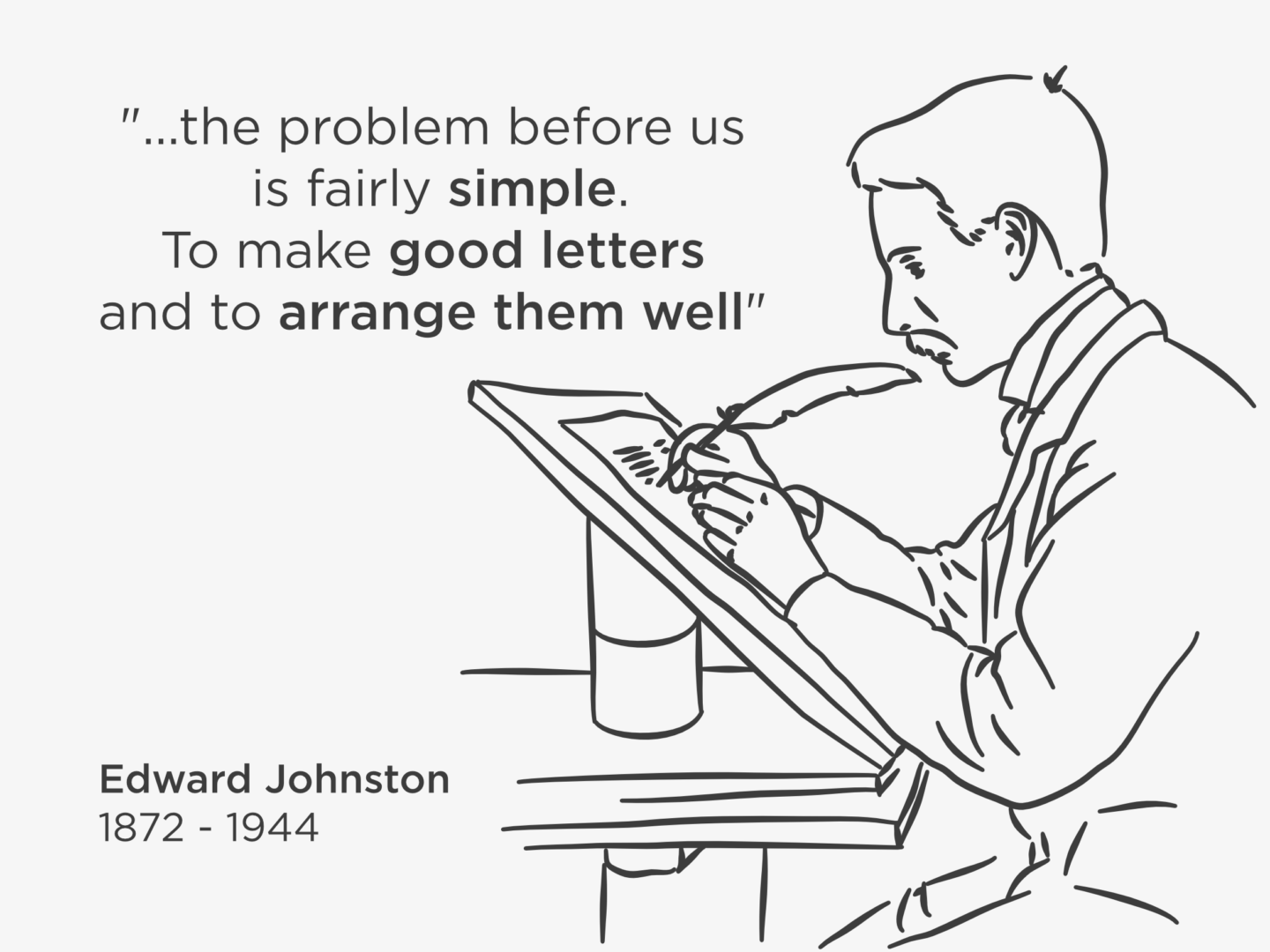
That designer was Edward Johnston. Johnston was commissioned by Frank Pick, one of the Underground’s driving forces, to create a typeface that unified all of London Underground’s lines, which at that point in 1912 were run by different companies with different branding. Pick had already rejected the W.H. Smith typeface, a serif typeface which was inspired by the fashionable calligraphy at the time because it would be too hard for travellers to read on the go. So, Pick asked Johnston for “a strong and unmistakable symbol” with “the bold simplicity of the authentic lettering of the finest periods”. 

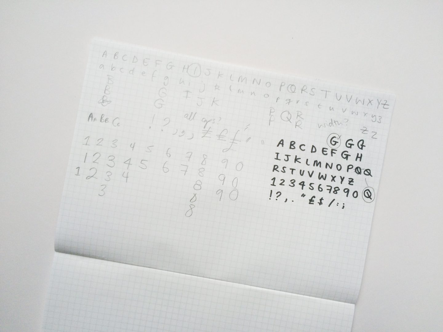
In 1915, Johnston answered with what would be known as Johnston Sans, a block letter typeface. A sans serif typeface might not seem all that revolutionary today, but in the early 1900s, the fashion was for more elaborate styles inspired by Victorian calligraphy. Johnston’s interest in earned him a lot of criticism from his teachers. Despite its being unfashionable, Johnston took his inspiration from the block lettering on tradesmen’s waggons and created a sans serif typeface. The result was a typeface that was easy to read at speed, and appealed to the people who were actually using the underground. The diamond shaped tittles (dots above the i) which Johnston Sans is perhaps most easily identified by, was, in fact, a nod to the popular styles of the time mimicking the angular mark made by a calligrapher’s pen.

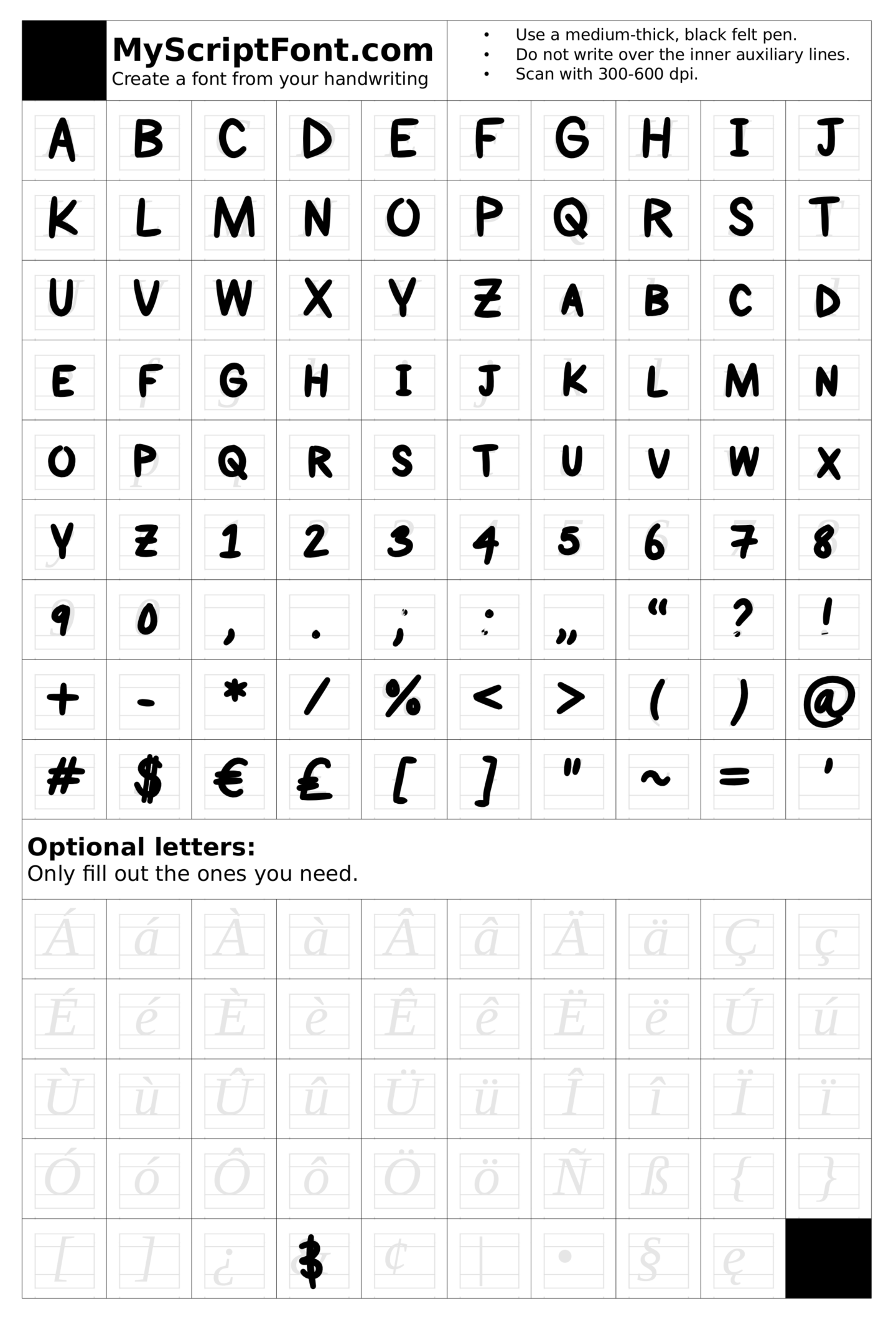
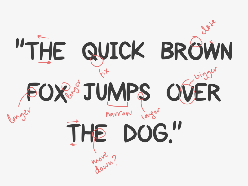
Those touches were retained when Eiichi Kono was tasked with revitalising the typeface in 1979 in order to make it fit to be used as London Underground’s house typeface. Johnston’s original design was made for signs. At first, he didn’t even make any lower-case letters. So, when it came to updating Johnston Sans for wider print usage Kono had to edit some of Johnston’s original design, and add in some missing characters, to make it fit for purpose and to stop it being replaced by fonts like Helvetica.

Johnston New, Kono’s version of the typeface, then had to be updated again for the typeface’s 100th birthday. Kono, and certainly Johnston, could not have predicted the importance of the hashtag or the @ symbol when they were designing the font. In fact, @ was used in email addresses precisely because it was one of the least used symbols on a keyboard. Nonetheless, in today’s digital world, if Johnston was to be useful it needed to be able to accommodate both characters as well as several weights for digital use. That’s where Monotype stepped in.  Not only did Monotype add in the missing pieces of Johnston’s font, they also took it back to its original width, at once making it more and less like Johnston’s first design. In the process of its updates over the past century, being taken from wooden blocks to metal, then to a digital form it had become narrower and narrower. So the Johnston100 you see on TfL documents and signage today is as close to the original as it can be in the modern day.

Johnston’s typeface hasn’t just been updated and adapted to suit a changing rail network, it was also the basis of another typeface which has shaped reading far more widely. One of Johnston’s former pupils, Eric Gill, further developed Johnston Sans. Gill, who is famous for both his design work and awful abuse of his daughters and dog, simplified Johnston’s typeface to create Gill Sans. The original design Gill Sans, a hand drawn sign above a bookshop, caught the eye of Monotype (yes, the same design house that recently created Johnston100), who commissioned Gill to create a full typeface. Since then, Gill Sans has become one of the most famous typefaces in the world as the choice for the covers of the classic Penguin book covers.

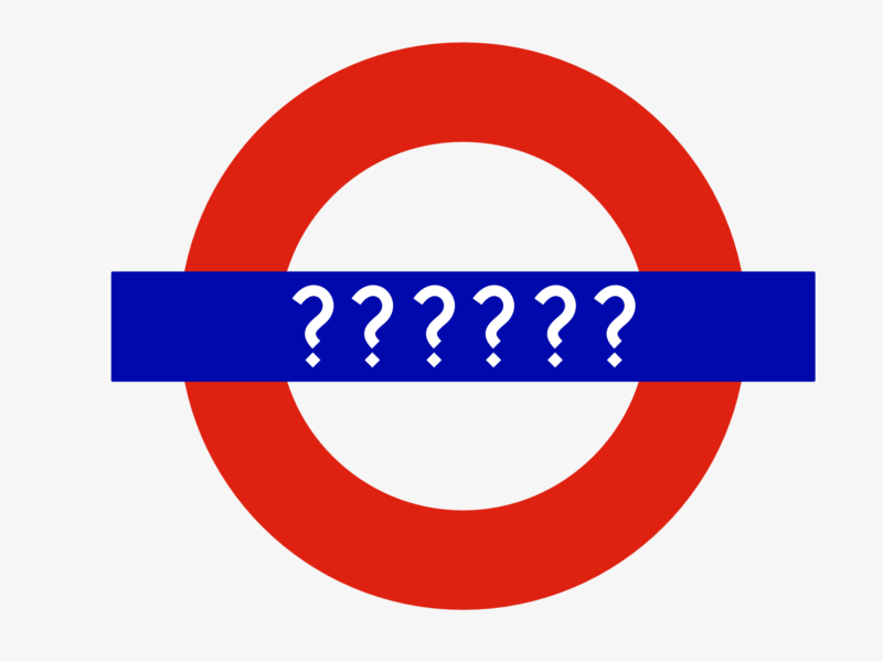
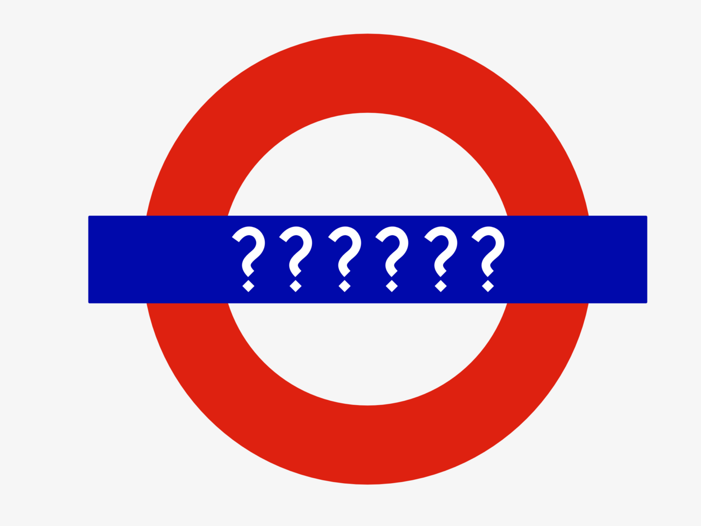
Just as Johnston’s typeface has been adapted and used far more widely than he may have ever anticipated, so has the roundel it is famously featured on. In 1908, the first roundel was simply a platform name board at the station we know today as St. James’s Park. Around 3 years later, the roundel became the official logo for the underground network. But it is not until 1917 when the new typeface is put on the roundel that it becomes a registered trademark. In the following years it undergoes a number of tweaks, but remains much the same and a symbol of London itself rather than just the underground.

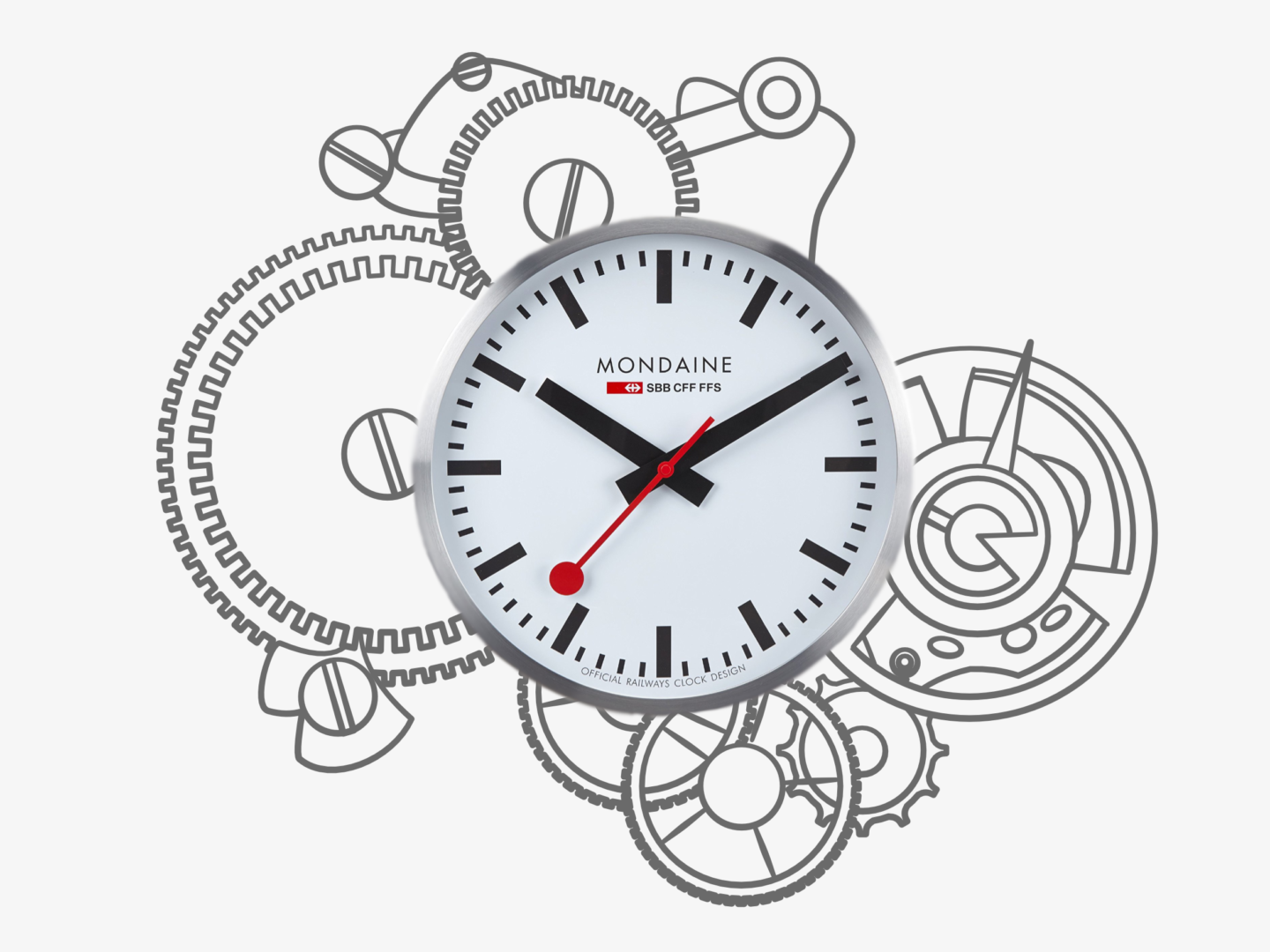
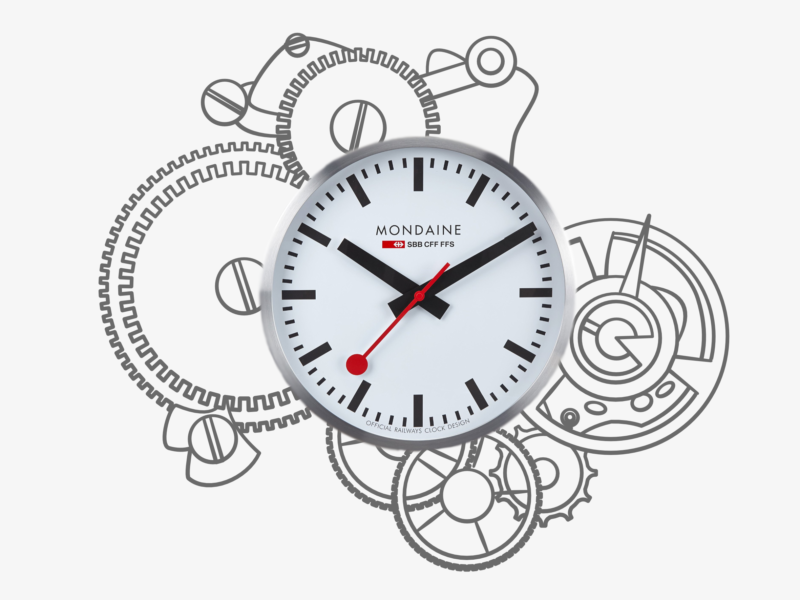
This synonymy with London, is why, in 2000, when TfL was founded and became responsible for all of the transport networks for London rather than commissioning a new logo they stuck with the roundel, and just commissioned more variations. Today, the roundel has been edited to accommodate airports (Heathrow’s roundel features a little aeroplane symbol), clocks such as the ones at Bethnal Green and Redbridge, and coffee art as seen in the Transport Museum’s café.

As someone who is, often quite vocally, not a huge fan of the tube, learning more about its design history has definitely changed the way I approach my commute. Finding out more about the design thinking in the details in the environment around you can really shift the way you look at the world.

Mondaine swiss railway clock design history

The Swiss, and in particular their railways, are known for being on time. Back in the 1940s, Swiss Federal Railways (SBB) wanted to highlight that part of their identity in a very visible way on their platforms. So, they asked Hans Hilfiker, one of their engineers, to come up with a clock design that could be seen across the station, incorporated into their brand identity, and most importantly help ensure that all Swiss trains left exactly on the minute. In 1944, Hilfiker came up with the solution, the Swiss Railway Clock.

He designed the now iconic clock face so that it was both practical and aesthetically pleasing. It featured a simple round white face which used lines to mark the time rather than characters, giving it a utilitarian and universal appeal. The thick black hour and minute hands make the time easy to read. But the most distinctive feature of the Swiss Railway Clock is its thin red second hand with a disk at the end. That red marker was nicknamed the “rote Kelle” or “red signal” because of the way that it resembled a station manager’s signal, which was used to mark a train’s departure. That little red disk became a symbol of Swiss punctuality.

Not only did the clock have a beautifully designed face, it also featured a tailor-made movement. All Swiss trains aim to leave exactly on the minute, as no seconds are listed on the departures board. This means all the clocks in a station need to run at the same time, to the second and their approach to the full minute needs to be clear. Hilfiker’s movement, which he created with clock manufacturer Mobatime in 1955, was designed so that the second hand on the clock could finish a full rotation in 58 and a half seconds before pausing at the full minute. The clock only starts its next minute after receiving a master electrical signal, which is sent out to all the clocks on the station floor at once. This movement was labelled ‘stop-to-go’ in reference to its pause at the minute.

In 1986, the iconic Swiss Railway Clock left the railway for the first time in the form of a wristwatch, sold by swiss watch manufacturer Mondaine. These watches are not only highly awarded, they’re displayed in design museums across the world, but also highly popular. In recent years Mondaine have brought out watches which mimic that original stop-to-go movement as well as collaborations with the Helvetica that move away from the classic Swiss Railway Clock Face.

That face had become so popular that Apple in its 2012 release of iO6 updated its clock face to one that was cannily similar to that of Hilfiker’s 1944 design. Later that year, Apple were forced to pay $21million for the use of the design, after being accused of plagiarism. While the origins of Apple’s use of the Swiss Railway Clock design were far less than ideal, there is something quite special in the merging of two great design classics and the idea that Hilfiker’s rote Keller is still helping people keep time.

Key Sources:

Time is Precious, Jan Hudal

Remarkable clocks and watches: the Swiss railway clock, Discover Switzerland

History of Mondaine Watches, Ezine Articles

Design thinking is a concept that I hear bounced around a lot at work and in a lot of the articles I read. It seems to be the buzz word du jour, to go along with a growing interest in Service Design. This interest isn’t about aesthetics or logos. It’s about embracing the principles of design as a process in the way people work.

So, what is design thinking? First off, it’s more than just buzz. Design thinking is all about taking a user-centric approach to a problem and then solving it in a hands-on iterative way. By focusing on the real user, and empathising with them, you are able to build something they actually need, rather than what you think they need. Taking this insight and working with it iteratively, prototyping and testing means you fail small and often as part of a process rather than dedicating a huge amount of time and resources to a project that might have an underlying flaw you hadn’t noticed. This process can take slightly longer at first, but it becomes more time and energy efficient overall because you work out more of the kinks at the start.

Design thinking isn’t just for designers or businesses. It can be used by everyone and anyone who’s creating something or grappling with a big question because its process is so simple and can be flexible around whatever you’re working on.

“But how?” you ask.

Well, the design process goes a roughly a little something like this:

EMPATHISE

Step one is all about understanding your audience or your user. This involves actually speaking to them, rather than just imagining what they think, or feel, or do. Where possible observe what they do in the space you’re looking to get into, so you can find the problems they face and the motivations that drive them. In order to be able to empathise with them and build for them, you need to understand them,

DEFINE

Researching and observing your target audience normally leaves you with a lot of information, so the next step is to hone that information into just a few golden nuggets of insight. You can do this by, once again, empathising with your audience to find out what they care about the most and what experiences or pain points they share.

GENERATE

Once you’ve focused your research on a couple of key points, you need to start coming up with solutions the problems you’ve identified, lots of them. At this stage, you need to generate as many ideas as you can, no matter how wild or unfeasible because you might be able to take something from them. Where possible do this in a team, so you can bounce ideas around and build on each other’s thoughts.

PROTOTYPE

Then you want to build rough models of your favourite ideas. You want these prototypes to be as tangible as you can make them. If you’re building a website, put together some wireframes. If you’re making a board game, build a mini version out of card. If you’re developing a menu, get cooking. This is where you find out which ones are most likely to work or be doable.

TEST

After building your prototypes you need to test them, on your target audience where possible. Get their feedback, you’d be surprised at how often something you think is as simple as ABC is completely indecipherable to a stranger. Take their feedback and then work it back into your prototype. Lather. Rinse. Repeat.

IMPLEMENT

Putting what you’ve built into the world, and into practice, is the last step. Make sure all of your learning comes together in a form that’s accessible to your audience and does actually solve their original problem. There’s no point creating self-cleaning glasses (please someone create these) if they’re not accessible or marketed to glasses wearers.

And that’s it. Apply these principles as you will!

If you’re interested in reading more about design thinking, I’d recommend having a read of some of the articles from The Harvard Business Review’s edition all about it or checking out This is Service Design Thinking which is at once thorough and accessible.

The story of the Fjällräven Kånken, is as classic a design story as they come. Åke Nordin saw a problem and he designed a simple solution. In the late 1970s, 80% of Swedes were suffering from back pain, and those suffering were getting younger and younger. As shoulder bags were in fashion at the time they were blamed by school medical officers for causing this discomfort, because of how they distributed weight unevenly over the body. So Åke Nordin decided to design a solution.

His solution was a backpack which would distribute the weight of school books and packed lunches across both shoulders, instead of just one. With this idea in mind, Nordin began his work by taking 2 A4 ring binders, the most commonly carried item in a school child’s bag, and designing around it. Once he had the basis of the shape, Nordin created his bags out of the durable Vinylon F fabric. He chose Vinylon F not only because it is hard wearing but because the fibres swell when wet, like many natural fibres do, meaning that when it rains that the Kånken is so waterproof that you can often see a small puddle forming on the top of its flat top. Other additions to the bag included a foam insert that acted as padding for the back and could be removed to be used as a picnic seat, a newspaper pocket to organise papers, a zippable front pocket, short top handles that can be poppered together to hold a rolled jacket on top of the bag, and the now iconic round reflective patch with the company’s logo.

With the help of the Swedish Guide and Scout Association, Nordin launched the Kånken right on time for the beginning of the school year in 1978. Nordin had hoped to sell 200 bags in that first year, he quickly sold double that figure as it did exactly what it was designed to do and reduced back pain and improved posture in its wearers. As well as school children, the elderly were also big fans of the Kånken, as they soon realised that the backpack’s design allowed them to carry their shopping whilst keeping their hands free to hold a walking cane.

Today, over 200,000 Kånkens are made a year, following that original design almost identically. After a lull in sales in the 90s, their rectangular shape and bright colours came back into fashion a few years ago. Their fans cite their Mary Poppins-like ability to hold everything they need without ever being heavy as the main reason for their enduring popularity. The backpacks are also popular with travellers who appreciate the bags waterproofness, added features, and the fact that, even when full, it can be slide underneath an aeroplane seat meaning it’s ideal for travelling light. Nordin’s initial decision to base the size of his bag around his customers’ actual needs, to carry an A4 file, has stood his design in good stead and means it has remained just right almost 40 years on.

Today I’m going to create my very first font, and I thought it would be interesting to document the process and share anything I learn along the way and from all the bits and pieces I’ve read.

I’m making a hand-written typeface based on my own handwriting, because it seems to be the recommended starter and it’s something that will be immediately useful to me, as I currently hand write a lot. I think it’s probably a great start for a beginner because you’re working with a style that you know really well and can draw naturally without having to think about it.

STEP 1

The first step I took was to pick a programme to use to create my font. I went with Paint Font, which is free and online, both of which are always good things. I decided to go with Paint Font rather than My Script Font which is very similar because it allowed me more options when it came to the characters I could design. Both of these programmes allow you to hand draw your font and then scan it which makes them very accessible. If you’re looking for a more digital option, FontStruct seems to be completely computer based, which would perhaps be better if you’re looking to build more standardised fonts.

STEP 2

This was the fun bit: drawing out my letters. I decided to start out by hand drawing my letters because it felt the most natural and the easiest for quick drafting. I kept playing around until I was happy with the set of characters I had. In the end, I settled on an all caps font, with slightly smaller caps as lowercase letters, as this is the way I normally write in my design work and in my planner which is where I like my handwriting the best.

STEP 3

You could just draw your letters onto the template by hand, scan it and upload it. But I wanted to put my letters on digitally as it allowed me more control and the ability to refine my letters more in regards to weight and also mitigated the inevitable “oh no my hand slipped!” moment. I scanned all of my letter forms, and then made them vectors by tracing over them in Affinity Designer. I refined the points, curves, and line quality, then added them into the template. If you’re just going in by hand, make sure you use a relatively thick (a fine felt perhaps) very black pen, so that your letters show up clearly when you scan them.

STEP 4

Then it was time to upload my doc to Paint Font and wait for the magic to happen. This process was pretty simple and painless, and in no time I had a .TTF file of my very first font. The finished product was a relatively good quality font, that I think I’m going to get a lot of use out of.

STEP 5

Then I tried out my font, typing out the customary “quick brown fox…” and just having a bit of a play really, and then printed it out for assessment. There were a couple of letters I wasn’t completely happy with so I changed them and repeated step 4. Once I was happy with that base font I also made a light version, a bold version, and an italic version. Those alternative styles were made infinitely easier by the fact I’d vectorised my font before uploading it, because I could easily edit the letters without having to redraw them all.

TOP TIPS

  • If you want to make a font, do it! It is SO easy.
  • If you can vectorise your font, I would highly recommend it. It makes editing and creating alternative versions so much easier.
  • Sketch out your ideas, and try out a few variations of everything. It’s just good practice.
  • Start with a font you know to get used to the process, plus it’s just fun to make your computer write like you do.
  • On that note, do your own thing, don’t just add serifs to Helvetica it’s a rip off and it’s just boring. The reason I really liked my font was because it was new and something I would use.
  • Go beyond just A-Z. If you’re working in English, and your font is for personal use, you probably don’t need the entire Russian alphabet but you will need numbers and punctuation for your font to be truly useful.
  • Print your test type. It makes it easier to see how your font will look in situ and sometimes it’s easier to work using pen and paper.
  • Have fun!

All that’s left to say is I’ve officially caught the homemade font bug, and will be making some more of my own typefaces in the very near future!