January is normally when we try to be our best selves. We set goals. We embark on behaviour changes. We have high expectations. But it doesn’t always go to plan.

For example, this post was going to be about my creative process. But the more I thought about it there was a big gap in that process that I was going to have to try and cover up, if I wanted to describe the process I want to have. So instead this post is going to be about perfectionism and performance anxiety.

I focus on creativity and productivity on this blog, and I try to keep it positive. I’m all about trying to get better. Trying is key there. I don’t think this blog would be honest if I said it was all easy, and I always live the advice I give 100% of the time because I don’t. I’m trying my very best but sometimes I get stuck in rut or lose motivation or get so scared I can’t do anything.

One example of that is my sketch book, or, rather, my lack of sketch book. I haven’t had a real sketch book for about 5 years now, which I know sounds crazy. I try and normally get a few pages through and then I give up because I can’t bring myself to use it. I’m what Tiffany Han described as a reformed (reforming) good student on a recent podcast. At school we were marked on our sketchbooks as well as our final pieces, which meant that every page had to be planned and presentable. Now, as a ‘grown-up’ I’m still in the same mindset. I have a lot of anxiety about making each page good, even though no one needs to see them. I plan on loose pages or I don’t plan at all. I don’t really play with my materials anymore, and that was why I loved art as a kid, just making and getting messy. But I keep letting the fear hold me back. I know it’s irrational. I know I’m missing out on a lot too.

I also know I’m not the only person who’s dealing with it. Even if it’s not to do with sketchbooks, I think everyone who makes, everyone who pursues a creative career has dealt with the fear, I think.

That same fear has held me back from starting a lot of projects. I’m still trying to get going on a project I’ve had in mind for a couple of months now. I know I should just get started, but I’m currently just letting my own good taste get in the way as Ira Glass would say. I’m not sure anything I’ve ever created has been an exact print out of what I had in my brain, yet that’s always what I strive for and fear not achieving. I would love a command+p for your mind, but alas it doesn’t exist and sometimes you get something a bit magic when you try and translate your thoughts with your hands.

I feel the most anxiety with my own work. I guess because I’m the only one responsible for it. Plus, I think everyone is naturally a bit more invested in their own stuff because it represents them. Putting something with your name and identity out into the world is terrifying.

But, when I’m working on something for a client I’m happy to present rough ideas and develop them, because it’s a collaborative process. I actually enjoy the rough ideas stage.

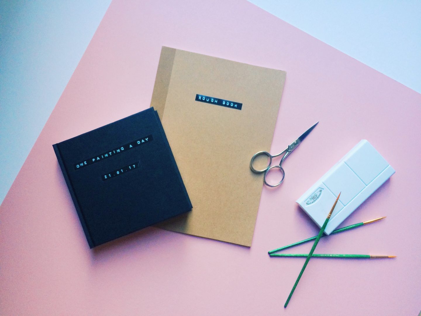
I need to start treating myself like my own client. My own work is a process too and I need to be able to have more fun with it. I’ve just started a rough book, it’s a sketchbook but without the baggage of the label sketchbook and it’s just going to be a place for play.

This is the creative process I’m currently going through. I’m rebuilding and restructuring and relearning. If you’re dealing with the fear, I promise it’s a demon you can fight, and defeat, because I’m doing it now, little by little.

I wanted to put together a series of helpful practical design tips for non-designers, because, as 99 per cent invisible has taught us, everything around us is designed. Today, I’m starting off with tips for designing effective and aesthetically pleasing presentations. I’m going with powerpoints/keynotes/slides/decks/cards first because they’re the thing I see designed at work most frequently, and, quite often, most awfully. Here are some simple tips to improve your presentations and really impress your office.

1. PLAN IT

This might be obvious, but don’t just jump into making your presentation. Sit down decide what you want to make, the story you want to tell and the aesthetic you want to have. If you need some inspiration, slideshare has some really amazing presentations. 

2. COLOUR SCHEME

After you’ve decided on your content, one of the first things you need to think about is a colour scheme. You don’t want to use more than 5 colours in a presentation, I usually just go with 3. Most companies have a set colour scheme so you might just have to use that, and if you’re working on a client presentation I’d suggest integrating some of their company colours. If you’re working on something with no rules, and don’t know where to start, check out Coloors.

3. USE SANS SERIF FONTS

The next basic decision to make is what font(s) you are going to use. Sans serif fonts are easier to read on screens, so stick within the sans family. I’d recommend using a maximum of two fonts, one for headers and one for body text, or just one for everything. If you’re bored of the ones preloaded onto your computer check out Dafont.com’s list of free fonts, or go with an opensource font like Lato.

4. USE MASTER SLIDES

I feel like people are afraid of using master slides but they are such a great resource. The very minimum you need to do is set up your logo and a simple header on every page so it’s always in the same place and the same size. But you can go as far as setting up all of your set slide layouts to create consistency, which I would highly recommend and will save you a lot of time in the long run, especially if you’re making a lot of presentations.

5. ONE IDEA PER SLIDE

You only want to have one idea per slide for maximum engagement and impact.

6. USE SIMPLE LAY OUTS

You don’t need to reinvent the wheel stick to basic layouts half text and half image, single image, single headline stat etc. You don’t want your audience having to spend all of their time working out where to start reading/looking, just stick with what they know.

7. DON’T CLUTTER

The second part of having simple layouts is having simple content. The fewer things you can have on a slide the better. Keep it to 1 idea per slide. Don’t overwhelm your audience with lots of colours, text styles, or different images, the more stripped back your slides are the easier they will be to digest.

8. USE LESS TEXT AND DON’T WRITE IN SENTENCES

Follow the six-by-six rule, have no more than six lines of text of six words. If that’s too tough, I would recommend sticking to just the six lines and not writing in sentences. People are only scanning the text you put up on screen so it doesn’t need to be fully formed text. In no circumstance, ever, should all of your script end up on the slides on the screen, if you do that you may as well send out your presentation as an email. Your slides should just be a visual aid to whatever it is you’re saying.

9.CONSIDER SIZING

Quite simply make the important information bigger. That doesn’t mean make every word a different size, but have one larger size for headers and smaller one for body text (always keep it over 24pt for readability though).

10. ILLUSTRATIONS OR PHOTOGRAPHS

Decide if you want to use illustrations or photographs. While there is no hard and fast rule that you can’t use both, almost all of the best presentations I’ve seen go with one or the other. Whichever you go with, make sure you keep the visuals consistent by using similar styles of illustration or photography. If you’re using photography just use a single image per slide where possible. For slides where you want to use a single image as a background, but it’s a bit too busy, you can use Fotor’s blur function for free to blur sections of your image so you can place text over them and still read it. Also, if you’re looking for icons please please please check out the noun project

11.GO VISUAL

To go along with using less text, try and make as much of the information you have visual as possible. Humans process images much faster than they process text, so making your information as visual as possible means it’s more likely to be digested much more easily. Some things you could do include illustrating percentages, using icons, or simple flow diagrams to show how information is linked.

12. BUT KEEP YOUR GRAPHS SIMPLE

No one has the ability or the time to pour over a really detailed, multi-layered graph during a presentation, especially if you’re speaking at the same time. Simplify your graphs as much as possible, or break them down, so that they’re easy to see and follow. You can always hand it out as an appendix if you needed.

13. CONTRAST

Make sure there is enough contrast between your text and your background, otherwise no one is going to be able to read what you’ve written. Don’t put two clashing colours together though, if you want to use a bright colour somewhere pair it with a neutral, black or white.

14. ALIGN

Where you’ve used icons or blocks of text make sure you align them so everything is neat and follows clean lines. This seems like quite a small, pointless, bit of extra work but it makes so much difference, and can make your presentation look so much more professional.

15. NO TRANSITIONS

Just don’t use transitions, you’re not 7. It’s that simple.

On my first few projects I found myself writing and rewriting and rewriting emails, even when I knew the client personally. Deciding what tone you want to use, and even what you want to say, when talking to a client at first can be one of the most daunting elements of starting to freelance. No one really teaches you how to be in charge of your own business emails in the same way they teach you to use photoshop. I most certainly don’t have all of the answers, or particularly outstanding email etiquette, but these are the most important factors I’ve found when communicating with clients.

stock3

BE FRIENDLY

If you’re a good person to work with, people will want to work with you again. It’s that simple. Whilst you should always be professional that doesn’t mean you can’t be pleasant. You probably don’t want to be throwing emojis out there but you do want to have some personality in your messages. That personality can come through in your phrasing, in asking the client about their day (or at least wishing them a good one), or even the occasional joke. Being friendly also comes down to making the client feel like they can approach you, make sure they know at the start that they can come to you with questions and if they do ask you something take the time to answer it properly. The hardest part of this tip is always being patient on the surface, sometimes a project can be frustrating, but you shouldn’t take that out on the client. Talk through any issues as calmly and clearly as you can not only will this help keep the client on side it also, usually, leads to a better solution.

The client is always right, but they’ve hired you for a reason

The age old idea that the client is always right definitely has some merit. They know what they want and you should work to it, it’s their product in the end and they’re the ones paying for it. However, if you think they’re going in the wrong direction or if you’ve got a great idea that lies slightly outside of their brief you should tell them. When you’re hired as a designer you’re not just hired (most of the time) you’re not just hired as a photoshop monkey, you’re hired because you’ve got a brain in your head – use it! 

Be honest

Being honest and transparent is absolutely key to building a good relationship with a client and creating something you can be proud of at the end of it. When I say be honest, be honest in all things. Be honest about what you can do. If there’s something beyond your capabilities or something you’ve never done before let them know. Clients have always seemed to respect me more if I’ve been honest and said X isn’t my strength, but I’m happy to give it a go or I can suggest another way to do it. When you do that you’re showing them that you value the product you’re creating for them and you’re putting their needs first. If you really can’t do it help them find someone else to help. Be honest with your opinion. This is kind of part of the last tip, but if they ask your opinion on a design or and idea, tell them the truth and make sure you’re making something you’re happy with too rather than pandering, even if it’s hard. Be honest with yourself. Make the best work you can, don’t cheat yourself out of making something amazing.


Ask Questions

When a client gives you a brief one instinct can be to just take it and run without thinking about it. But asking them about the brief at the start can really make sure you get off on the right foot, and save you a lot of time in the long run. If you can, call them, or meet face to face. I’ve found that’s the best way to get what someone actually wants out of them. Having a proper conversation is also a great way to get the creative juices flowing for you and the client, setting you up for a productive working relationship. Don’t just ask questions at the start of a project either, ask them throughout – especially why questions. If a client doesn’t like something, make sure you know why rather than guessing that way you don’t do it again. One caveat to this is don’t send them 50 emails a day asking a single question, work through what you can and at natural feedback points see what they’re really thinking.

Keep Talking

Don’t just stop talking to your client once you’ve finished working on the project you’re doing, keep in touch. This is a really great way to make sure you have a strong relationship with a client, and are more likely to get work from them in the future. If you see they’re doing something new or interesting send them an email. If they’re running an event show an interest. If you can, ask them for a coffee and catch up if it’s been a while

Putting a price on your work is one of the hardest, and most awkward, parts of freelancing. I’m still pretty uncomfortable doing it, but I am a lot better at it now than I used to be – I hope. Now I’m a couple of years into doing it, this the advice I wish I’d had when I was first starting out.

stock2

FREELANCE DOESN’T MEAN FREE

You deserve to get paid for what you make. That’s it. There are lots of people who will ask you to work for portfolio points, and sometimes the value of what you’ll get out of that is recompense enough. But most of the time it isn’t, and it shouldn’t have to be. If someone else is going to profit from your work, then you should share in that profit. 

THERE’S NO SECRET FORMULA

I spent a lot of time googling ‘how much should I charge as a freelance graphic designer’ to very little avail. There’s no crib sheet out there, because there is no secret formula. Sure it’s important to  see how much other people are charging (you want to at least be in the ball park) but how much you charge will change as you develop, it will change between clients, it will change between jobs, sometimes it will even change within a job. Don’t sweat it. Go with what feels right and appropriate rather than how much you think you should cost.

PRICING BY THE HOUR IS OKAY

When you’re just starting out working by the hour is probably the easiest way to price your work. It feels tangible, and you can give your client proof. There are even apps to help you with it.  

BUT REALLY PRICING BY VALUE IS WHAT YOU SHOULD BE DOING

First, as you get better at what you do you’ll work faster. So if you’re using a time tracking tool, you’ll start getting paid less for doing better work. That doesn’t make sense at all. Second, how much time a piece of work takes you on a computer isn’t a judge of how much value it will add to your client’s business or the amount of time and training that has gone into you being able to produce that piece of work. If you don’t want to just take my word for it Jake Jorgovan, wrote a great article all about it for Career Foundry.


CHARGE MORE THAN YOU THINK

This is the main thing I wish I’d told my younger self. When you start out there is a tendency to undervalue your work, because, well, you undervalue your work. You should have no fear in asking for a bit more than you think, if it’s more than your client can pay I promise they’ll tell you about it. Not only does pricing your work a bit higher than you think mean you get paid more, it also projects a level of confidence and quality to your client.


IT GETS EASIER THE MORE YOU TALK ABOUT IT

This really ties into the last point. The more you discuss your pricing, and the more you realise that people will pay you for your work the easier it gets. Discussing pricing up front is key. Make sure whoever you’re speaking to knows what they’ll be paying, and for what up front. When I’m discussing pricing with someone new I like to suggest the number of iterations I’m willing to do for the price quoted, then if we have to do more redesigns I let them know that it will cost more. If a project changes in scale so should your pricing, but you’ve got to be open about it.


This is where I’m at right now, but I’m still learning – what else should I know? What else should I be doing?

I’m by no means an expert in starting out as a designer, I’m still only starting out myself. But now I’ve overcome the first hurdle of actually getting going, I thought I’d share how I got started in the hopes that it helps someone who wants to have a go but isn’t sure how.


TOOLS

Having the right tools can seem like it’s a big barrier to starting as a designer. You don’t need anything to start at a very very basic level though, you can start to learn a load of the skills you need with a pencil, some paper, a laptop and some creative use of pages. But to properly get started, the only two things I would highly recommend you purchase are Affinity Designer and a tablet. I’ve spoken at length about Affinity Designer, and done a full review, but it’s a really powerful design tool that’s cheaper and easier to pick up than illustrator. It’s very rare that I need to do something that it can’t, and if you’re starting out I can think of no better companion. Adobe Creative Suite remains the gold standard as a design toolset, but it’s a huge investment if you’re just starting out and includes a whole host of things you won’t need and requires a bigger learning curve. The moment I bought my first tablet it changed my world. That might be too far, but it opened a lot of options up for me and made everything I did easier and quicker. You can’t really go wrong with Wacom. You don’t need of their more complex offerings if you’re just starting, I still use the Intuos Pen and Touch. I would recommend going for one that’s around A4 size (usually a Wacom Medium), anything smaller and you don’t get as much creative freedom, anything bigger can be hard to lug around and will obviously be pricier. I think my first tablet was only £20 second hand from eBay, and you can get similar ones today for well under £100. Of course it’s nice to have a camera and a scanner, but those things aren’t essential and you can normally work your way around needing them.


PRACTICE

This should be obvious but just make stuff on your own. It develops your skills, allows you to create a style and start to grow a portfolio. Working for yourself is a pressure free way to find out if you actually like designing. Practice tasks you could have a go at are: designing yourself a logo, creating a book cover for your favourite novel, creating an illustrated map of your area, or designing a poster for a band you love.


GETTING OUT THERE

I was very lucky that when I decided to get started I was at Uni, so there were loads of things I could get involved with, without having to have very much experience. But if you’re not in such an obviously opportunity rich environment there are still loads of things you can do. First, work on your portfolio – read just make some stuff and get better. Second, there are loads of small projects that can be designed that you don’t realise. Is your work having a social? Ask if you can design the invite. Do you have a friend who has a blog? Ask if you can help them create content. Basically ask people if you can help them, and I promise at least one of them will say yes. Post your work on social media, and try and build a following. Once you’ve got a few of those kinds of projects under your belt try reaching out for bigger things like offering to help charities on Pimp My Cause or bidding for work through sites like 99 Designs.


WHAT TO EXPECT FROM YOUR FIRST PROJECT

Every project is different so this is going to be pretty general, but I feel like there are some things you should be prepared for:

  • You’re probably going to go through more redesigns than you expect, this doesn’t mean you’re not doing well, most projects take a few goes to get right.
  • You might not be instantly inspired. Going from working on your own stuff to project for someone else is a bit of a change, not least because you might not instantly be interested in what you’re working on. But taking a breath then having a good google and a brainstorm normally solves that.
  • It’s going to be time intensive. If you’re still developing your technical skills things are just going to take some time to do.
  • It’s not all going to go to plan. As with the first point, this doesn’t mean you’re not doing well. There are always external factors you can’t control that can affect a project. You’ve got to be prepared to adapt to whatever happens and deviate from what you thought should happen at the start.


JUST DO IT

My final thing is just to have a go. It’s so easy to say “I’m not good enough” “There are too many other people with more experience doing” “It I don’t have this I don’t have that” “I’ll start when I have more free time”. As Walt Disney said “the way to get started is to quit talking and begin doing”