Introvert comes from Latin intro-, “inward,” and vertere, “turning.” It describes a person who tends to turn inward for their inspiration and who draw more energy from being alone than being in a big group. I’m one of those people.

There’s a lot of information out in the world about how tired introverts can get in big social situations, and how we prefer to think alone. But there’s not so much about how our inward turning nature helps us develop certain skills that extroverts might not without even knowing. This particular set of skills, I think, can mean that introverts make great designers*.
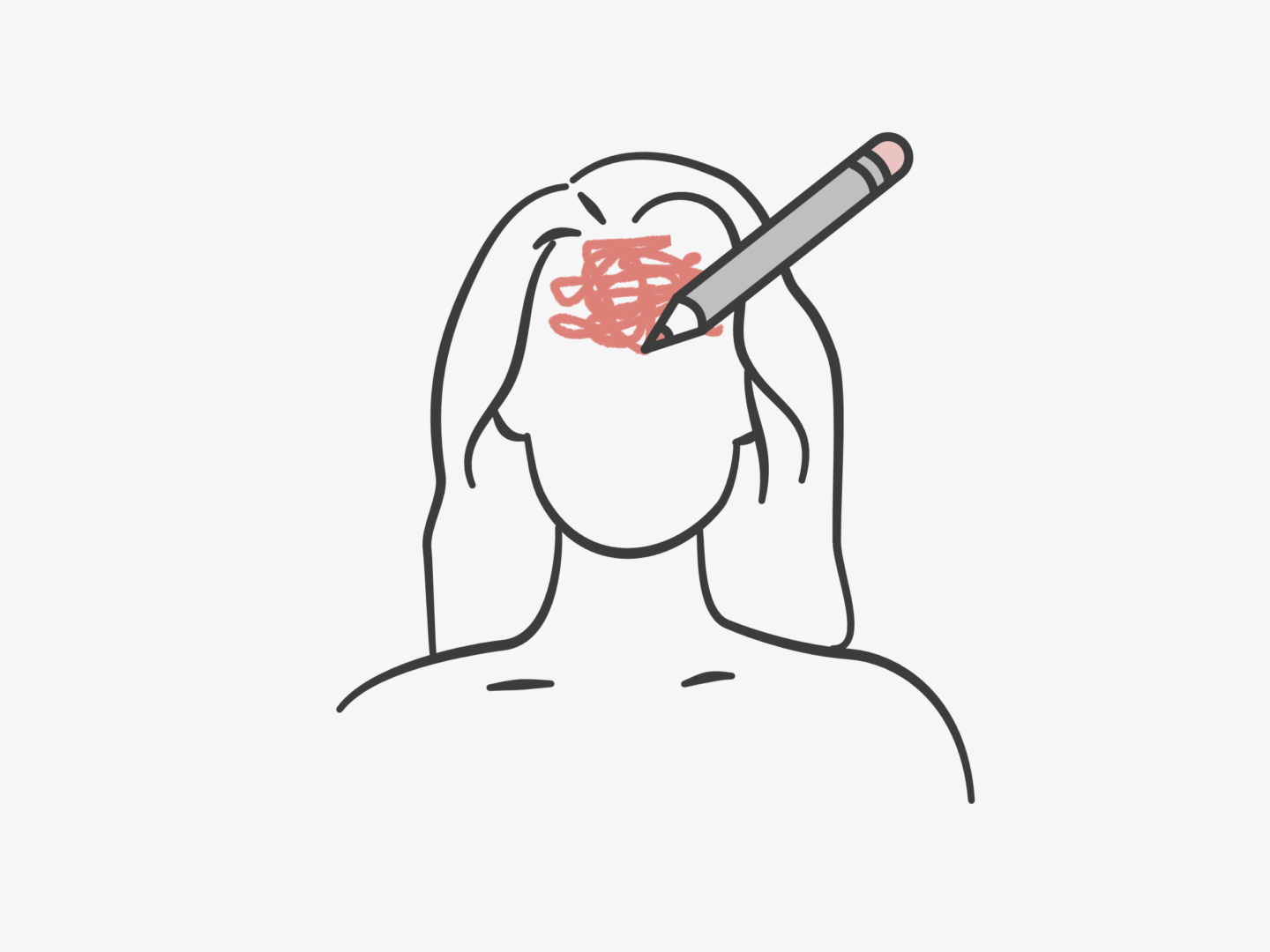
INSPIRATION

The same psychological trait that means that introverts can easily become overwhelmed in busy situations means we can also find inspiration anywhere. Hans Eysenck suggests that introverts require less stimulation to be alert and engaged than their extroverted counterparts, which means they require fewer stimuli to find inspiration. This is a super useful skill for any kind of creative pursuit, where you need to keep producing new ideas and finding more inspiration from the world.

PERCEPTION

The best designs come from a place of empathy. In order to produce designs people use and love you have to understand what they need. Introverts can be particularly great at picking up on other people’s emotions, in part because we’re so in tune with our own and in part because we’re so sensitive to shifts in the environment around us. This is a skill that introverts often have to develop, but when mastered and harnessed in the right way it can be incredibly powerful.

PLANNING

Introverts can take much longer to process information than extroverts. While this might sound like a weakness it can actually be a strength. Marti Olsen Lany says that introverts have longer neural pathways for processing information, which means that we involve our long-term memories and previous experiences in decision making. By taking our time when processing information and involving our memories we tend to make more considered decisions and in depth plans. Again, this is useful for pretty much any job, but it’s a particularly useful skill for anyone who has to structure their own work or create the direction for a project.

FOCUS

There’s no getting away from the fact that a lot of the work that designers do has to be done quietly, and alone. Introverts require less dopamine to feel happy and motivated, which means we can get a lot out of quietly pooting along rather than needing to do lots of things to get our kicks. Our energy saving nervous systems set us up perfectly for hours of aligning, and kerning, and making sure that shade of blue is just right.

GETTING TO THE POINT

Introverts are notoriously not the best at small talk. We tend not to get anything, especially enjoyment, out of it. While that’s not great for networking – and it’s certainly something I’m personally trying to work on – it’s actually really good for helping clients get to the point. Introverts enjoy meaningful one on one conversations, which are, in my opinion, one of the best ways to get to the heart of what a client wants and needs. That plus the emotional awareness we discussed above means we often have pretty good bs filters. Skipping the small talk to get to the point and the insightful discussion, speeds up the process of producing significant and impactful work.


There are so many great things about being an introvert, so don’t forget that you can make however you’re wired a strength rather than a weakness. I hope this has been a reminder out there to someone out there that even if you’ve developed skills without noticing it, or if they’re just innate, they’re still really useful qualities that can make you great at what you do.

So, to all of my introverted designer friends – go forth and conquer (quietly)!

Also, if you’re looking to hire a designer, don’t overlook us quiet folk – we’ve got a lot to offer even if we don’t always shout about it.


*Extroverts make great designers too. They’re great at brainstorming in groups, at fast prototyping, at sharing and presenting their ideas and so much more. Plus, no one is truly one or the other, we all sit somewhere on a scale, and anyone can develop any of the skills I’ve discussed above. I just wanted to write a little something for my introverted pals out there, because I feel like there’s a lot out there about the struggles of being an introvert in an extrovert’s world but not enough about the ways in which introversion can be a real asset.

The t-shirt is an undeniable design classic and wardrobe staple. It is an unquestionable design classic, that comes in every size, colour, and pattern imaginable whilst remaining identifiable. It’s an everyday essential that’s such a common sight now, that it seems crazy that it only really became a garment in its own right around 70 years ago.

Today’s story beings with, the butt of many a joke, the union suit. If you don’t know what a union suit is, it was a kind of onesie that buttoned from the neck to the crotch and had a very attractive bottom flap. It usually came in red. The union suit was worn under clothes and was really good at keeping people warm, which was great in the winter months but when summer rolled around it was a different story. So, people cut their union suits in half creating long johns and a collarless undershirt.

At the same time as people started customising and DIYing their own undergarments (I am sorry for how much I use that word in this post), manufacturers also started experimenting with fabrics. Eventually, they succeeded in creating a fabric that could stretch and still maintain their shape. Not only would this make clothing more comfortable it also meant that they could make a shirt that was pulled over the head without breaking the collar.

No one is sure quite who developed this fabric or turned it into a t-shirt first, but the Cooper Underwear Company were the most successful in marketing them. They marketed their t-shirts to bachelors with the idea that they required less maintenance than a button-down undershirt “No safety pins — no buttons — no needle — no thread“.

A year later, in 1905, the US Navy made a bulk order of these shirts and made them an official part of their regulation uniform. It was intended that these shirts would mainly be worn under uniforms, but they could also be worn on their own for training, in engine rooms, or in warm weather at a commanding officer’s discretion on their own. These t-shirts were so popular amongst the men that they brought them home with them and spread the word about their comfort and hardwearing nature.

Now might be a good time to go into the origins of the name of the t-shirt, or rather the question of the origins of the name of the t-shirt. I think the most common story behind the name that I’ve heard suggests that it comes from the T shape of the garment. However, there are also people who claim that the t in t-shirt might stand for training as t-shirts were sometimes worn alone for training sessions in the army. There are even those who think the t might be short for amputee, as the sleeves on the shirt are a cut down version of their predecessors. Whatever the reason behind the name, it stuck and was first recorded in popular literature in 1920 in F. Scott Fitzgerald’s This Side of Paradise.

At this stage in its development, however, the t-shirt was still mainly an undergarment. But the t-shirt grew slowly in popularity over the next 30 years. This growth mainly happened in American high schools where, by 1940, “newspaper columnist named Nancy Pepper wrote that teenagers owned closets full of T-shirts and customised them with sew-on patches and fringe”. These customised tees were even used to advertise for make out sessions. But it wasn’t until 1951, that the t-shirt would be labelled a “sexy, stand-alone, outer-wear garment” after being worn by Marlon Brando* in A Street Car Named Desire. His appearance throughout the movie in a tight fitting white t-shirt on its own lead to a surge in sales of the garment. James Dean later solidified the t-shirt’s status, sporting on in A Rebel Without a Cause.

After this cinematic turning point, the t-shirt became worn more widely as a standalone piece rather than an undergarment. Not only were they cool they were also cheap and easy to clean. A fact that made them popular for mothers with young children to dress.

While it was the plain white t-shirt that had soared to fame in the 1950s, in the 60s there was a new kid on the block, the printed t-shirt.  Warren Dayton pioneered art t-shirts featuring images of Cesár Chavez, the Statue of Liberty, polluted lungs, and other political and comic images. T-shirts were no longer just symbols of being cool but political statements used to advertise whatever the wearer believed in. This advertising potential was quickly pounced on by the likes of Disney, who began making t-shirts adorned with Mickey Mouse to sell as souvenirs. By 1977, perhaps the most famous of all printed t-shirts, the I heart NY shirt, was created by Milton Glaser.

That pretty much takes up to the t-shirt we know now which is printed with anything and everything, and is as much a beloved wardrobe staple as it was in the 1950s. This design story really speaks to the power of cultural change to make a classic as much as the design itself. Without the Marlon Brandos and James Deans of the world, we might still only be wearing t-shirts under our button downs.

Key Sources

*Marlon Brando is also credited with being the man who popularised jeans

The brain processes visual content 60,000 times faster than text so it’s no surprise that infographics have been proven to be a highly effective way of engaging people with information. Infographics are in fact 30 times more likely to be clicked on than a blog post. Brands, companies, and bloggers have all caught onto that effectiveness, and infographics have been booming.

This popularity has meant that more people want to give making them a go. So, building on my last workplace design tips post, I thought it might be useful to share some of my top tips and some helpful layout ideas for anyone wanting to give it a go either for work or just for fun.

So how should you go about creating an infographic? The first thing you always need to do is to choose your content. There’s no point deciding you want to create an infographic if you don’t have anything to say with it. Once you have a compelling story to tell, work out what kind of infographic is going to convey that story best. The seven most common types of infographic are: visual articles (make a story more visual), data viz (best for stats based stories), maps (for geographical content), versus (for illustrating 2 opposing ideas), timelines (for historical content), lists (used to support a claim through a series of information), and processes (used to show logic, or give readers personalised choices). Then you need to plan. I’ve put 3 really basic layouts you can follow below to help you get to grips with organising your information.

As you start to populate your infographic, there are a few things you should bear in mind. First, make sure you tell a story with your infographic. I like to gather up all of my information on separate cards and just move it around to see what works best, layout and hierarchy are so important when you’re making such a big graphic. Once I’ve got the flow sorted I either add in the graphs or ideas of how I can visualise the information. I do this stage digitally because it’s easier to produce graphs and to manipulate sizing without having to redraw elements. I play around with scale, to make the graphic interesting and also to keep the reader’s attention where I want it to be. Normally, I do all of this in black and white because I’m just creating the structure, so the next stage is to add the colour. All that’s left to do then is a final review of the flow and also the shareability of the graphic I’ve created because you need to get the most out of what you’re making.

Keep the story you’re telling, and the rest of your infographic, really simple. People like infographics because they’re easy top digest so don’t overcomplicate it. To create that simplicity, make sure you stick to a basic colour palette, a short title, maintain some white space, and don’t overwhelm it with text. Also, please, don’t make it 20ft long!

If you need some inspiration these are just a few of my favourites:

I am a very cautious road crosser. I’m not sure I would get anywhere without the assistance of the green man if I’m honest with you. So, as I was crossing the road the other day I realised I had no idea why pedestrian crossings are designed the way they are. They seem completely natural now, but they had to be designed and thought out at some point, right? Well, it turns out that the crossings we know now were a long time in the making and came about in the least organised way you could imagine.

The story of the pedestrian crossing begins in 1934, when, then Minister for Transport, Leslie Hore-Belisha instated range beacons on top of striped poles at crossing points in London to signal to drivers that they should slow down. A year later those orange lights were rolled out across the country under the title of ‘Belisha Beacons’.

It wasn’t until almost 20 years later that those crossings would become the zebra crossings we know now. In 1951, the Ministry for Transport were forced to add markings on the road to make the crossings clearer after several complaints that the beacons alone weren’t visible enough to motorists. These markings came in the form of thick white stripes, that matched the striped poles of the Belisha Beacons. This decision would pave the way for 2 trends you’ll see in the development of the pedestrian crossing, development only coming after complaints and the naming of crossings after animals.

Over the next decade there were a series of signalled crossings, including a renegade set of lights in Leeds, but nothing official until 1962 when the need for something more robust than the Zebra crossing became urgent. The government came into this next phase with a long list of requirements which centred on the idea of a signalled crossing that wouldn’t hold traffic up for too long. By all purposes, the design they were given as a solution ticked all the boxes. It featured a button for pedestrians to press to cross, and lights opposite them that read ‘Wait’ and ‘Go’, which any modern user would recognise. The Panda crossing, seemingly named for no other reason than it was the first black and white animal someone could think of, was opened in London in April.

Even though the Panda crossing seemed to check all the boxes and was opened by a very cute toy panda bear, it was far too complicated to use. Motorists were bombarded by an intricate pattern of flashing lights that didn’t seem to have a clear signal of when they could proceed. Perhaps the best summation of the scheme comes from an old lady interviewed by the BBC at the time who declared “that man Marples [the Minister for Transport] is up to too many tricks. It’s a hairbrained scheme and most dangerous!” They made the most critical of design errors, they forgot the user. 

Unsurprisingly, the Panda crossing was replaced. In its place came the X-Way. The X-Way took the same principles of the signalled crossing but simplified the lights for motorists. Instead of the complex flashing light system of the Panda crossing, the X-Way had just 3 lights that functioned like normal traffic lights. The only difference being that the green light was replaced with a white X light, which is where the crossing got its name, and the amber light flashed when the crossing period was almost over. The X-Way also saw the birth of the green man (and his red counterpart).

They were really close with the X-Way, the only issue was that an X is generally used to signal a stop rather than go. So, in 1969 the white X was finally replaced with a green light and the Pelican crossing was born, a system we still use today. Interestingly, the name Pelican wasn’t just chosen because it was another monochrome animal, instead it came from the abbreviation of PEdestrian LIght CONtrolled crossing.

The most recent incarnation of the pedestrian crossing is the Puffin. The major difference between the Pelican and the Puffin crossings is that the Puffin crossing sees the lights on the same side as the user rather than opposite. Puffin crossings also have sensors, either in the ground or the traffic lights above, that can detect when there is a pedestrian waiting to cross or crossing the road. This means that the traffic lights shouldn’t change if there is someone in the middle of the road. Despite some initial concerns, the Puffin crossing has been proven to be safer than its predecessor.

Other modern animal crossings include the Toucan for pedestrians and cyclists and the Pegasus (which is also in Peru) for horses.

As you can see, the design process of the modern pedestrian crossing was a long and complex one that involved iterations on iterations.  If you found this interesting, I would highly recommend having a read of the story of Ampelmann who is the German green man and is the coolest little fella.

Are there any more design stories you’d like to hear about?

Key Sources

QWERTY Design history

The tale of the QWERTY keyboard is one that has been surrounded by myth and legend. It has always seemed strange to me that an object we all use literally every day can have such a clouded history, so after seeing a few new papers on the topic of QWERTY’s history I thought I’d spend a bit of time investigating how QWERTY came to be the only keyboard we really use today.

For many years, the story of why the letters on a keyboard are arranged the way they are would be answered with “to stop typists going to fast”. It was believed that Christopher Scholes developed the QWERTY system in 1868 to stop typewriters jamming. When typists went too fast keys that were close to one another would catch on each other and the machine would break. So, it was said that Scholes moved commonly used letters away from each other to slow down their typing and to stop the jamming problem. Common pairings like T and H, and E and R, then should be set as far apart from each other as possible. But they’re not. T and H are diagonally adjacent, and E and R are right next to each other.

So, if Scholes wasn’t trying to slow typists down why did he arrange the letters in the way that he did? According to Koichi Yasuoka and Motoko Yasuoka, it was all about telegraphs. In their paper on QWERTY’s design history, they posit that Scholes’ QWERTY typewriter was derived from the Hughes-Phelps Printing Telegraph, and was developed for Morse receivers, with the arrangement of letters being easy for Morse code readers and senders to use. However, QWERTY might not have been the ideal system for telegraph operators, or indeed typists. The system reigned supreme not because of its innate efficiency but because of a compromise between inventors and producers, and to escape patent infringements. There are also some people who believe that the QWERTY arrangement was a tactic to sell more typewriters, as it allowed a salesman to handily, and impressively, type out the product’s name “typewriter” because all the letters were placed in one row. Whichever story you believe, there is little doubt that QWERTY’s design story has been a messy one at best.

But after a chaotic creation, QWERTY has stuck. I remember the sense of delight the first time I had a phone with a QWERTY keyboard because it was familiar and so much easier to type on. QWERTY’s persistence has been, in part, orchestrated by E. Remington & Sons the firearms manufacturing company who bought and marketed the Scholes and Glidden typewriter in 1873. As well as selling typewriters, they also sold courses for typists on touch typing. This meant that when companies hired typists, they had to buy Remington’s QWERTY typewriters as well to ensure that they got the most out of their employees. This sales tactic began a long history of people learning to use QWERTY and then being tied to it due to familiarity.

This development, where design is constantly tied to a previous innovation because people become stuck in their ways, is called ‘path dependency’. QWERTY is now fundamental to how people in the US, UK and Japan work. It is used on laptops, tablets and phones even though there is no design reason, other than it’s what people are used to. I doubt many people are using their iPhone’s QWERTY keyboard to tap out morse code.

Despite the prevailing power of QWERTY designers are still trying to improve on Scholes’ layout.  Particularly interesting alternatives include Dvorak, MALTRON, and KALQ. Dvorak is probably QWERTY’s oldest major challenger. Its design is technically more efficient, with studies showing that 70% of strokes on a Dvorak keyboard occur in the home row (the one your fingers hover over) compared to 32% in the QWERTY keyboard. The Dvorak keyboard also accounts for the fact that the majority of people are right-handed, placing more frequently used keys on the right-hand side. When you first see a MALTRON keyboard you would be forgiven for thinking it might control a space ship. The letter keys are divided into two halves with the numbers together between them, and 2 sets of 2 keys set diagonally underneath the letter panels. But if you hold your hands over the design you can see how well it reflects how our fingers and thumbs are naturally positioned. KALQ has been specially designed for typing with your thumbs on a tablet or phone. The keys are divided into two halves which makes a lot of sense.

Whether or not one of these alternative keyboards, or some more innovative none key based system, will prevail is yet to be decided. I don’t know what kind of shift would be needed to tear our hands away from the familiar pattern of QWERTY now so many generations have learnt to type, to code, to work using it. Perhaps it will take a generation being given something different, for their muscle memory to respond to something new, for their frustration to come out as something that doesn’t look like asjkl.

NB: This post was written on a QWERTY keyboard.

Now we’re a little ways into this series, is there anything else you’d like to be featured in a design story post? Previous design stories include Dr Martens, the Swiss Railway clock and Mondaine watches, the Kanken backpack, and the London Underground font.


Key Sources: