Last year I wrote and illustrated a number of design story pieces which delved into the histories of everyday design classics including the Kanken backpack, crossing signs, the biro, Mondaine watches and more. I had so much fun researching and putting them together that I wanted to make a few more.

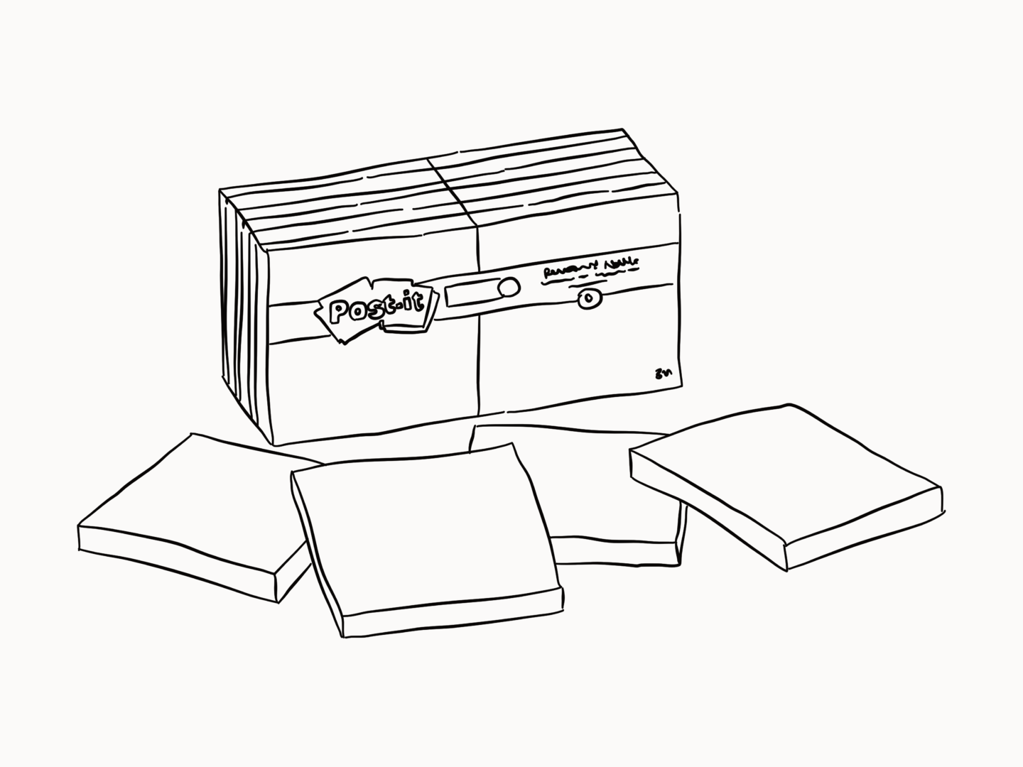
I’m starting off with post-it notes because they’re the resource we use most (other than our laptops) at work. It’s almost comical how many we go through. Honestly, if I had a pound for every time someone made a joke about service design just being covering walls in post-it notes I mightn’t need to work again.

Famously, post-it notes were created by mistake. 3M senior scientist Spencer Silver was trying to develop a new super-strong adhesive to expand his company’s range in 1968 when he accidentally created a weak adhesive that stuck to surfaces without bonding tightly to them, which at the time was completely useless.

That was until another 3M scientist Arthur, Art, Fry heard a Silver talk about this kind of sticky substance he’d created and the fact he’d spent years trying to find uses for it. Fry instantly thought of the problem he’d been having with his church music bookmark flying away.   

So Fry and Silver worked together and eventually realised Silver’s adhesive wasn’t useful on its own but when it was pre-applied the glue to the paper it had the potential to be something revolutionary. “I thought, what we have here isn’t just a bookmark. It’s a whole new way to communicate,” Fry once said.

They started using the yellow paper that the lab next door was using to build prototypes, a yellow which would later become an instantly recognisable part of their branding.

With the support of their boss, the pair were free to prototype further and bring in the help of Roger Merrill and Henry Courtney who were working on paper coatings. This fantastic four brought the first version of the post-it note, the “Press ‘n Peel”, to market with a test release in 1977. This release was limited in part to manage potential losses and in part because 3M couldn’t physically mass produce the sticky notes at that point. Despite this first test launch, bombing, the team were able to convince 3M to release free samples in Boise so users could see the product in practice for themselves.

There are a few things that have made post-it notes stick if you’ll pardon the pun. It’s simple. The post-it note does one thing and it does it well. But while it solves a specific problem but it’s open to users finding their own ways of fitting it into their lives. Art Fry initially saw the post-it notes as a great bookmark, but it’s also a tool for creating art and visualising and organising ideas. Plus, once you’ve used it you can reuse it again and again, which means it has a longer and more loyalty-inducing relationship with the user.

From idea to successful product, the humble post-it note, despite its simplicity, took twelve years of development. But it proves that with a little prototyping and a little problem solving, a failure can be turned into a design classic.

I started my illustration “career” by working with friends and it’s still a big part of what I do. But it’s something I know can be tricky and fraught if you don’t do it right. So here are my four top tips for working for, or rather with, your friends and loved ones*.

Make it fair

You need to be fair to yourself and fair to your friends if you’re going to work together. Don’t feel like you have to take on work if you don’t have time, or even if you don’t want to, and certainly don’t feel like you need to take on work for free. Work together to set a fair brief, a fair price and a fair timeline so that you’re both comfortable.

Be clear

Once you’ve worked out what works you need to make sure you’re both on the same page. Set out what your friends should expect, in the same way that you would if you were working with a “normal” client. Except with friends you need to make sure its crystal because it’s easy to slip into doing a little bit more, or accepting that extra redraft because they asked nicely. Going back to that first point you need to be fair to yourself. While we’re on the topic of clarity make sure your loved ones are clear with their briefs, it’s easy to assume you’re on the same page because you have the same in-jokes so take an extra minute or two to avoid making an ass out of anyone.

Do good work

If you’ve set a fair deal you need to do the best work you can. You should always do your best work, never forget that. But here it’s doubly important because if you do a good job for your friends you can bet they’re going to tell their friends about your work too. So much of my work comes through contacts made through friends sharing my work. Do good work and more work will find you.

Keep it fun

Don’t forget to have fun! You’re working with people you love, doing something you love! Making something together should be a positive experience, so don’t lose sight of that or your friendship as you’re going. If you can feel the work jeopardising that take a step back, go back to step two, and head out for a coffee/drink/laugh, then get back to it.

*Adam JK has so loads of great advice on this, and lots of the other aspects of working in the creative sector in his book Things Are What You Make of Them.

Have your eyes every felt sore, itchy, or tired, or even like they’re burning as you’re working? Have you ever suffered from blurred or double vision after long periods of screen time? If so you might have been suffering from eye strain.

Eye strain is relatively common, and it happens when you don’t take the time to look after your peepers. It’s something that’s often overlooked but so important, especially if you’re a maker of any kind because your eyes are one of your greatest tools. Eye care doesn’t have to be complicated though, here are 6 simple steps you can take to look after your eyes right now.

Eye Checks

First things first, make sure you go for regular eye tests. The NHS recommends that everyone (even if you don’t wear glasses) goes to get a check up every two years. But if you’re having issues, or lots of headaches, you should definitely go sooner. Eye tests are normally around £25 but you can quite often get a discount, or claim back through your work place if you’re in the UK. If you want to read more about why you should get your eyes tested the lovely Natasha Nuttall has a great post all about it.


Breaks

Take screen breaks. Seriously, take a break (not to look at your phone!). I know we all know that we should be doing it, but it’s easy to forget. When I got my eyes tested at the end of last year, the optician recommended going for the 20-20-20 method, which is to look 20 metres (or as far as you can in your room) away every 20 minutes for 20 seconds. Sparing 20 seconds doesn’t seem too onerous right? Then you can take bigger breaks when you need to.


Active blinks

Another regular bit of eye TLC you should be doing is “active blinks”. When you’re working for a long time, especially on a screen you don’t blink properly which means that your eyes dry out and the glands that keep your eyes fresh can get blocked. So every once in a while you need to do a really overacted blink, squeezing your eyes together as if you were 5 again and making a wish. You could even make this part of your 20-20-20 routine.

Find your best light

As well as those little tasks you should also make sure that your workspace is set up in the best way to look after your eyes. Ensure there’s no glare on your screen and that your desk is well lit to avoid eye strain.


Optimise your screen

Once you’ve optimised your desk set up, move onto your screen itself. Go granny style and increase the size of the text on your screen by a few points so you don’t have to strain to look at it. You can also increase your screen’s refresh rate to reduce any flickering that might wear out your eyes. Where you can reduce the amount of blue light you’re exposed to, as continual exposure to blue light can damage your retina. While, if you’re working on colour sensitive pieces it might be hard to change the colouring of your screen to something more in the soft yellow range, can always use tools like night shift mode on your screen which shifts the colour dynamics on your phone at a certain time to reduce the amount of blue light you’re taking in. Plus it will help you sleep better too!


Don’t get too close

When you are working on a screen don’t get super duper close. I know the temptation is real when you’re working on a really detailed piece, but try and zoom in, instead of placing your face 2cm from your laptop, and your eyes will thank you for it.

I’ve been thinking a lot about community and my values recently, and I’ve realized I really want to put some more work into supporting fellow creatives. Nothing feels better than when someone I admire comments on my work or buys a card, and I want to do that for others as much as I can. Plus creating that network of support, of lifting each other up, of positivity, is, I think, a really lovely way to start to build and strengthen my community.

Also, I really want that denim jacket now I’ve drawn it.

Engage

The simplest thing you can do to support fellow creatives is to engage with their work. I know we all hate Instagram, but the way to make it better is to make it about engaging with the content you love. Sometimes hours of work can go into a post and having someone engage with it (like it, leave a comment etc.) can make all the difference, and means it gets seen by a wider audience. I really loved Grace Victory’s post about her relationship with Instagram, and how engaging with other likeminded people not just supporting them but ended up improving her own visibility too. So, if you see something you like, like (or retweet, or comment, or share) it!

Reach out

If you really love what someone is doing let them know. Leaving a comment, or sending a message might seem like a small thing for you to do but it can really make someone’s day. Having someone reach out with some words of encouragement, genuinely does make the tough days a little easier, and they always seem to come just when you need them (perhaps because we always need them to some extent) or at least in my experience they do.

Promote

Let’s share each other’s work! It’s that simple, if you see something you love and you think your internet pals would like it, then share it. Every week I like to share an artist I’m loving in my newsletter, and I do the same monthly in my round up posts. But I want to do it more, so expect to see my Instagram stories and my Twitter feed filling up with posts about wonderful creative people. If you’re looking for more people (in particular ladies) to follow, the #visiblewomen hashtag on Twitter has helped me find some real gems as has the womenwhodraw network.

Buy from the source

I didn’t want this post to be all about spending money, but it is a key way you can support artists you like. Even a small purchase can make a big difference. The Just a Card campaign is always a great reminder and champion of that idea. Artists end up making and sharing a lot of content for free, so if there’s someone whose work you like and you can support them by buying a card/print/book/zine please do! You’ll end up with something lovely and you’ll be supporting them to create even more in the future. Where possible try to buy directly from the artist. So, this year I’m only going to buy greeting cards directly from makers, and I really want to boost my prints collection.

If you follow me on Instagram (if you’re not, I would highly recommend it) you’ll know that I create a pattern (almost) every week. They’re something I really enjoy making, because they’re a fun little challenge. Plus, they seem to be something you enjoy too – so much so that I’ve started selling phone cases with a few of them on.

In the spirit of sharing today, I wanted to show you how I put my patterns together, and give you some top tips in case you want to make your own.As with my last how to I’m using Affinity Designer and a Wacom Bamboo tablet to draw with.

1. Find an idea

So, this is the starting point of any work really, but I thought it was worth mentioning here because there are some parameters I work within to help guide me on these patterns. The subject has to be something that either comes in a few different kinds (like with my fishes or my dinosaur patterns), is interesting to draw from a number of angles (like with my bananas pattern), or is part of a group of things (like in my stationery pattern). I keep a list of ideas in my journal so I can keep a track of them, and then just draw when I feel like it. 

For this example, I’ve gone with crystals, because they give me the option to draw lots of versions, shapes and colours, of the same thing.

2.Collect reference images

Once I’ve chosen my subject matter I collect up a whole bunch of reference photos to guide my illustrations.

3. Outline and refine

Now we’re at the fun part – drawing. I create vector outlines of whatever I’m illustrating. I always tend to do my initial outlines in a bright colour, I’m not sure why, but I just find it easier to see how something is going to come together that way. Once I’m happy I then change the outlines to black. Through trial and error, I’ve found that between 5 and 7 different objects is normally around the right number, to provide the right time to variation ratio. But feel free to change it up however you see fit!

4. Arrange

I then take all of my outlines and arrange them. You can see here I decided to lose one of the sketches I didn’t like. I usually try to vary shape and size of objects that are together. When it comes to my Wednesday patterns I don’t usually put together my patterns “properly” (I have a post all about the best ways to make repeating patterns) instead I try to arrange my outlines into a format that can easily be repeated, more often than not a parallelogram (slanted rectangle).

5. Choose a colour palette

This stage could come a lot sooner in the process if you wanted, but I usually wait until I’ve got the outlines sorted before I decide on any colours. I like to pick out 3-4 main colours, including one that’s a little brighter, as well as a few tonal variations as shown above

6. Add the colour

Using the colour palette I’ve just created, I colour in my images. I start by adding a broad sweep of colour to each image, trying to vary which colours are next to each other. Then I add in the more detailed bits of colour, whether that’s highlights, shadows or accents. I don’t worry too much about colouring within the lines as you can see.

7. Erase

As I said, I don’t worry too much about colouring in the lines in step 6, that’s because I just clean up everything at the end. I erase around all of the edges of the outlines and make sure everything is looking tip top.

8. Repeat

All that’s left to be done once I’ve cleaned up the colouring is to regroup everything and then repeat the illustrations to make a pattern. Occasionally, I need to do a few tweaks at this stage either to fill in gaps or to vary up the arrangement, but more often than not this is all I do.So, that’s how I make my Wednesday patterns. If you give this a go yourself, please do let me know and share your images I’d love to see some more fun patterns out in the world!