The whole reason behind me opening a store as a part of my personal rebrand was that I wanted to design greeting cards. As you know I love writing letters, and I love buying cards to send to people (I may or may not have a whole box full of them) so it seemed only natural that I have a go at designing my own. So, that’s where I started. I drew up a list of the 5 occasions I buy cards for most frequently, and then designed the cards I would want to buy and send. In this first collection, there’s a celebration card (for achievements, big or small, birthdays, parties, and life events), a hello card (for when you just want to write to someone for no reason other than you like them), a sending love card (to send well wishes, sympathy, or just lots of love to someone special), a number one fan card (to cheer on friends and loved ones) and a thank you card (to, well say thank you).


I love each one for different reasons. I’ve had the idea for the “sending love” card in my mind for quite a while, and I always want more cheerleading cards like the “number one fan” design in my stash because who doesn’t want to cheer on the people they love? But I think my favourite, if I had to choose a favourite, has to be the “just to say hello” stamp card. This was the last design I finished because I really struggled with it, getting the stamp design just right, playing with different styles and just generally being indecisive as to how to make the most simple message of all something special. But I think I got there. It reminds me of the old leaflets and stamps my mum has in her display cabinet, so it’s something more than just a hello, whilst still being fun and modern and a bit tongue in cheek with the waving hand instead of the Queen.

I love sealing my letters with little stickers (gold stars are my go to) I even designed some tiny stamps to seal your cards and give them that extra finishing touch.  Each sticker is designed like a postage stamp, as an ode to my love of snail mail, and features a little illustration to convey something about what’s inside the envelope they adorn, from love, to triumph, to happiness.

I have some very VERY exciting news to share. After months of work behind the scenes, I have redesigned my portfolio, and more excitingly, I’ve opened a store!

That’s right you can now buy my illustrations on greeting cards, postcards, in a zine, on stickers and, if you’re feeling extra fancy as originals!

Check it out

This is a huge step for me, and a bit of a big gamble on myself. But it’s something I’ve always wanted to do, and after proving to myself I could stick to blogging for a year and build a little audience, it felt like time. I’m super proud of how it’s turned out, and I’m hoping it’s the start of a new chapter in my creative work.

I want this to be a much better platform for people to learn more about my work, and hopefully allow me to indulge the idea that making things could be a feasible part of my career.

It feels super indulgent to have just designed the cards I would want to send, the zine I would want to read, the originals I would want to hang on my wall, but I felt like there was no point in doing this unless it truly felt like it was mine. And it does.

I love everything I’ve made. Each piece has a story behind it and a lot of love in it.

I’m going to be doing a series of behind the scenes posts in the next week or so, so you can see in a little more depth how they came together and where my inspiration came from. I might also do a post on my switch to Squarespace and redesign, if you’re interested?

In the meanwhile, head on over to my new site and maybes pick up a greeting card or five while you’re there!    

If you want to keep up to date with new products, and get some exclusive discounts (as well as free downloads and some ace reading recommendations) sign up to my newsletter in the side bar!

I’ve been sharing a pattern every Wednesday over on my Instagram and I’ve bene having so much fun creating them, that I thought I’d share two ways of creating a repeating pattern with you guys to share the love. Creating a professional looking, repeating pattern is surprisingly easy when you use these two techniques.

But for this I really wanted to push myself to create something a bit more complex than usual, so I took some inspiration from one of my favourite artists and designers of all time, William Morris. I love the way that all of his patterns flow together and seem to interweave so intricately. There’s something a little bit magical about seeing his process sketches – I would highly recommend you take a trip out to the William Morris Gallery or at least the top floor of the V&A if you’re ever in London to see them. They’re so magical in fact that I thought creating something similar was completely out of my reach. But, with a little bit of work, I feel like I’ve been able to create something which, even if I’m still learning, takes a lot of inspiration from the patterns I love.

All you will need to do these really is a pencil, a ruler, some paper, and some kind of image editing software e.g. Affinity Designer. But, if you’re not confident designing on the computer you might also want to have some scissors, and colouring pencils or paint nearby.

METHOD 1

This method is the one that I’ve used the longest, and the most frequently. It’s really simple and doesn’t really require any forward planning. It works best for patterns with separate illustrated elements, but you can also use it for more interwoven patterns.

1. I usually work completely digitally for this method, so the process images are screenshots, but I have added in notes if you want to work physically.For this method you’re going to want to start with a square, whether you’re working on a piece of paper or on the computer. I’m pretty sure you could do this with a rectangle too, but I always like working with a square

2. Then just draw whatever you want to be in your pattern. I went with some naked ladies because I was feeling sassy. The only rule here is don’t touch the edges of your square – I put some guidelines in to remind me, but you don’t need to.

3. Once you’ve filled in the middle of your square, you want to divide it up into quarters. So, if you’re working on paper you’re going to need to carefully cut your drawing.

4. Now you’ve got 4 little squares, you need to rearrange them so that the top left square becomes the bottom right, the top right becomes the bottom left, the bottom left becomes the top right, and the bottom right becomes the top left. Then you need to stick it together to make one big square again. If you’re working on paper, but the sticky tape on the back of the paper because you’re going to need to do some more drawing.

5. Because of how you’ve rearranged the squares, you should now have a bit of space in the middle and across the joins of your square. You’re going to want to fill in those spaces with some more of your illustrations, so that the full square is evenly covered.

6. Now you have a finished pattern tile! You can now repeat your pattern, by copying the square and putting them together, over and over again. If you’ve been working on paper, you’re probably going to want to scan your tile in, and then edit it digitally so you can reproduce it more easily.

And there you have it, a repeating pattern that you can print onto pretty much anything!

METHOD 2

This is my William Morris inspired method. It requires a bit more planning, and, for me redrafting. Fun fact, William Morris didn’t like to redraft his patterns, he thought any design worth its salt could be made and coloured in one single draft. We disagree on this. Because this method requires mirroring of tiles, it doesn’t work as well for illustrated elements like characters who mightn’t look as good flipped. Instead it’s best for more interwoven patterns featuring more abstract or simple natural elements, here I have used leaves and more natural elements taking further inspiration from Morris.

1. Method 2 works best if you start with a rectangle. Personally, I like to draft on paper, and overlay a grid onto my initial sketch because it helps me visualise where parts will join up an keeps my design neat.

2. Then you want to sketch out your design. I begin with just drawing out the structure of my design using curves and lines to show where I want elements to go and how I want the pattern to flow across the tile. You really want to create a sense of movement across the tile. Unlike the first method, you want to go right to the edges, and into all of the corners.

3. Once you have your layout you’re going to want to refine (and colour) your design. I normally do this using Affinity Designer, but you could certainly do this on your physical page still. As my sketches are quite messy, if I was working on paper I would transfer my design onto a fresh sheet using some tracing paper.

4. Now you have your first pattern tile, you want to duplicate and flip your image 180 degrees, then place them together. This is best done digitally, so if you’ve been working on paper up until now you’re going to want to have scanned and cleaned up your design.


5. Then take your two tiles together and flip them vertically, if you have an element that only works one way up e.g. a bird you can skip this stage, to create a master tile made up of 4 of your original design.

6. Once you have that master tile you can check to see if there’s anything you want to change or refine. It’s also worth trying your design rotated at this stage too, so you can see which way round it looks the best.

When you’re happy, get repeating!

In my quest to share everything I’ve learned in recent months, I thought I’d do a little (this ended up being not quite so little) piece on making a creative CV. One of the few things I am remembered for in my office building is my CV, and it’s something that has been mentioned in every interview I’ve taken it to. So, I know first-hand the power of a well-designed CV to make you memorable, and more specifically memorable for the right reasons. This has been in advertising agencies, data analytics firms, PR companies, art festivals, and even temping jobs – before you think that creative CVs are only for “creative” jobs.

Whatever you’re applying to do, you want to stand out, and a creative CV is a great way to do that.

There are a whole load of examples out there, some good, some bad, but there aren’t many tutorials on how to do it. So, I thought I’d share an outline of my process, which is super-duper simple. If you’d like more of a tutorial of how I practically put mine together – let me know and I’ll be sure to make one soon. I’m also thinking of sharing a bit of a guide to creative job applications too.

So, without further ado, here’s my process in the form of a few questions I asked myself.

PROCESS

WHAT DO YOU WANT TO SAY?

Start with what you want to say. What are your main selling points or your most impressive experiences? How can you show them off? This is the key to a great CV. I started by writing out all of my information, curating it, then trying to make it compelling in a regular CV format. If you can make yourself look good in plain Times New Roman, anything else you add will just be a bonus.

WHAT IS THE BEST WAY TO SAY IT?

Once you know what to say, you can then think about the best way to visually present it. First off have a sketch of what you think you can do or any ideas you have. Then have a look on Pinterest (I have a whole board of ideas here) and see what other people have done with similar information, see what works and what doesn’t, then adapt it to make something that suits you.

CAN YOU MAKE IT SIMPLER?

Get your ideas together, then ask yourself one question: can I make it simpler? This is the point where you want to cut out anything unnecessary, whether that’s content (do recruiters really care if you like long walks on the beach?) or a visual element (does that 6th graph really add anything to what you’re trying to say). The simpler and easier to access it is the better.

HOW CAN YOU MAKE IT FLEXIBLE?

If you’ve simplified really well, you’ll probably have this sorted. But you want your CV to be able to flex and change as you apply to different jobs. Going through this process every time would be so frustrating. What this basically means is don’t lock content that will have to change a lot – your who you are statement, or past experiences into a format you can’t edit or that will only suit one job.

OH, SO I’VE GOT TO MAKE IT NOW?

Put it all together. I made mine in Affinity Designer. While I would highly recommend you try it out, or use a design programme for the best results, you can still make some really great, visually compelling stuff in word processing programmes. Just make sure you export it as a pdf before you send it to anyone to avoid elements moving around or not rendering properly.

DOES IT WORK?

Give it to a friend or colleague and see what they think. An extra pair of eyes will help you find out if what you’re saying is clear, and help fish out any sneaky typos. NB: if you’re too embarrassed to share your CV with a friend, you need to do some more work on it – if it’s not good enough for someone who already likes you, why would it be good enough to sell you to someone who doesn’t?


COMMON MISTAKES

IT’S OVERLY COMPLEX

It’s easy to get over-excited by the visual stuff, but when it comes to CVs less is definitely more. Any graphic elements you use should make getting to the information easier, not harder. So, don’t overwhelm whoever has to read your CV, instead look to help them to see the best in you.

THEY FORGET THE CONTENT

I see a lot of creative CVs on Pinterest that look absolutely stunning but have absolutely no substance, or even space to add it in. Content is king in all things, but especially your CV. Sure having a really cool infographic is going to catch a recruiter’s eye, but if you don’t have anything that actually tells them who you are, what you’ve done, and why you’d be a good fit there’s no way they’re going to hire you. Start with making the content relevant then get creative about showing it off, not the other way around.

IT’S TOO LONG

I have honestly seen 5 pages CVs at work. No one, and I really mean this, no one needs a 5-page CV. You should be able to fit everything you need to say on one, double-sided, page. Curate your best bits, and don’t waffle. If your CV is the same size as a small novel, it’s not going to be read.

IT DOESN’T MATCH WHO THEY ARE

As I said earlier, your CV is there to show you off. So, it’s vital that if you’re going to get creative with your layout or use some more visual elements, they have to fit with who you are and what you want to say. If you’re a serious management consultant you might not want fun hand-drawn illustrations down the side, but some graphs might work better. Equally, if you’re going to work in social media, it might not make sense to have something that feels more old-fashioned and features beautiful calligraphy, instead, you might want to play with colour and emojis. Again, start with who you are then look to present that, don’t start with a style you like the look of then try to fit into it.

AN EXAMPLE: MY OLD CV

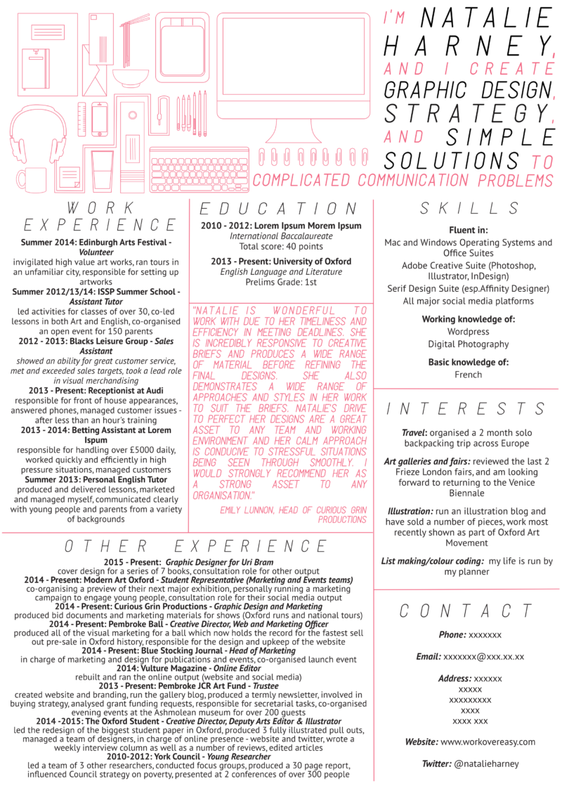
I started this off by talking about my own CV, so I thought I should share it with you. This is really quite old now (2014, I was 18), I couldn’t find a more modern version, but I have used this format for every CV since.

Why does it work?

  • It fits on a single side of A4 so it’s easy to skim
  • I used it to apply to a grad scheme with a number of different businesses (from events to creative agencies, to data) so it isn’t geared towards a specific industry
  • The layout is unusual but still easy to navigate
  • The top section adds character and is memorable, without detracting from the content
  • The pop of colour makes it eye catching
  • It’s all about the content inside the boxes (which I have edited out in some instances for privacy)

If there’s anything I’m known for in the office other than being the resident grad, and my sparkling personality, it’s my journal. Whenever I move office, I get at least a couple of comments on it a day, because it sits open on my desk, it’s orange and I guess people are intrigued by my tiny handwriting. So, I figured, if it’s interesting enough for office folk to ask about it, it might just about be interesting enough to share with you guys.

First off, I would like to say that I’m not sure if what I do is technically a bullet journal, is there an official definition? Can someone let me know? But it does keep me organised and make me feel much more together than I actually am which is all I can ask it to do.

My journal has been through many incarnations and permutations as my life and career have changed. Initially, it was inspired by the homework planner I had to carry around in school. Then it was just a book of lists. Then back to being a day by day to do list in a diary. Then it was my attempt to make something like the journals I saw on studyblrs. Then after all of that, it came out as something that worked for me. Something that included all of the things I needed my lists, my habits, my key dates, in a format that worked for me still day by day but in an undated notebook on dotted paper, that looked how I wanted it to neat and practical but still attractive.

It’s an ongoing process still though, and I’m sure that as my life changes so will the journal I use to organise it.

I think journals are just so personal that I didn’t really want to do a top tips style post because the only tip I have is try things out and make a journal that works for you. So instead, I thought I’d share a few of the bits and pieces that make my journal my own and why I choose to do them in the way that I do.

TOOLS

RHODIA WEB NOTEBOOK WITH DOT GRID PAPER IN ORANGE

I previously used various incarnation of Moleskine, squared, diary, A5, pocket, but as soon as I used my first Rhodia Notebook I wasn’t going back. First, let’s discuss the paper.  It’s so smooth. There’s n no bleed through, there’s no feathering. It is a pleasure to write on. Second, dot grid paper is the only way to go. It allows you to line up your writing whilst giving you plenty of freedom and still leaving the page mainly free compared to squared pages. Third, it’s orange! The soft touch hard cover wears really well, and is always easy to spot in the office. It’s also worth noting the elastic fastener, ribbon and back pocket are all properly sturdy as well. In the past, they lasted me around 6 months, but with the style I’m using I think it’s going to be more like 9 months to a year. It’s safe to say I’m a little bit in love with this notebook, even now that I’m on my 5th I think.

PILOT V BALL 0.5 IN BLACK

There’s nothing too special about this pen. It just writes really nicely. It’s smooth and comes out with a good even deep black line. 0.5 is the perfect width for the size of my handwriting and the size of the dot grid.

POST-IT NOTES

I like to include any lists e.g. shopping or packing lists, any schedules, or any other miscellany on post it notes. It separates them from the main body of my journal and means they can be moved around or taken out in the case of my shopping list. I keep a stash of yellow square post its in the back pocket of my notebook. But I try and change the colour up as much as I can because it’s probably the only fun element to my journal. I am particularly partial to the light pink rectangular ones for schedules or longer lists.

COLOURED NOTE BLOCK

The calendar that’s stuck into the front cover of my journal is a new addition. I realised I was struggling to joy down dates further in the future than a week and I was having to turn to digital solutions, so I decided to make a little calendar. I like having a centralised monthly spread rather than waiting every month to draw a new one out. Mine is made out of 12 pages of one of those coloured note blocks and I love it. It’s just big enough to include everything and just small enough not to intrude on my journal. I am toying with the idea of including a calendar in my first few pages of my next journal though.


WHAT’S INSIDE?

WEEKLY SPREAD

Every week I do a weekly spread with, surprisingly enough, a list of the things that I have to do that week. This takes up the whole left-hand side of the page. The right-hand side also includes a bar tracker for my habits (exercise, writing in my journal, and making something), a list of the blog posts I want to work on that week, my overarching work goals, and a little notes section. I give my week view a full page of its own because my to do list normally takes the full height of the page.

DAILY SPREAD

I can normally fit two daily spreads per side now that I’m at work every day and my personal to do list isn’t as long. This means I get more use out my journal and my pages look fuller. Just as in the weekly spread, the left-hand column is a to do list. The right-hand column is habit tracking with tick boxes for my weekly habits plus making sure I eat enough veggies and drink enough water. Underneath my habits, I like to include a work to do list. I have a separate notebook for all of my rough work notes that I take in meetings or when I’m planning out presentations, so that work to do isn’t normally too long. I usually have to put some kind of notes in the middle as well as I think of ideas or other things to add in.

DECORATION

When it comes to decoration I don’t really have any. I box my dates and hand rule a line between days as you can see, and there are icons for my habits but otherwise I don’t really decorate my bullet journal. I love seeing beautiful BuJos where people illustrate their weeks and include stickers and washi tape, but that’s just not for me. My journal is just about sorting my head out and keeping things neat and simple.