If you don’t know already I recently redesigned my portfolio and opened a store over at natalieharney.com. Because this blog is all about sharing everything I’m learning as an illustrator and designer (and human) I thought it would be worthwhile sharing the redesign process with you. Plus, it’s the kind of post I like to read, so I thought it might be the kind of post other people might enjoy too.

When I made my old portfolio, I was an English student, the work I was creating was very different, the skills I had were very limited and I didn’t need a portfolio all that much – or at least I didn’t share the link all that often. So, I thought it was about time I had a portfolio and personal site that really showed off the work that I’m doing and that I was proud to share when emailing people about commissions or even when my colleagues ask what I do outside of work. Plus, I really wanted to start selling some pieces on my own terms. Both of those meant that the time was right for me to build a new portfolio.

Once I’d come to the decision I needed a redesign, it took me a good month or so to actually find the time to do anything about it. Or rather I procrastinated because I had a blank slate, and there’s nothing scarier than a blank piece of paper.

So, my first stage was to try and build some boundaries into that blank sheet of paper. I created a list of the basic things I would need from my portfolio:

  • a short but engaging landing page
  • a grid portfolio page
  • flexible individual project pages
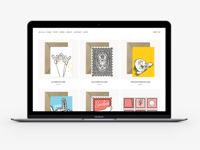
  • a store page
  • product pages
  • an about/contact section
  • all of the extra information sections that come with running a store

Then I gathered some inspiration by going through the sites of people who are doing similar work to see what they had included and how they’d laid out their content. Thankfully I feel like I’m digitally surrounded by so many incredible artists and makers with wonderful portfolios like Kitkat Pecson and Katie Suskin, which meant I was spoiled for choice. I also did a run through of the classic design inspiration Pinterest, Behance, and one page. Through that research as well as picking up a few new cards, I started to have an idea of how I wanted my new site to work and look.

After some more research, I decided that I wanted to use Squarespace to build my new site. I use WordPress for this blog, and it’s great, but I’ve used WordPress for previous portfolios and found it cumbersome and inflexible as someone who can’t code.* I’d heard good reviews of Squarespace and it seemed to tick all of the boxes I needed.

With Squarespace (as you probably already know) you have a selection of themes to choose from to base your site template on. I chose Brine as it fulfilled all of the basic criteria I established at the start, and seemed to offer me more than enough flexibility so I could make it my own.

Rather than just jumping into designing on Squarespace, I chose to start with pencil and paper. I wrote a list of all of the design capabilities and options I had with Brine and then I tried to imagine what I would do with all of those options instead of tweaking the options on site and getting a cookie cutter portfolio. I think I did okay.

The next step was obviously to build the thing, which thanks to Squarespace was really easy and didn’t take much time at all.

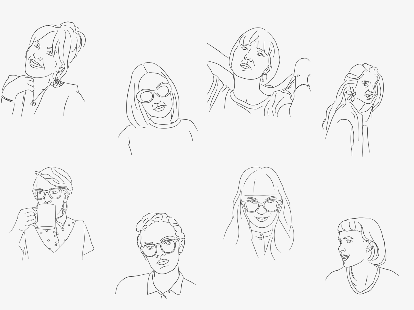
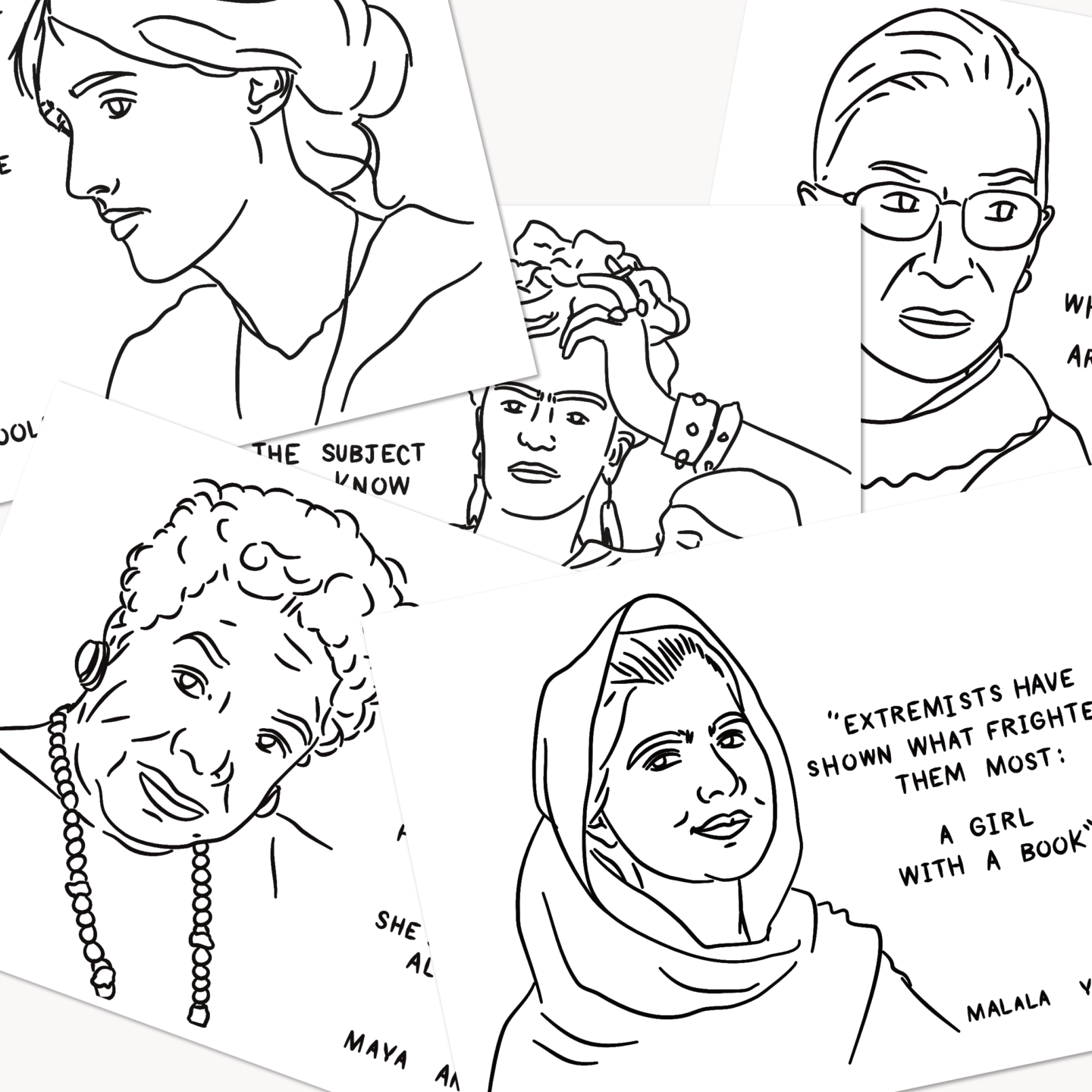
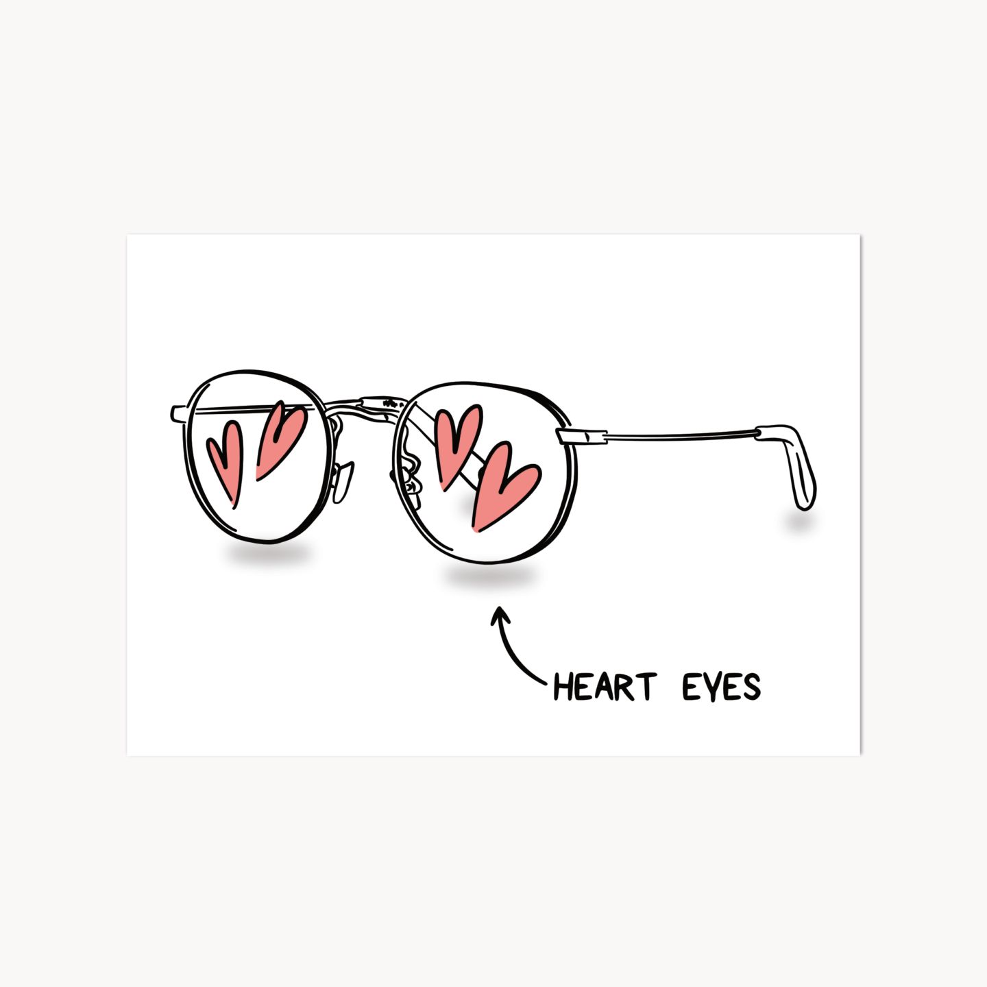
This might have been the wrong way to have done things, but I didn’t start making content until I had that framework in place. It worked for me because I know my own body of work pretty well, so from the start, I was already imagining how best to display it. I do think I underestimated the amount of time it would take me to turn a few years of work into a set of concise project case studies. Plus, it took me a good warm-up period to get over the discomfort of writing another about section. But once I’d powered through the curating, writing, editing, and uploading process I was left with a selection I’m pretty happy with and I think shows off a good range of the things I can do. It has also given me a lot of food for thought on the kind of work I want to do more.

Before sending it live, and sharing it with you, I tested it on a couple of friends and colleagues to get their feedback and to have an extra few pairs of eyes to spot typos. I’m still gathering feedback and improving and I think I will be for a long time, but that’s all part of the process to isn’t it?

All in all, it took me about a month to sort out my new portfolio (whilst still doing my 9-5, working on the products for my store and posting on the blog).

I think it’s hugely important in this day and age to have a portfolio you are proud of, and somewhere you can direct people to that explains what you do. If I can do it, I think anyone can, especially with the number of tools out there to help.

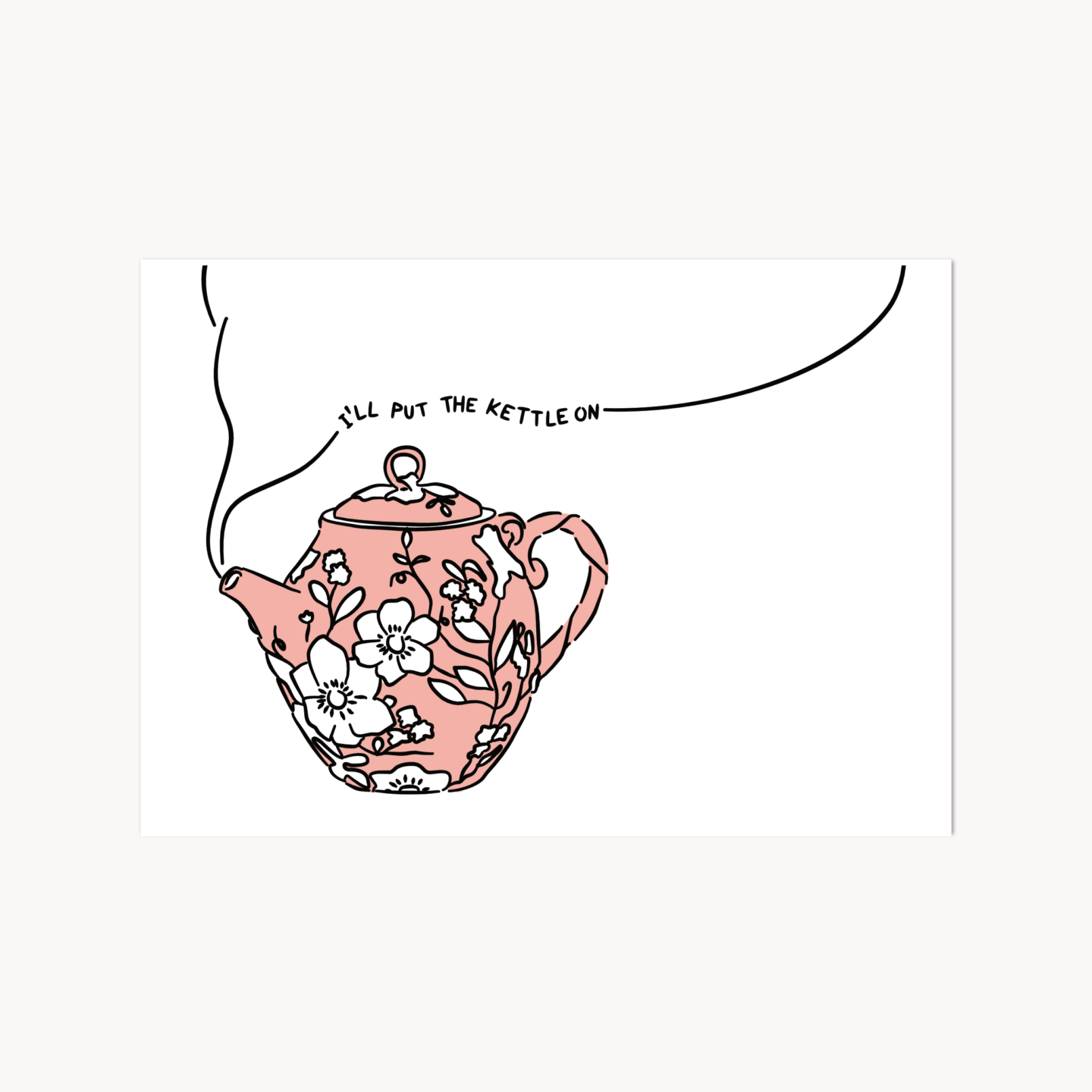
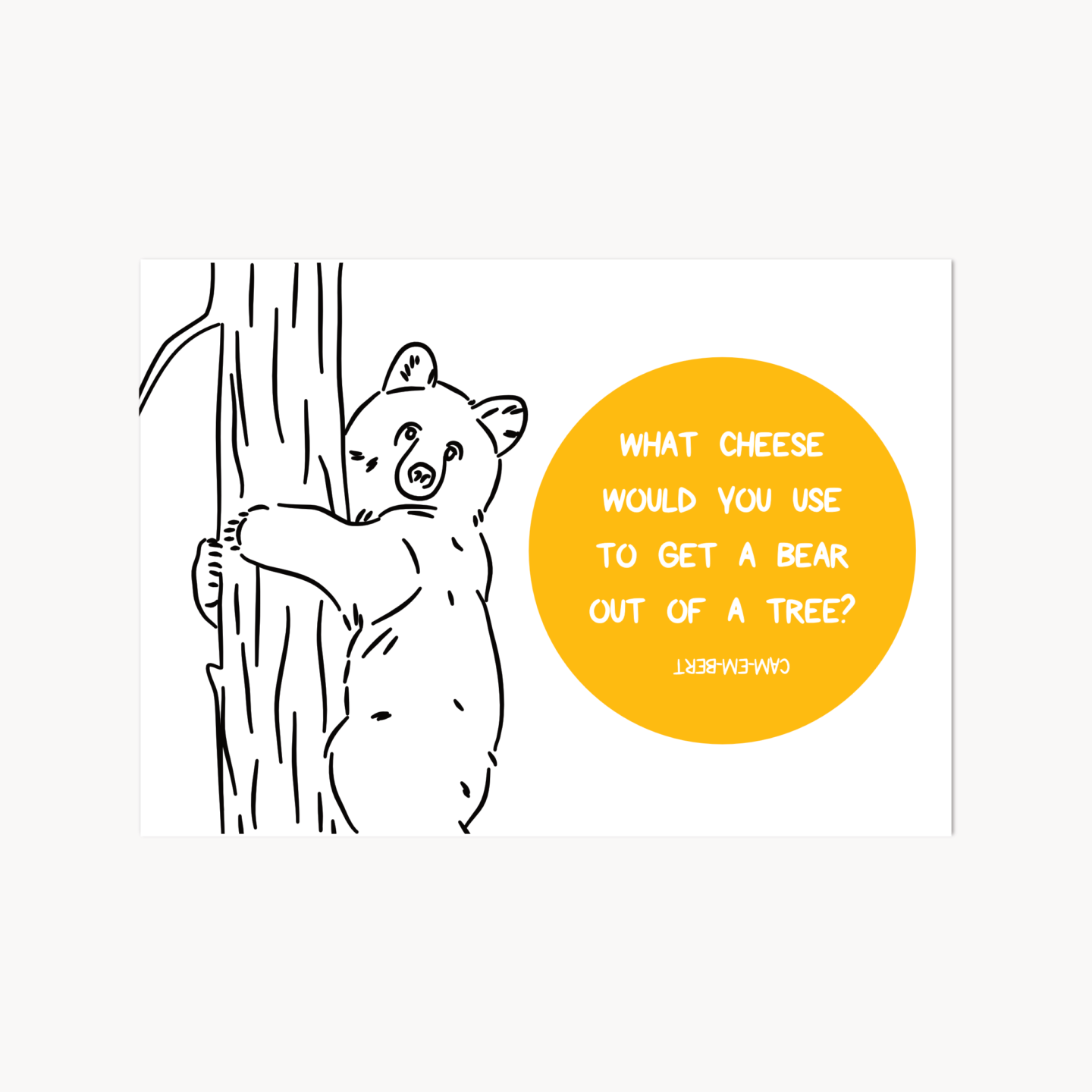
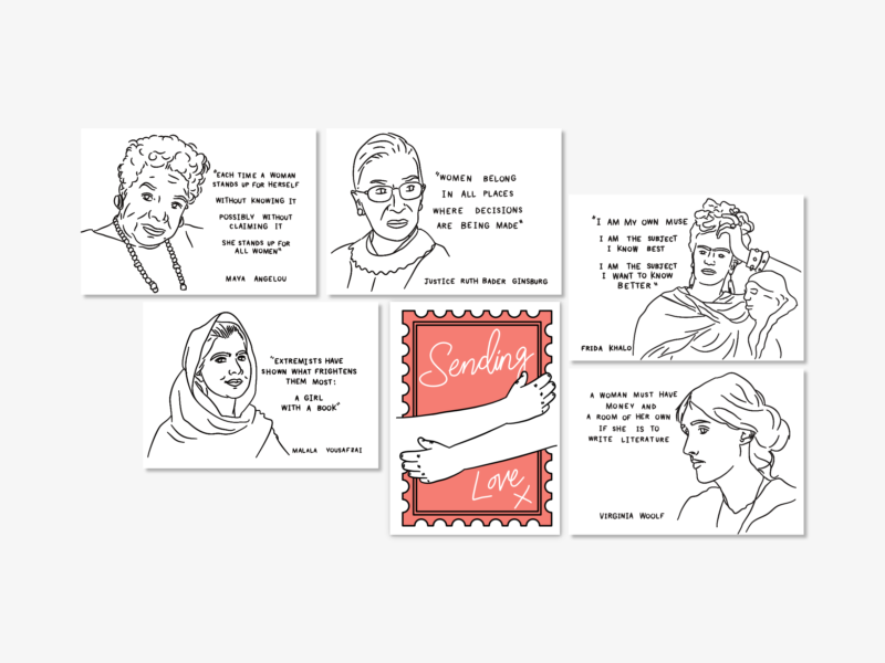
Please do head on over to my new portfolio and leave me any feedback you have on the site, or if you like what you see pick up some new stationery!

*I have also used Wix for other projects, but it just didn’t offer the level of control I wanted.

I feel like we’ve all experienced digital overwhelm at some point. It’s that feeling where you have so many screens, so much information, so many little buzzing sounds going on around you, you just don’t know what to do with yourself. You’re burned out from processing images and text and video. You’re stressed. You’re anxious. You’re experiencing digital overwhelm.

It’s something I’ve been feeling a lot recently, so I’m making a conscious effort to avoid digital overwhelm, and this is the advice I’m following.

DON’T SLEEP NEXT TO YOUR PHONE

Recently I got back into the really bad habit of having my phone on my bedside table. Having my phone just a blindly flailing hand away means that it’s quite often the last thing I see at night and the first thing in the morning. It’s not great. If you’re thinking about your phone when you sleep there really is no escape. So, as I write this post, I am vowing to leave my phone on my desk before I go to bed. No longer will I think about emails before I think about breakfast, and no longer will Twitter be the last thing I see before I sleep.

HAVE SET SCREEN/PHONE/EMAIL TIMES

You work more efficiently when you group similar tasks together e.g. answering all of your emails together. Or working on writing that report without checking your Instagram seven times an hour. I’m currently trialing having designated phone breaks when I’m at work, so I have a bit more time to scroll when I do it but I’m not constantly distracted by refreshing. It’s working. I’m more productive. I’m less anxious about constantly checking social media. I’m generally a little bit more balanced.

CUT DOWN ON THE NUMBER OF TABS YOU HAVE OPEN

As a serial tab hoarder, this is the hardest one on the list for me. But having all of that information out at once makes it harder to sort through and harder to focus on the task at hand. We’re simple, single-task creatures at our hearts and our browsers should reflect that to avoid digital overwhelm. I’ve been using Pocket to help me cut down. As soon as I want to open loads of tabs I just save them to pocket instead so that I can come back to them later.

UNSUBSCRIBE FROM THE JUNK EMAILS

I mentioned this in the digital part of my spring cleaning guide but I’m mentioning it again. The sight of 200 unread emails is a little terrifying, and spend your entire day answering and deleting is way too time-consuming. Unsubscribing from newsletters you don’t like and stores that bombard you with information means your inbox is way easier to sort through, and help cut down on impulse shopping. It also means you have more time for the emails you really like.

UNFOLLOW THINGS THAT STRESS YOU OUT

I feel like this should be obvious but the number of times I’ve found myself scrolling through someone’s twitter when I know that they just stress me out is ridiculous. Just unfollow anything that makes you feel bad. If you can’t bring yourself to unfollow or unfriend someone for fear of hurting their feelings, just mute them. Clear up your social media feeds and stop being overwhelmed by messages that make you feel worse.

TURN OFF NOTIFICATIONS

You do not need to be notified every time you gain a follower. They’ll still be there if you check back in half an hour. You do not need to be notified if you get a new email. They’ll still be there if you check back in half an hour. You do not need to be notified of everything, and certainly not with a loud ringtone. Reduce the number of notifications you have on your phone and laptop so that you check things when you want to, not when your device wants you to. Don’t forget you’re in charge in this relationship.

TRAVEL WITHOUT A SCREEN

Being bored is good for you. The easiest way to embrace boredom is when you travel. If you have a daily commute try and do it without looking at a screen (or even listening to anything). I know the tube is gross but taking some time to let your brain rest and not have to take in hundreds of images as you scroll is actually really nice. Embracing your screen free time when you commute is also nice because it helps provide a more distinctive break between work and home, and work screentime and home screentime.

You might not know that one of my big, pipe-dream goals for the future is to write and illustrate a book. I made my first one when I was 16 for a class, about a Llama who lost her Mamma and I loved it. It’s still at my home in York, and I like to flick through it when I go back.

Now I’m a little ways away from being able to have a published illustrated book, but there’s nothing to say I can’t make my own. So, in a now age old tradition I decided to self-publish and start small by making my very first zine.

And where better to start than with something I love?

An Ode to Tea is all about why tea is so much more than just a drink, it’s a comforting hand, it’s a ritual, it’s a moment of understanding. Tea can be everything and I think it’s so easy to forget how much can be wrapped up in a simple cuppa, and that’s the story I wanted to tell.

Actually putting the zine together was a lot of fun. It started, of course, with me making a cup of tea. Then I mind-mapped everything I love about tea. There was a lot. Then I made an attempt at some story boards, so I could try and stitch all of those separate ideas together into some form of a narrative. Then I drank some more tea and got on with the illustrations.

When it comes to creative work I’m usually someone who just dives straight in and tries things out. I don’t have a lot of patience for planning in the way that I do with other kinds of work. I just want to make. That’s what I did when making the zine. So there were a lot of images and bits of text I scrapped in the end because they didn’t work. But making all of those failed attempts is what informed the finished product and I think it’s so much the better for it.

It took a lot longer than I thought to be ready to print properly – I did print a few drafts to see how it would look, but the final one took a few weeks in the end. But the moment when I saw all of those pages churning through the printer I felt like I had joined a special club. It felt like I had joined a union of self-publishers. Is that weird?

As fun as mass producing your illustrations is, I really wanted the zine to still feel personal. That’s why each on is assembled, signed and finished by hand, so you know each one has really come from me.

You can buy my zine on its own or in a bumper par-tea (I know I’m hilarious) bag, which includes the zine, postcard, a greeting card, and an exclusive sheet of biscuit-y stickers for just £6. That’s the same as a tea and a slice of cake, and a bit of a bargain if you ask me.

Over the last 12 months I’ve written over 180 posts, which by my rough calculations is around 126,000 words which is about the length of a novel (Harry Potter and The Philosopher’s Stone was only 76,944). When I did that quick bit of maths I was really surprised, and, you know what, pretty proud. To think that I’ve managed to write enough to fil a novel, and drawn more than enough illustrations to fill a book, in a year all while working and settling into a new city is a real achievement, and I need to get better at acknowledging my own achievements. So, as a part of my celebration of my first year of blogging I thought I’d do a roundup of my favourite posts from the year.

MOST VIEWED: My review of Affinity Designer

affinity designer review

MOST COMMENTED: On Fighting Busyness

Juggling work and busyness


FAVOURITE ILLUSTRATIONS: 8 Women Who Have Inspired Me

8 Women Who Inspire Me

FAVOURITE COLLABORATION: My Interview with Hollie Arnett

Chatting Design School Experiences with Hollie Arnett

FAVOURITE POST IN A SERIES: Design Story: Dr Martens

Design history of Dr Martens

FAVOURITE LONG READ: My Love Letter to Rubbish TV

In Praise of Rubbish TV


Postcards are the perfect hybrid of something you can keep and display, and something you can quickly send to a friend to let them know you’re thinking of them. They somehow feel less formal than a greeting card, but just as much work goes into making them something special.

I knew I had to do something with the content from one of my favourite posts, the post that got me drawing portraits, my ode to some badass feminists on International Women’s day. There can never be enough celebration of badass females, and I knew that they were something people would enjoy, after hearing about people printing the original drawings to stick on their walls. And thus, my pack of five feminist postcards was born.


I did change up the list of remarkable ladies, subbing in Frida Khalo because I love drawing her, and felt she would round out the list really well, but I think it still has the spirit of the original post. I also played around with a slightly textured, paint like line, to make them feel extra special.

As well as the five feminists pack, I also wanted to make a few that were a bit more fun, and like the postcards I pick out to send to friends. I took inspiration from some of my favourite illustrations of the past year, because what’s better than reusing and elevating work you’ve already done?

I think there’s a postcard for everyone in there. There are ones for friends, jokers, lovers, tea-drinkers, and everyone in between. You can also get a postcard in a pretty tea-rrific par-tea bag of goodies featuring my zine. I just couldn’t help myself on the pun front, apologies.

I also illustrated my favourite joke/cheese pun of all time, mainly because if they don’t sell well I know I will still be laughing at it no matter how many times I see it – “Cam-em-bert!” oh man. Yes, I do have the same humour level as a cardigan wearing dad. Am I ashamed? Absolutely not. In fact, send this one to your dad from me and spread the love/guffawing across the postal system.

All of my postcards, like all of my greeting cards, are printed on 300gsm TruCard stock (shiny on one side, easy to write on the other) here in the UK.